2. Introduction
As part of our A2 media coursework we were asked to create a music video as well as
produce two ancillary tasks. These ancillary tasks were to create a digipak and website.
When combined with the finished video these two products would demonstrate a marketing
campaign for our song, complete with branding and house style.
I feel I done a good job in making my products consistent through the use of a house style
that is very clear. A house style is a set of standards that provides a style guided based
on the consistency of a certain style presented through many different ways- however,
mainly through the use of color, fonts/typography and imagery.
From my research i found that consistency within products is very conventional within the
pop music genre as it creates more of a brand for the artist and makes the artist very
easy to follow.
3. PreliminarystagesWe firstly had to establish the meaning of branding and how we could apply that to our
products. Branding is a feature that can come in the form of a name, symbol, term, design
etc.. It gives a product a distinct identity which makes it stand out and is familiarised
by their audiences. We firstly researched rap/hip hop music brands to see which one our
artist could fit into. Bad boy records is a subsidiary of Sony which is why we thought
these brands would suit our artist. Bad boy records gives an illusion that the celebrities
have been through a tougher upbringing giving an impression to their audience that anyone
can make it and be highly successful. Our artist presents himself as a realist and is a
working class normal citizen, he has to struggle harder to make it to fame and this suits
the bad boy record image.We chose rap/hip hop to be our genre for this project as we all
were very familiar with the conventions and it was a mutual decision as we all enjoyed
listening to the music. Also, our artist fitted the conventions visually and looked
appealing to the target audience (16-19 year olds). His image matches the rap/hip hop
conventions by his baggy trousers, trainers, snap backs and jackets. This 'casual wear' is
a very common trait in hip hop music videos. Despite this, it is apparent that our artist
also challenges conventions by his lyrical content, most rap stars connote wealth within
their songs and videos. Our artist mocks the materialistic lifestyle and articulates
himself purely as a realist who is working hard from the bottom to get to the top. He
wants to be recognised for his music not for anything else. He discusses real life
situations and doesn't focus on involving women in his video like most rap/hip hop music
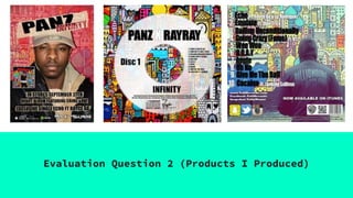
4. Digipak
The purpose for making a CD digipack was because we had to find different ways of
marketing our artist. In the music industry, releasing an album promotes not only your
music, but also your style, persona and genre as a whole. My pack effectively markets to
my target audience in many ways -
The clothing my artist is wearing is a common convention of rap/hip hop. The hats, jackets
and usual 'casual' wear is worn by most rap artists. It is a fashion statement that their
audience feel they can relate too and also wear. It is urban and contemporary which people
like and are influenced to also wear.
The font is simple but bold, which is appealing as it is almost making a statement on the
album's content. 'My Life' the title is clear & bold showing the audience this is plain
and simply focuses only on the artist's life experiences and his era in music.
My cover and back booklet images are carefully constructed to resemble a rap/hip hop
theme. My artist is positioned in the center & facing the audience. By making eye contact
it gives the impression his music is personal and wants to share it with you.
5. Advert
My artist is positioned to the side and we have taken a wider shot of him to exaggerate
his body language. The folded arms and straight position makes him seem superior and
powerful which would be effective as the audience would see him as a confident figure and
make his lyrical content seem more 'real'. This also shows his rap is about issues that
are serious to him, this is also reinforced by his expression in the second picture.The
fonts chosen are once again simple but this time I chose a red colour to emphasise the
title 'INFINITY'. The red portrays a fiery impression which could also imply his music
will leave a mark on you and you'll remember it, just like fire would burn you. Also I
enlarged 'PANZ' a few times across the album as it is our artist's distinct line that
shows us he is an upcoming artist who has the potential to be big! This is HIS time to
become the next huge star. After doing some research I chose my advert promotional logos
to be iTunes as iTunes is used a lot by my target audience and is highly popular. People
aged 16-19 are always on the look out for new music and would be very familiar with
companies like iTunes and Amazon, as finding good deals would also be a prime factor when
buying any product especially for a younger audience. Similar typography to that of my CD
digipack as I wanted the theme to stay the same so my audience would recognise it easier.
This matching theme is also reinforced by the black and white image as the upcoming tour
would have the artist's song from our music video. This shows he has kept a distinct
appearance throughout and I wanted the audience to see that through the products I made.
6. Branding
Branding is a way of clearly highlighting what makes your product or service different to, and more
attractive than, your competitors'. There are four key elements in a successful branding project:
The big idea - The big idea is the starting point for any branding project. It is a summary of your business'
or product's 'personality', and what makes it different. To find your big idea, you must first look very
carefully at your business and the marketplace you operate in.
Vision - An understanding of where your business is going, or where you want it to go, so you can plan your
journey. Your vision may be large scale - such as switching the emphasis of your business from one core area
to another - or simple, such as offering an existing product in a completely new way.
Values – Clarifies what your business stands for. Your values are an important part of how people see your
business - however, it can be tricky to communicate values.
Personality - When you start communicating your brand to consumers, you will also be expressing the
personality of your company through the tone, language and design you use.
7. Synergy
I believe that the combination between our music video, advert and digipak is very strong as we have taken
shots from the video and used this as our main focus for the poster. This was the shot of the main character
facing a wall with graffiti on it which is called “Infinity” which is also the name of the album. We took
inspiration from another Eminem album cover which showed the artist against a wall with meaningful graffiti
on it and we believed this was effective as it again gives the post-modern view on rap. Mixing this with the
black and white text colour scheme that we added to our product it gives it a clear brand identity as the rap
genre but also shows clear codes and conventions of this genre. We use this convention across all 3 of our
texts to build synergy and brand recognition for the audience. This allowed the red font that we used for the
album title "Infinity" to really stand out across all three texts and make this the thing that the audience
remembered. We also used the same layout in the overlapping of the title and Eminem's name ad the same font
on all three texts as a prominent feature to build brand recognition. This font gives an urban feel to the
product which would relate to the C2,D,E target audience demographic who may have a difficult life or live in
an urban setting. We also achieved this over all three texts by using city settings and high rise urban
apartment blocks which we learned through viewing Eminem videos. Another feature which was put on the album
advert was the overlay of the graffiti, initially the main character was just against a plain red wall. From
audience feedback I was told it wasn’t easy enough to recognise it belonged to the album, so from what I
received I cropped out his body and placed over the background so the audience can easily recognised that it
belonged to the album.
8. MediaConvergence
Another way we have linked all three texts is through media convergence. We have done this on the digipak by
having a link to www.trillymayne.com, and on the music magazine poster we have put a link to the songs
website where they can give us further advertisement through the two-step flow theory. The audience would
enjoy sharing and liking our product on social media and provide free advertising. Also we have put our music
video onto youtube to combine old media with new media to get more people interested in the product. Finally,
we have used an iTunes symbol on the music magazine poster to encourage our tribe-wired audience to digitally
download our songs which would save money for us because we wouldn't have to pay a shop to advertise our
music/the product. Furthermore both the album and the digipack have a copyright sentence containing the same
text, this is just another example of the correlation between the products.
9. Location
There is quite alot of synergy between our main product (music video) and the ancillary texts. The main
theme of the song ‘straight hip hop’ is to highlight that true hip hop isn’t about materialistic possessions
and objectifying women as is shown in many hip hop videos nowadays, but truly about self expression and
passion for the actual music.This is shown by establishing shots to reflect the artist’s social background so
a running theme through our video is an urban one of being ‘on the streets’ and & ‘ in the hood.’Which is
why we thought a good location would be in front of a wall of graffiti , which was also included in our
digipack ( cd back cover.)There is also little influence of grime music which is largely associated with
being on the streets.