SlideShare a Scribd company logo
1 of 22
Digipack and advert analysis
              What is a digipack?
A Digi-pack is the name given to a style of CD or DVD
packaging that comes in the gatefold format. For the purpose
of my coursework, when evaluating, i will use the term Digi-
pack to refer to the artwork of any album or CD case- both
gatefold and jewel cases
                What is an advert?
An advert comes from the word advertising, which is a form of
communication used to encourage or persuade to buy a
product or service. Within the music industry adverts have
been mainly online but also use magazine like NME and fill the
back pages. Big tour posters are present outside music venues
and record shops. these adverts generally match the style of
digi-pack and the music video.
codes and conventions Pictures                      Record label and
                                                    distributors logos
         of a digipack
                                       photo of   Artists logo
                                        artist

 Text          Credits and
               ownership            Design
                                                     narrative behind
 track list                                             the deign
               lyrics
                                   Gate fold
                      copyright
 Album and             details                    Pull out/Booklet
 artist name                      barcode
                        price
     bonus material                Representative of the genre

   producer's details                               artists font
                                   side title
Tinie tempah
 Disc-Overy
Patrick Okogwu, better known by his
stage name Tinie tempah is a British
rapper who has been working to make a
name for himself in the RnB Genre since
2006. In 2010 he released his debut
album, Discovery, which not only hit the
number spot but stayed in the UK top
40 album chart for fifty consecutive
weeks.
Breaking down the front cover of this album shows a typical RnB picture of a
photo shopped mid shot of the artist with 'the world in his hands'. The
picture shows Tinie wearing sunglasses, something that artists of this genre
tend to do. this would not be done in the pop genre as the artist is this
cheesy brand that the record company want to show off. When thinking
about creating a brand on this cover, the logo of the artists name has
become recognisable and will forever related back to tinie tempah. The
typography used for the logo has been used for most of what's left of the
albums text, again trying to establish a brand for a debut album.
Disc-Overywhat genre he is in and the kind of
The clothing worn shows
                        continued....
artist he is. The bling that is present, the watch and chain, is
again stereotypical of an artist of this type and gives of the
impression that RnB artists are all about money, Bi*ches and
Bling. the use of colour is effective and would stand out on the
shelf. Since the album hit number one it has become part of
the pop scene and there could have been a strategy of the
distributors as the purple and pink mixed with some sparkle,
could be seen as pop. the dark colours and the mid shot of the
artist bring the artwork back to the RnB it is originally intended
for. i also think the use of a shinny effect on his arms are
symbolic of Tinie being new on the scene, something fresh that
should be listened to. By including the stars in the
background, it links back to the title name, Disc-Overy. A word
that some would relate to space and also the name of some of
the shuttle ships sent into the outer atmosphere and the moon.
Disc-Overy continued....
the design and theme is based upon the use of triangles. i think this is
again taken from the font which creates this brand. I also think it is
symbolic of the progression to success for this artist, who some would
say has reached his peek with this mercury award nominated album.

Going inside the album and looking at the CD
and booklet, there is a continued use of the
colour purple and the font is the same as the
front and also. The print on the CD is very simple
and just carries the artist and album logo which
accompanied by the copyright small print.

Overall the digipack for this album sticks to the codes and conventions of
an normal album and particularly one in the RnB genre. There are parts
that lean towards a more 'POPy' album- the font and the colours do this. I
think this is because as he grows as an artist he begins to appeal to
those into the pop genre, becoming a mainstream radio artist.
Disc-Overy Intertextuality


Although i can't find any intertextuality with other types of
media text, I found that throughout the campaign of the
release of 6 singles from this album, he had used the same
style and themes throughout his artwork, which helps to build
a brand. The triangles are still present in the background of
the covers and the artist wears sunglasses in all pictures.
Therefore adhering to his genre and maybe suggesting he is
invincible and there is more to come.
Disc-Overy Advert
For this A2 media coursework, it's not all
about creating a good music promo video,
but it's also to create a Digi-pack and Advert
that would support the promotional video and
the album campaign of the artist. i will look at
adverts separately, but I'm also looking at
how the digipack links to the adverts. The
advert for Tinie Tempah is using almost the
same image but has a much darker theme. i
think this is because his tour would appeal
more to those Rnb fans. The city he appears
to be hold on his album cover has
disappeared suggesting that his tour is over
a much bigger territory that he hopes to take
hold of. the light shining from behind him
represents that the spotlight is on him and
there is something to be discovered, linking
to the album name.
Tinie Tempah Music video                                       Written in
                                                               the stars

     How it links into the digi-pack and advert
Buildings, city in his hands   up tall in the stars (Disc-Overy)


   light shining over city     Similar costume (sunglasses, leather
                                             jacket)


use of the colours black and white
Oasis
Definitely Maybe
Oasis are a Brit pop band made up of two
n o r t h e r n b ro t h e r s , L i a m a n d N o e l
Gallagher from the nineties. The album
definitely Maybe was the debut and the
album artwork has become somewhat
famous.
Being Brit-pop there is a laid back natural picture on the front of the
album that suggest that there music is very much relaxed and laid back.
What also appears to be interesting is they are not looking with their
audience, some say this is key to grabbing the buyer attention. i think
this is something done across the genre of all things indie. The artist is
trying to create a brand but want their fans to fall in love with them and
their album for the standard of music on it. The poses are not Forced
poses and show these are real people, suggesting that the music on the
album is real too. fans love this and bands like the smiths capitalised on
this in the 1980's.
Definitely Maybe continued....
The back cover shows a similar picture to the one that is on the
front. Members of the band have changed position, creating
something visually interesting, getting their audience to think
about the difference in picture. it suggests that their songs and
lyrics have the same effect. Also we see they have adhered to
some codes and conventions by including a numbered track list
and a bar code across the top.
The pictures, both by photographer,
Colin Bell, have used interesting
lighting to produce a pastel tone to
he picture. They are very basic and
show that its not all about the shiny
lights and fame the band are after.
Definitely Maybe continued....
Although I mentioned in the first slide that the album artwork for oasis wasn't
all about creating a brand, i think that they way the pictures are used, are
there to create personality and therefore brand identity. the use of mise en
scene in the picture highlights this. The use of props, e.g. the wine and
cigarettes show that they are not perfect people and suggest a rock and roll
lifestyle that the brothers have tried to enforce since the band got together in
1991. the appear to be in a normal house, just casually chilling. this makes
me think that they are just normal, everyday working class people.
Something that has carried this band through as
a brand is the iconic logo. It appears on all
merch, including this digipack and CD (adhering
to Codes and Conventions). also on the main
CD, we see the Compact Disk logo, copyright
details and a track list. its simple font and layout
with just a plain simple silver background. All this
shows that oasis are not trying to shock the pop
world and get 20 number 1's, but simply make
music and if people like the music, then good.
This kind of attitude is something that is generic
across the genre.
Definitely Maybe Intertextuality
As the picture is quite abstract
there is some things that can be
related back to other media texts.
One that is sometimes picked up
is the picture of Burt Bacharach,
Noels Idol. It is seen to be paying
homage to the Pink Floyd album
Ummagumma and the picture
that is in a similar position of the
musical film, GiGi.
The good, The bad and The ugly is seen to be playing on the
television in the background. this could be reference to their
music and looking back now could also be symbolic of their
rock and roll lifestyles. On the back cover the TV appears to
have a still fro the film, A Fist full of Dollars.
Definitely Maybe Advert
This poster is the advert for the DVD
of the making of definitely maybe
and is sticks to convention by using
the same logos and pictures from the
digi-pack allowing the audience to
recognise the product straight away.
It also sticks to convention by
including the date in bold letters and
a small description along the bottom.
What i like about this advert is how
simple it is, using the black and
white colours from the bands logo.
by keeping it simple it supports the
campaign of the main album but also
adheres to the genre they are in.
Oasis Music Video                           How it links into the digi-
                                               pack and advert
cigarettes, shows attitude and Looks drugged up. RnR lifestyle and
  the Rock and Roll lifestyle           the 'real Liam G'


Creates voyerisum into normal
    life (lounging around)          the use of pastel colours
codes and                           Pictures          Of the
    conventions of an                                        artist
                                           Artist and
    magazine advert                        record
                                                                Of the
                                                                album
        (music)                            label logos
                                                                cover
Text         Website of artist      Design        Same theme as video
                Website and         Links to         and digipack
bold text         name of          where it can
                record label       be brought         Digital online version
Dates of
release        What is different   tour dates added         Magazine
               about the album
 Who is                                                     friendly
the artist       Places to buy
                    album             Hot spot stickers with
Description                                bonus info
                 Price
m                                                      Bold text
                      ak  en fro                the logo of the record company                         t h a t re a d s
           tur  e is t as been                  and distributor show that this           name of th
                                                                                                      e album, w
                                                                                                                          the
Th e pic          and h have a                                                          actually inc                    hich
            um                                  poster is sticking to convention.
   e alb ted to                                                                                      ludes the n
th           la               t . this          It also enforces the product as it      of the band                     ame
 m anipu sh effec more                          shows it is made by a                   name of the
                                                                                                      . by having
                                                                                                                         the
              a                t
 p  ink w the adver                 eye         respected company                                     album so b
                                                                                                                       ig, it
            s                nd                                                        creates a rh
  make a b l e a rts the                                                                            etorical que
                                                                                                                      stion
      o t i c e . it disto s the                                                       form the
   n             g                e                                                                 audience
       atchin hich mak m o r e                                                         could be                       and
     c            w                                                                                  a convinc
     im  age         e    l o o k t.                                                  reason to b
                                                                                                   y the album
                                                                                                                       ing
      aud     i e n c e adver                                                         the text bei                  . with
                        h
                ly at t                                                                            ng so big i
       close                                                                         something
                                                                                                  you will be
                                                                                                                   ts not
                                                                                     to forget                       able
displaying a small version of
the album cover on the album                                                           displaying the date underneath
cover on the bottom of the                                                             the title gives the consumer of
advert makes the audience                                                              this advert all the information
know what the product looks                                                            needed if they choose to buy
like and can look out for it                                                           the album. i think this is a key
when shopping in their local                                                           element to an advert.
record shop. Also with it being
                                                                                         by inc
their debut album its not                                                                       luding
                                                                                        the ad         a
something that people would                                                                     vert e sellers logo
                                                                                       audien         ncour           ,
go out of their way to look at,                                                                c           ages
so if the advert has fulfilled its        reviews from trusted sources like            buy t e to go o            the
                                                                                              he pr          ut an
purpose people will now the               these enforce the product and               away.          oduct          d
                                                                                              T             straigh
album, and know what it looks             have the power to encourage the            iTunes his is norm             t
                                          customer to buy the album, this is                 logo.          ally a
like                                                                                                               n
                                          an important feature on the advert
The Vaccines continued....
I have chosen this advert as it is one that I personally was influenced by.
Seeing this advert on the back on NME last year i was intrigued by this new
band on the scene and i was immediately talking about this new band 'The
Vaccines' before i had even heard of them. i think this was down to the bold
writing and the eye catching photo that left me feeling there was only one
option and that was to listen to this band. By including the picture of the album
and the band website along the bottom enabled me to discover this band, this
is something i will take when creating my own advert.

 To make sure i created 3 products that all link, I'm linking all 3 products to the advert
    The Vaccines Digi-pack                        The Vaccines music video


                                                                              If you wanna
                                              Similar tone and style to the way the film
    Same picture as advert                   was shot and how the picture is portrayed
Not only have they                                                  The picture is of the artist.
included the name of the                                            she is not looking at the
artist but it is in the form of                                     camera and doesn't have
the artist's logo. this is                                          a connection with her
important to creating a                                             audience. The picture is
brand within the music                                              abstract and follows the
industry and as this is her                                         theme of the album 'Lungs'
debut album with major                                              by showing such organs.
label, it needs to be clear                                         the pastel colours are
who this woman actually is.                                         typical for the Indie genre
                                                                    and is the only colour in
                                                                    the advert.
The extra information along
the bottom helps selling the                                          The title of the album is
product. mentioning                                                   the largest text on the
popular well known songs.                                             page as it is the product
it also states the formats                                            being sold. The large,
that the album can be                                                 simple and structured font
brought in. All of this is in                                         used here clearly stands
the same font as the Album                                            out on the page. As i said
title and fits in with the rest                                       before the only colour is in
of the page. there is again a     Along the bottom we see the         the picture which allows
contrast in colour with the       artist website and logos of the     the white lettering to stand
black and white.                  distributor, this shows it is       out on a black
                                  sticking to some codes and          background
                                  conventions
Florence and the machine continued....
What i like about this Advert is that it is very abstract and would stick out from other
adverts in a magazine. By using the album cover to dominated the page makes the
audience of this advert think about the product and makes it easily recognisable in a
record shop. By stating some of the popular songs on the album creates an enigma
and will persuade people to buy the CD. It is clear she has followed codes and
conventions (Artist picture, album cover picture, large album title, dates and other
details printed). What i would change in this advert is thinking about pulling in a
specific audience with a review quote or tag line.
  To make sure i create 3 products that all link, I'm linking all 3 products to the advert
 Florence an the machine
                                       Florence an the machine music video
        Digipack


                                                                     dog days are over
                                        Seen in the same position similar to the one
   Same picture and fonts                 on the album and advert many times.
Its clear to see that there is not an image of Coldplay on the advert but instead the
backdrop is dominated by the same theme that the album and digipack follow. I think
this is because of the bands popularity. It also makes the album cover recognisable on
the shelves. There is lots of bright colour which makes the advert stand out.

                                                              The stencil font that the
The released date is the
                                                              bands name is in shows
same style as the bands
                                                              of the colourful
logo as although is can be
seen as an important
                                                              background. the lines
element to you and me,                                        seem very thin and
Coldplay fans will already                                    don't seem to show of
know this and will counting                                   the Coldplay brand.
down the days anyway. if we
didn't know who Coldplay                                    Instead of the bands
were then maybe they would                                  name, the name of the
enforce this more along with                                album covers most of the
the bands name.                                             space in the same stencil
                                                            text. Its thicker than the
                                                            Coldplay writing and really
                                                            introduces an album that
 The extra info supplied along the bottom helps sell        has such an abstract name
 the album, Pre-order option is attractive to fans who      and theme.
 want it first and by mentioning the popular single
 'paradise', people will know what to expect from the
 rest of the album.
Coldplay continued....
Overall i love this advert as it really introduces the album. I think it is perfect for it's
target audience and will suit their new popularity within the teenage pop market. The
way that have created a new concept away from their previous albums is done by the
use of bright, absurd colours and a new band logo using the stencil. This is effective
because i feel Coldplay have changed their sound with this album so it is important to
introduce it in that way with a stand out advert like this one. I like the use of
mentioning songs, creating an enigma for the audience and this is something i look to
use. I feel again it would be boasted by a quote and the date being bigger and
bolder, but overall a good advert.

To make sure i created 3 products that all link, I'm linking all 3 products to the advert
   Coldplay Digi-pack                         Coldplay music video


                                                                                       Paradise
Same background and font                             Graffiti and colour
Final evaluation of
    adverts and digipacks
After looking at different digipacks and adverts for different
artists, i have started to understand the codes and
convention and how these are used to benefit the artist.
Looking at the products individually i reconignse things that
work well and things i could use, for example, different fonts
and the use of album pictures. Creating an enigma by
quoting some of the songs on the album can be beneficial
in encouraging the reader to buy the album. One thing i
have recognised is that all 3 products should link in some
way and follow the same style.
The final key thing is that the product should be specific to
your AUDIENCE!!

More Related Content

What's hot

A2 media coursework evaluation
A2 media coursework evaluationA2 media coursework evaluation
A2 media coursework evaluationxv_Identity
 
Brandon - ATR
Brandon - ATRBrandon - ATR
Brandon - ATRB H
 
Et1 album artwork
Et1   album artworkEt1   album artwork
Et1 album artworksashawardy1
 
Radial digipak analysis
Radial digipak analysisRadial digipak analysis
Radial digipak analysisRField11
 
Hype in the booth evaluation two
Hype in the booth evaluation twoHype in the booth evaluation two
Hype in the booth evaluation twoToneEgan
 
Ancillary
Ancillary Ancillary
Ancillary Chloe G
 
Evaluation Question 2
Evaluation Question 2Evaluation Question 2
Evaluation Question 2Manisha1994
 
Website evaluation task 1
Website evaluation task 1Website evaluation task 1
Website evaluation task 1sashawardy1
 
Main product and ancillary texts
Main product and ancillary textsMain product and ancillary texts
Main product and ancillary textshanmas12
 
Genre Research on the House Music Industry
Genre Research on the House Music IndustryGenre Research on the House Music Industry
Genre Research on the House Music IndustryJamesGaffney12
 
Digipak analysis
Digipak analysisDigipak analysis
Digipak analysiscraneyboi
 
Digipak analysis 1
Digipak analysis 1Digipak analysis 1
Digipak analysis 1Dom Collins
 
Digipack presentation
Digipack presentation Digipack presentation
Digipack presentation Nikachu
 
Conventions of grime music
Conventions of grime musicConventions of grime music
Conventions of grime musicMorgan Noel
 
Analysing Adverts And Digipaks
Analysing Adverts And DigipaksAnalysing Adverts And Digipaks
Analysing Adverts And DigipaksChloe Owen
 

What's hot (20)

Q1
Q1Q1
Q1
 
A2 media coursework evaluation
A2 media coursework evaluationA2 media coursework evaluation
A2 media coursework evaluation
 
Brandon - ATR
Brandon - ATRBrandon - ATR
Brandon - ATR
 
Et1 album artwork
Et1   album artworkEt1   album artwork
Et1 album artwork
 
Radial digipak analysis
Radial digipak analysisRadial digipak analysis
Radial digipak analysis
 
Hype in the booth evaluation two
Hype in the booth evaluation twoHype in the booth evaluation two
Hype in the booth evaluation two
 
Ancillary
Ancillary Ancillary
Ancillary
 
Evaluation Q 1
Evaluation Q 1Evaluation Q 1
Evaluation Q 1
 
Evaluation Question 2
Evaluation Question 2Evaluation Question 2
Evaluation Question 2
 
Website evaluation task 1
Website evaluation task 1Website evaluation task 1
Website evaluation task 1
 
Evaluation Task 1
Evaluation Task 1Evaluation Task 1
Evaluation Task 1
 
Main product and ancillary texts
Main product and ancillary textsMain product and ancillary texts
Main product and ancillary texts
 
Genre Research on the House Music Industry
Genre Research on the House Music IndustryGenre Research on the House Music Industry
Genre Research on the House Music Industry
 
Digipak analysis
Digipak analysisDigipak analysis
Digipak analysis
 
Risk assessment
Risk assessmentRisk assessment
Risk assessment
 
Digipak analysis 1
Digipak analysis 1Digipak analysis 1
Digipak analysis 1
 
Evaluation task 1
Evaluation task 1Evaluation task 1
Evaluation task 1
 
Digipack presentation
Digipack presentation Digipack presentation
Digipack presentation
 
Conventions of grime music
Conventions of grime musicConventions of grime music
Conventions of grime music
 
Analysing Adverts And Digipaks
Analysing Adverts And DigipaksAnalysing Adverts And Digipaks
Analysing Adverts And Digipaks
 

Similar to Research into Digipacks and Music Magazine adverts

ancillary research
ancillary researchancillary research
ancillary researchkenyaL
 
Generic conventions of r&b digipaks
Generic conventions of r&b digipaksGeneric conventions of r&b digipaks
Generic conventions of r&b digipaksSam Benzie
 
Too weird analysis
Too weird analysisToo weird analysis
Too weird analysisSophie Rudd
 
Genre specific digipack analysis
Genre specific digipack analysisGenre specific digipack analysis
Genre specific digipack analysisjparker98
 
Album poster analysis
Album poster analysisAlbum poster analysis
Album poster analysiskelsey ry
 
Album poster analysis
Album poster analysisAlbum poster analysis
Album poster analysiskelsey ry
 
Album poster analysis
Album poster analysisAlbum poster analysis
Album poster analysiskelsey ry
 
Digipak and magazine advert analysis
Digipak and magazine advert analysis Digipak and magazine advert analysis
Digipak and magazine advert analysis godsell1999
 
Cd cover research
Cd cover  researchCd cover  research
Cd cover researchRathina159
 
Digipak
DigipakDigipak
Digipakenosd1
 
Digipaks analysis
Digipaks analysisDigipaks analysis
Digipaks analysisHarry Monan
 
Ancillary task
Ancillary taskAncillary task
Ancillary taskemily_hop
 
Cd cover research
Cd cover  researchCd cover  research
Cd cover researchRathina159
 

Similar to Research into Digipacks and Music Magazine adverts (20)

ancillary research
ancillary researchancillary research
ancillary research
 
Generic conventions of r&b digipaks
Generic conventions of r&b digipaksGeneric conventions of r&b digipaks
Generic conventions of r&b digipaks
 
Digipak presentation.
Digipak presentation. Digipak presentation.
Digipak presentation.
 
Too weird analysis
Too weird analysisToo weird analysis
Too weird analysis
 
Genre specific digipack analysis
Genre specific digipack analysisGenre specific digipack analysis
Genre specific digipack analysis
 
Digipak Analysis
Digipak AnalysisDigipak Analysis
Digipak Analysis
 
Evaluation Q2
Evaluation Q2Evaluation Q2
Evaluation Q2
 
Album poster analysis
Album poster analysisAlbum poster analysis
Album poster analysis
 
Album poster analysis
Album poster analysisAlbum poster analysis
Album poster analysis
 
Album poster analysis
Album poster analysisAlbum poster analysis
Album poster analysis
 
diiigii
diiigiidiiigii
diiigii
 
Digipak and magazine advert analysis
Digipak and magazine advert analysis Digipak and magazine advert analysis
Digipak and magazine advert analysis
 
Cd cover research
Cd cover  researchCd cover  research
Cd cover research
 
Digipak
DigipakDigipak
Digipak
 
Digipaks analysis
Digipaks analysisDigipaks analysis
Digipaks analysis
 
Ancillary task
Ancillary taskAncillary task
Ancillary task
 
Digipak Research
Digipak ResearchDigipak Research
Digipak Research
 
Digipaks
DigipaksDigipaks
Digipaks
 
Cd cover research
Cd cover  researchCd cover  research
Cd cover research
 
Digipak Analysis
Digipak AnalysisDigipak Analysis
Digipak Analysis
 

Recently uploaded

Industrial Policy - 1948, 1956, 1973, 1977, 1980, 1991
Industrial Policy - 1948, 1956, 1973, 1977, 1980, 1991Industrial Policy - 1948, 1956, 1973, 1977, 1980, 1991
Industrial Policy - 1948, 1956, 1973, 1977, 1980, 1991RKavithamani
 
Sanyam Choudhary Chemistry practical.pdf
Sanyam Choudhary Chemistry practical.pdfSanyam Choudhary Chemistry practical.pdf
Sanyam Choudhary Chemistry practical.pdfsanyamsingh5019
 
Paris 2024 Olympic Geographies - an activity
Paris 2024 Olympic Geographies - an activityParis 2024 Olympic Geographies - an activity
Paris 2024 Olympic Geographies - an activityGeoBlogs
 
The basics of sentences session 2pptx copy.pptx
The basics of sentences session 2pptx copy.pptxThe basics of sentences session 2pptx copy.pptx
The basics of sentences session 2pptx copy.pptxheathfieldcps1
 
Separation of Lanthanides/ Lanthanides and Actinides
Separation of Lanthanides/ Lanthanides and ActinidesSeparation of Lanthanides/ Lanthanides and Actinides
Separation of Lanthanides/ Lanthanides and ActinidesFatimaKhan178732
 
Presentation by Andreas Schleicher Tackling the School Absenteeism Crisis 30 ...
Presentation by Andreas Schleicher Tackling the School Absenteeism Crisis 30 ...Presentation by Andreas Schleicher Tackling the School Absenteeism Crisis 30 ...
Presentation by Andreas Schleicher Tackling the School Absenteeism Crisis 30 ...EduSkills OECD
 
The Most Excellent Way | 1 Corinthians 13
The Most Excellent Way | 1 Corinthians 13The Most Excellent Way | 1 Corinthians 13
The Most Excellent Way | 1 Corinthians 13Steve Thomason
 
18-04-UA_REPORT_MEDIALITERAСY_INDEX-DM_23-1-final-eng.pdf
18-04-UA_REPORT_MEDIALITERAСY_INDEX-DM_23-1-final-eng.pdf18-04-UA_REPORT_MEDIALITERAСY_INDEX-DM_23-1-final-eng.pdf
18-04-UA_REPORT_MEDIALITERAСY_INDEX-DM_23-1-final-eng.pdfssuser54595a
 
Hybridoma Technology ( Production , Purification , and Application )
Hybridoma Technology  ( Production , Purification , and Application  ) Hybridoma Technology  ( Production , Purification , and Application  )
Hybridoma Technology ( Production , Purification , and Application ) Sakshi Ghasle
 
Organic Name Reactions for the students and aspirants of Chemistry12th.pptx
Organic Name Reactions  for the students and aspirants of Chemistry12th.pptxOrganic Name Reactions  for the students and aspirants of Chemistry12th.pptx
Organic Name Reactions for the students and aspirants of Chemistry12th.pptxVS Mahajan Coaching Centre
 
Kisan Call Centre - To harness potential of ICT in Agriculture by answer farm...
Kisan Call Centre - To harness potential of ICT in Agriculture by answer farm...Kisan Call Centre - To harness potential of ICT in Agriculture by answer farm...
Kisan Call Centre - To harness potential of ICT in Agriculture by answer farm...Krashi Coaching
 
PSYCHIATRIC History collection FORMAT.pptx
PSYCHIATRIC   History collection FORMAT.pptxPSYCHIATRIC   History collection FORMAT.pptx
PSYCHIATRIC History collection FORMAT.pptxPoojaSen20
 
Introduction to ArtificiaI Intelligence in Higher Education
Introduction to ArtificiaI Intelligence in Higher EducationIntroduction to ArtificiaI Intelligence in Higher Education
Introduction to ArtificiaI Intelligence in Higher Educationpboyjonauth
 
Incoming and Outgoing Shipments in 1 STEP Using Odoo 17
Incoming and Outgoing Shipments in 1 STEP Using Odoo 17Incoming and Outgoing Shipments in 1 STEP Using Odoo 17
Incoming and Outgoing Shipments in 1 STEP Using Odoo 17Celine George
 
Q4-W6-Restating Informational Text Grade 3
Q4-W6-Restating Informational Text Grade 3Q4-W6-Restating Informational Text Grade 3
Q4-W6-Restating Informational Text Grade 3JemimahLaneBuaron
 
A Critique of the Proposed National Education Policy Reform
A Critique of the Proposed National Education Policy ReformA Critique of the Proposed National Education Policy Reform
A Critique of the Proposed National Education Policy ReformChameera Dedduwage
 
_Math 4-Q4 Week 5.pptx Steps in Collecting Data
_Math 4-Q4 Week 5.pptx Steps in Collecting Data_Math 4-Q4 Week 5.pptx Steps in Collecting Data
_Math 4-Q4 Week 5.pptx Steps in Collecting DataJhengPantaleon
 
Mastering the Unannounced Regulatory Inspection
Mastering the Unannounced Regulatory InspectionMastering the Unannounced Regulatory Inspection
Mastering the Unannounced Regulatory InspectionSafetyChain Software
 
Presiding Officer Training module 2024 lok sabha elections
Presiding Officer Training module 2024 lok sabha electionsPresiding Officer Training module 2024 lok sabha elections
Presiding Officer Training module 2024 lok sabha electionsanshu789521
 

Recently uploaded (20)

Industrial Policy - 1948, 1956, 1973, 1977, 1980, 1991
Industrial Policy - 1948, 1956, 1973, 1977, 1980, 1991Industrial Policy - 1948, 1956, 1973, 1977, 1980, 1991
Industrial Policy - 1948, 1956, 1973, 1977, 1980, 1991
 
Sanyam Choudhary Chemistry practical.pdf
Sanyam Choudhary Chemistry practical.pdfSanyam Choudhary Chemistry practical.pdf
Sanyam Choudhary Chemistry practical.pdf
 
Paris 2024 Olympic Geographies - an activity
Paris 2024 Olympic Geographies - an activityParis 2024 Olympic Geographies - an activity
Paris 2024 Olympic Geographies - an activity
 
The basics of sentences session 2pptx copy.pptx
The basics of sentences session 2pptx copy.pptxThe basics of sentences session 2pptx copy.pptx
The basics of sentences session 2pptx copy.pptx
 
Separation of Lanthanides/ Lanthanides and Actinides
Separation of Lanthanides/ Lanthanides and ActinidesSeparation of Lanthanides/ Lanthanides and Actinides
Separation of Lanthanides/ Lanthanides and Actinides
 
Presentation by Andreas Schleicher Tackling the School Absenteeism Crisis 30 ...
Presentation by Andreas Schleicher Tackling the School Absenteeism Crisis 30 ...Presentation by Andreas Schleicher Tackling the School Absenteeism Crisis 30 ...
Presentation by Andreas Schleicher Tackling the School Absenteeism Crisis 30 ...
 
The Most Excellent Way | 1 Corinthians 13
The Most Excellent Way | 1 Corinthians 13The Most Excellent Way | 1 Corinthians 13
The Most Excellent Way | 1 Corinthians 13
 
18-04-UA_REPORT_MEDIALITERAСY_INDEX-DM_23-1-final-eng.pdf
18-04-UA_REPORT_MEDIALITERAСY_INDEX-DM_23-1-final-eng.pdf18-04-UA_REPORT_MEDIALITERAСY_INDEX-DM_23-1-final-eng.pdf
18-04-UA_REPORT_MEDIALITERAСY_INDEX-DM_23-1-final-eng.pdf
 
Hybridoma Technology ( Production , Purification , and Application )
Hybridoma Technology  ( Production , Purification , and Application  ) Hybridoma Technology  ( Production , Purification , and Application  )
Hybridoma Technology ( Production , Purification , and Application )
 
Organic Name Reactions for the students and aspirants of Chemistry12th.pptx
Organic Name Reactions  for the students and aspirants of Chemistry12th.pptxOrganic Name Reactions  for the students and aspirants of Chemistry12th.pptx
Organic Name Reactions for the students and aspirants of Chemistry12th.pptx
 
Kisan Call Centre - To harness potential of ICT in Agriculture by answer farm...
Kisan Call Centre - To harness potential of ICT in Agriculture by answer farm...Kisan Call Centre - To harness potential of ICT in Agriculture by answer farm...
Kisan Call Centre - To harness potential of ICT in Agriculture by answer farm...
 
PSYCHIATRIC History collection FORMAT.pptx
PSYCHIATRIC   History collection FORMAT.pptxPSYCHIATRIC   History collection FORMAT.pptx
PSYCHIATRIC History collection FORMAT.pptx
 
Introduction to ArtificiaI Intelligence in Higher Education
Introduction to ArtificiaI Intelligence in Higher EducationIntroduction to ArtificiaI Intelligence in Higher Education
Introduction to ArtificiaI Intelligence in Higher Education
 
Incoming and Outgoing Shipments in 1 STEP Using Odoo 17
Incoming and Outgoing Shipments in 1 STEP Using Odoo 17Incoming and Outgoing Shipments in 1 STEP Using Odoo 17
Incoming and Outgoing Shipments in 1 STEP Using Odoo 17
 
Q4-W6-Restating Informational Text Grade 3
Q4-W6-Restating Informational Text Grade 3Q4-W6-Restating Informational Text Grade 3
Q4-W6-Restating Informational Text Grade 3
 
A Critique of the Proposed National Education Policy Reform
A Critique of the Proposed National Education Policy ReformA Critique of the Proposed National Education Policy Reform
A Critique of the Proposed National Education Policy Reform
 
Model Call Girl in Tilak Nagar Delhi reach out to us at 🔝9953056974🔝
Model Call Girl in Tilak Nagar Delhi reach out to us at 🔝9953056974🔝Model Call Girl in Tilak Nagar Delhi reach out to us at 🔝9953056974🔝
Model Call Girl in Tilak Nagar Delhi reach out to us at 🔝9953056974🔝
 
_Math 4-Q4 Week 5.pptx Steps in Collecting Data
_Math 4-Q4 Week 5.pptx Steps in Collecting Data_Math 4-Q4 Week 5.pptx Steps in Collecting Data
_Math 4-Q4 Week 5.pptx Steps in Collecting Data
 
Mastering the Unannounced Regulatory Inspection
Mastering the Unannounced Regulatory InspectionMastering the Unannounced Regulatory Inspection
Mastering the Unannounced Regulatory Inspection
 
Presiding Officer Training module 2024 lok sabha elections
Presiding Officer Training module 2024 lok sabha electionsPresiding Officer Training module 2024 lok sabha elections
Presiding Officer Training module 2024 lok sabha elections
 

Research into Digipacks and Music Magazine adverts

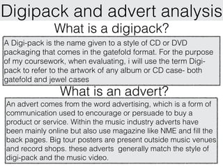
  • 1. Digipack and advert analysis What is a digipack? A Digi-pack is the name given to a style of CD or DVD packaging that comes in the gatefold format. For the purpose of my coursework, when evaluating, i will use the term Digi- pack to refer to the artwork of any album or CD case- both gatefold and jewel cases What is an advert? An advert comes from the word advertising, which is a form of communication used to encourage or persuade to buy a product or service. Within the music industry adverts have been mainly online but also use magazine like NME and fill the back pages. Big tour posters are present outside music venues and record shops. these adverts generally match the style of digi-pack and the music video.
  • 2. codes and conventions Pictures Record label and distributors logos of a digipack photo of Artists logo artist Text Credits and ownership Design narrative behind track list the deign lyrics Gate fold copyright Album and details Pull out/Booklet artist name barcode price bonus material Representative of the genre producer's details artists font side title
  • 3. Tinie tempah Disc-Overy Patrick Okogwu, better known by his stage name Tinie tempah is a British rapper who has been working to make a name for himself in the RnB Genre since 2006. In 2010 he released his debut album, Discovery, which not only hit the number spot but stayed in the UK top 40 album chart for fifty consecutive weeks. Breaking down the front cover of this album shows a typical RnB picture of a photo shopped mid shot of the artist with 'the world in his hands'. The picture shows Tinie wearing sunglasses, something that artists of this genre tend to do. this would not be done in the pop genre as the artist is this cheesy brand that the record company want to show off. When thinking about creating a brand on this cover, the logo of the artists name has become recognisable and will forever related back to tinie tempah. The typography used for the logo has been used for most of what's left of the albums text, again trying to establish a brand for a debut album.
  • 4. Disc-Overywhat genre he is in and the kind of The clothing worn shows continued.... artist he is. The bling that is present, the watch and chain, is again stereotypical of an artist of this type and gives of the impression that RnB artists are all about money, Bi*ches and Bling. the use of colour is effective and would stand out on the shelf. Since the album hit number one it has become part of the pop scene and there could have been a strategy of the distributors as the purple and pink mixed with some sparkle, could be seen as pop. the dark colours and the mid shot of the artist bring the artwork back to the RnB it is originally intended for. i also think the use of a shinny effect on his arms are symbolic of Tinie being new on the scene, something fresh that should be listened to. By including the stars in the background, it links back to the title name, Disc-Overy. A word that some would relate to space and also the name of some of the shuttle ships sent into the outer atmosphere and the moon.
  • 5. Disc-Overy continued.... the design and theme is based upon the use of triangles. i think this is again taken from the font which creates this brand. I also think it is symbolic of the progression to success for this artist, who some would say has reached his peek with this mercury award nominated album. Going inside the album and looking at the CD and booklet, there is a continued use of the colour purple and the font is the same as the front and also. The print on the CD is very simple and just carries the artist and album logo which accompanied by the copyright small print. Overall the digipack for this album sticks to the codes and conventions of an normal album and particularly one in the RnB genre. There are parts that lean towards a more 'POPy' album- the font and the colours do this. I think this is because as he grows as an artist he begins to appeal to those into the pop genre, becoming a mainstream radio artist.
  • 6. Disc-Overy Intertextuality Although i can't find any intertextuality with other types of media text, I found that throughout the campaign of the release of 6 singles from this album, he had used the same style and themes throughout his artwork, which helps to build a brand. The triangles are still present in the background of the covers and the artist wears sunglasses in all pictures. Therefore adhering to his genre and maybe suggesting he is invincible and there is more to come.
  • 7. Disc-Overy Advert For this A2 media coursework, it's not all about creating a good music promo video, but it's also to create a Digi-pack and Advert that would support the promotional video and the album campaign of the artist. i will look at adverts separately, but I'm also looking at how the digipack links to the adverts. The advert for Tinie Tempah is using almost the same image but has a much darker theme. i think this is because his tour would appeal more to those Rnb fans. The city he appears to be hold on his album cover has disappeared suggesting that his tour is over a much bigger territory that he hopes to take hold of. the light shining from behind him represents that the spotlight is on him and there is something to be discovered, linking to the album name.
  • 8. Tinie Tempah Music video Written in the stars How it links into the digi-pack and advert Buildings, city in his hands up tall in the stars (Disc-Overy) light shining over city Similar costume (sunglasses, leather jacket) use of the colours black and white
  • 9. Oasis Definitely Maybe Oasis are a Brit pop band made up of two n o r t h e r n b ro t h e r s , L i a m a n d N o e l Gallagher from the nineties. The album definitely Maybe was the debut and the album artwork has become somewhat famous. Being Brit-pop there is a laid back natural picture on the front of the album that suggest that there music is very much relaxed and laid back. What also appears to be interesting is they are not looking with their audience, some say this is key to grabbing the buyer attention. i think this is something done across the genre of all things indie. The artist is trying to create a brand but want their fans to fall in love with them and their album for the standard of music on it. The poses are not Forced poses and show these are real people, suggesting that the music on the album is real too. fans love this and bands like the smiths capitalised on this in the 1980's.
  • 10. Definitely Maybe continued.... The back cover shows a similar picture to the one that is on the front. Members of the band have changed position, creating something visually interesting, getting their audience to think about the difference in picture. it suggests that their songs and lyrics have the same effect. Also we see they have adhered to some codes and conventions by including a numbered track list and a bar code across the top. The pictures, both by photographer, Colin Bell, have used interesting lighting to produce a pastel tone to he picture. They are very basic and show that its not all about the shiny lights and fame the band are after.
  • 11. Definitely Maybe continued.... Although I mentioned in the first slide that the album artwork for oasis wasn't all about creating a brand, i think that they way the pictures are used, are there to create personality and therefore brand identity. the use of mise en scene in the picture highlights this. The use of props, e.g. the wine and cigarettes show that they are not perfect people and suggest a rock and roll lifestyle that the brothers have tried to enforce since the band got together in 1991. the appear to be in a normal house, just casually chilling. this makes me think that they are just normal, everyday working class people. Something that has carried this band through as a brand is the iconic logo. It appears on all merch, including this digipack and CD (adhering to Codes and Conventions). also on the main CD, we see the Compact Disk logo, copyright details and a track list. its simple font and layout with just a plain simple silver background. All this shows that oasis are not trying to shock the pop world and get 20 number 1's, but simply make music and if people like the music, then good. This kind of attitude is something that is generic across the genre.
  • 12. Definitely Maybe Intertextuality As the picture is quite abstract there is some things that can be related back to other media texts. One that is sometimes picked up is the picture of Burt Bacharach, Noels Idol. It is seen to be paying homage to the Pink Floyd album Ummagumma and the picture that is in a similar position of the musical film, GiGi. The good, The bad and The ugly is seen to be playing on the television in the background. this could be reference to their music and looking back now could also be symbolic of their rock and roll lifestyles. On the back cover the TV appears to have a still fro the film, A Fist full of Dollars.
  • 13. Definitely Maybe Advert This poster is the advert for the DVD of the making of definitely maybe and is sticks to convention by using the same logos and pictures from the digi-pack allowing the audience to recognise the product straight away. It also sticks to convention by including the date in bold letters and a small description along the bottom. What i like about this advert is how simple it is, using the black and white colours from the bands logo. by keeping it simple it supports the campaign of the main album but also adheres to the genre they are in.
  • 14. Oasis Music Video How it links into the digi- pack and advert cigarettes, shows attitude and Looks drugged up. RnR lifestyle and the Rock and Roll lifestyle the 'real Liam G' Creates voyerisum into normal life (lounging around) the use of pastel colours
  • 15. codes and Pictures Of the conventions of an artist Artist and magazine advert record Of the album (music) label logos cover Text Website of artist Design Same theme as video Website and Links to and digipack bold text name of where it can record label be brought Digital online version Dates of release What is different tour dates added Magazine about the album Who is friendly the artist Places to buy album Hot spot stickers with Description bonus info Price
  • 16. m Bold text ak en fro the logo of the record company t h a t re a d s tur e is t as been and distributor show that this name of th e album, w the Th e pic and h have a actually inc hich um poster is sticking to convention. e alb ted to ludes the n th la t . this It also enforces the product as it of the band ame m anipu sh effec more shows it is made by a name of the . by having the a t p ink w the adver eye respected company album so b ig, it s nd creates a rh make a b l e a rts the etorical que stion o t i c e . it disto s the form the n g e audience atchin hich mak m o r e could be and c w a convinc im age e l o o k t. reason to b y the album ing aud i e n c e adver the text bei . with h ly at t ng so big i close something you will be ts not to forget able displaying a small version of the album cover on the album displaying the date underneath cover on the bottom of the the title gives the consumer of advert makes the audience this advert all the information know what the product looks needed if they choose to buy like and can look out for it the album. i think this is a key when shopping in their local element to an advert. record shop. Also with it being by inc their debut album its not luding the ad a something that people would vert e sellers logo audien ncour , go out of their way to look at, c ages so if the advert has fulfilled its reviews from trusted sources like buy t e to go o the he pr ut an purpose people will now the these enforce the product and away. oduct d T straigh album, and know what it looks have the power to encourage the iTunes his is norm t customer to buy the album, this is logo. ally a like n an important feature on the advert
  • 17. The Vaccines continued.... I have chosen this advert as it is one that I personally was influenced by. Seeing this advert on the back on NME last year i was intrigued by this new band on the scene and i was immediately talking about this new band 'The Vaccines' before i had even heard of them. i think this was down to the bold writing and the eye catching photo that left me feeling there was only one option and that was to listen to this band. By including the picture of the album and the band website along the bottom enabled me to discover this band, this is something i will take when creating my own advert. To make sure i created 3 products that all link, I'm linking all 3 products to the advert The Vaccines Digi-pack The Vaccines music video If you wanna Similar tone and style to the way the film Same picture as advert was shot and how the picture is portrayed
  • 18. Not only have they The picture is of the artist. included the name of the she is not looking at the artist but it is in the form of camera and doesn't have the artist's logo. this is a connection with her important to creating a audience. The picture is brand within the music abstract and follows the industry and as this is her theme of the album 'Lungs' debut album with major by showing such organs. label, it needs to be clear the pastel colours are who this woman actually is. typical for the Indie genre and is the only colour in the advert. The extra information along the bottom helps selling the The title of the album is product. mentioning the largest text on the popular well known songs. page as it is the product it also states the formats being sold. The large, that the album can be simple and structured font brought in. All of this is in used here clearly stands the same font as the Album out on the page. As i said title and fits in with the rest before the only colour is in of the page. there is again a Along the bottom we see the the picture which allows contrast in colour with the artist website and logos of the the white lettering to stand black and white. distributor, this shows it is out on a black sticking to some codes and background conventions
  • 19. Florence and the machine continued.... What i like about this Advert is that it is very abstract and would stick out from other adverts in a magazine. By using the album cover to dominated the page makes the audience of this advert think about the product and makes it easily recognisable in a record shop. By stating some of the popular songs on the album creates an enigma and will persuade people to buy the CD. It is clear she has followed codes and conventions (Artist picture, album cover picture, large album title, dates and other details printed). What i would change in this advert is thinking about pulling in a specific audience with a review quote or tag line. To make sure i create 3 products that all link, I'm linking all 3 products to the advert Florence an the machine Florence an the machine music video Digipack dog days are over Seen in the same position similar to the one Same picture and fonts on the album and advert many times.
  • 20. Its clear to see that there is not an image of Coldplay on the advert but instead the backdrop is dominated by the same theme that the album and digipack follow. I think this is because of the bands popularity. It also makes the album cover recognisable on the shelves. There is lots of bright colour which makes the advert stand out. The stencil font that the The released date is the bands name is in shows same style as the bands of the colourful logo as although is can be seen as an important background. the lines element to you and me, seem very thin and Coldplay fans will already don't seem to show of know this and will counting the Coldplay brand. down the days anyway. if we didn't know who Coldplay Instead of the bands were then maybe they would name, the name of the enforce this more along with album covers most of the the bands name. space in the same stencil text. Its thicker than the Coldplay writing and really introduces an album that The extra info supplied along the bottom helps sell has such an abstract name the album, Pre-order option is attractive to fans who and theme. want it first and by mentioning the popular single 'paradise', people will know what to expect from the rest of the album.
  • 21. Coldplay continued.... Overall i love this advert as it really introduces the album. I think it is perfect for it's target audience and will suit their new popularity within the teenage pop market. The way that have created a new concept away from their previous albums is done by the use of bright, absurd colours and a new band logo using the stencil. This is effective because i feel Coldplay have changed their sound with this album so it is important to introduce it in that way with a stand out advert like this one. I like the use of mentioning songs, creating an enigma for the audience and this is something i look to use. I feel again it would be boasted by a quote and the date being bigger and bolder, but overall a good advert. To make sure i created 3 products that all link, I'm linking all 3 products to the advert Coldplay Digi-pack Coldplay music video Paradise Same background and font Graffiti and colour
  • 22. Final evaluation of adverts and digipacks After looking at different digipacks and adverts for different artists, i have started to understand the codes and convention and how these are used to benefit the artist. Looking at the products individually i reconignse things that work well and things i could use, for example, different fonts and the use of album pictures. Creating an enigma by quoting some of the songs on the album can be beneficial in encouraging the reader to buy the album. One thing i have recognised is that all 3 products should link in some way and follow the same style. The final key thing is that the product should be specific to your AUDIENCE!!

Editor's Notes

  1. \n\n
  2. \n\n
  3. \n\n
  4. \n\n
  5. \n\n
  6. \n\n
  7. \n\n
  8. \n\n
  9. \n\n
  10. \n\n
  11. \n\n
  12. \n\n
  13. \n\n
  14. \n\n
  15. \n\n
  16. \n\n
  17. \n\n
  18. \n\n
  19. \n\n
  20. \n\n
  21. \n\n
  22. \n\n