
Recommended
More Related Content
What's hot
What's hot (20)
Viewers also liked
Viewers also liked (20)
Similar to Digipak advert analysis
Similar to Digipak advert analysis (20)
Recently uploaded
Recently uploaded (20)
Digipak advert analysis
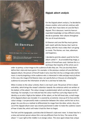
- 1. Digipak advert analysis For the Digipak advert analysis, I’ve decided to choose another artist and not continue with the work that I have done on Lana Del Rey’s digipak. This is because; I want to have an expended knowledge on how different artists decide to promote their albums throughout the use of visual elements. Ed Sheeran and Lana Del Rey music genres both match with the themes that I wish to portray with the music video that I am going to create. The themes are: love, adventure and happiness. I decided to pick the advert used for his first album called ‘+’. As an establishing image, a picture of himself was used. I believe this is a technique that majority of the artists use in order to portray a clear image to the audience of who they are. This can also help them define their style and music genre. For example, in the previous analysis of Lana Del Rey’s digipack album, the picture of herself made it very clear that she has a vintage style and her music is mainly targeting a niche audience who is interested in indie and pop music/culture. In this case, the image of Ed Sheeran does not specify that as it focuses on allowing the audience to consume the information of who he is and how he looks like. When it comes to the colour scheme, there is not much used. The picture of him is black and white, which brings the viewer’s attention towards the sentences which are written at the bottom of the advert. The colour orange is predominated which can bring a variety of meanings. For example, it can indicate how the colour itself has such a big impact on his identity as an artist. Right at the bottom of the advert, on the left hand side, a small image of his digipack album was included. It is covered by an extreme close up of his face and the colour orange. I can personally make a connection between the colour and his hair as he is ginger. He uses this as a method to differentiate his image from the other artists. Also, the use of the digipak album cover was cleverly positioned in order to make the audience aware of how it looks like, which will make it hard for them to forget. The font and the typography used describe Ed Sheeran’s style even more. It shows how he is a relax and normal person whose life is not any different from his fans. The name of the album ‘+’ is put right at the middle in an orange colour. This once again shows how unique
- 2. he is as an artist, as it is a very odd way to name an album. Underneath, he added two of his most popular songs ‘The A theme’ and ‘Lego house’. It almost allows the audience to know what to expect from the album, and have an idea on what his genre and music work is about. The last thing included in the advert is a quote, which shows how his fans or the people in the music industry think about him. It is very useful for people who do not know who Ed Sheeran is to see how different groups react to his work as an artist. Also, the audience which make part of the mainstream category is more likely to be passive and easily manipulated into buying the album. This is where the Hypodermic Syringe theory can apply, as in simply states that the audience any media product that is revealed to them. In other words, the technique used can bring Ed Sheeran high profits from the album’s sales.