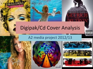
4. The Killers – Greatest Hits
By showing the band in a
central shot, this gives the
audience knowledge to
who’s album they are
buying. In addition, when
fans by their favorite
bands album, they want
to see the band appearing
on the album cover itself. .
In addition, the band is
shown to be looking
forward, directly at the
audience. This creates a
direct mode of address
and shows that the band
are trying to engage with
the audience.
• As shown above, typography is used in an affective way to draw the attention of the audience. By
placing the font vertically rather than the standard horizontal way, it adds variation to the album
cover and adds interest. In addition, the font used is found both in the album name and band
name. By using the same font it doesn’t create confusion and looks professional as it creates a
theme for the album cover.
6. Chris Brown - Fame
As shown to the right, the artist,
Chris Brown is shown to cover most
of the album cover whereas the
album name only covers 1/5 of the
album. In addition, the artist is
shown to be looking forward,
directly at the audience. This shows
direct contact and interaction with
the audience which shows the artist
to have confidence and therefore
establishes a relationship with the
audience and artist. By seeing the
artist in loads of different shots
behind the main shot of the artist
facing the audience, this tells us
that we are focusing mainly on the
artist rather than the music. In
addition, the artist, Chris Brown is
seen without any musical
instruments, telling us that his act is
most likely just using his voice.
• As you can see above, the typography used for the album name, “F.A.M.E”
follows a graffiti styled font as well as the background behind. Lots of variations
of colours are used to make the album cover stand out. The bright images of Chris
Brown help him establish himself as an artist for the audience.
7.
8. Deadmau5 - 4x4= 12
• The front cover for deadmau5’s album 4x5=12 is very simple yet
effective. They have simply put their logo of a mouse in the centre
which fills up a large majority of space for the whole front album
cover. In addition they have simply made the outline of the mouse
bright and green to give the effect that it has been lit up in neon to
give the impression of being in a club. Furthermore, the band’s name
and album name has been placed at the top to tell the audience
who’s album they are purchasing if the band’s logo wasn't clear to
the buyer. Moreover, the band’s name has been written in the same
font and colour as the band’s logo (the green neon colour).
The back of the album shows the song list of what
song’s the band have chosen to put in the album.
The band’s name as seen to the left is also in the
same font as the writing used for the band’s name
on the front cover of the album. By using a similar
pattern for the typography it makes it easy to follow
and more simplistic. Furthermore, as seen in the
picture to the right, a barcode has been used in the
bottom right of the back cover of the album as it is a
typical convention to have the barcode in that
place. Moreover, the album’s CD follows the same
typography pattern by using the same font and
colour scheme as well as the band’s logo.
9.
10. David Guetta – One Love
• The typography used for this album cover has been
used in a similar way to the font used for the
typography found in Deadmau5’s album cover. The font
is bright and colourful, typical colours found at a club
or disco which goes well with David Guetta’s genre of
music. Furthermore, the font used for the artists name
is the font used for all his album covers as if it were his
logo.
The appearance of the artists has been portrayed as
being at a club as if he were performing/Disk Jockeying
and so David Guetta is dressed very casually, as if he
were at a club. Furthermore, he has his arms in the air
as if he were getting the audience involved. This looks
as if he is performing to us now and that we’re involved
in his performance.
11.
12. Guns N’ Roses – Family Tree
• The reason I chose to look at and analyze a
rock album cover is to compare the
differences between a rock album cover and
a dance/rap album cover (the genre we’re
doing for our music video). Instantly, the first
noticeable thing between the two album
cover genre’s is that the theme of a rock
album cover is more dark and gloomy. For
example, the use of skulls and fire can be
found on the front of the Guns N’ Roses cd
cover as that is relevant to the genre of rock,
whereas on the David Guetta album cover
and Chris Brown album cover, bright colours
and typical conventions are used to suit the
genre of dance and pop.
In addition, unlike the stereotypical pop/dance album cover, the band or artist himself doesn’t seem
to appear on this rock cd, letting us know that this particular band doesn’t care whether audiences can
see the band on the front cover of the album. However, they have stuck to the traditional occurring
trend which is to have the band’s name at the top with the album name at the bottom, leaving the
band’s logo or image in the centre of the screen covering a majority of the album cover.
13. Guns N’ Roses – Family Tree
• The back of the album
cover is very similar to all
the other album covers I
have analyzed. For
example, the song list
goes down vertically so
that it is easy for the
person viewing the
album cover to read.
Moreover, when looking
at the bottom left of the
back of the album cover,
a barcode is found as
another typical
convention.
14.
15. Flo Rida - Roots
• Unlike most of the other
album covers, as we can see
to the right, the text used As shown to the left, the
for the artist and album artist has been portrayed to
name has been placed in be facing to the left (not
the top left hand corner of facing the audience). In
the album cover. Typically addition, noticeably, Flo Rida
you would normally see is shown to be shirtless. Flo
these two names centrally Rida has also stated that the
as normally recognized as album cover was done this
the most important way because he admittedly
information for the album has an 'addiction to being
cover. Moreover, the shirtless' and he wanted to
typography for the font has show his body, and show his
cleverly been done in a style addiction to the world.
to look like the state, Florida
(Where Flo Rida is from).
Flo+Rida = Florida.
Flo Rida stated the inspiration for the album comes from his success and knowing
that it wasn’t an overnight thing. "It also takes inspiration to turn an album, so I had
to really get everything together."