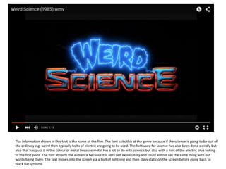
1. The information shown in this text is the name of the film. The font suits this at the genre because if the science is going to be out of
the ordinary e.g. weird then typically bolts of electric are going to be used. The font used for science has also been done weirdly but
also that has puts it in the colour of metal because metal has a lot to do with science but also with a hint of the electric blue linking
to the first point. The font attracts the audience because it is very self explanatory and could almost say the same thing with out
words being there. The text moves into the screen via a bolt of lightning and then stays static on the screen before going back to
black background.
2. The information shown in this text is the main actors and also the secondary actors. The font suits this at
the genre because if the science is going to be out of the ordinary e.g. weird then typically bolts of
electric are going to be used. The font attracts the audience because it is very vibrant and catches the
eye but by all see using Electric it Is really appeals to the younger age group (the target market). The text
moves into the screen via a bolt of lightning and then stays static on the screen before going back to a
black background. All of the text comes in onto the screen to a song that’s sings weird science. The
names come in this order because they start with the most important actors that are starring in it to the
less important secondary actors so the order is most important to least important.
3. The information shown in this text is the name of the woman that did the castings, the costume designer, who music was
by and also a list of editors.The font suits this at the genre because if the science is going to be out of the ordinary e.g.
weird then typically bolts of electric are going to be used. The font attracts the audience because it is very vibrant and
catches the eye but by all see using Electric it Is really appeals to the younger age group (the target market). The text
moves into the screen via a bolt of lightning and then stays static on the screen before going back to black background.
All of the text comes in onto the screen to a song that’s sings weird science. The names come in this order because it
slowly builds up to the most important e.g. the editors.
4. The information shown in this text is the production designer, Director of photography, the producer and also who wrote
and directed the film. The font suits this at the genre because if the science is going to be out of the ordinary e.g. weird
then typically bolts of electric are going to be used. The font attracts the audience because it is very vibrant and catches
the eye but by all see using Electric it Is really appeals to the younger age group (the target market). The text moves into
the screen via a bolt of lightning and then stays static on the screen before going back to black background. All of the text
comes in onto the screen to a song that’s sings weird science. The names come in the order of least important first two
most important at the end they come in this order because they wants the watchers to take notice of the last name on the
screen as this is the most important.
5. The information shown by this text is the company that made the film, and Matthew made the film, one of the stars and eventually the
name of the film. The the font suits the genre of the film because it’s all in capital letters dark blue and on a black background which
leads me to believe that the film will be about confident boy. I say confident because this is shown with the use of Capital letters and I
believe the film is about a boy because of the use of dark blue which is usually the colour associated with masculinity. The font attracts
the audience because it is big and bold added to the fact it consumes the entire screen. Text text enters The screen I feeding itself in
and then out and returning to a black screen before the next text appears on the screen and does the same. The sound that
accommodates these for sets of text is the sound of a Radio and amount talking about the weather. The order that the names appear
our first the company that is presenting the film then the man who made the film and one of the starring roles and eventually the
actual name of the film. They do this because it shows the four main names hard to do with the film before any thing else and they
really want the audience to take notice of the names.
6. The information shown by this text is the main seven actors that are in the film. The the font suits the genre of the film because
it’s all in capital letters dark blue and on a black background which leads me to believe that the film will be about confident boy.
I say confident because this is shown with the use of Capital letters and I believe the film is about a boy because of the use of
dark blue which is usually the colour associated with masculinity. The font attracts the audience because it is big and bold
added to the fact it consumes the entire screen. Text text enters The screen I feeding itself in and then out and returning to a
black screen before the next text appears on the screen and does the same. The sound that accommodates these for sets of
text is the sound The order that the names appear is this starring actors Down to the co-starring actors. They do this because
the first one the audience to see the main actors in the film and then take no of the not so important actors.
7. The information shown by this text is the name of the music scorer, who did the casting, the costume designer, the editor, the
production designer and the Director of photography. The the font suits the genre of the film because it’s all in capital letters
dark blue and on a black background which leads me to believe that the film will be about confident boy. I say confident
because this is shown with the use of Capital letters and I believe the film is about a boy because of the use of dark blue
which is usually the colour associated with masculinity. The font attracts the audience because it is big and bold added to the
fact it consumes the entire screen. Text text enters The screen I feeding itself in and then out and returning to a black screen
before the next text appears on the screen and does the same. The sound that accommodates these for sets of text is the
sound of the mum and dad talking about what to do about Ferris. The order that the names appear is first the music scorer
then the man who did the casting, The costume designer, the editor, the production designer and the director of photography.
They do this because they think that the audience Will take more notice when they are getting more into the film and will
take more notice of the names.
8. The information shown by this text is the name of the executive producer, who produced the film and the man who wrote and
directed film. The the font suits the genre of the film because it’s all in capital letters dark blue and on a black background which
leads me to believe that the film will be about confident boy. I say confident because this is shown with the use of Capital letters
and I believe the film is about a boy because of the use of dark blue which is usually the colour associated with masculinity. The
font attracts the audience because it is big and bold added to the fact it consumes the entire screen. Text text enters The screen I
feeding itself in and then out and returning to a black screen before the next text appears on the screen and does the same. The
sound that accommodates these for sets of text is the sound of Ferris’s parents muttering to Ferris and then walking out of the
door. The order that the names appear is first the executive producer then the producers and then he wrote and directed the
film. They do this because they think that the audience Will take more notice of the names if they are the last rather than the
middle as these are the most important names that the company once the audience to notice.
9. The information that is shown first is the companies that made the film. The font does not suit the genre this is because
the film is a comedy and they are using an old Erie looking font. On the other hand, in some ways this is good and does
then to the genre because it is funny when you realise that it was there to mislead you and the point of a comedy is to
make you laugh so therefore you could argue of the film. The font attracts the audience because they question whether
they are watching the right film or not this also means that they Will try to read the font more thoroughly as they will try
to pick up clues as to whether it is the right film. The text appears very eerily and fades away very quickly to give a horror
a sort of feel to the opening. The sound that accompanies the text is and extremely eerie and dark piece of music that all
add to the attempt to confuse the audience. The order that the names appear our first the smaller company that made
the film and then the bigger company that made the film.
10. The information that is shown is the four main characters in the film . The font does not suit the genre this is because the film is a
comedy and they are using an old mediaeval looking font. On the other hand, in some ways this is good and does then to the genre
because it is funny when you realise that it was there to mislead you and the point of a comedy is to make you laugh so therefore you
could argue of the film. The font attracts the audience because they question whether they are watching the right film or not this also
means that they Will try to read the font more thoroughly as they will try to pick up clues as to whether it is the right film. The text
appears very eerily and fades away very quickly to give a horror a sort of feel to the opening. The sound that accompanies the text is and
extremely eerie and dark piece of music that all add to the attempt to confuse the audience. The order that the names appear the screen
Simon Bird, James Buckley, Blake Harrison, Joe Thomas I do not think that there is any reason why these names are before or after each
other as they are all equal star roles in the film.