This document provides a summary of magazine articles about various artists such as Ed Sheeran, Lily Allen, and Adele. Key details include:
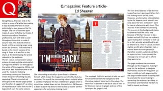
- The Ed Sheeran article discusses his recent chart-topping success and portrays him as a down-to-earth musician.
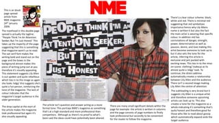
- Elements like layout, fonts, colors, and images are analyzed across the magazines to understand how they portray the artists and engage the target audiences.
- Adele's black and white photo depicts her as a reserved but strong musician focused on her passion for music rather than fame.
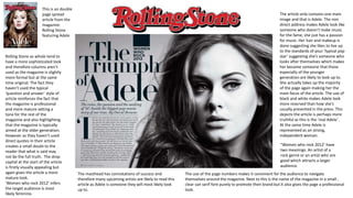
- Magazine elements like mastheads, page numbers, and fonts aim to look professional while engaging readers and promoting the magazine brands.


![Magazine research really official [recovered]](https://cdn.slidesharecdn.com/ss_thumbnails/magazine-research-really-official-recovered-160211094822-thumbnail.jpg?width=640&height=640&fit=bounds)
![Magazine research really official [recovered]](https://cdn.slidesharecdn.com/ss_thumbnails/magazineresearchreallyofficialrecovered-160222160255-thumbnail.jpg?width=640&height=640&fit=bounds)


![Proposal [autosaved]](https://cdn.slidesharecdn.com/ss_thumbnails/proposalautosaved-161114222431-thumbnail.jpg?width=640&height=640&fit=bounds)


