Fostering Friendships - Enhancing Social Bonds in the Classroom
Task 2
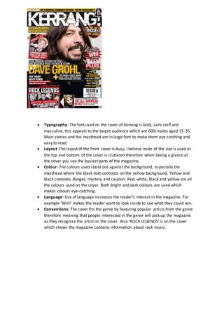
1. Typography- The font used on the cover of Kerrang is bold, sans serif and
masculine, this appeals to the target audience which are 60% males aged 15-35.
Main stories and the masthead are in large font to make them eye catching and
easy to read.
Layout-The layout of the front cover is busy, I believe route of the eye is used as
the top and bottom of the cover is cluttered therefore when taking a glance at
the cover you see the busiest parts of the magazine.
Colour- The colours used stand out against the background, especially the
masthead where the black text contrasts on the yellow background. Yellow and
black connotes danger, mystery and caution. Red, white, black and yellow are all
the colours used on the cover. Both bright and dark colours are used which
makes colours eye-catching.
Language- Use of language increases the reader’s interest in the magazine. For
example ‘Win!’ makes the reader want to look inside to see what they could win.
Conventions- The cover fits the genre by featuring popular artists from the genre
therefore meaning that people interested in the genre will pick up the magazine
as they recognise the artist on the cover. Also ‘ROCK LEGENDS’ is on the cover
which shows the magazine contains information about rock music.
2. Typography-The font used on the double page spread of Kerrangvaries.The Headlineis in a large
font which makes itstand out and attracts the reader to the page. The standfirstis in a sansfont
and in a smaller fontthan the headlinebut a bigger font than the text used in the story. There is
also a pull quoteused.
Layout- The layoutof the double page spread follows the route of the eye lineas mostof the
information is on the bottom of the page. There is also thename of the band in the top left
therefore itwould be the firstthingyou see if you followthe route of the eye which means if you
were interested in that particular band you would stop to read the article.
Colour- There is only 3 colours used on the whole of the doublepage spread,the colours are
black,orange and white. The headlineis in black and orange,which contrastas black is a dark
colour and orange is bright,due to the contrastof colours in the headlineyour eyes are drawn
towards it. Also in the text the kickers areorange whilstthe rest of the text is black.This makes
them stand out to the rest of the text. Once again drawingyour eyes towards it.
Language- The headlinecreates confusion as,out of context, it doesn’t make sense. This makes
the reader curious and eager to read more and find out what itis all about.
Conventions- The double page spread fits the genre by includingband names such as Blink-182.
Also the headlinefont portrays rock connotations.And the double page spread also features a
pictureof a band member from Blink-182.
3. Typography- The font used in the doublepage spread varies.The
text is sans serif therefore it portrays masculineconnotations.The
text is also differentsizes,this shows areas of importance and
attracts attention towards those areas.
Layout- The layoutof the contents page is busy which attracts
attention. All of the information is in the bottom of the page
which makes it easy to find.There is also a largecloseup of
‘Slash’the musician wearingblack clothingwhich makes him
intimidatingwhich fits the genre. The contents page also has a
ordered layoutas itis sorted into columns,this makes it easy to
find pages that they are lookingfor.
Colour- There isn’ta vastrange of colours used on the contents
page. Although the few colours contrastand stand outwhich
draws the reader to the information.Yellowagainstthe black
background indicates danger,they yellowagainstthe black also
makes it stand out and attracts the reader.
Language- The contents page features a ‘Win!’ section which
attracts readers as they areintrigued by the offer. Italso features
harsh languagesuch as “kill Hannah”.
Conventions- The languageused has rock convections such as
“school of rock” and “kill Hannah”.Slash the iconic rock musician
is also used which shows that the magazineis a rock magazine.