1. Detailed Analysis of Music Magazine
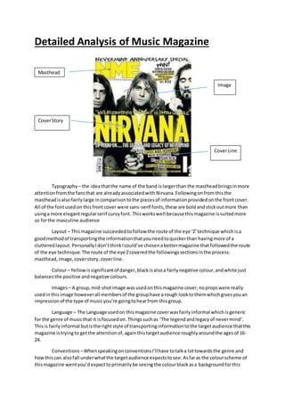
Typography – the ideathatthe name of the band islargerthan the mastheadbringsinmore
attentionfromthe fansthat are alreadyassociatedwith Nirvana.Followingonfromthisthe
mastheadisalsofairlylarge incomparisontothe piecesof informationprovidedonthe frontcover.
All of the fontusedon thisfrontcover were sans-serif fonts,these are boldandstickoutmore than
usinga more elegantregularserif curvyfont. Thisworkswell becausethismagazine issuitedmore
so forthe masculine audience
Layout – Thismagazine succeeded tofollow the route of the eye ‘Z’technique whichisa
goodmethodof transportingthe informationthatyouneedtoquickerthan havingmore of a
clutteredlayout.PersonallyI don’tthinkIcould’ve chosenabettermagazine thatfollowedthe route
of the eye technique.The route of the eye Zcoveredthe followingssectionsinthe process:
masthead,image,coverstory,coverline.
Colour– Yellowissignificantof danger,blackisalsoa fairlynegative colour,andwhite just
balancesthe positive andnegative colours.
Images– A group,mid-shotimage wasusedonthismagazine cover,nopropswere really
usedinthisimage howeverall membersof the grouphave a rough looktothemwhichgivesyouan
impressionof the type of musicyou’re goingtohearfrom thisgroup.
Language – The Language usedon thismagazine coverwasfairlyinformal whichisgeneric
for the genre of musicthat it isfocusedon.Thingssuchas ‘The legendandlegacyof nevermind’.
Thisis fairlyinformal butisthe rightstyle of transportinginformationtothe targetaudience thatthis
magazine istryingto getthe attentionof,againthistargetaudience roughlyaroundthe agesof 16-
24.
Conventions –WhenspeakingonconventionsI’llhave totalka lottowardsthe genre and
howthis can alsofall underwhatthe targetaudience expectstosee.Asfaras the colourscheme of
thismagazine wentyou’dexpecttoprimarilybe seeingthe colourblackasa backgroundforthis
Masthead
Image
CoverStory
CoverLine
2. genre as musicas thiscolouris stronglyrelatedtothe genre of musicas far as whatit connotedas
well aswhatfans of thismusicwear.Anotheranti-conventional pointaboutthismagazine thatI
foundwasthe colour yellow,despite whatthiscoloursymbolises,thisreallyisn’tassociatedthat
much withthisgenre of music.Itis onlysubtlyusedforsome captions,bylinesandstandfirsts,not
mastheador headlines.Anotherwaythatthis magazine isanti-conventionalwouldbe thatdespite
the clutteredlayoutIfoundthatmy fistimpressionof the magazine wasthatit wasfairlybland,Isay
thisbecause of the actual variationandvarietyof the colourscheme.The layoutbeingclutteredis
veryconventional forarock musicmagazine asI discoveredthatmostrock magazinesfollow this
same patternor trend…
Typography – Similartothe frontcoverthe contentspage of the ‘Kerrang’magazine consistedof
purelysans-serif fonts,whichisabit more focusedonthe male targetaudience.Thisisall
conventional forthe musicgenre of choice beingrock,as the rock genre issoonto be violentand
rule breaking.Thisfontisalsofairlydistortedwhichrepresentsthe magazineasbeingmore
rebellious whichagainisconventionalforthe musicgenre
Layout – the layoutof thiswasfairlyunconventional inthe sensethatitwas well laidoutandina
formal presentation,thisisonlyunconventional forthe genre of musicthatthe magazine isfocused
on howeverthisisalsoconventional because amasculine targetaudience wouldbe fondof having
everythingeasily accessible onthe contentspage tofindwhatthey’re lookingforquickly. Columns
are usedforthe contentslistingtocreate an orderedeffect.
3. Colour– The colourscheme usedforthe contentspage are primarilyblackwhichare conventionally
masculine,thisfitsinwellwiththe targetaudience.The colourscheme hasbeensimilarthroughthe
frontcover andcontentspage of twodifferenteditionsof the magazine whichsuggeststhatthisisa
significantcolourforthe brand,these colourswere yellowand black,bothof these colours
representsdangerwhichagainisconventional forthe genre of musicasitis seentobe fairly
aggressive andviolent.
Images– on the contentspage there isn’treallyenoughspace tofitinan image foreach sectionof
the magazine soKerrangstuck to usinga primaryimage,a secondaryimage withanarticle anda few
otherimagesforpromotion.The primaryimage colourscheme wasalsoblackwiththe band
memberwearingnotonlyblackmakeupbuta blackoutfittorepresentthe importance of the colour
to the people involvedinthisgenre of music.
Language – The language usedonthe contentspage was fairlyconventional forthe male target
audience aseverythingwasstraighttothe pointand informal,there wasenoughinformationonthe
page for the target audience tounderstandthe pointthatthe magazine wastryingtomake.Simple
wordssuch as the name of the bandand what the sectionof the magazine wasall about.To the left
handside of the page where the article isIcould imagine thatthe informationwouldbe alittle more
formal as anyone interestedinreadingthatsectionhasalot of time ontheirhands.
Conventions –The entire frontcoverwasfairlyconventional forarock musicmagazine,the colour
schemedworkedwellwiththe targetaudiencethatKerrangislookingtogetthe attentionfrom.But
primarilythe contentspagedstuckthe ideaof whatit is actuallythere for,to informthe readerof
whatpage the thingstheyare interestedinthe mostare on,regardlessof how decorative the page
was,the main pointof contentionisthatthe page got to the pointbrieflyandefficiently,despite a
small sectionbefore thatthe audience canlookpast.
Typograpy – Againsimilartothe restof the Kerrangmagazine additions,the onlyfontstyle usedwas
that of a sansserif font,the biggestsize of fontbeingthe name of the bandwhichisconventional as
that iswhat attract the target audience the most,thisisfollowedbyasmall captionof the band
whichthe customermay alsoreadbefore lookingintothe magazineinmore depthsoKerranghave
chosenthere typographycarefullyandeffectively.
4. Layout – the layoutof thisdouble page spreadworkedwell.Inthe pastI’ve seenimagesthattake
one side of the page thentextonthe eitherside,howeverinthismagazine the image coveredboth
of the pageswhichisstill veryconventional. Onthe rightpage there isa columnforof information
whichisa wayisa formal layoutwhere informationcanbe accessedeasily,there isalsoafairlylong
captioninthe bottomleftcornerof the double spread,thisworkswell asthe image isthe main
attractionon thisdouble page butitstill managestoconveyinformationtothe reader.
Colour– For the mostpart the of the double page spreadthe colourredwas usedforsome of the
text,alsoforthe scratch of ‘Nevermindthe bollocks’here’The colourredsymboliseslove,danger,
romance,danger,violence,aggression,whichisconventional forthe genre of musicbeingrockand
the target audience thatare typicallyalsoassociatedwiththiscolour.Inorderto balance the colour
kerranguseda white backgroundasthe bandiscompletelyrock,ratherthanthistheyare a punk
rock ban whichisn’tasaggressive asa rock band so thisisreallycomplimentaryforthe banditself
howeveritisunconventional forthe Kerrangbrand.Anotherprimarycolourwasthe use of black.
Despite beingapunkrock bandall of the membersstill continuedtowearblackon the mise-en-
scene forthe costume,the adds audience pleasure asmostof the target audience alsoare into
wearingmore darkand depressingcoloursassociatedwiththe bandsfeaturedonKerrang,other
than the redfontssome of the otherfontsalsoconsistedasblackto add to thisconventionof dark
and depressingcoloursforthe genre of music.
Conventions –Thisdouble page spreadwasfairlyconventional,howeverif I lookintospecificthings
such as the colourscheme I couldsaythat thiswas fairlyunconventionalbecause of the magazines
lack of darkercolourswhenmostof the time the magazine isfocusedonmore hard rock bands
whichare typicallyassociatedwithmore dull anddepressingcolours,thisseparatedthe punkrock
band‘fall outboy’from otherbandsfeaturedinthismagazine suchas‘BeingMe The Horizon’or
otherpopularhard rock bands.Somethingthatwasactuallyconventional aboutthismagazinewould
be the layoutandwhat wasactuallyincludedcontentwise Icansafelysaythat thismagazine didn’t
reallymissalot whenrunningdownachecklistof what’sexpectedtobe foundondouble page
spreads,examplesof these are aquote fromthe interview is sometimespresentedasthe headline,
or by the picture andsometimesitisevenusedinthe text,tobreakitup.