1. Thisis a contentspage fromthe
magazine ‘Vibe’whichmakesthe
huge ‘V’on the greyscale
backgroundimportant.Ithas been
deliberatelydesigned inthe style of
the Vibe mastheadandcleverly
placedas itmatchesthe colour
scheme of the page.
The colour scheme of the page iswhite,greyandblack mostly
witha touch of a beige/white sooverall the page isverytonal
and calm.The backgroundfromtopto bottomfadesfromblack
to a verylightgrey,almostwhite colourmakingthe model stand
out more while the darkergreyatthe topmakesthe ‘contents’
writingstandout.
The ‘contents’has
beensplitintothree
parts whichI believe
isextremely
effectiveandmakes
the magazine more
appealingtothe
youngergeneration
and modern.Itis
alsooriginal from
othermagazines
that tendto just
write ‘contents’ina
straightline.The
fontusedissans
serif andis inblock
white capitals
standingouthugely.
The page appearsto
be freshand new.
The contentsisfairly
simple withonlytwo
sections- ‘features’
and ‘fashion’which
have beenwrittenin
italicsaddinga
sophisticatedfeel to
the page.The sub
headlinessuchas
‘barelythere’match
the greyishtheme
beingwrittenina
verypale blue/grey.
Extra information
has beenwritten
underneatheach
subtitle withthe
namesof each star
of the article inbold
so the reader
straightawayknows
the maintopic of the
story. Black dots
have beenusedto
part each title- again
simple buteffective.
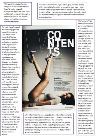
The main focus/image of
the contentspage isthe
model.Thismodel is
Ciara whoisa well
knownRnB/Hiphop
artistwhichis an areaI
am hopingtolookinto
withinmymagazine
alongwithpop.Her
clothingmatchesthe
simplisticcolourscheme
of the page as she is
mostlywearing
nude/beige colours.
Howeverhershoesare
quite a mainfocusas
theyare heelsandalsoa
purple/lilaccolour
reinforcingthatthis
magazine notonlycover
musicbut alsofashion
too.Ciara is ina very
body-confidentpose
showingshe ispositive
inwhat she wearsand
perhapsencouraging
othersto be as self-
confidentasherself.
Ciara iswearingsilver
jewelleryagain
reiteratingthe fashion
articlesandalso
matchingthe colour
scheme of grey.The
image wasclearly taken
instudioand the
backgroundof the image
has beeneditedout.She
islookingratherdirectly
at the cameramaking
the image directto the
readerencouraging
themto continue
reading.
Extra informationhasbeenplacedatthe bottomof the contents.
The date has beenplacedatthe bottom-‘October2008’ showing
the magazine isissuedmonthly.Alsothe name of the
photographerwhotookthe photoof the Ciarais at the bottom
for those perhapsinterestedinmodellingorphotography.The
date of whenthe photowastakenand where the photowas
taken(NewYorkCity) hasalsobeenincludedperhapsforthose
whoare fansof Ciara.
2. The colour scheme of the contents
page matchesthe overall scheme
of ‘Q’magazine whichisnotably
redand black andwhite.The
mastheadhasbeenusedat the
top of the page alongwith
‘contents’ where the typographyis
white,boldandalsoincapitals
makingitclear whatis goingtobe
includedonthe page.
The main image onthe page
isof Adele –a womansinger
whowas the nextbigthing
back in2008 and the
magazine reiteratesthisby
exclaiminghertobe ‘Britain’s
brightestnewtalent.’Here
the magazine couldbe seen
as patriotic,proudto be
British.A close upshot has
beenusedtoportray the fact
that furtheronin the
magazine the readerwill be
gettingclose andpersonal
withAdele,findingoutabout
the insidesonherlife.She is
lookingatthe camera but not
completelydirectlyperhaps
presentinganauraof
shyness.She doesn’thave a
lotof makeuponpresenting
herself asnatural andradiant.
Her haircolour almost
matchesthe colourscheme
of the page withreddishand
blacktones.
At the top of the page the date has beenwritten-‘May2008.’
Onlythe monthhas yearhas beenusedshowingthe magazine
isissuedmonthly.Belowthe date isthe magazine’swebsite
showingwhere the readercanfindoutfurtherinformationand
the magazinesaimisprobablytoget the readerto subscribe.
Downthe lefthandside of the
page is the contents.The
colourscheme andtypography
iscontinuedhere.The
‘featuressection’mustbe the
mainsectionof the magazine
as it hasbeenplacedfirst.The
title ‘features’inwhite capitals
has beenplacedona red
backgroundmakingitclear.
The firstword I see inthis
sectionisan exclamatory
‘New!’straightawaymaking
thissectionappealing.
Rhetorical questionshave also
beenusedinthissection
causingcuriosity,suspense.
The page numbersare inred
alongwiththe black
informationwhichiscontinued
downthisside of the page into
‘Womeninmusic’.Thissection
appearsto be givinga very
femininefeel sothissection
will appeal towomenalthough
the entire colourscheme of
the page wouldappeal toboth
genders.A box-outhasbeen
usedinthe ‘womeninmusic’
section’of the colourgrey
addinga tonal colourto the
section.The ‘everymonth’has
againbeenwritteninwhite
placedoverredmakingit
standout and appeal tothe
every-monthpurchasersof the
magazine.Althoughthe
magazine includesnewarticles
theyalsohave a set organised
sectioneverymonth.
The ‘Q review’sectionhasincorporatedthe entire
colourscheme of red,black,white andgreyalongwith
an image.The image showstwomen.One appears
much laidbackwithhishands inhislap- appealingto
youngergeneration.The otherismakingdirectcontact
withthe camera enticingreadersin.The twomodels
are indark clothingapartfrom the white topwhichstill
matchesthe colourscheme.The magazine hasuseda
puff bystatingthat it includes‘the world’sbiggestand
bestmusicguide’appealinghugelytothose interested
inmusic.Thissectionwill be useful tothose thinkingof
goingout andpurchasingnew albums,CD’sas theywill
knowwhatto and what notto buy.
A box-outhasagain
beenusedonthe image
of Adele of the colour
white makingthe
number78 standout.
78 is the page to go if
youare an Adele lover.
The picture of Adele is
alsothe largeston the
page emphasisingthat
she isthe mainarticle in
the magazine.
3. A graphicfeature hasbeenusedin
the top lefthandcornerof the
page of a star shape withthe white
writing‘foryoureyesonly’.Thisis
enticingforthe readeras itmakes
themfeel importantandspecial.
They’re the onlypeople reading
thisinformation.
The colour scheme of the contentspage isblue,orange,blackand
white.The mise-enscene of the page isbusywithlotsgoingonand a
lotof imagesusedsothispage will appeal toyoungteenagersand
childrenwhoprefertosee colourona page ratherthan a sophisticated
look.The mastheadhasbeenusedagainon the contentspage sothey
are proudof theirbrand.The word‘contents’hasn’tactuallybeenused
on the page whichisunique tothismagazine fromthe othersI have
lookedat.Insteadtheyhave use ‘WELOVE THIS...’ inblack capitalised
lettersstandingoutfromthe white backgroundespeciallywiththe
colourfilled‘O’.The ellipsisencouragesthe readertocontinue on
reading.
Downthe righthand
side of the page we
have imagesusedto
show whatis included
inthe magazine.These
imagesinclude the likes
of one directionand
JoeyEssex appealingto
younggirls.Quotations
are alsoa popularway
to entice readersinon
thismagazine contents
page.Quotesare a
goodway to summarise
an article soI may
interpretthisintomy
magazine.The page
numbersdownthe side
are inwhite italics
standingoutfromtheir
yelloworblue
background.The main
focusof the page is
KellyRowlandand
Tulisainthe centre
showingthatThe X
Factor isthe main
article inthis issue.
Theyboth appearto be
smilingandin
contrastingclothesto
each otherbutstill
matchingthe scheme.
Theirsmilingfaces
actuallycontradictthe
quote statedbyTulisa
below the image.The
quote howevershows
herto be figure of
powercapable of
crushingdreamsso you
wantto read on.
Downthe lefthand
side of the page is
letterfromthe editor
whichisdifferentfrom
all the othermagazines
I have lookedat.
HoweverIbelievethis
isa nice addition tothe
contentspage as it
almosta welcome into
the magazine and
inside lookintohow
the magazine was
made.The image usedI
believeisapicture of
the editorwhichgives
readersan insideron
the team whocreate
the magazine.The
‘Inside thismonth...’
has usedthe same
typographyas the main
title onthe page and
alsothe same ellipsis
encouragingbuyersto
readon. The main
contentsof the page
have beenputina text
box and the page
numbersare inbold
orange matchingthe
colourscheme.The
informationnexttothe
numbersisinblackand
I can see that short
snappysentenceshave
beenusedmakingthe
contentseasyto follow
and shortto read
gettingstraighttothe
point.
At the bottomof thispage a range of pictureshave beenusedto
showthe free postersyougetwhenyoubuythis magazine.Young
readerswill wantthese postersif theylike the artistsonthemorif
theylike havingpostersintheirroom.Ibelieve givingaway
freebieswithamagazine isa goodideainorder to make people
wantto purchase your magazine soI mayinterpretthisintomy
ownmagazine.Alsoatthe bottompage isthe magazine’swebsite
were reader’scanfindoutmore informationandmore thanlikely
be able to subscribe tothe magazine.Ihave seenthe website of
everymagazine Ihave analysedincludedonthe contentspage soI
will use thisonmine.
4. The main coloursusedonthis
contentspage are grey,blackand
white complimentedbyblue
creatinga calm, sophisticatedtone.
Denotationisthe literal meaningof something.The model in
the middle of the page iswearingnearlyall black,iskneltdown
and lookshappygivingthe magazine ajoyful tone rightfrom
the centre of the page.Thispicture has beentakenina long
shotas youcan see fromher haddownto her feet.The 3
picturesat the top have beenplacedinarow and I believe look
effectiveasall the modelsare insome formof blazer/suit.All
the imagesare differentshowingthe magazineisjam-packed
full of excitingarticles.The firstpicture againusesalongshot
and appearsto use propsof windowsinthe image.The second
image presentsanunshavenmanfroma highangle shot.The
thirdimage presentsaneat,radiantwomanlookinginnocently
shocked.
The mastheadhas againbeenused
on the contentspage- ‘billboard’and
the coloursusedinthe masthead
can be seenthroughoutthe
contents- blue andblackbeing
explicitlyusedalong withfragments
of yellow,redandgreensothe
magazine isclearlyorganised.
Connotations- The main
image inthe centre
presentsayoungmodel
withfree-flowinghairand
a huge smile,she is
kneelingdownpresenting
innocence.Her
highlightedhairand
fashionablewearwill
appeal tothe young
readers.The insert
imagesat the top of page
presentthe magazine’s
varietywithafirstpicture
of a confidentlooking
artistwitha hands-in-
pocketpose presenting
calmness.The second
image presentsamiddle-
agedman showinga
wide-range of stories
withinthe magazine,he
appearsto be
intimidated.Whatishe
beingintimidatedby?-
curiosity.The final image
showsa model with
radiantmakeupanda
younglookagaincausing
curiositybecause she
looksshocked.Whathas
she beenshockedby?
The huge ‘contents’title at
the top makesitclear what
thispage is for.The
typographyisbig,boldand
blackappealingtoboth
gendersandstandingout
fromthe white background.
The furthersubtitlesare
alsoin capitalsandblackbut
theyhave been
complimentedbysome blue
titleswhichagainappeal to
bothgendersas the blue isa
pale blue presenting
gentlenessandnota too
loudeffectonthe page.
Downthe lefthandside of
the magazine we can see
the top sellingalbumsand
songsat the momentso
thismagazine appeals
hugelytomusicloversand
keepsthemupto date with
the latesttrendsonthe
musicscene. The colour
yellowhasbeenusedto
splitthe columninto
sectionsalongwitha
multicolourbeingused
downthe middle making
thissectionstandoutfrom
the rest of the contents
page.The ‘no 1’ is inwhite
and inthe same fontas
‘contents’ -standsoutto
the reader.
The mise-en-sceneof thiscontentspage isquite neatasnot
a lot of props andimageshave beenused.Ithassimplybeen
splitupintothree clearsectionsof the charts, the contents
page and ‘home front’.The general contentspartof the
page is clearlylaidoutwiththe mainheadlines,sub-titles,
summaryof the articlesandpage numberswhichare typical
conventionsof mostmagazines.The typographyof the
‘home front’title isthe same asthe ‘contents’typography
and iswhite againsta blackbackgroundmakingitstand out
againto the reader.The home frontsection showsonline
exclusivessothe magazine givesmore thanwhatothersdo
throughthe word ‘exclusive’.Furtherstoriesare alsogiven
inthissectionaboutdifferentculturesof musicincluding
countryand Latin sothismagazine appealstoall.
The page number‘35’ has
beenputina textbox
and isbolderthanothers
showingthistobe a
significantpage forthe
readerto lookat.