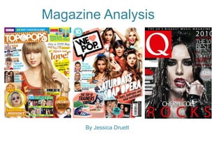
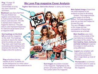
Magazine Analysis
By Jessica Druett
BBC logo added to provide details
of who owns this brand.
Plug that draws the audience in.
It gives the reader a chance to be
up close and personal with
band members. It can provide
an unique selling point.
Masthead uses sans serif font
and uses contrasting colours
to attract the reader. It makes
a statement and is bold to draw
attention as well as emphasis.
Having a barcode is a
common convention and is
used so you can purchase
the magazine.
The date, price and issue
number common conventions.
Little font as it’s not appealing
to the audience. The price is
£4.75 which is quite expensive
for teenagers.
Main splash image of artist, direct
address to the audience as she is
looking forward. It invites the reader in
to get up & personal with the stars.
Body language is relaxed and Taylor is
wearing fashionable clothing which
creates a selling point for fans.
Sub Images are used to advertise
What’s inside the magazine to
entice the audience to buy.
Layout uses basic colours however,
they’re bright & have a summery
feel to the magazine. It represents
that summer is quite a fiery season.
It is full of captions and pictures that is contained
In this months issue.
Sub headings on the
Left third tell the
reader what they can
expect to read. Uses
alliteration for emphasis, and
headlines that are catching so
the reader will want to buy the
magazine to find out more on the
subject.
Top Of The Pops Cover Analysis
Plug that draws attention to be
able to dress like the stars.
Particularly aimed at girls.
Buzz Word – Quiz gets the audience
Involved with everyday issues in life.
Plug to tell the audience
that fashion is a big part
of the magazine.
Main Headline in bright colours
the word ‘never’ highlighted to
emphasis the subject.
Top Of The Pops Contents Page Analysis
Editors news, The editor
expresses this months news.
Highlights the articles the
audience should look at. The
editor signs off in a friendly
way to the audience.
Sub Headings let’s the
audience find what
they’re looking for. It
gives you a starting
point to choose a section
when you open the
magazine.
Front cover image relays the
page numbers of the articles
that are advertised on the front.
It’s the main image on the contents
page.
Heading ‘Inside Your Mag’
big and bold with contrasting
colours. The pink makes it stand
out more.
Sub Images used to promote the content, added
with page numbers to instantly access them
Sub images with celebrities
shows the editing team up,
close and personal with the
stars.
Layout is simplistic but effective,
Its laid out clearly to be able to
find what you want to read. Sub
Headings help navigate round the
page. Colour very plain however,
It contrasts with the pink very well
so its eye catching.
Plug ‘We love boys’ emphasises on the topic
of boys which is biased.
Fashion sub heading connotations
and a lexical field about this subject.
Contents page numbers and bold sub headings
The numbers are in bold pink, with bold sub
headings in black to draw attention to the
audience.
Tops Of The Pops Double Page Spread Analysis
Tagline image has connotations of leaves to go
with the season ‘Autumn’ contrasting colours that
go with this season.
Main Image selling
Taylor Swift’s and
Rita Ora’s style.
Fans want to know
the latest fashion
from celebs.
Sub Images with a
range of fashion
items that are
appealing to young
girls and teens. It
gives the fans a
chance to have a
similar dress code
to Taylor Swift/Rita
Ora and it’s
affordable.
Plug is written in a
colloquial way to grab
attention to the audience.
It sums up what the article
Is about.
Layout is separated into two areas of fashion. It uses basic
colours such as white and pink. Two different shades of pink
used to contrast with the items of clothing. Its attractive
and persuades the audience to pursue research in these
different clothing outlets.
Sub headings are big and bold.
They use contrasting colours so
its eye catching.
They have used
key iconic words
such as 80’s revival
and geek chic. Revival
is English lexis in
contrast with chic
which is French lexis.
The font represents
the season of autumn
and the key events
that happen.
Plug shapes tells
the audience more
Information
about the
fashion items and
with a quote from Rita
about her fashion style.
Graphology is the main content
on this page with little writing.
It really emphasises the purpose
of the article.
We Love Pop magazine Cover Analysis
Masthead uses Sans Serif font.
The use of black has
negative connotations but
is made positive with the pale
colours used around it. The title
is slanted which makes the
magazine stand out. The pale
colours used represent happiness.
It’s bold and would stand out on
a magazine shelf.
Tagline ‘Don’t bore us. Get to the chorus’ is catchy and rhymes.
Main Splash Image of band that
has direct address to the
audience as they’re all looking
forward. The image portrays
the image of not being
perfect. The body language is
quite shy as they don’t expect to
be seen this way.
The use of Props is visible
in this image and has
connotations of being high
maintenance as a female.
Main Headline uses neon
colours on the outside of the
main lettering to emphasis
the subject of the article. The
Sub heading ‘tears, tantrums
and total meltdown’ explores
the subject in brief words by
using alliteration.
The barcode is a common
convention which is used so
consumers can purchase
the magazine.
Sub headings on the third
left promote the magazine
on the shelf. The headings
provide an idea to the reader
what the articles are about.
They have used bright blue with
contrasting white background to
emphasis the third left. The sub
images entice the audience.
Sub Images are posters included
in the magazine. Highlighted by the
phrase ‘girl power posters.’ This plugs
The content within the magazine.
Plug advertising the top
trainers of 2013. It stands out
as the background is a neon colour.
It draws attention to the audience as it’s
on the third left.
Plug ’12-page 1D
pull out spesh.
Concentrates on a big
boy band. Good for
promotion.
Layout very simplistic with
neon colours and white
contrasting background.
Main image takes up most of
the page.
We Love Pop Contents Page Analysis
Puff ‘for your eyes only’ makes
the reader feel exclusive and
the magazine is on a
personal level with the
audience.
Direct mode social media
link the reader
can explore more about the
magazine and access more
exclusive material.
Heading ‘we love this…’
emphasises the topics
the magazine are
excited about. It is black
and bold to draw attention
to the contents page.
Editor’s briefing on what has
been happening during the
month. The usually write
about their favourite
events and meeting the stars.
Contents page numbers
the numbers are bright
and attractive. Very clear
and concise for the reader
to find the pages they’re
looking for. Sub images of posters included in the
magazine.
We Love Pop masthead smaller so
the reader is aware of the
magazine they’re reading and
genre.
Sub image and highlighted page
number to emphasise the
article been advertised. It’s placed
in the middle to create effect
towards the audience. It will make
the reader want to turn to that
page. The colour of the writing
contrasts with the picture being
conveyed.
Articles with sub images
promoting the main stories
in the magazine mirrored with
page numbers for the reader
to access instantly. The colours
are light and punchy.
Layout is very busy with all
the images which can be
quite confusing against
the writing. However, it is
simplistic and effective with
the colours.
We Love Pop Double Page Spread Analysis
Minor heading has connotations of boys behaviour.
It is bold for attention and gets the audience thinking
about who this article is about. It is also the band name.
Main Splash Image of the band looking in a natural state,
boyish behaviour and direct address to the audience.
The background drop is bright and contrasts with the boys
wearing dark clothes in the shoot.
Main headline sums up
the type of article this
is. It’s a spontaneous
Interview as the
questions are a mix of
lifestyle situations.
Layout is very
clear, concise and
easy to navigate
around the page with
the key in the middle.
It is very colourful, bold
and bright so it draws
attention to the
audience.
Direct mode is
on every page
within the magazine next
to the page number. The
link promotes the magazine
and usually has more exclusive
up to date artist news as it can
be updated daily.
Sub-heading lets the
reader know who the
article is about and
ends with an
exclamatory that
emphasises the type of
language that is used
throughout.
Sub images look studio based. Very natural
looking photos as it doesn’t seem posed.
Laddish behaviour is the representation here,
and how boys behave, very stereotypical.
The sub images allow the audience to see what
else went on behind the scenes of the interview.
Puff uses a quote
from the article to
draw attention to
the audience. It will
generally catch
their eye before the
actually interview
itself.
Plug is asking the
readers to get
involved by sending
in their questions for
next month’s
interview. It creates a
relationship between
artists and fans.
Main article of interview is
presented very nicely and is
easy to read. It is easy to
Identify the interviewee.
Q Magazine Cover Analysis
Masthead uses the font sans-serif, and is very
bold. The red contrasts with the white ‘Q’ letter itself.
It uses red which is a
unisex colour so its based on
a whole gender rather than
stereotyping one gender. It draws
attention on the third left of the
magazine. It instantly creates an
emphasis on the type of magazine
it is.
Tagline ‘Discover Great
Music’ gives the magazine an
identity that the audience can
recognise.
Subheadings on the left third
the headings are in bold white
which contrast with the red hair in
the picture. Having them on the
third left lets the audience to
discover the type of articles in the
magazine. It also promotes the
content with alliteration and using
big bold lettering will entice the
audience.
Main splash image of Florence
is a extreme close up. The
colours of her make-up and hair
contrast with the colours used
on the magazine cover. She is
looking directly into the camera
which invites the audience in.
The image portrays the lifestyle
she leads as its bold and bright.
Her hair colour matches the Q
masthead and emphasises
the connotations of the
magazine. Florence’s skin is pale
which makes her look innocent
and vulnerable.
Puff uses a quote from inside the
magazine to entice the readers.
It’s tells you who’s interview it’s
from and uses an exclamatory for
emphasis.
Direct mode lets the audience get
access to more Information on the magazine and
get exclusives
available to this magazine only.
Barcode, price & website
Is a common convention
on magazines now. The price is
small because most people tend
to look at the articles rather than price.
The barcode is there as consumers need
To be able to purchase the magazine.
Main Headline promotes the main
article in the magazine. It’s big, bold
and attracts the attention the
magazine wants. ‘Woman on the
edge’ line contrasts with her cheek
bones and her fringe. It sums up her
personality and edginess.
Layout is a full image that is very
effective and addresses the
purpose of the magazine. It’s
simple but gets the reader
talking about the artist.
Q Magazine Contents Page Analysis
Puff splash feature is a
special so the magazine
emphasised this by adding a box
around the content and it’s easy for
the audience to locate it. It is gold
instead of red, so it helps draw
attention to this special. It entices the
audience to read this section first.
Sub headings with page
numbers left third of the magazine
includes the main features. The page
numbers are in red which match the
theme of the magazine. The little
headings are in bold black followed by
a little description below it. The bold
represents the artists and invites the
audience in.
Contents heading is white on a
black background. It is
clear and includes a little
masthead of ‘Q’ It’s identifies
who the magazine belongs too.
Issue number, date and direct mode
Issue number lets the reader collect
and store magazines in order. The
date is a common convention and
allows you to see what month the
magazine belongs too. Direct mode
allows the reader to research more
on the magazine and access
exclusives through the website. It also
provides daily news that is up to date.
Splash Image is the band stood
on a heath. Represents nature
and has a calming effect. It
looks photo shopped as the
actual background is on a
smaller scale compared to the
band. The clothes of the band
contrast with the gloomy, foggy
heath. It sums up the type of
music they do.
Reviews is a special section
highlighted every month. It’s the
important feature every music
fan enjoys. It provides views of
live shows, new music and of
up coming new bands. It provides
a selling point for artists.
Sub image is used as it gives the audience
a taste for what’s in the magazine. It is
emphasised with the page number and
heading. It helps the audience access it
Instantly.
Every month feature is included
as it has these features every month.
It’s a section of the magazine for subscriptions,
fan mail, crosswords and other important
articles that make the magazine complete.
Layout is clear, concise and easy to
navigate to where you want to be.
Q Magazine Double Page Spread Analysis
Sub heading Cheryl Cole is alliteration
Identifies the artist. Italic is used to
create emphasis on the first name. Splash image is a
full page. The white
background contrasts
with what Cheryl is
wearing. The fashion
represents a dark
side to her and is
quite punky. The
Image portrays that
Cheryl owns her life
and how its her
choice to do what
she wants. It shows
another side to her
and that she isn’t
always squeaky
clean popstar. She’s
not looking at the
camera which shows
her vulnerability and
the images are
always of high
quality which a
reader can enjoy.
Main Article provides all the story the audience
are looking for and instantly answers any question
they have. Its unstructured and a relaxed interview
which lets the reader in on a more personal level
with the artists.
Sub image at the bottom
portrays Cheryl as the boss. The pose and fashion
sum this up. The background looks photo shopped
as its on a massive scale compared to Cheryl.
Page number, direct mode page number
is in black so it’s easy to identify. The Q sign
Is at the bottom too so you can identify the
magazine your reading. The website is also
at the bottom on every page to promote their publication.
Block quote is
Important as it’s the
first port of call a reader
goes too. It provides a bit
of the story but leaves the
reader wanting more. Therefore,
they will read the full article.
The ‘C’ is red
and bold. It
represents the initial
of the artist. The red
matches the colour
scheme of the magazine
and draws attention
to the eye.
Layout is simplistic yet
effective. Draws
attention where it needs
to be. The colours are
basic but work really well,

Magazine Analysis

  • 1.
  • 2.
    BBC logo addedto provide details of who owns this brand. Plug that draws the audience in. It gives the reader a chance to be up close and personal with band members. It can provide an unique selling point. Masthead uses sans serif font and uses contrasting colours to attract the reader. It makes a statement and is bold to draw attention as well as emphasis. Having a barcode is a common convention and is used so you can purchase the magazine. The date, price and issue number common conventions. Little font as it’s not appealing to the audience. The price is £4.75 which is quite expensive for teenagers. Main splash image of artist, direct address to the audience as she is looking forward. It invites the reader in to get up & personal with the stars. Body language is relaxed and Taylor is wearing fashionable clothing which creates a selling point for fans. Sub Images are used to advertise What’s inside the magazine to entice the audience to buy. Layout uses basic colours however, they’re bright & have a summery feel to the magazine. It represents that summer is quite a fiery season. It is full of captions and pictures that is contained In this months issue. Sub headings on the Left third tell the reader what they can expect to read. Uses alliteration for emphasis, and headlines that are catching so the reader will want to buy the magazine to find out more on the subject. Top Of The Pops Cover Analysis Plug that draws attention to be able to dress like the stars. Particularly aimed at girls. Buzz Word – Quiz gets the audience Involved with everyday issues in life. Plug to tell the audience that fashion is a big part of the magazine. Main Headline in bright colours the word ‘never’ highlighted to emphasis the subject.
  • 3.
    Top Of ThePops Contents Page Analysis Editors news, The editor expresses this months news. Highlights the articles the audience should look at. The editor signs off in a friendly way to the audience. Sub Headings let’s the audience find what they’re looking for. It gives you a starting point to choose a section when you open the magazine. Front cover image relays the page numbers of the articles that are advertised on the front. It’s the main image on the contents page. Heading ‘Inside Your Mag’ big and bold with contrasting colours. The pink makes it stand out more. Sub Images used to promote the content, added with page numbers to instantly access them Sub images with celebrities shows the editing team up, close and personal with the stars. Layout is simplistic but effective, Its laid out clearly to be able to find what you want to read. Sub Headings help navigate round the page. Colour very plain however, It contrasts with the pink very well so its eye catching. Plug ‘We love boys’ emphasises on the topic of boys which is biased. Fashion sub heading connotations and a lexical field about this subject. Contents page numbers and bold sub headings The numbers are in bold pink, with bold sub headings in black to draw attention to the audience.
  • 4.
    Tops Of ThePops Double Page Spread Analysis Tagline image has connotations of leaves to go with the season ‘Autumn’ contrasting colours that go with this season. Main Image selling Taylor Swift’s and Rita Ora’s style. Fans want to know the latest fashion from celebs. Sub Images with a range of fashion items that are appealing to young girls and teens. It gives the fans a chance to have a similar dress code to Taylor Swift/Rita Ora and it’s affordable. Plug is written in a colloquial way to grab attention to the audience. It sums up what the article Is about. Layout is separated into two areas of fashion. It uses basic colours such as white and pink. Two different shades of pink used to contrast with the items of clothing. Its attractive and persuades the audience to pursue research in these different clothing outlets. Sub headings are big and bold. They use contrasting colours so its eye catching. They have used key iconic words such as 80’s revival and geek chic. Revival is English lexis in contrast with chic which is French lexis. The font represents the season of autumn and the key events that happen. Plug shapes tells the audience more Information about the fashion items and with a quote from Rita about her fashion style. Graphology is the main content on this page with little writing. It really emphasises the purpose of the article.
  • 5.
    We Love Popmagazine Cover Analysis Masthead uses Sans Serif font. The use of black has negative connotations but is made positive with the pale colours used around it. The title is slanted which makes the magazine stand out. The pale colours used represent happiness. It’s bold and would stand out on a magazine shelf. Tagline ‘Don’t bore us. Get to the chorus’ is catchy and rhymes. Main Splash Image of band that has direct address to the audience as they’re all looking forward. The image portrays the image of not being perfect. The body language is quite shy as they don’t expect to be seen this way. The use of Props is visible in this image and has connotations of being high maintenance as a female. Main Headline uses neon colours on the outside of the main lettering to emphasis the subject of the article. The Sub heading ‘tears, tantrums and total meltdown’ explores the subject in brief words by using alliteration. The barcode is a common convention which is used so consumers can purchase the magazine. Sub headings on the third left promote the magazine on the shelf. The headings provide an idea to the reader what the articles are about. They have used bright blue with contrasting white background to emphasis the third left. The sub images entice the audience. Sub Images are posters included in the magazine. Highlighted by the phrase ‘girl power posters.’ This plugs The content within the magazine. Plug advertising the top trainers of 2013. It stands out as the background is a neon colour. It draws attention to the audience as it’s on the third left. Plug ’12-page 1D pull out spesh. Concentrates on a big boy band. Good for promotion. Layout very simplistic with neon colours and white contrasting background. Main image takes up most of the page.
  • 6.
    We Love PopContents Page Analysis Puff ‘for your eyes only’ makes the reader feel exclusive and the magazine is on a personal level with the audience. Direct mode social media link the reader can explore more about the magazine and access more exclusive material. Heading ‘we love this…’ emphasises the topics the magazine are excited about. It is black and bold to draw attention to the contents page. Editor’s briefing on what has been happening during the month. The usually write about their favourite events and meeting the stars. Contents page numbers the numbers are bright and attractive. Very clear and concise for the reader to find the pages they’re looking for. Sub images of posters included in the magazine. We Love Pop masthead smaller so the reader is aware of the magazine they’re reading and genre. Sub image and highlighted page number to emphasise the article been advertised. It’s placed in the middle to create effect towards the audience. It will make the reader want to turn to that page. The colour of the writing contrasts with the picture being conveyed. Articles with sub images promoting the main stories in the magazine mirrored with page numbers for the reader to access instantly. The colours are light and punchy. Layout is very busy with all the images which can be quite confusing against the writing. However, it is simplistic and effective with the colours.
  • 7.
    We Love PopDouble Page Spread Analysis Minor heading has connotations of boys behaviour. It is bold for attention and gets the audience thinking about who this article is about. It is also the band name. Main Splash Image of the band looking in a natural state, boyish behaviour and direct address to the audience. The background drop is bright and contrasts with the boys wearing dark clothes in the shoot. Main headline sums up the type of article this is. It’s a spontaneous Interview as the questions are a mix of lifestyle situations. Layout is very clear, concise and easy to navigate around the page with the key in the middle. It is very colourful, bold and bright so it draws attention to the audience. Direct mode is on every page within the magazine next to the page number. The link promotes the magazine and usually has more exclusive up to date artist news as it can be updated daily. Sub-heading lets the reader know who the article is about and ends with an exclamatory that emphasises the type of language that is used throughout. Sub images look studio based. Very natural looking photos as it doesn’t seem posed. Laddish behaviour is the representation here, and how boys behave, very stereotypical. The sub images allow the audience to see what else went on behind the scenes of the interview. Puff uses a quote from the article to draw attention to the audience. It will generally catch their eye before the actually interview itself. Plug is asking the readers to get involved by sending in their questions for next month’s interview. It creates a relationship between artists and fans. Main article of interview is presented very nicely and is easy to read. It is easy to Identify the interviewee.
  • 8.
    Q Magazine CoverAnalysis Masthead uses the font sans-serif, and is very bold. The red contrasts with the white ‘Q’ letter itself. It uses red which is a unisex colour so its based on a whole gender rather than stereotyping one gender. It draws attention on the third left of the magazine. It instantly creates an emphasis on the type of magazine it is. Tagline ‘Discover Great Music’ gives the magazine an identity that the audience can recognise. Subheadings on the left third the headings are in bold white which contrast with the red hair in the picture. Having them on the third left lets the audience to discover the type of articles in the magazine. It also promotes the content with alliteration and using big bold lettering will entice the audience. Main splash image of Florence is a extreme close up. The colours of her make-up and hair contrast with the colours used on the magazine cover. She is looking directly into the camera which invites the audience in. The image portrays the lifestyle she leads as its bold and bright. Her hair colour matches the Q masthead and emphasises the connotations of the magazine. Florence’s skin is pale which makes her look innocent and vulnerable. Puff uses a quote from inside the magazine to entice the readers. It’s tells you who’s interview it’s from and uses an exclamatory for emphasis. Direct mode lets the audience get access to more Information on the magazine and get exclusives available to this magazine only. Barcode, price & website Is a common convention on magazines now. The price is small because most people tend to look at the articles rather than price. The barcode is there as consumers need To be able to purchase the magazine. Main Headline promotes the main article in the magazine. It’s big, bold and attracts the attention the magazine wants. ‘Woman on the edge’ line contrasts with her cheek bones and her fringe. It sums up her personality and edginess. Layout is a full image that is very effective and addresses the purpose of the magazine. It’s simple but gets the reader talking about the artist.
  • 9.
    Q Magazine ContentsPage Analysis Puff splash feature is a special so the magazine emphasised this by adding a box around the content and it’s easy for the audience to locate it. It is gold instead of red, so it helps draw attention to this special. It entices the audience to read this section first. Sub headings with page numbers left third of the magazine includes the main features. The page numbers are in red which match the theme of the magazine. The little headings are in bold black followed by a little description below it. The bold represents the artists and invites the audience in. Contents heading is white on a black background. It is clear and includes a little masthead of ‘Q’ It’s identifies who the magazine belongs too. Issue number, date and direct mode Issue number lets the reader collect and store magazines in order. The date is a common convention and allows you to see what month the magazine belongs too. Direct mode allows the reader to research more on the magazine and access exclusives through the website. It also provides daily news that is up to date. Splash Image is the band stood on a heath. Represents nature and has a calming effect. It looks photo shopped as the actual background is on a smaller scale compared to the band. The clothes of the band contrast with the gloomy, foggy heath. It sums up the type of music they do. Reviews is a special section highlighted every month. It’s the important feature every music fan enjoys. It provides views of live shows, new music and of up coming new bands. It provides a selling point for artists. Sub image is used as it gives the audience a taste for what’s in the magazine. It is emphasised with the page number and heading. It helps the audience access it Instantly. Every month feature is included as it has these features every month. It’s a section of the magazine for subscriptions, fan mail, crosswords and other important articles that make the magazine complete. Layout is clear, concise and easy to navigate to where you want to be.
  • 10.
    Q Magazine DoublePage Spread Analysis Sub heading Cheryl Cole is alliteration Identifies the artist. Italic is used to create emphasis on the first name. Splash image is a full page. The white background contrasts with what Cheryl is wearing. The fashion represents a dark side to her and is quite punky. The Image portrays that Cheryl owns her life and how its her choice to do what she wants. It shows another side to her and that she isn’t always squeaky clean popstar. She’s not looking at the camera which shows her vulnerability and the images are always of high quality which a reader can enjoy. Main Article provides all the story the audience are looking for and instantly answers any question they have. Its unstructured and a relaxed interview which lets the reader in on a more personal level with the artists. Sub image at the bottom portrays Cheryl as the boss. The pose and fashion sum this up. The background looks photo shopped as its on a massive scale compared to Cheryl. Page number, direct mode page number is in black so it’s easy to identify. The Q sign Is at the bottom too so you can identify the magazine your reading. The website is also at the bottom on every page to promote their publication. Block quote is Important as it’s the first port of call a reader goes too. It provides a bit of the story but leaves the reader wanting more. Therefore, they will read the full article. The ‘C’ is red and bold. It represents the initial of the artist. The red matches the colour scheme of the magazine and draws attention to the eye. Layout is simplistic yet effective. Draws attention where it needs to be. The colours are basic but work really well,