
Recommended
More Related Content
What's hot
What's hot (20)
Viewers also liked
Viewers also liked (17)
Similar to Unorganised Layout Grabs Attention in Alternative Music Magazine
Similar to Unorganised Layout Grabs Attention in Alternative Music Magazine (20)
Unorganised Layout Grabs Attention in Alternative Music Magazine
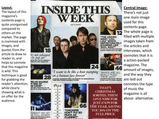
- 1. Layout: The layout of this magazine’s contents page is quite unorganised compared to others on the market. The page is crammed with images, and quotes from the article to draw to reader in, and helps to connote that this magazine is wild. This technique is good for grabbing the reader’s attention, while clearly showing what is on offer for the audience. Central image: There’s not just one main image used for this contents page. The whole page is filled with multiple images taken from the articles and interviews, which connotes that it is a action-packed magazine. The amount of images, and the way they are laid out connotes the type of music the magazine is all about- alternative.
- 2. The Header: The header for this contents page is in the centre of the top of the page. The font is bold, black and of serif style. This connotes that the artists take their music more seriously in this magazine. Unlike other magazines on the market, this one avoids simply stating that it is a contents page, and instead opts for a more original ‘Inside This Week.’ This magazine also follows the header with the issue date. Adverts: In the bottom right hand corner of the page, there is an advert for a subscription for the magazine. The writing is white on a rather bold red/brown background, which makes the readers subconsciously go towards it. They use informal mode of address here, drawing the reader into a sense of closeness with the magazine, lulling them into giving them the money.
- 3. Colour pallet: The contents page of this magazine consists of three basic colours; black, white and red. These are not including the colours of the photos. By keeping the colour pallet so basic, it connotes that the magazine and the music it centres around is simple, and not overplayed. Brand identity: The text is always kept at the same font and colourblack serif. In the bottomright hand corner of each photo is a white box with a bold, black page number. One main thing that distinguishes this magazine from the rest is the fact that the majority of the page is taken up with photos, with just a tiny area dedicated to small font stating other aspects of the magazine.
- 4. Coverlines: On the contents page of this magazine, the coverlines are made up of quotes from the articles inside the magazine. It’s always a quote that leaves the reader curious as to the context of what’s said, which is a great way to make them read on. Straplines: Underneath the quotes/coverlines, there is always a short summary sentence to inform the reader what the article on a whole consists of. By doing so, they can either draw in any readers hesitant to read the article, or continue to ensure the dedicated readership’s interest. The straplines are always written in bold san-serif, which stands out against the otherwise consistent serif style, and also rarely uses punctuation. Mode of address: The mode of address for this magazine is quite informal. They show a relaxed, friendly approach towards the readers, which helps to make the reader feel comfortable and as if they belong. The mode of address is very important when it comes to magazines, because, for example, the target audience of this magazine is young Individualists and Explorers , so they prefer a more lax approach.