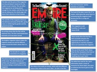
1. The date and the price of the magazine
are tiny and doesn’t stand out for the
reader to see it clearly. This can affect
the magazine by not being attract
enough for the readers, and the film may
also be taking over the whole page and
divert their attention to that instead.
The head of the joker covers the ‘P’ in
empire, which gives the sense that it is
overpowering the magazine itself
because the film is so big and
successful.
The word ‘Exclusive’ catches
attention to customer.
These words show that the film is
that successful and gives the
impression that this is a rare
opportunity to read this anywhere
else so as it promotes the magazine.
The red title of the magazine enhances
the darkness and sense of the film, giving
clues or reinforcing the gender and the
general narrative.
The writing shows that the film will be
relatively eerie. The font used handwritten
and looks as if it has been carved.
This magazine is sold
monthly; it’s only cost
about £3.99
The brighter magazine colours makes the
magazine stands out and the different
shapes around the letters shows that it is
unique.
The barcode it’s a typical
convention of a magazine.
The use of the word ‘PLUS’ shows
that the film situated on the front of
the poster is the main focus and
anything else is just ‘extra’.
The picture of the film is the main aspect
of the cover. The other features are
written over the picture, as opposed to
the picture being a small feature on the
magazine. The colour of his socks are shown, which with the different
colours they relate to the word ‘Joker’, his title in the film.
The white font used for the ‘extra’
information shows a sense of
innocence for those topics, but more
so enhances the horror genre of The
Dark Night.
2. The Masthead “BLISS” uses sans serif font which is straight forward and informal. The font uses bright pink
because the magazine aims at the female gender and the colour pink is associated with that stereotype of
the girly teenager. Also this is shown at the word “BLISS” is a name you would expect as it reminds the
reader of something glamorous or girly.
The main connotes the celebrity
“Taylor Swift” wearing a fashionable
clothes and she is using direct gaze by
looking into the camera, this is a form
on interaction as the audience may fee
connected with the image of the front
cover. She is the main focus on the
front cover which attracts the audience
to read the magazine.
Barcode is a common conventions
used on the front cover in order for
the costumers to purchase the
media product.
Question marks are used to make
the reader think and it makes it a
personal question to them. Also,
exclamation marks are used to
suggest a high importance.
Most cover line are in bold with a bright pink background in a spiky bubble
to look different from other cover lines and make it stand out.
The pug ‘172’ stands out on the front
cover in order to draw in the audiences
attention to look at the latest fashion
and to connotes a high importance.
They have put the text in
zigzag rectangle, slanted
boxes to make it more
inviting and informal.
Date and price is a common
convention you would always expect
in all magazines. If the price is
displayed in smaller font it is usually a
convention that the company doesn’t
want it to stand out as it is not as
appealing to the audience. The price
of £2.50 also is reflecting on the
socioeconomic status of the working
class.
The layout is very colourful by using
lots of bright pinks and blues in order
to follow the representation of
females. Also from the layout we can
work out it is a cheaper (weekly)
magazine as the pages is very busy full
with captions, pictures and text.
Secondary images are used to
advertise what is featured inside the
magazine which is used to attract the
audience in order for them to read the
magazine.
The sub heading “Holiday Horrors”
uses a good use of alliteration which
is catch in order to gage the audience
attention. Also a black background
brings more focus to the text because
of the contrast of colours.
3. The masthead is normally the
name of the magazine, placed in
central with the big font size for
the audience to see. This
magazine is worldwide and well
known so the masthead can be
overlapped by the image without
it being a problem.
The barcode is placed aside as it isn’t to do anything with
the story but it is important for the producer.
The main image is always in central
and it catches the audience’s eye.
The model “Sherlock Holmes” is
posing in a powerful way which
gives a sense if intimidation. The
shot that has been takes is a mid-
shot as his whole body is not
needed, just his upper half. He has
been chosen as he is the main
character in the movie being
advertised, and he is standing in
that position to emphasis the
personality of his character.
Celebrity endorsement has been
used for this magazine cover page,
to emphasise and brig a wider group
of people and get them to know
more about the magazine – “Total
Film”.
The direct address has been used in
the front cover to bring a wider
audience into the magazine. We can
see that he is looking into the
camera which gives a sense of
power, but also intimacy. It can
have many effects on people, but
the models way is to seduce the
readers into wanting to see the film
being advertised.
The sell lines attract target audience, and
are appropriate. They go along with the
lines of the page an give away a short clue
within the magazine. This also attract
buyers, as it looks more stable and serious.
When the text runes along with the image,
this is called anchorage text. As we can see
the name of the film is across the page and
the character’s name which all runs along
with the image and gives a bit of
information but not enough to get away the
film, so people will go and watch it. The
magazine included a bit of advertisement
for the movie on the front cover.
The slogan links with the sky line,
we can see what is included in
the inside of the magazine which
draws the audience’s eye to read
it.
Line across the top of the page,
calls out to the reader about
themselves and adds attraction.
The colour scheme is simple and plain. The
main colour that is used over again is white
and blue because the intention is to relate
to the film being advertised often brings out
the main image, as there is Sherlock
Holmes.
The price isn’t so obvious on this magazine as its maybe a bit expensive,
but it is an appropriate place to be that isn’t in the way or too obvious.
This is also a monthly magazine so the price will be higher from others.
The layout of this magazine is quite formal,
the lining is straight and it is organised which
gives the audience a sense of seriousness
and importance.
4. One of the letters in masthead has
been hide by the artists head –
letter B of the magazine. This
suggests that “Vibe” magazine is a
well known reputable magazine.
The background suggests that Trey
Songz is in the bathroom as we
can see by the wall. This wall is
more likely related to those of a
prison, which makes the artist
seem like a hardened character.
Which works further well with the
facial expression and tattoos.
The language makes the magazine
looks in with the times, such as “4
ways to rock a suit” and “The
hardest.” This type of language
suits the hip hop genre. The font
also seems very basic and
readable.
The use of red throughout the
texts in the magazine suggest
danger, but also contrasts with
the background.
Settle advertisement for Calvin Klein underwear. The use of topless males will increase the buying
factor for mostly the female target market.
The layout forces the artist to be the
centre of attention, which seems like
a casual approach for any magazine
about music by suggesting that any
celebrity or a star is more important
from the magazine.
The font is very bold and wide, this
gives the magazine an original and
authentic look.
Just by looking at the letter that have
been used on the front cover can tell
that this might be a American
magazine and it reflect the music
genre of hip hop.
By having the artist’s name on the
front cover of a magazine helps to
lure the reader in because they
would be interested in what the story
is about. This is because it is a
famous artist and would be well
known within the target audience,
also known as celebrity
endorsement.
The central image is taken of a well
known artist which is “Trey Songz”.
This helps to attract readers as they
would like to read what's inside to
find out.
The artist is also looking directly
in the camera at the potential
buyers of the magazine, and so it
makes it more personal towards
individuals by creating a
relationship.