
Recommended
More Related Content
What's hot
What's hot (20)
Viewers also liked
Viewers also liked (20)
Similar to Sight and sound
Similar to Sight and sound (20)
More from AmyRyckaert
More from AmyRyckaert (16)
Recently uploaded
Recently uploaded (20)
Sight and sound
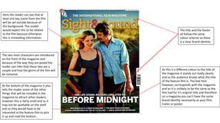
- 1. The title and the footer all follow the same colour scheme so there is a clear brand identity Here the reader can see that at least one key scene from the film will be set outside because of the background. The reader would expect this to be related to the film because otherwise this is misleading information. The two main characters are introduced on the front of the magazine and because of the way they are posed the reader can infer that these two are a couple and that the genre of the film will be romance. As this is a different colour to the title of the magazine it stands out really clearly and so the audience knows what the title of the feature film is. The text font however, corresponds with the magazine and so it is unlikely to be the same as the film had for it’s original title and therefore on a magazine you can’t have the same brand identity necessarily as your film, trailer or poster. At the bottom of the magazine it also tells the reader some of the other things that will be included in the magazine to attract other readers, however this is fairly small and so it may not be spottable on the shelf and so they would have to be interested in the feature film to pick it up and read the bottom.