Fostering Friendships - Enhancing Social Bonds in the Classroom
Media mag plan
1. Title:
The title of the magazine is very white and very bold with
the first word of the title being see-thru so the ‘total’ sticks
out as well, this connotates as people only want to see the
films in the magazine (‘FILM’) and not the other articles so
this connotates to peoples attention to the genre.
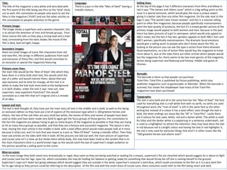
Primary image:
The image shows a superhero and a women character, this
is to attract the attention of men and female groups, from
there stance this tells us they play a strong lead and a main
lead, connotating from the dark shades the mood of the
film is dark, bad not light, happy.
Secondary images:
there are small images of iconic film characters from old
and new film, this brings in different audiences from each
and everyone of these film, and that would connotate to
an exclusive or special the magazines featuring
Primary cover lines:
the main title would be the ‘Man of Steel’ title which they
have done in a shiny bold steel text, this would catch the
eye of a seller and would interest them, above that text
says exclusive and its time for change, all this text is in
white to make the text look more bold as the background
is in dark shades, under the text it says ‘new suit, new
superman, new superhero franchise?’ this would
connotate as a new film that isn't original and is a remake
of an idea.
Layout and text:
The text is well thought of, they have put the main story all text in the middle and in bold, as well as this being
an exclusive edition so they have put a lot of aspects of the exclusive type which is 100 greatest heroes and
villains, the text of the sub titles are very small but white, the names of films and names of people have been
used as titles and have been made very bold to again get the focus groups of those genres, this connotates to
the fact the magazine are always trying to get as many buyers of the magazine as possible or that they are trying
to hit as many focus groups as possible, and that they are a famous and successful magazine. The layout is very
neat, Having the main article in the middle in bold, with a steel effect which would make people look at it more
because it sticks out, and I'm sure that was meant as a pun as “Man Of Steel” having a metallic effect. Then they
have sub articles on the sides with title in bold. All the pictures are laid out well, the main picture of superman
and Louise Lane isn’t a close up but shows there whole body, this may have been maid as the symbol that is on
the main characters chest is a world known logo so this would catch the eye of superman's target audience so
this picture would be a selling point to the comic
Mise-en-scene:
In the main image they both stand very dramatically or regal, they seem as they are being watched or waiting for a impact, superman's fist are clenched which would suggest he is about to fight
and Louise Lane has her legs open far, which connotates she may be holding her balance or getting ready for something that would throw her off she is rooting herself to the ground.
Superman's cape isn’t down but going sideways which would suggest they are outside in the wind, superman's costume is dark blue, which could connotates to the film as it is a very dark film
for its age rating so they picture could be referring to the description of the film and with the smart dress of Louise Lane, there costumes could refer to the film being smart and dark.
Language:
There is a pun in the title “Man of Steel” having a
metallic texture,
Selling lines:
At the top of the page it has 5 different characters from films and billow in
red it says “The heroes and villains issue” which is a big selling point as this
issue is a special exclusive, which would give the issue a unique aspect
giving it a better sale than any other film magazine. On the side next to the
logo it says “The world’s best movie reviews” and this is a massive selling
point to other film magazines, because people specifically mainstreamers
want the best quality of products, the fact it’s a mixed gender picture of the
primary image would appeal to both women and men, because in the past
there has been pictures of a girl in swimwear, which would only appeal to
ABC1 males, but the fact it has two genders appeals to both ABC1 men and
ABC1 women, specifically mainstreamers. The dramatic facial emotions
would give a selling point to people who don’t know about the film, as
looking at the picture you can see the type is action from there dramatic
facial expressions, so a fan of action films would buy the magazine to know
more about it, also at the sides there are other articles which people would
but the magazines for, there seems to be two main genres of the magazine,
Action being superman and Robocop and fantasy: Hobbit and game of
thrones.
Barcode-
The barcode is there so that people can purchase
Total Film. Total Film is published by future publishing, which also
publishes magazines such as gamesrader or bikerider. When the barcode is
scanned, this shows the shopkeeper how many of the Total film
magazines have been purchased.
Typography-
The text is very bold and all in the same font bar the “Man of Steel” the font
used for everything else is a tall white font with no serifs, no serifs are used
throughout work, the “man of steel” is still in the same font as the other
writing but instead of a colour it has a steel effect, even though the text is
bold, the letter endings are sharp like the “M” in “total film”. Lastly there
are 3 colours for text used, white, red and a darker white. The white Is used
for titles and the darker white is a explaining or a sentence underneath, red
is used as a highlighter to attract the attention, they may have done the text
in red because red is a bright colour and having the text in red highlights it,
the red is only used for exclusive things that aren’t in other issues like the
“100 greatest heroes and villains ever!”
2. Font-They have a lot of font variety in
the content page but they have kept to a
theme with the mast head and page
numbers of being very quirky and
Aesthetically pleasing, as most readers
only would want to read the article they
bought the magazine for first , so the
size of the font of the pages must have
been done like they are to attract the
reader to a article. The colours are very
simple, black white and red, black has
been used as to title a text and in the
text, but important quotes or names of
people as a type of highlighter. Lately
white has been used on a picture so it
would stand out and suit the theme
Research into Contents PagesCategories in which contents are
arranged-
The categories start in an important order,
starting with the titles on the cover, as the
text and the images are what would draw
different audiences in so they aren’t really
reading for the other articles but the article
they saw on the cover which they bought
the magazine for in the first place.
Title –The titles are very stylish and
casual to make the article content
summary look very attractive and easy
to look at. The main title is the same
font as all the other ones but in a serif
font, this makes the “contents” title
stand out compared to the rest of the
titles as it’s the main one,.
Subscription deal- There isn't any Subscription deals but
promotion for social media and website site, self advertising apps
and emails giving you updates about the magazine, 1 quarter of
the double paged contents page is a self promotion by the
magazine to make its global campaign on the internet bigger,
looking at this it would show that there social media fans and
followers aren't as high of a number as they would like to be to
allocate that much room for it
Types / range of images that are used- a lot of images are used in the
content page to give the reader a real look at what the article is
about, as many people that are interested in a specific article tend to
ignore the words and look t the pictures so this makes it very
important, there are a range between movie scenes and actors and
actresses at different ceremonies and I feel like they do this to show
that people are different from what they are actually like in the film.
A picture of Katniss from ‘The Hunger Games’ and the bow comes
out of the picture as a 3D effect, this may show that the predicament
that this character is in can possibly be a real life problem, this is a
great effect
How individual article information is laid
out- Articles are spread out accordingly: On
the cover, buzz, agenda, screen, every
month, this month. Connotating the order to
the level of importance focus groups had
rated it. Starting with the articles from the
cover because that’s the main reason people
would by the magazine, then the buzz and
agenda articles, The publishers company
“Future” is famous for its agenda and Buzz
articles in all magazines like “gamesrader”
and “bikereader” and then after time tables,
something like this goes in the middle of a
magazines at it isn’t as important as the main
articles. Every masthead has a subheading
underneath it and another line of text, this
makes the reader feel very comfortable with
the magazine as it isn’t hard to read and
everything is together, so someone who
wanted a specific article in the buzz section
they can see the page instantly.
Byline-
The byline is at the bottom, it has only has 3
names, and the byline consists of the three
people that made the contents page and no
other people, it is in a footer box separate to
everything else
Adverts-
A advertisement page for social media
and applications of the magazine consist
of half a page, ¼ of the contents page,
this is a massive plug because everyone
that buys the magazine will see this
advert, as well as the advert would have
been free to be placed there, so it pulls
a lot of traffic on there social media
sights and applications
3. Research into Feature Articles
Layout: As this feature article is set out as a double page spread it is ordered in neat columns,
this is normal for a double page spread so it is easy for the reader to read the information
featured in this article. At each new paragraph in this article there is a large purple arrow which
indicated where each paragraph begins and ends. This can also make reading the article easier
for the reader. The arrows match the rest of the colour scheme on this page which in this case
is purple. It is effective as it make this double page very neat and organised. Also in the middle
of the double page spread their is an image of two stars, these two stars were probably shown
on the front cover on the magazine. The text surrounds the image almost acting like a frame for
the two main stars. Along the right hand side of the double page are columns which include
more articles to come in the magazine, they include: an image of who the article is about and a
brief summary of what the article includes. This can ensure that the reader will carry on reading
because they will have an idea of the next articles and want to read the full article because they
have already been intrigued by the summary article.
Main Image: The main image in this article is a
shot that has been taking from the film ‘Hunger
Games’. Both characters look very serious, and
from the way that they are standing together we
can tell they have a strong bond which is going
to be shown in the movie this article is
discussing. The main image is very large and
takes up a lot of the space on the double page,
this can help engage the reader. The background
colour of the main image is very bright and light
this helps fit in with the colour scheme of the
rest of the page, making the whole page flow...
In the background of the image you can see
some petals falling from the sky this suggests
that both of the characters are being serenaded
by a crowd for perhaps doing something heroic.
As the petals are being directed at them this
highlights that they are very important and
above everyone else who is with them,
portraying a sense of pride. They are both
dressed in white which connotates purity, this
could possibly portray that they are dedicated to
one another in a relationship. Also Katniss is
holding a bouquet of white roses which again
can suggest they are at some kind of ceremony.
Large Heading: The heading of this article is simply
the name of the film that the two character in the
main image have previously starred in. It is in a
large bold text to attract the readers attention
and again matches the colour scheme of this
page. The simplicity of the title could connotates
to the simplicity of the film, and purple
connotating as a sweet yet dark colour, which the
film is, a good film with a dark means
Pull Quotes: This article does not have any pull
quotes however they would usually be seen on a
double page spread in a magazine such as this
one, to grab the readers attention. Pull quotes are
usually quotes in a larger text that have been
taken out of the article as they would be seen as
the most exciting/interesting parts.
Page Numbers: On the top right hand corner of this page
above the title is a large purple arrow, within that arrow is
the page number for this article. The colour of the arrow
fits in with the colour scheme. The number is exaggerated
to show the reader that they have come to the page with
the feature article on.
Short Introductory Paragraph: This article does not have an
introductory paragraph, instead it just goes straight into
the article. But underneath the title it reads: ‘Why the odds
were in its favour’. This is a play on words from a quote of
the film, this is effective as it links to the film that the
article is about and also highlights that this film was very
successful.
New Media: This is usually on magazines so that the
audience can see new information on social networking
sites before issues are released to get information.
However it is not displayed on this page but it is possibly on
another page in this issue of ‘Total Film’.
Mise-en-scene:
The main image has the two main characters looking
regal, I see the female lead holding flowers, the colour of
the picture is very white connotating pure and innocence,
there pose looks very staged and regal, which could
connotate they are trying to look dramatic for cameras, or
a crowd of people, as a sign of intimidation.
Headers and footers:
There is a small header, even though there is a title there is also a header with the films
name, the footer at the bottom has a number of different texts, like the page number, a
small byline and “total Film” having total film could connotate that why don’t want people
to copy the article so they have small plugs just incase.