
Recommended
More Related Content
What's hot
What's hot (17)
Similar to Magazine Front Cover, Emma's assignment 18/10/2018
Similar to Magazine Front Cover, Emma's assignment 18/10/2018 (20)
More from PatchCarter
More from PatchCarter (20)
Recently uploaded
Recently uploaded (20)
Magazine Front Cover, Emma's assignment 18/10/2018
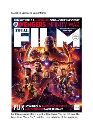
- 1. Magazine Codes and Conventions: For this magazine, this is aimed at Film lovers. You can tell from the Mast-Head “Total Film” that this is the publisher of the magazine.
- 2. We have a few headings for this magazine, as the purpose of this magazine is to entertain and inform. These headings consist of bold white words. But they use red letters for key parts of what readers can find entertaining. For example, we some famous and main stars for the upcoming movies are written in red bold letters to stand out to readers, it also does this for some of the upcoming movies that were coming out at that time. On the front cover you also have a quote from Chris Pratt saying “The stakes have never been higher” This is mean to pull readers in by making them curious as to what the higher stakes Chris could be on about and make them wonder if they will be given information on the story or any little bits of teaser information that readers could be informed on. You notice that Chris Pratt’s name is colored in red for this and this is because it stands out since it’s not white text like the rest of the normal text. So along with it being red text, having Chris Pratt’s name also pulls readers in since he’s a famous actor and one of the stars in the film so readers will naturally be curious as to what he has to say. In a white bubble it says in transparent text “On set” This is a very interesting bubble due to the text it is placed between. The bubble is placed between “Jurassic world 2 Mark Hamill Solo: A Star Wars story” and “Avengers Infinity War” This bubble doesn’t give any information on what story/film the “On Set” is meant to be on, so it makes readers curious and intrigued to find out what set they magazine is on about. On this front cover you can also see their sell-line for their magazines.
- 3. “The world’s most trusted film reviews” This also intrigues readers that this magazine publisher is really good at film reviews and persuades them to take their word for what is said than anywhere else. “Total Film” – Masthead For the masthead also, it has the word “total” inside the F for film. This makes the masthead take up a lot less space so that it doesn’t take up too much space that other images or text don’t fit into the cover. It also gives it a unique design that stands out for the masthead. But also blends into the “Film” so it all seems connected and part of each other. Due to it being bold, large white text, it stands out to the audience straight away right after you notice the dominant image. A lot of the text around the dominant image is also white, but since quite a bit of it is in red, it causes the white text around to stand out less due to the red text wanting to stand out to readers. This in turn,
- 4. causes the Bold white text of “Total Film” to stand out clear to the readers and doesn’t have anything distract the readers when they focus on this. Tagline: “Smarter movie magazine” At the top right of the magazine you can see that most of the magazine’s tagline has been cut off by the dominant image. What this indicated to the readers is that the dominant image is more important than that the tagline has to say. It can also indicate that their readers already know that their magazine is the “smarter movie magazine” and they don’t need to show it off to the readers. The downside however is that it can be quite confusing to readers what the text is actually meant to say since the only part that isn’t cut off is “sazine”. This could confuse people by making readers think that the “total film” masthead is linked up with the text underneath of it, causing them to think that it’s meant to link up and say “total film magazine” But because of that, you can’t see the letter “a” in the meant to be completed word, “Magazine” Dominant Image: This dominant image is a layered and large image that covers the whole front cover and doesn’t need or want any sub images. The dominant image has all of the iconic, main or other stand out characters in the film. We have Thanos as the dominant character for the dominant image to show that he is the main story for the film or image, then after Thanos we have Iron Man as the second biggest character in the image as he is one of the key and leading characters for this film. So this shows readers that Thanos and Iron Man are the two important characters for this film and this is why they’ve made these two the more dominant people in this image.
- 5. A more in-depth breakdown of the dominant image shows us that the dominant image shows the important parts of the film it is showing off. You can see a large ring type looking object behind the dominant character, Thanos. What this is showing us (if you’ve watched the film before or the trailers) is the importance of the object as this object (SPOILER ALERT) lands on earth and is the first part of the attack on earth from Thanos, so it shows us the key importance of this object. We also have a few more of these, one being where the character Spider-Man is standing on. This rock that he is standing on, is a rock from (SPOILER ALERT) Thanos’s home world, Titan, the planet that he failed to save and started his conquest to “save the universe” The last one is the dark part of the image behind the masthead and skyline, this is just a little image of Space/the universe. Since this Is the battle of a lifetime and involves the whole universe, space is infinite long and is also the reason the Avengers first started their team and is also now the reason they’re fighting their possible last fight now. Besides the key part of the dominant image, you can also see that all of the characters are collaged together to fit all the important characters together and in one image. We can also see in the dominant image with the rest of the character’s scale down in size, showing the important characters larger in size and the less important characters to the story smaller in size. So this shows and tells us the more important characters or the more iconic and loved characters and causes them to catch readers eyes quicker than the other characters for the film. Costume Association: As you can see in the dominant image a few of the items that some of the characters are using are standing out with them or standing out even more.
- 6. For example, Thanos gauntlet is standing out just as much if not a little more than Thanos himself, this is so it can indicate to readers the importance of this item that Thanos is wearing since it is they key part many of the Avenger films/independent character films. Iron-Man is wearing his new suit that he will be wearing for the battle. Along with this you can see all of the characters in the dominant image are wearing their battle outfits and all their gear for the war. This indicates that they are all prepared for battle and war and shows readers all the new and possibly funky items/costumes that these characters might not have worn in the previous films. Skyline: For the Skyline you can see “Jurassic world 2 Mark Hamill Solo: A Star Wars story” This shows the target audience of films of the magazine in general, not just the Avengers, that the magazine has more to offer in its issue than just one story on the Avengers story. It also gives the readers more information about what stories this issue has, like an index page for a book. At the bottom of the page, it spears to be second part of the Skyline. It says “PLUS Josh Brolin Fantastic Beasts 2 Amy Schumer David Tennant” From this it tells us that these stories about these actors/films aren’t the main part of the magazine but are just a little something else to offer the readers also.
- 7. You can see that some of the words being highlighted in red separate films and actors but also highlight key actors or upcoming films that may interest the target audience. Target Audience: How this front cover suits its target audience of film lovers, information seekers (reviews) and entertainment is by giving you a large dominant image of the upcoming, highly anticipated film Avengers Infinity War. Where normally magazines can have multiple images on their front cover, this magazine only has one image that fits the whole front cover. It also highlights a few other key words like “Fantastic Beasts 2”, “Mark Hamill” and “Amy Schumer” Letting readers who aren’t that interested in Avengers other things to read by highlighting key actors who star in hit, legendary films or giving the film name itself. The target Audience for this magazine are movie goers or watches of all different types of ages, social, demographic and psychographic. As all films are different or the same, so everyone can have at least one film that they enjoy. Colour Scheme: For the colour scheme that this magazine has used they haven’t used many colour’s but the ones that they’ve used stand out very well to the readers and are very unique and bright for a magazine. At the top of the page behind the Skyline and masthead the magazine have used very dark colour’s and designs to show as the black abyss of space. But not only is it good for design wise, but they’ve also done it very smartly by making it darker colour’s so it doesn’t distract or make readers struggle to read the masthead and skyline. Since the rest of the dominant image use bright and colorful colour’s, if they used those same colour’s at the top of the page with the Skyline and masthead, it would of caused the readers to struggle
- 8. to read the skyline and masthead as it would have caused the colour’s of the masthead and the skyline to blend in with the dominant image’s colour’s. Publisher: The publisher for this magazine have their own small logo in the bottom right of the magazine. It is a basic design for the logo and doesn’t distract anyone from the dominant image or anything else that the front cover has to offer. But because of its simple and basic colour and design scheme, they also get noticed by readers when they have a quick look at the magazine. The target audience, because of the lack of text, images and other small information that the front cover offers, indicated that the age range of the magazine could be anywhere from 14 or 15 up to around 30 to 35. The psychographic for this issue of the magazine could really be anything since films are made for all types of people. Profession: Any, possibly more likely to be student, or full time job workers Age: 14 to 35 Gender: Majority male, but females are quickly making the gender target audience more even. Country: Worldwide. Since the Marvel films are taking over the film industry worldwide and are filmed and released all over the world. It doesn’t really matter where a person is located to watch the film anymore.