Call Girls Nikol 7397865700 Ridhima Hire Me Full Night
Chiko
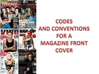
1.
2. Empire
The masthead for Empire
is usually in red which is
quite an eye catching
colour, making it stand out
from on magazine stalls.
The date and price is
placed in the V of M.
The colour scheme suits the
genre of the film for example
the background of the image
is quite futuristically blue
which matches her eyes and
the title of the film. The
magazine uses 3 main colours
which is one of the codes and
conventions for a magazine
front cover.
Empire is the magazine of
the year which heightens
its popularity and how
good the magazine is for it
to have been voted for as
the magazine of the year it
attracts more readers
The main image is
presumably of one of the
main characters. The
character usually has a
direct gaze which creates
a direct connection with
the audience. The shot
used for a magazine front
cover is usually a mid
shot.
The tagline above the
masthead entices the
audience into buying the
magazine
The barcode is featured
to the right hand of the
magazine.
Instead of using the
word plus the plus
sign as used
Other magazines are
advertised as ‘3
collectors edition’
The headline/ title of the
film outlined to make it
stand out more
They are consistent with
their colour scheme on the
front cover.
3. Total film
The barcode in this
poster is positioned
differently to the
previous poster
perhaps its placed
where it causes the less
disruption to the page.
the date, issue and
price is placed in
between the V shape
of the M in the
masthead similar to
the previous magazine.
The masthead is quite creative as
the ‘total’ part of total film is
featured within the letter F and
compared to the last magazine
front cover has an image covering
part of the masthead which is
quite a conventional feature. And
it is placed at the top of the
magazine page.
Head shot of the main characters
are used infused with images of
some of the scenes of the film.
They all have a direct gaze which
helps connect with the audience
The sticker at the top
of the magazine is
advertising a different
film.
The subtitle ‘dead man’s chest’ is
in a much larger font size and its
in bold which makes it stand out
compared to the title of the film
‘pirates of the Caribbean’. This
may be because the characters
are well recognized and
consumers already know the
title.
Compared to the
previous magazine
total film has less
subheadings on their
front cover and they
are placed around
the main image .
The front cover similar to the
last one features a tagline. The
magazine also has a border
around it and the context is
within the border.
4. Empire
The front cover features a
tagline which entices the
audience into reading the
magazine.
Similar to the other 2
magazines the date, issue,
website and price are placed
in the V shape of the M
The masthead is placed at the
top of the magazine but at a
much smaller font size than
the previous empire magazine.
The image of the main
character is unconventionally
placed over a whole letter of
the masthead. Similar to the
first magazine it heightens its
popularity ‘the worlds biggest
movie magazine’
The image is a long shot of the
main character with a direct
gaze which creates a
connection with the audience.
The image is positioned over
the text which makes him
stand out.
The titles of the other films are
in various fonts/sizes and some
are in bold
The title of the film is in a
large font and the colour
scheme used for it reflects the
title; the grey and white
gradients create a steel-
looking effect.
The barcode is placed at the
bottom of the front cover where
it causes less obstruction.
The front cover features a
sticker which stands out and
lures the audience to read it.
The sticker is advertising
David’s possible final interview.
The magazine’s colour scheme
is consistent on the cover.
The cover features the word ‘plus’
indicating there I more to read in
the magazine.
The magazine includes
words/phrases such as
‘exclusive’ and ‘ first look’
which possibly make the
audience feel as if they are
receiving information no one
else knows
5. Total film
The barcode at the side.
The date, issue number and
website are placed underneath
the M
The use of the arrow
encourages you to open the
magazine to answer the
question which is placed inside
of it. And the use of secondary
images of previous magazines
explains the text.
The masthead is in a
different colour scheme to
their typical white and red
one. This is to match the
genre of the film.
The colour scheme is consistent
throughout the front cover.
The title of the film is in orange,
bold and in capital letters which
makes it stand out. It also
features a tagline .
The main image is a mid shot
of the main 4 characters
which was taken at a low
angle which makes it seem
like they are looking down at
us . All four characters have a
direct gaze.
Words such as extra, exclusive
etc. were edited to match the
title of the film. The filled
textbox in which they are in also
highlights then
Similar to the first
magazine a plus sign was
used.
The subtitles are in 2
different colours; in orange a
more general statement and
in white a description of the
statement.
The names of other films
are placed along the
bottom of the magazine
front cover.
The red circle formed by stars
attracts the readers attention
and similar to empire it
heightens the popularity of it
movie reviews