Model Call Girl in Bikash Puri Delhi reach out to us at 🔝9953056974🔝
Contents analysis 1 & 2
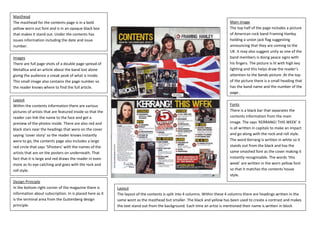
1. Masthead
The masthead for the contents page is in a bold
yellow worn out font and is in an opaque black box
that makes it stand out. Under the contents has
issues information including the date and issue
number.
Images
There are full page shots of a double page spread of
Metallica and an article about the band lost alone
giving the audience a sneak peak of what is inside.
This small image also contains the page number so
the reader knows where to find the full article.
Layout
Within the contents information there are various
pictures of artists that are featured inside so that the
reader can link the name to the face and get a
preview of the photos inside. There are also red and
black stars near the headings that were on the cover
saying ‘cover story’ so the reader knows instantly
were to go, the contents page also includes a large
red circle that says ‘5Posters’ with the names of the
artists that are on the posters on underneath. That
fact that it is large and red draws the reader in even
more as its eye catching and goes with the rock and
roll style.
Main image
The top half of the page includes a picture
of American rock band Framing Hanley
holding a union jack flag suggesting
announcing that they are coming to the
UK. It may also suggest unity as one of the
band members is doing peace signs with
his fingers. The picture is lit with high key
lighting and this helps draw the reader’s
attention to the bands picture .At the top
of the picture there is a small heading that
has the band name and the number of the
page .
Fonts
There is a black bar that separates the
contents information from the main
image. The says ‘KERRANG! THIS WEEK’ it
is all written in capitals to make an impact
and go along with the rock and roll style.
The word Kerrang is written in white so it
stands out from the black and has the
same smashed font as the cover making it
instantly recognisable. The words ‘this
week’ are written in the worn yellow font
so that it matches the contents house
style.
Layout
The layout of the contents is split into 4 columns. Within these 4 columns there are headings written in the
same wont as the masthead but smaller. The black and yellow has been used to create a contrast and makes
the text stand out from the background. Each time an artist is mentioned their name is written in block
capitals to stand out.
Design Principle
In the bottom right corner of the magazine there is
information about subscription. In is placed here as it
is the terminal area from the Guttenberg design
principle.
2. Photography and layout
The contents has 8 main
articles featured on it all of
them have artist photos and
are in different sizes
depending on the
importance. The biggest
picture there is a black and
white photo that goes with
the article ‘the 20 sets that
shook Glastonbury festival’
this picture is the only one in
black and white as it is
showing the older sets.
Page Numbers
Each featured article has a
bold number at the bottom
right of it so the reader knows
what page the remainder of
the article is on.
Masthead
The masthead of the NME
contents page says ‘inside this
week’ all in black block capitals
centred in the middle of the
page. Underneath this is the
issue date. The background is
white and all of the pages’ text is
black giving it a classic feel.
Although this may be
misconstrued as boring it does
bring all of the reader’s attention
to the bold text and pictures
without overwhelming them.
Pull Quotes
Many of the featured articles
contain quotes written in italics
to give the audience preview as
to what is in the article. By
reading the climax of a quote
that a celebrity has said causes
the reader to want to know
more.
Layout
There is a small strip in-between
the articles that says ‘plus’
followed by a list of the magazine
regulars such as ‘reviews’ and
‘gig guide’.
House style
The house style for this
magazine is black and white
as the text is black and white
along with the main image.
The page also uses a varied
style of fonts to interest the
reader and give some variety
and excitement to an
otherwise boring page.