
Recommended
More Related Content
What's hot
What's hot (20)
Viewers also liked
Viewers also liked (20)
Similar to Film magazine conventions
Similar to Film magazine conventions (20)
Recently uploaded
Recently uploaded (20)
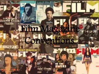
Film magazine conventions
- 2. Skyline/tagline Magazine title/ masthead Film title Buzz words- ‘The epic issue’ Anchorage text Barcode and price Cover lines Secondary images Cover lines Main image of the leading actor Promotional puff
- 3. Masthead A masthead always features on a film magazine, which is at the top of the page. It should be the largest element on the page, clear and bold. The colour of the masthead will often be the same, to use as a brand identity. For example, Empire, mostly uses the colour red.
- 4. The main image of a film magazine is always central on the page as it is the main focus of the cover. Usually, the image is of the main character of the film. If the reader is a fan of the actor and have previously enjoyed other films they have starred in, then they will most likely be enticed to watch the certain film promoted on the front cover. Main Image
- 5. Tag lines Tag lines are very useful to promote films, as not only can they briefly tell the reader what the film is about, or what genre it could be, it also sticks in the readers head, which will ensure they are more likely to remember the film that is being advertised.
- 6. This is the extra information on the cover to tell the readers what else is inside, which will most likely take their interest, and persuade them more to buy it. However, it will be smaller than the more major elements on the cover, such as the masthead, main image and film title. This is because this is what the whole magazine focuses on in that certain issue. So it is logical for the magazine to make the main elements larger. The anchorage text is mostly always the same font and colour as other elements on the magazine to connect all the information together, create a brand identity, and also bring the whole cover together, to make it attractive to the reader as much as possible. Anchorage text and cover lines
- 7. Barcode, date and issue number These are essential parts of information on a magazine cover. However, they are always small and are not usually bigger than the rest of the elements on the magazine. This ensures the readers attention is not taken away from the main elements of the cover, such as the main image, tag line, and title of the film.
- 8. Cover analysis This is a magazine cover from Studio, which we found from doing our research. It is a woman's film magazine which would be perfect to use for our own magazine cover to promote our film, since our target audience are 15-24 year old females. Masthead- This allows the audience to know that the name of the magazine is Studio. Studio instantly relates to film since films are shot in Studios. The title is in block capitals and is bold, which would catch the audiences eye instantly. Also, the grey is a fairly neutral colour which doesn’t detract any attention away from the rest of the features on the magazine. The colour also complements the pink and white colours as well. Skyline- The pink relates well to the female target audience. It also states it’s ‘Britain's first woman's film magazine.’ This would instantly attract the female audience since they would not have had a magazine just dedicated to them before, which may intrigue them to buy it. It also tells the reader it’s a film magazine, so film enthusiasts will most likely buy it. Main image- the main image centred in the middle of the magazine is Amanda Seyfried as herself, a popular actress who many females can relate to and will likely be fans of hers. She is looking straight into the camera which would instantly engage the reader and create a connection between the character and audience. Readers who are big fans of Amanda will instantly want to buy the magazine as it suggests it will involve details about her real life, on the outside of the filming world, which would be interesting for most readers. The cover also includes the magazines website which allows the audience more access to information from the magazine. This will also attract a wider target audience, particularly younger females. The anchorage text allows the reader an insight into what else is inside. The font and colours of the writing also attracts the target audience since it is feminine. Buzz word- ‘exclusive.’ This will entice the reader to buy the magazine as it highlights how it is a special edition and they may be able to read information which is fresh in the film world. It Is also slightly larger than the other text to make it stand out more. The title- the title of the ,magazine is ‘The Oscars’, which also relates it to films. Also, as the Oscars is a major event, it may attract more readers. As the magazine is mostly about the Oscars, this is the largest text on the cover, with white font which matches the background and therefor creates a brand identity.