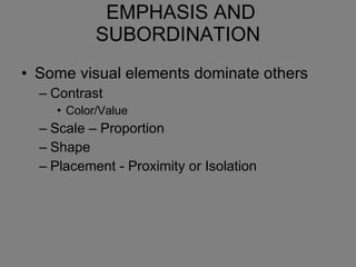
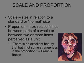
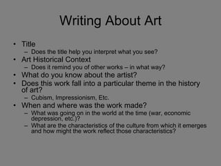
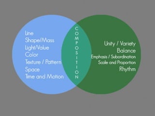
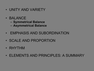
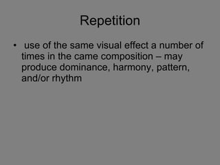
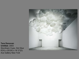
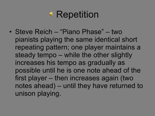
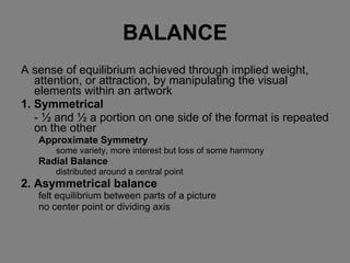
The document provides an overview of principles of design including unity and variety, balance, emphasis and subordination, scale and proportion, and rhythm. It discusses key concepts such as symmetrical and asymmetrical balance, visual weight and emphasis, the use of scale and proportion in composition, and creating a sense of movement through repetition. Examples of artworks are presented to illustrate applications of these different principles.
UNITY AND VARIETYBALANCE Symmetrical Balance Asymmetrical Balance EMPHASIS AND SUBORDINATION SCALE AND PROPORTION RHYTHM ELEMENTS AND PRINCIPLES: A SUMMARY
4.
Unity and VarietyThe result of bringing the elements of art into the appropriate ratio between harmony and variety to achieve a sense of oneness. Variety : Differences that provide interest and contrast. Unity : The sense of oneness, of things belonging together and making up a coherent whole .
Yun-fei Ji, the empty city - fragrant creek, 2003, mineral pigment on xuan paper 59.25 x 37.5 inches Yun-fei Ji, the empty city - east wind, 2003 mineral pigment on xuan paper 35.5 x 53.5 inches
Harmony quality achievedby different elements of a composition interacting to form a whole. Harmony is often accomplished through repetition of the same or similar characteristics.
Repetition Steve Reich– “Piano Phase” – two pianists playing the same identical short repeating pattern; one player maintains a steady tempo – while the other slightly increases his tempo as gradually as possible until he is one note ahead of the first player – then increases again (two notes ahead) – until they have returned to unison playing.
32.
BALANCE A senseof equilibrium achieved through implied weight, attention, or attraction, by manipulating the visual elements within an artwork 1. Symmetrical - ½ and ½ a portion on one side of the format is repeated on the other Approximate Symmetry some variety, more interest but loss of some harmony Radial Balance distributed around a central point 2. Asymmetrical balance felt equilibrium between parts of a picture no center point or dividing axis
Asymmetrical Balance Alarge form is visually heavier than a smaller one A dark-value form is visually heavier than a lighter-value form A textured form is visually heavier than a smoother form of the same size A complex form is visually heavier than a simple form of the same size A smaller dark form can balance a light one
56.
Asymmetrical Balance Anobject far from the center of the picture seems to have more weight than one near the center. Objects in the upper part of a picture seem heavier than objects of the same size in the lower part of a picture. Isolation seems to increase the weight of an object. Intensely interesting objects seem to have more compositional weight. Elements on the right side of an asymmetrical picture appear to have more weight than elements of the same size on the left side of the picture.
57.
58.
59.
James Abbott McNeillWhistler Arrangement in Grey and Black No. 1: Portrait of the Artist's Mother , 1871, oil on canvas, 4 feet 8 3/4 x 5 feet 3 3/4 inches
SCALE AND PROPORTIONScale – size in relation to a standard or “normal” size Proportion – size relationships between parts of a whole or between two or more items perceived as a unit “There is no excellent beauty that hath not some strangeness in the proportion.” – Francis Bacon
Writing About ArtTitle Does the title help you interpret what you see? Art Historical Context Does it remind you of other works – in what way? What do you know about the artist? Does this work fall into a particular theme in the history of art? Cubism, Impressionism, Etc. When and where was the work made? What was going on in the world at the time (war, economic depression, etc.)? What are the characteristics of the culture from which it emerges and how might the work reflect those characteristics?
96.
What is theform of this work? How does the artist use the formal elements? What is it made of and how is it organized? Elements of Art (line, shape, value, color, texture, space, time/motion) Principles of Design (unity/variety, repetition, harmony, balance, scale and proportion, rhythm) Does this work seem unified and is there enough variety to sustain interest? How is the composition balanced? What is the focal point or points and how did the artist create them? What roles do proportion and scale play? Is there significant use of rhythm or repetition? What is the content of this work? Is there a recognizable subject – a story, a person, a place or an event? If so, how is the subject treated? What feelings or associations does this work evoke to me?
#28 BURTYNSKY - CHINA In the autumn of 2005, Edward Burtynsky presents his latest release of work, photographs of both remnant and newly established zones of Chinese industrialization. Using diplomatic channels Burtynsky has gained rare access to the extreme expressions of Chinese industry, creating images that are at once arresting and unsettling. These photographs afford us a privileged glimpse of the vast social and economic transformations currently underway in China.
#30 Michael Wolf : Architecture of Density January 6 - February 26, 2005 ROBERT KOCH GALLERY is pleased to present Architecture of Density , an exhibition of large scale color photographs by Michael Wolf. Wolf has lived and worked in Hong Kong for ten years. Stimulated by the region's complex urban dynamics, he makes dizzying photographs of its architecture. One of the most densely populated metropolitan areas in the world, Hong Kong has an overall density of nearly 6,700 people per square kilometer. The majority of its citizens live in flats in high-rise buildings. In Architecture of Density , Wolf investigates these vibrant city blocks, finding a mesmerizing abstraction in the buildings' facades. Some of the structures in the series are photographed without reference to the context of sky or ground, and many buildings are seen in a state of repair or construction: their walls covered with a grid of scaffolding or the soft colored curtains that protect the streets below from falling debris. From a distance, such elements become a part of the photograph's intricate design. Upon closer inspection of each photograph, the anonymous public face of the city is full of rewarding detail- suddenly public space is private space, and large swatches of color give way to smaller pieces of people's lives. The trappings of the people are still visible here: their days inform the detail of these buildings. Bits of laundry and hanging plants pepper the tiny rectangles of windows- the only irregularities in this orderly design. In 2002, the San Francisco Chronicle called Wolf's work in Hong Kong "most improbable and humanly alert". In previous series, Wolf described the vernacular culture of the street. His early vision of the region dwelt on personal aesthetic gestures left in back doors and alleyways, such as makeshift seating in the streets. In these photographs, small tokens of human presence took precedence over monumental architecture. Wolf continues to explore the theme of the organic metropolis- that which develops according to the caprice of its citizens as much as the planning of its architects. In Architecture of Density , his vision has evolved to evaluate the high-rises that shape the spatial experience of Hong Kong's citizens. Wolf finds in each building a singular character, despite its functional purpose and massive form. Wolf was born in Munich, Germany in 1954. He studied first at the North Toronto Collegiate Institute in Canada, then UC Berkeley and, in the mid 1970s, with Otto Steinert at the University of Essen, in Germany. Published monographs include Sitting in China (2002) and China im Wandel (China in Transition) (2001). Hong Kong: Front Door/Back Door will be published by Thames and Hudson in 2005.