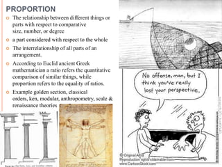
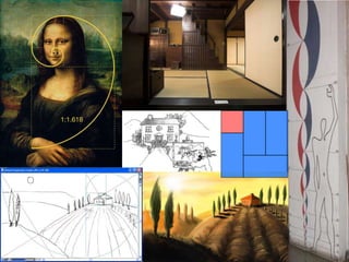
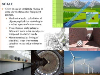
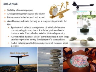
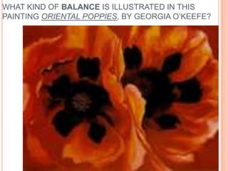
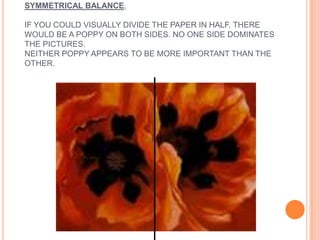
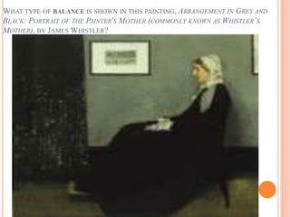
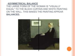
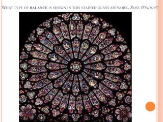
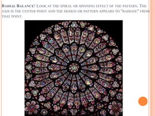
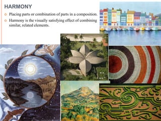
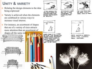
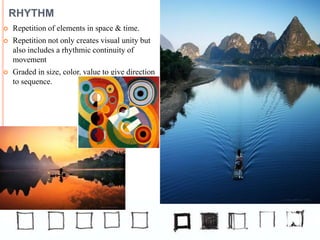
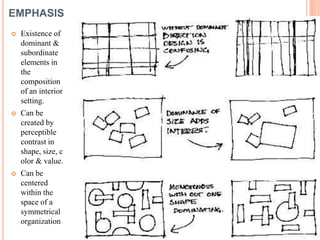
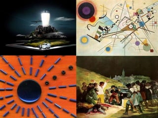
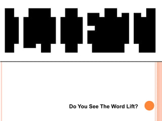
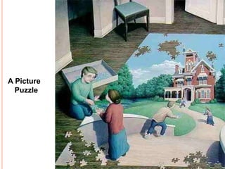
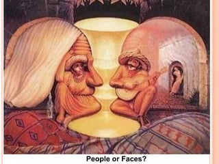
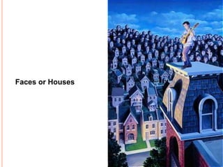
The document discusses several principles of composition including proportion, scale, balance, harmony, unity and variety, rhythm, and emphasis. It defines each principle and provides examples to illustrate different types of balance, such as symmetrical balance seen in Georgia O'Keeffe's painting "Oriental Poppies" and radial balance shown in a rose window's spiral pattern. Visual puzzles are also included asking the reader to find specified numbers of items or interpret images in different ways.
This Basic design Presentation serves the purpose of initiating creativity and there by appreciation of visual language.
Basic design studios help to unlock students creativity and enhance spatial perception.
Design is what links creativity and innovation. It shapes ideas to become practical and attractive propositions for users, clients or customers. Design may be described as creativity deployed to a specific end
Design is the creation of a plan or convention for the construction of an object or a system. It may be an architectural blueprints, engineering drawings, business processes, circuit diagrams or sewing patterns. Design has different connotations in different fields
N.B: The presentation is compiled from articles and presentations of experts, researchers, professors working in the same field for educational purpose.
There are a lot of rules and best practices to consider when designing anything (regardless of the medium– website, print campaign, keynote presentation, etc.), and the process can easily become overwhelming to the uninitiated. Fortunately, various sets of principles exist to help lay out the general premise of a design. There are nine principles, and the process becomes vastly simpler after learning the concepts behind this set. Most of the time, after some practice and comprehension, the principles begin to work subconsciously within the back of your mind, guiding the creative process.
it is about designing building by few articulation techniques, for example by altering its corners, or emphasizing its vertical, horizontal, base, roof, ceiling plane to add creativity.
the corners van be altered by cutting it, adding an element to it, curving it, opening it or even giving it a contrasting tone than the other surfaces.
The presentation will give you a good understanding about the significance, meaning and the types of designing elements and principles. For more visit our website https://www.admecindia.co.in/.
L’analyse fonctionnelle, le secret le mieux gardé des bons gestionnaires de p...PMI-Montréal
La présentation portera sur une description de la méthodologie d’analyse fonctionnelle, qui a pour but de bien comprendre et documenter les besoins-clients, dans le but de réaliser un projet le mieux enligné possible sur ces besoins et de livrer ce que le client s’attendait à avoir. Les 5 étapes de la méthodologie seront présentées.
L’approche de la cohérence architecturale selon la densité, par Jean-Pierre D...CAUE85
Atelier du colloque "réinvestir nos centre-bourgs, l’impossible défi ?", organisé par l'EPF de Vendée et le CAUE de la Vendée le 24 mai 2013.
Jean-Pierre DENIS
Atlantique de Projets, Gérant – Machecoul
Ingénieur TPE, puis aménageur au sein du groupe SCET Caisse des dépôts en qualité de chargé d’opérations d’aménagement, fort également d’une expérience de directeur de sociétés d’aménagement et gérant de la société Atlantique de Projets (44), Jean-Pierre DENIS est cofondateur de la marque « La Maison Abordable » conçue pour concilier densité et montage CMI. Il développe aujourd’hui un concept qui a pour objet de mettre en oeuvre
le montage «lots individuels groupés» dans les ZAC ou opérations denses de centre-ville. Urba 30 (30 comme 30 logements à l’hectare et 30% de logements en accession sociale) est un compromis entre le montage de lots libres (qui ne fonctionne plus lorsque la forte densité impose des doubles mitoyennetés) et le montage de maisons de ville groupées en Vefa (qui génère des surcouts et une uniformité excessive).
Overview of C.R.A.P. design principles (Contrast, Repetition, Alignment, and Proximity), and the elements used to execute those principles (line, color, shape, scale, texture, and space) for beginners.
This is the talk I presented at the O'Reilly Software Architecture conference in San Francisco on November 15th, 2016. I talk about Conway's Law, my experience building organizations and evolving architectures at Avvo, Spotify and Adobe; and I talk about ways to leverage the homomorphic force of Conway's Law to improve your architecture.
Basic design & visual arts (Elements of design)Ar.Shakti Nanda
Lecture and presentation on Elements of Design for students of architecture, fine art and photography. semester - I (2015), Sri Sri University, Odisha. 7+1 Elements of design explained (Point, Line, Shapes, Space, Form, Texture, Value, Colour) in details with examples for better understanding. Content compiled from books and internet.
Between Filth and Fortune- Urban Cattle Foraging Realities by Devi S Nair, An...Mansi Shah
This study examines cattle rearing in urban and rural settings, focusing on milk production and consumption. By exploring a case in Ahmedabad, it highlights the challenges and processes in dairy farming across different environments, emphasising the need for sustainable practices and the essential role of milk in daily consumption.
Can AI do good? at 'offtheCanvas' India HCI preludeAlan Dix
Invited talk at 'offtheCanvas' IndiaHCI prelude, 29th June 2024.
https://www.alandix.com/academic/talks/offtheCanvas-IndiaHCI2024/
The world is being changed fundamentally by AI and we are constantly faced with newspaper headlines about its harmful effects. However, there is also the potential to both ameliorate theses harms and use the new abilities of AI to transform society for the good. Can you make the difference?
You could be a professional graphic designer and still make mistakes. There is always the possibility of human error. On the other hand if you’re not a designer, the chances of making some common graphic design mistakes are even higher. Because you don’t know what you don’t know. That’s where this blog comes in. To make your job easier and help you create better designs, we have put together a list of common graphic design mistakes that you need to avoid.
Hello everyone! I am thrilled to present my latest portfolio on LinkedIn, marking the culmination of my architectural journey thus far. Over the span of five years, I've been fortunate to acquire a wealth of knowledge under the guidance of esteemed professors and industry mentors. From rigorous academic pursuits to practical engagements, each experience has contributed to my growth and refinement as an architecture student. This portfolio not only showcases my projects but also underscores my attention to detail and to innovative architecture as a profession.
7 Alternatives to Bullet Points in PowerPointAlvis Oh
So you tried all the ways to beautify your bullet points on your pitch deck but it just got way uglier. These points are supposed to be memorable and leave a lasting impression on your audience. With these tips, you'll no longer have to spend so much time thinking how you should present your pointers.
Book Formatting: Quality Control Checks for DesignersConfidence Ago
This presentation was made to help designers who work in publishing houses or format books for printing ensure quality.
Quality control is vital to every industry. This is why every department in a company need create a method they use in ensuring quality. This, perhaps, will not only improve the quality of products and bring errors to the barest minimum, but take it to a near perfect finish.
It is beyond a moot point that a good book will somewhat be judged by its cover, but the content of the book remains king. No matter how beautiful the cover, if the quality of writing or presentation is off, that will be a reason for readers not to come back to the book or recommend it.
So, this presentation points designers to some important things that may be missed by an editor that they could eventually discover and call the attention of the editor.
2. PROPORTION
The relationship between different things or
parts with respect to comparative
size, number, or degree
a part considered with respect to the whole
The interrelationship of all parts of an
arrangement.
According to Euclid ancient Greek
mathematician a ratio refers the quantitative
comparison of similar things, while
proportion refers to the equality of ratios.
Example golden section, classical
orders, ken, modular, anthropometry, scale &
renaissance theories
3.
4. SCALE
Refers to size of something relative to
some known standard or recognized
constant.
Mechanical scale : calculation of
objects physical size according to
standard system of measurement
Visual/human scale: refers to
difference found when one objects
compared to others visually
Monumental scale: feeling of
smallness when we compare
ourselves to a exterior or interior
space
5. BALANCE
Stability of an arrangement
Arrangement appears secure and stable
Balance must be both visual and actual
visual balance refers to the way an arrangement appears to the
eye.
Symmetrical balance: arrangement of identical elements
corresponding in size, shape & relative position about a
common axis. Also called as axial or bilateral symmetry
Asymmetrical balance: lack of correspondence in size, shape
or relative position among the element of a composition.
Radial balance: results from arrangement of elements about
a center.
6. WHAT KIND OF BALANCE IS ILLUSTRATED IN THIS
PAINTING ORIENTAL POPPIES, BY GEORGIA O’KEEFE?
7. SYMMETRICAL BALANCE,
IF YOU COULD VISUALLY DIVIDE THE PAPER IN HALF. THERE
WOULD BE A POPPY ON BOTH SIDES. NO ONE SIDE DOMINATES
THE PICTURES.
NEITHER POPPY APPEARS TO BE MORE IMPORTANT THAN THE
OTHER.
8. WHAT TYPE OF BALANCE IS SHOWN IN THIS PAINTING, ARRANGEMENT IN GREY AND
BLACK: PORTRAIT OF THE PAINTER'S MOTHER (COMMONLY KNOWN AS WHISTLER’S
MOTHER), BY JAMES WHISTLER?
9. , ASYMMETRICAL BALANCE
THE LARGE FORM OF THE WOMAN IS "VISUALLY
EQUAL" TO THE BLACK CURTAIN AND WHITE PAINTING
ON THE WALL. THIS MAKES THE PAINTING APPEAR
BALANCED.
10. WHAT TYPE OF BALANCE IS SHOWN IN THIS STAINED GLASS ARTWORK, ROSE WINDOW?
11. RADIAL BALANCE! LOOK AT THE SPIRAL OR SPINNING EFFECT OF THE PATTERN. THE
AXIS IS THE CENTER POINT AND THE DESIGN OR PATTERN APPEARS TO "RADIATE" FROM
THAT POINT.
12. HARMONY
Placing parts or combination of parts in a composition.
Harmony is the visually satisfying effect of combining
similar, related elements.
13. UNITY & VARIETY
Relating the design elements to the idea
being expressed
Variety is achieved when the elements
are combined in various ways to
increase visual interest.
For instance, an assortment of shapes
that are of a variety of sizes attracts
more attention than an assortment of
shapes all the same size.
14. RHYTHM
Repetition of elements in space & time.
Repetition not only creates visual unity but
also includes a rhythmic continuity of
movement
Graded in size, color, value to give direction
to sequence.
15. EMPHASIS
Existence of
dominant &
subordinate
elements in
the
composition
of an interior
setting.
Can be
created by
perceptible
contrast in
shape, size, c
olor & value.
Can be
centered
within the
space of a
symmetrical
organization