Balance
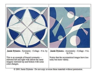
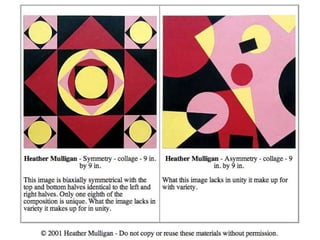
• Symmetrical balance – both sides of a composition are
matching.
• Asymmetrical balance – both sides are not equal or
matching.
• Radial balance – circular design with overall symmetrical
balance.
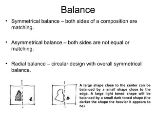
A large shape close to the center can be
balanced by a small shape close to the
edge. A large light toned shape will be
balanced by a small dark toned shape (the
darker the shape the heavier it appears to
be)
• When components are balanced left and right of a
central axis they are balanced horizontally.
• When they are balanced above and below they are said
to be balanced vertically.
• And when components are distributed around the center
point, or spring out from a central line, this is referred to
as radial balance.
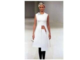
Symmetrical balance involves
elements mirroring each other.
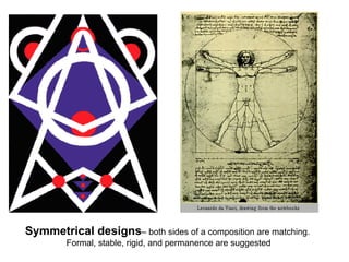
Symmetrical designs– both sides of a composition are matching.
Formal, stable, rigid, and permanence are suggested
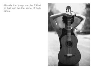
Usually the image can be folded
in half and be the same of both
sides.
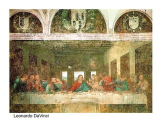
Leonardo DaVinci
Asymmetrical Designs - both sides are not equal or matching.
Chaotic, unstable, loose and suggested.
Henri Rosseau,
The Football Players, 1908.
Oil on canvas.
Alexander Calder
James Whistler
Palace of Versailles 1682, Paris
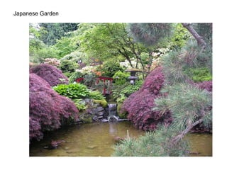
Japanese Garden
Unity
•The sense of wholeness which results from the successful combination
of the elements of art.
•A principle of design that relates to the sense of oneness or wholeness
in a work of art.
When you repeat an
element like color,
direction, value, shape,
or texture, or establish a
style, like a linear style,
you establish a visual
connection or
correspondence among
the elements.
Poster Design firm:
Concrete Design Communications
The painting on the left
creates a sense of unity by
the effective use of repetition.
See how the artist has
repeated similar forms (ducks)
and color (brown) throughout
the composition?
On the right grouping of similar
objects (proximity) was used to
create unity within this painting.
When all the elements
and principles work
together to create a
pleasing image.
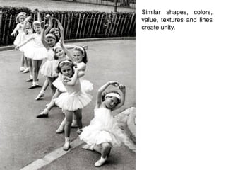
Similar shapes, colors,
value, textures and lines
create unity.
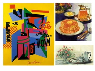
Contrast in art and design occurs when two related elements are different.
The greater the difference the greater the contrast. Contrast adds variety to the total
design and creates unity.
The most common ways of creating contrast are by creating differences in:
• size
• value
• color
• type
• texture
• shape
• alignment
• direction
• movement
The contrast in the illustration to the left
is quite obvious. Notice the contrast of
the light background (wall) with dark
foreground (table cloth) and the contrast
of the dark shadows on the tea pot and
cup against the wall and with the lights
of the same objects against a dark
window.
There is also a contrast of thin and thick
lines in the napkin, straight and curved
lines, and don't miss the dark steam as
contrasted with the light clouds off in the
distance.
In the painting on the left is
another example of contrast
between light and darkness.
On the right a contrast exists between the
lights and darks. Also notice the contrast of
the roundness of the objects in the
foreground against the flatness of the
background.
When the principle of proportion is applied to a work of art it is usually in the
relationship of
• size, height, width and depth of one element to that of another
•size of one area to the size of another area
•size of one element to the size of another element amount of space between
two or more elements
Proportion in art is the comparative harmonious relationship between
two or more elements in a composition with respect to size, color, quantity,
degree, setting, etc.; i.e. ratio.
Rhythm is a type of
movement seen in
repeating of shapes and
colors. Alternating lights
and darks also give a
sense of rhythm.
Rhythm: the way elements combine to produce the
appearance of movement in an artwork.
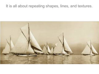
It is all about repeating shapes, lines, and textures.
Remember, implied lines direct the viewer’s eye.
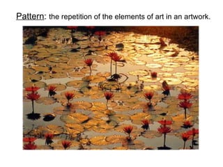
Pattern: the repetition of the elements of art in an artwork.
The difference is
pattern does not
focus on repeating
elements to make
movement.
Focal Point
Visually, the focal point of an image is the place
where your eyes are drawn to first. Usually the
focal point will be highlighted or the most striking
color in the work. The focal point can also be
reinforced by the implied lines guiding the
viewer’s perspective.
The arrangement of parts in
an artwork to create a
feeling of dominance and
importance on a particular
area.
Similar to dynamics and
movement, implied or
actual lines can point to
the area of emphasis.
The Conversion of St. Paul, Caravaggio
Where are
your eyes
drawn to
first? Next?
Then?
•There are arguably several focal points
within this image.
• The focal point can also be the place
where the action is happening – the dark
space between the horse and the man in the
foreground. One can also call this place a
focal area.
•This image is particularly entertaining
because it has layers of focal points and
areas.
• The artist highlights places all over the
entire space of the canvas which
automatically takes the viewer’s eyes all
over the image.
• After the immediate two or three first
attractions, my eyes are then led to the
horse’s rump, down the leg to the hand and
kneecap of the soldier to the red cloth and
then up the arm on the right to the other
man in the image landing where I started

Principles Of Design

  • 1.
    Balance • Symmetrical balance– both sides of a composition are matching. • Asymmetrical balance – both sides are not equal or matching. • Radial balance – circular design with overall symmetrical balance. A large shape close to the center can be balanced by a small shape close to the edge. A large light toned shape will be balanced by a small dark toned shape (the darker the shape the heavier it appears to be)
  • 2.
    • When componentsare balanced left and right of a central axis they are balanced horizontally. • When they are balanced above and below they are said to be balanced vertically. • And when components are distributed around the center point, or spring out from a central line, this is referred to as radial balance.
  • 4.
  • 6.
    Symmetrical designs– bothsides of a composition are matching. Formal, stable, rigid, and permanence are suggested
  • 7.
    Usually the imagecan be folded in half and be the same of both sides.
  • 8.
  • 9.
    Asymmetrical Designs -both sides are not equal or matching. Chaotic, unstable, loose and suggested.
  • 11.
    Henri Rosseau, The FootballPlayers, 1908. Oil on canvas.
  • 12.
  • 13.
  • 17.
  • 18.
  • 21.
    Unity •The sense ofwholeness which results from the successful combination of the elements of art. •A principle of design that relates to the sense of oneness or wholeness in a work of art.
  • 22.
    When you repeatan element like color, direction, value, shape, or texture, or establish a style, like a linear style, you establish a visual connection or correspondence among the elements. Poster Design firm: Concrete Design Communications
  • 23.
    The painting onthe left creates a sense of unity by the effective use of repetition. See how the artist has repeated similar forms (ducks) and color (brown) throughout the composition? On the right grouping of similar objects (proximity) was used to create unity within this painting.
  • 24.
    When all theelements and principles work together to create a pleasing image.
  • 25.
    Similar shapes, colors, value,textures and lines create unity.
  • 27.
    Contrast in artand design occurs when two related elements are different. The greater the difference the greater the contrast. Contrast adds variety to the total design and creates unity. The most common ways of creating contrast are by creating differences in: • size • value • color • type • texture • shape • alignment • direction • movement
  • 28.
    The contrast inthe illustration to the left is quite obvious. Notice the contrast of the light background (wall) with dark foreground (table cloth) and the contrast of the dark shadows on the tea pot and cup against the wall and with the lights of the same objects against a dark window. There is also a contrast of thin and thick lines in the napkin, straight and curved lines, and don't miss the dark steam as contrasted with the light clouds off in the distance.
  • 29.
    In the paintingon the left is another example of contrast between light and darkness. On the right a contrast exists between the lights and darks. Also notice the contrast of the roundness of the objects in the foreground against the flatness of the background.
  • 33.
    When the principleof proportion is applied to a work of art it is usually in the relationship of • size, height, width and depth of one element to that of another •size of one area to the size of another area •size of one element to the size of another element amount of space between two or more elements Proportion in art is the comparative harmonious relationship between two or more elements in a composition with respect to size, color, quantity, degree, setting, etc.; i.e. ratio.
  • 35.
    Rhythm is atype of movement seen in repeating of shapes and colors. Alternating lights and darks also give a sense of rhythm. Rhythm: the way elements combine to produce the appearance of movement in an artwork.
  • 38.
    It is allabout repeating shapes, lines, and textures.
  • 40.
    Remember, implied linesdirect the viewer’s eye.
  • 41.
    Pattern: the repetitionof the elements of art in an artwork.
  • 43.
    The difference is patterndoes not focus on repeating elements to make movement.
  • 44.
    Focal Point Visually, thefocal point of an image is the place where your eyes are drawn to first. Usually the focal point will be highlighted or the most striking color in the work. The focal point can also be reinforced by the implied lines guiding the viewer’s perspective.
  • 45.
    The arrangement ofparts in an artwork to create a feeling of dominance and importance on a particular area.
  • 46.
    Similar to dynamicsand movement, implied or actual lines can point to the area of emphasis.
  • 48.
    The Conversion ofSt. Paul, Caravaggio Where are your eyes drawn to first? Next? Then?
  • 49.
    •There are arguablyseveral focal points within this image. • The focal point can also be the place where the action is happening – the dark space between the horse and the man in the foreground. One can also call this place a focal area. •This image is particularly entertaining because it has layers of focal points and areas. • The artist highlights places all over the entire space of the canvas which automatically takes the viewer’s eyes all over the image. • After the immediate two or three first attractions, my eyes are then led to the horse’s rump, down the leg to the hand and kneecap of the soldier to the red cloth and then up the arm on the right to the other man in the image landing where I started