Download as PDF, PPTX
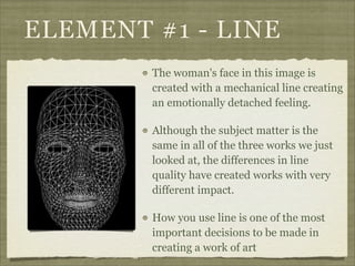
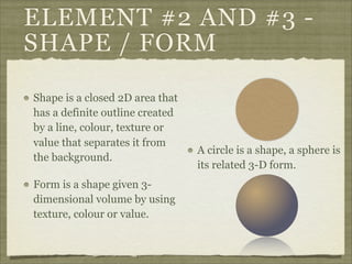
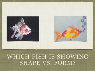

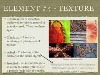

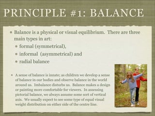
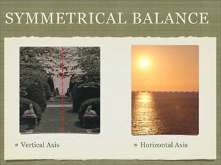
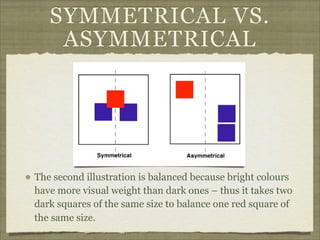
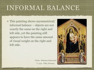
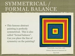
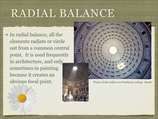
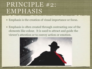
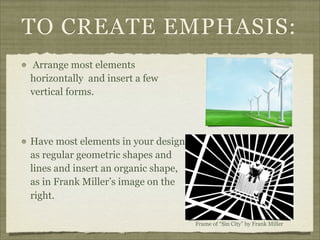
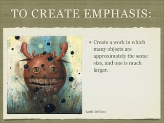


The document discusses the elements and principles of design. It defines elements as the basic building blocks of visual art, including line, shape, form, texture, color, value and space. It explains that principles are the rules that govern how elements are combined, such as balance, emphasis, rhythm and unity. Balance creates a sense of visual equilibrium, and can be symmetrical, asymmetrical or radial. Emphasis draws attention to specific elements through contrast, size, placement or other techniques. Understanding elements and principles allows artists to effectively structure compositions and convey meaning or emotion.


