Download as PPS, PPTX
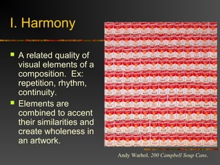
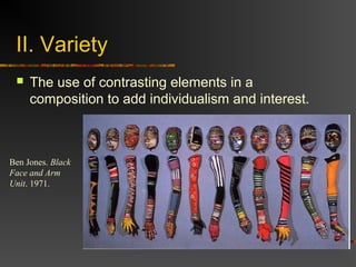
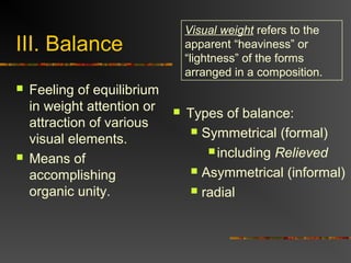
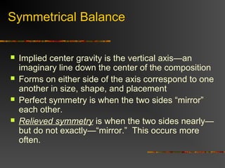
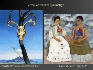
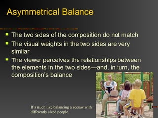
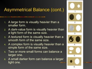
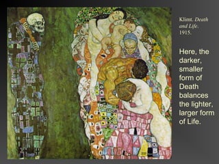
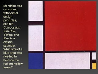
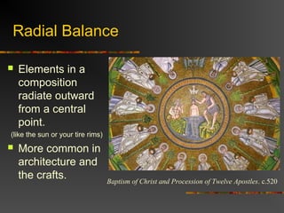
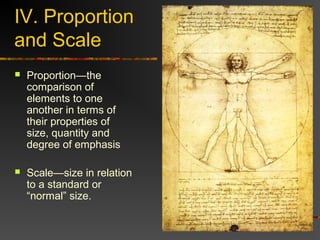
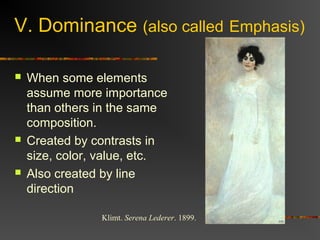


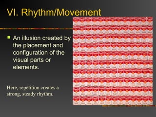
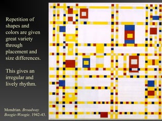


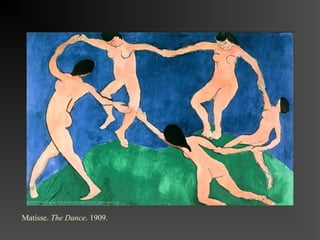


The document discusses 7 principles of design: harmony, variety, balance, proportion and scale, dominance, rhythm/movement, and economy. It defines each principle and provides examples to illustrate how artists have applied each principle in their works. Harmony involves combining elements to accent similarities and create unity. Variety adds interest through contrasts. Balance creates a feeling of equilibrium. Proportion examines size relationships and scale examines size relative to a standard. Dominance emphasizes certain elements. Rhythm creates the illusion of movement. Economy simplifies compositions to their essential elements.


