Front Cover Analysis
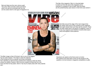
The title of the magazine ‘Vibe’ is in big bold letter
 Red and black are the main colours used.                                       to stand out from the rest of the magazine and is
 The colour Red connotes violent and blood                                      coloured in a gradient of red to black. Red and black
 which can also be connected with hip hop                                       are the predominantly used colours in this front cover which h
 and its culture which is the type of magazine it is.


                                                                                      Sub titles around the edge of the main image show
                                                                                      the viewer what some of the contents of the magazine.
                                                                                      that might interest them and help sell the product. These
                                                                                      sub titles relate back to the genre of magazine, which is
                                                                                      a hip hop magazine and therefore include artists topics
                                                                                      which will appeal to that audience.


The Main image is that of ‘Eminem’ who is one of the biggest
                                                                                 Questions are asked on the front cover to involve
hip hop artist (rapper). This helps to draw the attention
                                                                                 the audience and want them to find out the answer to the
of the audience as he is popular and known worldwide.
                                                                                 question or to be involved in magazine competitions or gifts.
He is standing up with his arms crossed and is wearing a tank top which
shows his variety of tattoos. With his arms crossed he looks like he is the
boss and that he has power, which in hip hop he clearly does with many awards
won.
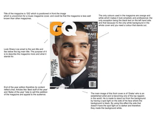
Title of the magazine is ‘GQ’ which is positioned in front the image
which is uncommon for a music magazine cover, and could be that the magazine is less well           The only colours used in the magazine are orange and
known than other magazines.                                                                         white which makes it look simplistic and professional, the
                                                                                                    only exception being the black text on the left hand side
                                                                                                    and that because it’s the only white background in the
                                                                                                    whole cover and you need a colour that stands out.


Look Sharp Live smart is the sub title and
lies below the big main title. The purpose of it
is to describe the magazine more and what it
stands for.


End of the year edition therefore its content
reflex's that. Articles like ‘Best stuff of the year’
and ‘Babe of the year’ help to sell this addition
of the magazine and appeal to the audience.                                                 The main image of this front cover is of ‘Drake’ who is an
                                                                                            established artist and is becoming one of the top rappers
                                                                                            in the world. He is made to stand out from the background
                                                                                            by having a spot light on the side of his face where the
                                                                                            background is black. By using this effect the side that
                                                                                            doesn't have the spot light on is darker and therefore
                                                                                            they made the background white.

FC analysis

  • 1.
  • 2.
    The title ofthe magazine ‘Vibe’ is in big bold letter Red and black are the main colours used. to stand out from the rest of the magazine and is The colour Red connotes violent and blood coloured in a gradient of red to black. Red and black which can also be connected with hip hop are the predominantly used colours in this front cover which h and its culture which is the type of magazine it is. Sub titles around the edge of the main image show the viewer what some of the contents of the magazine. that might interest them and help sell the product. These sub titles relate back to the genre of magazine, which is a hip hop magazine and therefore include artists topics which will appeal to that audience. The Main image is that of ‘Eminem’ who is one of the biggest Questions are asked on the front cover to involve hip hop artist (rapper). This helps to draw the attention the audience and want them to find out the answer to the of the audience as he is popular and known worldwide. question or to be involved in magazine competitions or gifts. He is standing up with his arms crossed and is wearing a tank top which shows his variety of tattoos. With his arms crossed he looks like he is the boss and that he has power, which in hip hop he clearly does with many awards won.
  • 3.
    Title of themagazine is ‘GQ’ which is positioned in front the image which is uncommon for a music magazine cover, and could be that the magazine is less well The only colours used in the magazine are orange and known than other magazines. white which makes it look simplistic and professional, the only exception being the black text on the left hand side and that because it’s the only white background in the whole cover and you need a colour that stands out. Look Sharp Live smart is the sub title and lies below the big main title. The purpose of it is to describe the magazine more and what it stands for. End of the year edition therefore its content reflex's that. Articles like ‘Best stuff of the year’ and ‘Babe of the year’ help to sell this addition of the magazine and appeal to the audience. The main image of this front cover is of ‘Drake’ who is an established artist and is becoming one of the top rappers in the world. He is made to stand out from the background by having a spot light on the side of his face where the background is black. By using this effect the side that doesn't have the spot light on is darker and therefore they made the background white.

Editor's Notes