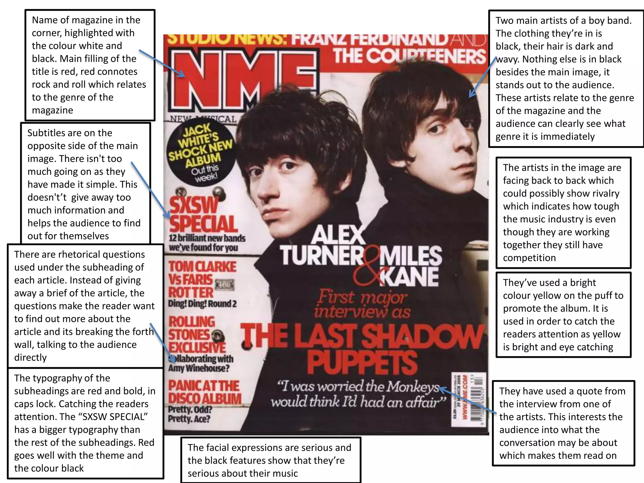
Name of magazine in the                                                   Two main artists of a boy band.
    corner, highlighted with                                                  The clothing they’re in is
    the colour white and                                                      black, their hair is dark and
    black. Main filling of the                                                wavy. Nothing else is in black
    title is red, red connotes                                                besides the main image, it
    rock and roll which relates                                               stands out to the audience.
    to the genre of the                                                       These artists relate to the genre
    magazine                                                                  of the magazine and the
                                                                              audience can clearly see what
   Subtitles are on the                                                       genre it is immediately
   opposite side of the main
   image. There isn't too
   much going on as they                                                       The artists in the image are
   have made it simple. This                                                   facing back to back which
   doesn't’t give away too                                                     could possibly show rivalry
   much information and                                                        which indicates how tough
   helps the audience to find                                                  the music industry is even
   out for themselves                                                          though they are working
                                                                               together they still have
There are rhetorical questions                                                 competition
used under the subheading of
each article. Instead of giving                                                They’ve used a bright
away a brief of the article, the                                               colour yellow on the puff to
questions make the reader want                                                 promote the album. It is
to find out more about the                                                     used in order to catch the
article and its breaking the forth                                             readers attention as yellow
wall, talking to the audience                                                  is bright and eye catching
directly
The typography of the
subheadings are red and bold, in                                              They have used a quote from
caps lock. Catching the readers                                               the interview from one of
attention. The “SXSW SPECIAL”                                                 the artists. This interests the
has a bigger typography than                                                  audience into what the
the rest of the subheadings. Red     The facial expressions are serious and   conversation may be about
goes well with the theme and         the black features show that they’re     which makes them read on
the colour black                     serious about their music
The masthead is in the            Referring to another                   The main image is a medium long shot and
 colour yellow/orange as           female                                 dynamic so it takes up most of the page
 it’s a bright colour and          artist, competition                    which is why there is less information
 stands out. It’s the fist
 thing that catches the                                                                          Talking directly to the
 audiences attention                                                                             audience, not giving them a
                                                                                                 choice of whether they want
                                                                                                 the songs or not.
  The main image on this
  magazine is overlapping
  the masthead. This is for                                                                       The glitter on her outfit may suggest
  audiences who are                                                                               that she is a out going person and
  familiar with the                                                                               likes to party. This could again relate
  magazine company and                                                                            to the music genre of the magazine
  read it regularly.                                                                              it may be RnB

The typography of the name
of the artist “Leona Lewis” is                                                                   Main image is quite
bigger than the rest as she is                                                                   seductive, body posture and
the main focus on the                                                                            pose with the hand. Relates to
magazine cover                                                                                   the genre of the magazine

                                                                                                 Asking the audience rhetorical
The orange writing matches                                                                       questions so that they can get
her ‘gold’ skin tone which                                                                       involved and read on
could relate to her
wealth, also they relate to
her as a “megastar”
                                                                                                Her outfit is black, black connotes
 The layout of the                                                                              sexy and makes a person look more
 magazine is quite                                                                              slimmer, her skin is showing. Also the
 simple, not too much                                                                           heavy eye make up may suggest that
 information is given            Magazine website for people to get more                        the target audience are females who
 out. Makes the                  information and month and year of the magazines                go out and look good
 audience curious                release which helps as people will know the
                                 information in the magazine isn't updated
Name of drugs and a quote from the
                                                                                                The colour scheme is red, black
                                        artists interview to entertain the
                                                                                                and grey. It matches the
 The typography of the                  audience and get them to read on
                                                                                                masthead and some of the
 masthead is a mixture of                                                                       texts. The important texts are in
 red/black/grey which                                                                           red as red is a symbol of
 connote serious colours.                                                                       importance and shock. The
 The colours link to his                                                                        background is grey but there are
 posture as he looks quite                                                                      darker shades of grey used for
 serious with his arms                                                                          text
 folded.
                                                                                                Jewellery relates to the
Name of artists are related                                                                     stereotypical rap artists as
to the hip hop genre. The                                                                       they stand out also it is a
names are also placed on                                                                        status symbol of wealth
top of the masthead for the                                                                     and prestige
audience in case they want
to read about other artists                                                                    His body posture is very serious
instead of the one on the                                                                      and he looks like he has a high
main image                                                                                     authority. The facial expressions are
                                                                                               also serious as he has no emotion
The use of alliteration in                                                                     such as a smile. This again relates
“vicodin”, “valium” to make                                                                    to the rap/hip hop genre as the
it more interesting to read                                                                    stereotypical artists are quite
and it is also underneath the                                                                  serious as their music is serious and
masthead which also begins                                                                     what they speak about in their
with a V                                                                                       music is serious

The colours may represent
                                                                                             The layout of the magazine is laid
the gang culture which also
                                                                                             out evenly, there isn't much
relates to his tattoos which
                                                                                             information but just brief
are symbolical
                                                                                             information of what the magazine
                             A website on the magazine for more information about it.        may consist. This lets the audience
                             It is small and in the corner as it is irrelevant information   find out for themselves and doesn’t
                             but still there hidden just in case the audience want to        give away too much information
                             know more or read the online magazines

Cover magazine

  • 1.
    Name of magazinein the Two main artists of a boy band. corner, highlighted with The clothing they’re in is the colour white and black, their hair is dark and black. Main filling of the wavy. Nothing else is in black title is red, red connotes besides the main image, it rock and roll which relates stands out to the audience. to the genre of the These artists relate to the genre magazine of the magazine and the audience can clearly see what Subtitles are on the genre it is immediately opposite side of the main image. There isn't too much going on as they The artists in the image are have made it simple. This facing back to back which doesn't’t give away too could possibly show rivalry much information and which indicates how tough helps the audience to find the music industry is even out for themselves though they are working together they still have There are rhetorical questions competition used under the subheading of each article. Instead of giving They’ve used a bright away a brief of the article, the colour yellow on the puff to questions make the reader want promote the album. It is to find out more about the used in order to catch the article and its breaking the forth readers attention as yellow wall, talking to the audience is bright and eye catching directly The typography of the subheadings are red and bold, in They have used a quote from caps lock. Catching the readers the interview from one of attention. The “SXSW SPECIAL” the artists. This interests the has a bigger typography than audience into what the the rest of the subheadings. Red The facial expressions are serious and conversation may be about goes well with the theme and the black features show that they’re which makes them read on the colour black serious about their music
  • 2.
    The masthead isin the Referring to another The main image is a medium long shot and colour yellow/orange as female dynamic so it takes up most of the page it’s a bright colour and artist, competition which is why there is less information stands out. It’s the fist thing that catches the Talking directly to the audiences attention audience, not giving them a choice of whether they want the songs or not. The main image on this magazine is overlapping the masthead. This is for The glitter on her outfit may suggest audiences who are that she is a out going person and familiar with the likes to party. This could again relate magazine company and to the music genre of the magazine read it regularly. it may be RnB The typography of the name of the artist “Leona Lewis” is Main image is quite bigger than the rest as she is seductive, body posture and the main focus on the pose with the hand. Relates to magazine cover the genre of the magazine Asking the audience rhetorical The orange writing matches questions so that they can get her ‘gold’ skin tone which involved and read on could relate to her wealth, also they relate to her as a “megastar” Her outfit is black, black connotes The layout of the sexy and makes a person look more magazine is quite slimmer, her skin is showing. Also the simple, not too much heavy eye make up may suggest that information is given Magazine website for people to get more the target audience are females who out. Makes the information and month and year of the magazines go out and look good audience curious release which helps as people will know the information in the magazine isn't updated
  • 3.
    Name of drugsand a quote from the The colour scheme is red, black artists interview to entertain the and grey. It matches the The typography of the audience and get them to read on masthead and some of the masthead is a mixture of texts. The important texts are in red/black/grey which red as red is a symbol of connote serious colours. importance and shock. The The colours link to his background is grey but there are posture as he looks quite darker shades of grey used for serious with his arms text folded. Jewellery relates to the Name of artists are related stereotypical rap artists as to the hip hop genre. The they stand out also it is a names are also placed on status symbol of wealth top of the masthead for the and prestige audience in case they want to read about other artists His body posture is very serious instead of the one on the and he looks like he has a high main image authority. The facial expressions are also serious as he has no emotion The use of alliteration in such as a smile. This again relates “vicodin”, “valium” to make to the rap/hip hop genre as the it more interesting to read stereotypical artists are quite and it is also underneath the serious as their music is serious and masthead which also begins what they speak about in their with a V music is serious The colours may represent The layout of the magazine is laid the gang culture which also out evenly, there isn't much relates to his tattoos which information but just brief are symbolical information of what the magazine A website on the magazine for more information about it. may consist. This lets the audience It is small and in the corner as it is irrelevant information find out for themselves and doesn’t but still there hidden just in case the audience want to give away too much information know more or read the online magazines