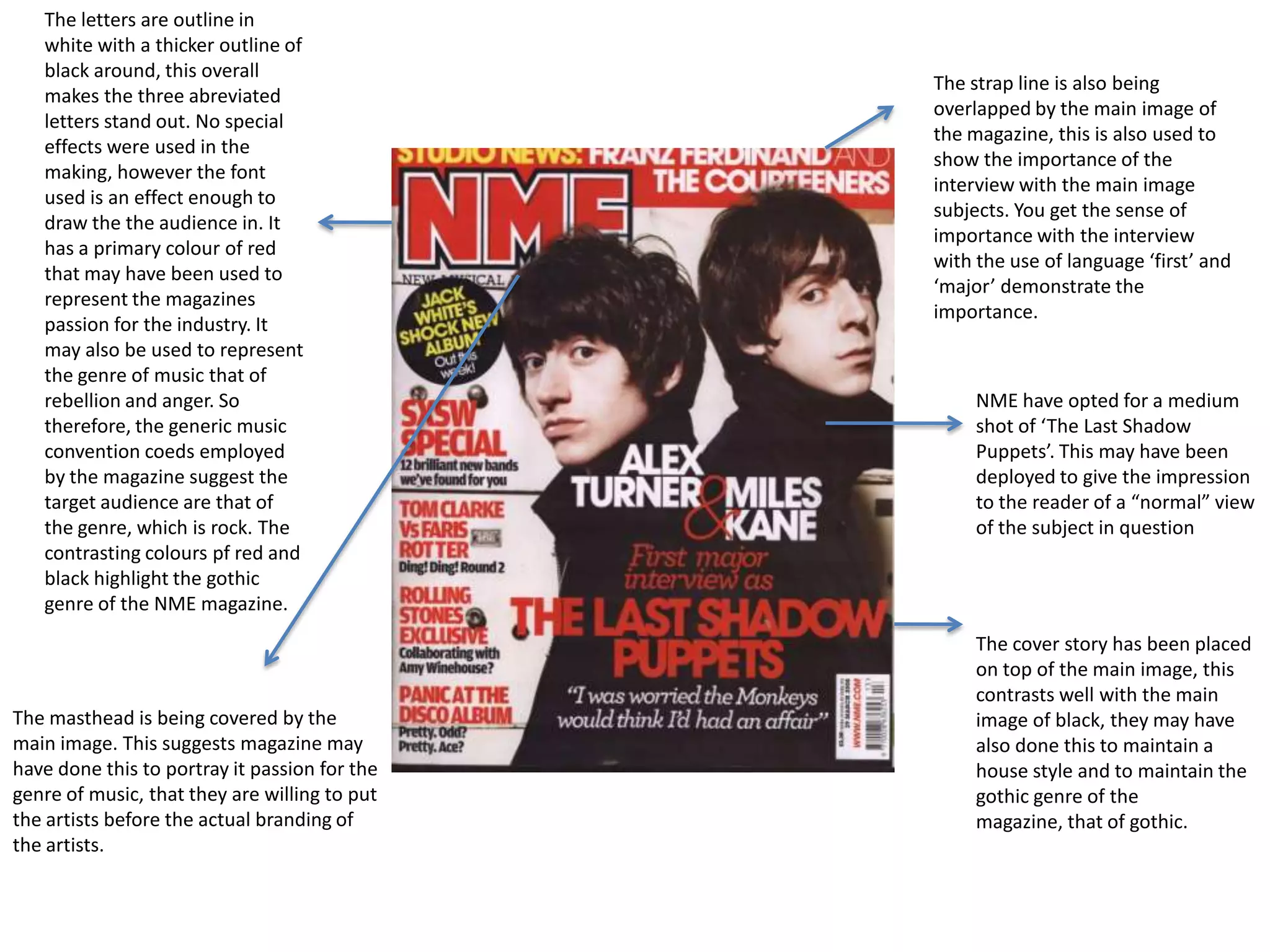
The letters are outline in
   white with a thicker outline of
   black around, this overall
                                               The strap line is also being
   makes the three abreviated
                                               overlapped by the main image of
   letters stand out. No special
                                               the magazine, this is also used to
   effects were used in the
                                               show the importance of the
   making, however the font
                                               interview with the main image
   used is an effect enough to
                                               subjects. You get the sense of
   draw the the audience in. It
                                               importance with the interview
   has a primary colour of red
                                               with the use of language ‘first’ and
   that may have been used to
                                               ‘major’ demonstrate the
   represent the magazines
                                               importance.
   passion for the industry. It
   may also be used to represent
   the genre of music that of
   rebellion and anger. So                          NME have opted for a medium
   therefore, the generic music                     shot of ‘The Last Shadow
   convention coeds employed                        Puppets’. This may have been
   by the magazine suggest the                      deployed to give the impression
   target audience are that of                      to the reader of a “normal” view
   the genre, which is rock. The                    of the subject in question
   contrasting colours pf red and
   black highlight the gothic
   genre of the NME magazine.
                                                    The cover story has been placed
                                                    on top of the main image, this
                                                    contrasts well with the main
The masthead is being covered by the                image of black, they may have
main image. This suggests magazine may              also done this to maintain a
have done this to portray it passion for the        house style and to maintain the
genre of music, that they are willing to put        gothic genre of the
the artists before the actual branding of           magazine, that of gothic.
the artists.
From the title black beat we straight away can         The mast head is bright so therefore having the
see the main intention of the magazine, as it          intention of trying to be eye catching.
will be heavily representing culture and the           However, the font is quite small compared to
music within the specific culture.                     every thing on the page which could suggest
Therefore, having a specific and focused               there are other things on the cover which are
audience.                                              more important to be viewed.

                                                                                                    There is a lot going on in the overall mise-en
The main image is a close up of the artist                                                          scen of the magazine cover with it containing
bowwow, giving the audience a chance                                                                many images cover lines on music artists, which
intimate and a feeling of being close to                                                            could be representing the amount going on
the superstar. Also the fact that he is                                                             within this magazines genre.
above all the other images on the
magazine cover which could infer that
he is currently above everyone else in
the music industry and the biggest star
at the moment. Also by him being the
main image is likely to mean that the
main part/article of the magazine is                                                                The cover has a selected focus, with there
going to be on him.                                                                                 being a lot going on in terms of color and
The image of Bow Wow can also give                                                                  images with it drawing attention to it and
readers the gratification of personal                                                               causes you to look at it.
identity, with them aspiring to be like
him and heavily influenced by him and
his lifestyle.


  With the urban artists and in formal text being on                             Many different colors are used to make the cover more
  the magazine highlights the fact it is the music                              appealing to the audience. Certain words are highlighted in
  source for young fans of the urban music scene.                               bright colors to make stand out with them being important
                                                                                informative words on the magazine cover. The genre of music
                                                                                and the audience of the magazine is a big reason why many
                                                                                vibrant colors are used due to these bright colors being related
                                                                                to the youth culture.

Magazine uses and gratifications

  • 1.
    The letters areoutline in white with a thicker outline of black around, this overall The strap line is also being makes the three abreviated overlapped by the main image of letters stand out. No special the magazine, this is also used to effects were used in the show the importance of the making, however the font interview with the main image used is an effect enough to subjects. You get the sense of draw the the audience in. It importance with the interview has a primary colour of red with the use of language ‘first’ and that may have been used to ‘major’ demonstrate the represent the magazines importance. passion for the industry. It may also be used to represent the genre of music that of rebellion and anger. So NME have opted for a medium therefore, the generic music shot of ‘The Last Shadow convention coeds employed Puppets’. This may have been by the magazine suggest the deployed to give the impression target audience are that of to the reader of a “normal” view the genre, which is rock. The of the subject in question contrasting colours pf red and black highlight the gothic genre of the NME magazine. The cover story has been placed on top of the main image, this contrasts well with the main The masthead is being covered by the image of black, they may have main image. This suggests magazine may also done this to maintain a have done this to portray it passion for the house style and to maintain the genre of music, that they are willing to put gothic genre of the the artists before the actual branding of magazine, that of gothic. the artists.
  • 2.
    From the titleblack beat we straight away can The mast head is bright so therefore having the see the main intention of the magazine, as it intention of trying to be eye catching. will be heavily representing culture and the However, the font is quite small compared to music within the specific culture. every thing on the page which could suggest Therefore, having a specific and focused there are other things on the cover which are audience. more important to be viewed. There is a lot going on in the overall mise-en The main image is a close up of the artist scen of the magazine cover with it containing bowwow, giving the audience a chance many images cover lines on music artists, which intimate and a feeling of being close to could be representing the amount going on the superstar. Also the fact that he is within this magazines genre. above all the other images on the magazine cover which could infer that he is currently above everyone else in the music industry and the biggest star at the moment. Also by him being the main image is likely to mean that the main part/article of the magazine is The cover has a selected focus, with there going to be on him. being a lot going on in terms of color and The image of Bow Wow can also give images with it drawing attention to it and readers the gratification of personal causes you to look at it. identity, with them aspiring to be like him and heavily influenced by him and his lifestyle. With the urban artists and in formal text being on Many different colors are used to make the cover more the magazine highlights the fact it is the music appealing to the audience. Certain words are highlighted in source for young fans of the urban music scene. bright colors to make stand out with them being important informative words on the magazine cover. The genre of music and the audience of the magazine is a big reason why many vibrant colors are used due to these bright colors being related to the youth culture.