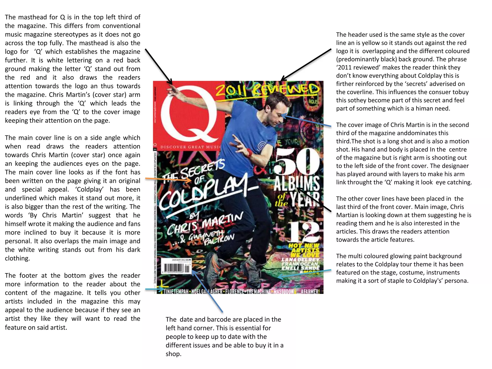
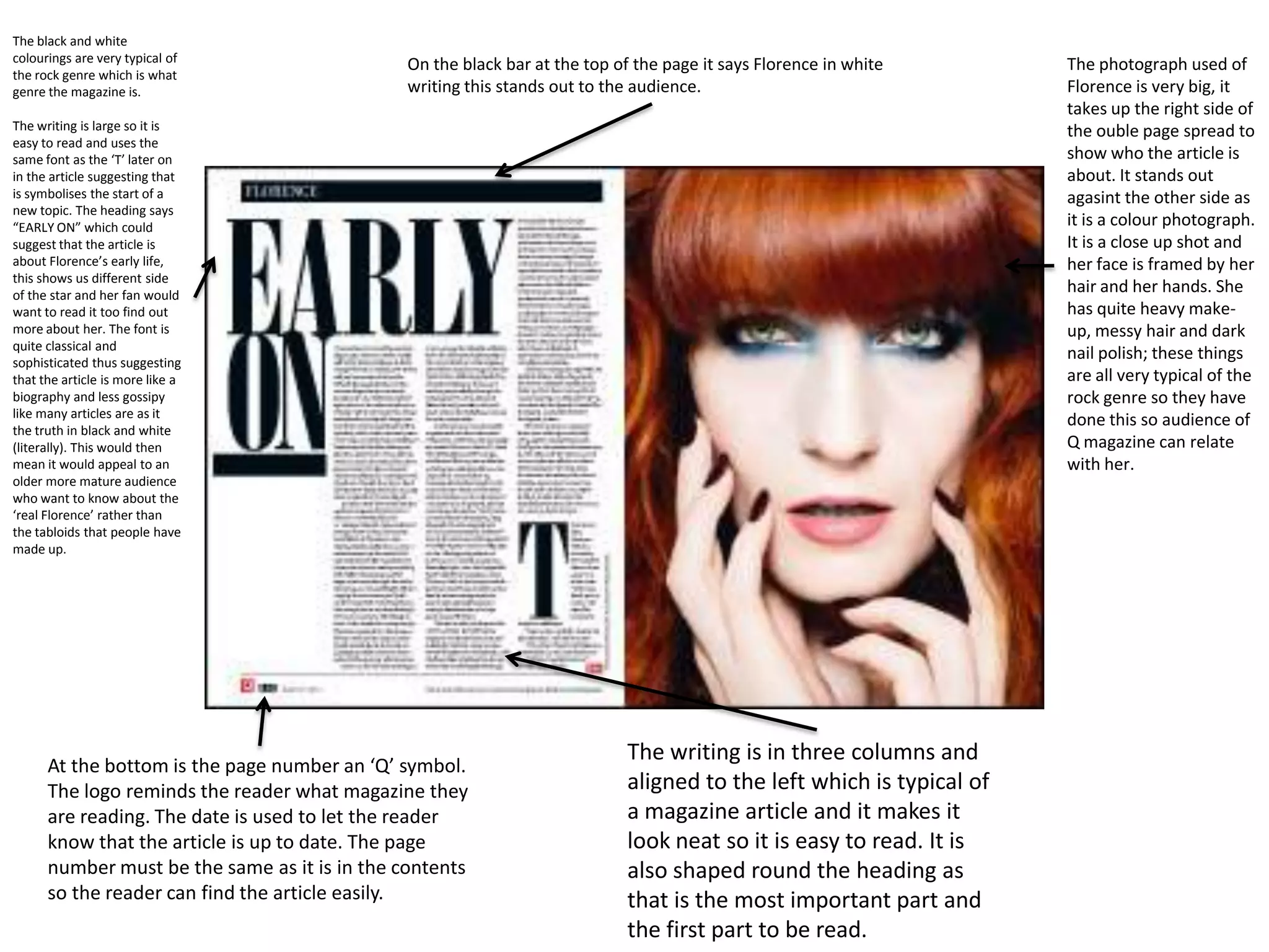
The masthead is in the top third of the magazine. It is also
   dominant of the page but does not cover the cover images
   midshot. Because this is an established magazine editors can
   slightly distort the view of ‘vibe’ as the audience will already                                                  The header that has been used on this
   know the magazine. The masthead is in big bold capital                                                            magazine states that inside there is ‘exclusive’
   letters, it is blue standing against an off white greyish back                                                    news. The word exclusive has been put in pint
   ground which makes it stand out it is surrounded by colours
   that make it stand out like the pink and black. The masthead
                                                                                                                     to stand out and the word ‘Notorious’ is in
   is placed at the top of the magazine this conforms to usual                                                       blue and in italics as it is the name of a film.
   magazine conventions because the magazine is usually                                                              This catches the readers attention and makes
   stacked this was so in the shops it is easy to recognise.                                                         them feel special because they’re getting
The colour pink is used for the main cover line and                                                                  something ‘exclusive’.
compliments the blue, grey and black surrounding
it. The use of capitalisation is used throughout the                                                                 The sell lines are very short and snappy
magazine cover and the large font used on this                                                                       following the colours of pink, black and blue.
particular cover line makes it stand out showing                                                                     They tell the audience what articles are going
readers it’s the main cove line. It is used to tell the                                                              to inside the magazine.
audience who the main image is about and
describe the main story to the audience. Under the
cover line is a smaller pull quote from the inside                                                                   By using the rule of and putting Kanye
article in which Kanye is saying ‘I AM RAP’ this is a                                                                West’s head in the centre of the magazine
contrast to the pink writing and is in blue. It also                                                                 it makes appear to be the main focus of
gives the audience an indication of what genre this                                                                  the magazine.
issue of the magazine is about.
                                                                                                                       The background used is plain which
The close up of the rapper dominates the frame. He is                                                                  also suggests that the target audience
being a stereotypical rap artist and posing quite                                                                      are ‘cool’ and laid back. Editing has
arrogantly. The clothing he is wearing fits the house                                                                  been used to give West a drop
style of the magazine with his blue and grey jacket it                                                                 shadow and a glow empathising his
makes the cover look more professional. His head                                                                       presence making him look more
covers a small portion of the masthead which is an                                                                     dominating and powerful.
important part of the magazine so this could connote
that he is better and bigger than anyone else. The artist
is also looking directly at the camera thus making it
look as if he is looking at the audience making them                                                                        We learn the audience of this magazine
feel part of something which associates with the need                                                                       is in to rap music from various things on
for affiliation humans have.
                                                                                                                            the cover for example ‘I AM RAP’ quote
                                                                      The house style is the same throughout                from Kanye and the rap institution at
                                                                      the magazine. It consists of three different          the bottom.
                                                                      colours; Pink, Blue and black. This could
                                                                      show that the audience is modern,
                                                                      minimalistic and sophisticated.
NME title is in block capitals and stands out
    against the black and white picture. This draws
the readers attention to the magazine because of
    the contrast between black white and red. This
  title also sets the house style as it is red and the                                                                           The header displays to the reader some of the
        colours in this issue the colours are red and                                                                            content of the magazine. In this case it’s ‘Nirvana
     yellow along with black and white. This title is                                                                            unseen pictures’ the use of red and yellow catches
    also in the first third of the magazine cover this                                                                           the readers attention as these are complimentary
      conforms to the typical aspects of a magazine                                                                              colours. The contrast between the yellow and the
             and it allows the reader to see the title                                                                           red of the title makes our attention go from the
 instantaneously. Having the title in the first third                                                                            header to the masthead then to the cover photo
 and having it dominant on the cover attracts the                                                                                keeping our eye line on the page. Nirvana are also
                                    readers attention.                                                                           a very popular band and are well known
                                                                                                                                 throughout the world. So even if some people
                                                                                                                                 don’t buy this magazine this would influence them
    The dateline and the price is located                                                                                        to buy it because of the ‘exclusive’ pictures. Which
 under the title. At £2.40 this magazine                                                                                         makes the consumer feel like they are getting
is in the higher price range so the price                                                                                        something special .
   is not advertised towards customers.
         However being at £2.40 it’s still
     affordable for younger people with
                                                                                                                                   The two pictures displayed are used
        pocket money and working class
                                                                                                                                   as a teaser. The audience will see
    people. The date is also printed here
                                                                                                                                   these photos and believe that there
    to show the audience what date this
                                                                                                                                   are more inside. Because these
                  issue was released on.
                                                                                                                                   pictures are ‘exclusive’ people are
                                                                                                                                   not likely to see them so they are
          This red puff stands out from the black                                                                                  more influenced toward buying the
             and white background this makes it                                                                                    magazine.
        attract the viewers attention it is also in
          the first third of the magazine cover so                                                                               Cover image is a medium close
      when the magazines are stacked in shops                                                                                    up shot. The image is edited to
     the reader will have their attention drawn                                                                                  give it a black and white effect
           to this. The puff also has a per cent of                                                                              gives it a more sophisticated
          transparency so the cover image is still                                                                               appearance. The cover star –
     visible beneath the puff. The yellow cover                                                                                  Jake Bugg – is looking directly at
             line also stands out and the red and                                                                                the camera which makes the
         yellow colours compliment each other.                                                                                   viewer feel as if he is directly
      Having competitions enforces the human                                                                                     looking at them thus making
               need for affiliation from Maslow’s                                                                                them feel part of something.
       Hierarchy of needs which shows humans
       as needing to feel part of something. The
       use of competitions makes the consumer
      feel as if they could be part of something.
             The cover line says ‘first ever’ which
           would make the audience feel special.

                                                                                                                                          The barcode is placed at
                                                                                                                                          the bottom so the
                                                                                                                                          consumer can buy it at
                                                         The use of the yellow colouring here makes ‘Noel Gallagher’ stand out            shops.
                                                         which attracts the audiences attention. Because Jake Bugg is a new
                                                         artist it could widen his fan base my relating him to the ex oasis
                                                         member Noel Gallagher, who is well know and re nound for his music.
                                                         This technique is used throughout the magazine cover to highlight
                                                         band or artist names in cover lines.
The masthead for Q is in the top left third of
the magazine. This differs from conventional
music magazine stereotypes as it does not go                                                     The header used is the same style as the cover
across the top fully. The masthead is also the                                                   line an is yellow so it stands out against the red
logo for ‘Q’ which establishes the magazine                                                      logo it is overlapping and the different coloured
further. It is white lettering on a red back                                                     (predominantly black) back ground. The phrase
ground making the letter ‘Q’ stand out from                                                      ‘2011 reviewed’ makes the reader think they
the red and it also draws the readers                                                            don’t know everything about Coldplay this is
attention towards the logo an thus towards                                                       firther reinforced by the ‘secrets’ adverised on
the magazine. Chris Martin’s (cover star) arm                                                    the coverline. This influences the consuer tobuy
is linking through the ‘Q’ which leads the                                                       this sothey become part of this secret and feel
                                                                                                 part of something which is a himan need.
readers eye from the ‘Q’ to the cover image
keeping their attention on the page.
                                                                                                 The cover image of Chris Martin is in the second
                                                                                                 third of the magazine anddominates this
The main cover line is on a side angle which                                                     third.The shot is a long shot and is also a motion
when read draws the readers attention                                                            shot. His hand and body is placed In the centre
towards Chris Martin (cover star) once again                                                     of the magazine but is right arm is shooting out
an keeping the audiences eyes on the page.                                                       to the left side of the front cover. The designaer
The main cover line looks as if the font has                                                     has played around with layers to make his arm
been written on the page giving it an original                                                   link throught the ‘Q’ making it look eye catching.
and special appeal. ‘Coldplay’ has been
underlined which makes it stand out more, it                                                     The other cover lines have been placed in the
is also bigger than the rest of the writing. The                                                 last third of the front cover. Main image, Chris
words ‘By Chris Martin’ suggest that he                                                          Martian is looking down at them suggesting he is
himself wrote it making the audience and fans                                                    reading them and he is also interested in the
more inclined to buy it because it is more                                                       articles. This draws the readers attention
personal. It also overlaps the main image and                                                    towards the article features.
the white writing stands out from his dark
clothing.                                                                                        The multi coloured glowing paint background
                                                                                                 relates to the Coldplay tour theme it has been
The footer at the bottom gives the reader                                                        featured on the stage, costume, instruments
                                                                                                 making it a sort of staple to Coldplay's’ persona.
more information to the reader about the
content of the magazine. It tells you other
artists included in the magazine this may
appeal to the audience because if they see an
artist they like they will want to read the        The date and barcode are placed in the
feature on said artist.                            left hand corner. This is essential for
                                                   people to keep up to date with the
                                                   different issues and be able to buy it in a
                                                   shop.
NME title is in block capitals and stands
  out against the white background. This
masthead draws the readers attention to                                                                                    The header tells you the special
    the magazine because of the contrast                                                                                   features in this issue.
   between black white and red. This title
 also sets the house style as it is red and                                                                               The cover lines lets the reader
   the colours in this issue the colours are                                                                              know what other articles are in the
   red, black and white. This title is also in                                                                            magazine. If there is a cover line on
 the first third of the magazine cover this                                                                               the cover of a magazine there must
      conforms to the typical aspects of a
                                                                                                                          be a story inside that is related to it.
 magazine and it allows the reader to see
the title instantaneously. Having the title
  in the first third and having it dominant
          on the cover attracts the readers
                                   attention.                                                                          The main image looks like the artist is
                                                                                                                       jumping out at the reader. He has a big
        The pug use gives the viewer extra
                                                                                                                       open grin smile on this face showing he is
     information which they might not get
anywhere else. The pug is red which first                                                                              friendly and happy, suggesting the story
 the house style and is also eye catching.                                                                             inside is a positive story.
 It is placed in the left third to the side of
      Dizzee Rascal which then reverts the
      readers eyes towards his head up his                                                                         The main cover line lets the reader know
     arm and back to the page through his                                                                          who he magazine is featuring and anchors
                                      thumb.                                                                       the image which makes it obvious who
                                                                                                                   the image is.
 The back ground is in graffti
 style and is part f the mise en
 scene it applys to this because
 he is a rap star.
                                                                                                                           The date and barcode are placed
                                                                                                                           in the left hand corner. This is
                                                                                                                           essential for people to keep up to
  This pull quote tells the reader why
                                                                                                                           date with the different issues and
  Dizzeeis featured in the magazine
                                                                                                                           be able to buy it in a shop. The
  and is also used like he is speaking to
                                                                                                                           price is important because if you
  the reader which makes it more
                                                                                                                           are paying around £2 for a
  personal.
                                                                                                                           magazine you will expect to have
                                                             The footer at the bottom gives the reader more                at least 80 pages.
      Dizzee Rascals face is in the left third of the        information to the reader about the content of the
      magazine and the cover image is ominate in the         magazine. It tells you other artists included in the
      second horzontal third. His arm is postitioned so it   magazine this may appeal to the audience because if
      looks like he is jumping out of the shot.              they see an artist they like they will want to read the
                                                             feature on said artist.
Editors have placed the logo behind the              It is a typical convention of a contents page in a
main image. The two lines wouldn’t be clear          magazine is to put the date near the logo or
to everyone but knowing the magazine                 masthead. This is used to show the reader
name ‘vibe’ lets the reader make the                 what issue they picked up. The date in this
connection to the two lines being a ‘V’. This        magazine is simplistic and is just a ‘1/3’
placement challenges regular conventions             meaning it’s the 1st of March.
of magazine titles by placing it in the top left
third rather than it typically going across the
                                                    ‘Features’ and ‘Fashion 'are both
top.
                                                    headings on the page. They are the only
                                                    headings on the page. And their larger
                                                    size and different font makes them
                                                    stand out against the text below them.
The by-line gives credit to the                     It also shows the reader what’s included
photographer and editor who designed this           in the magazine. The second heading
page. This lets the reader acknowledge who          ‘Fashion’ shows that although ‘Vibe’ is a
they are. It usually anchors the main image.        music magazine it has widened its
It is in small print but noticeable due to the      audience and specified its target
bold black text.                                    audience by adding in a few fashion
                                                    pages.

The contents page shows Kanye West has
been placed in the first two thirds of the         Also under the headings are the cover lines
page this could be because we read from            and the page numbers. The whole content of
left to right so our attention would be            the magazine is not written down with each
automatically drawn towards that side of           page number just the main stories the target
the page. The photo is overlapping the ‘V’ so      audience would be interested in.
your attentions is then drawn towards the
‘CONTENTS’ text and then further down the
page. A filter has been used on this page to
make everything black and white apart from
the paper heart on the right side of Kanye’s
chest. Making the heart red makes the
reader focus on that object and combined
with the woman's hand holding it could
suggest an article about his love life and          Unlike other typical magazines there is no letter
how he has ‘given his heart to a girl’. The         to the editor on the contents page. This shows
heart stands out because it of the filter and       that this magazine has a different target
the heart is the only coloured thing on the         audience and its own style.
page.
The main image is titled to the side,
this makes it more original appearance
than a dead face on image. It has also
been taken like this to make it look not                                                   The masthead ‘NME’ which is also the
more like a ‘snapshot’ that has just                                                       logo is the same colour and style as the
been printed off and stuck on. They                                                        one on the front so it links to the house
have done this because it links with                                                       style throughout out the magazine. The
the title ‘Touring Special’ and you                                                        white capital ‘Contents’ stands out
expect Polaroid-esque photos on tour.                                                      against the black backdrop and attracts
                                                                                           the readers attention.
Bands are listed down the side as an
index. They have done this so if you                                                       The date is used to let the reader know
are not interested in the front cover                                                      what issue they are on and if they are up
artist you can find your favourite artist                                                  to date.
by using this. This technique brings in
more readers as they will find it easy                                                     The headers of different sections
to find who they like. It is in red as it                                                  throughout the magazine are displayed
links with the house style of ‘NME’ and                                                    as white text with a black backdrop this
it stands out next to the black page                                                       stands out to the reader and makes it
numbers.                                                                                   clear the different sections in the
                                                                                           magazine. Then there is a brief summary
                                                                                           of what is on each page and the page
The editors introduction to the                                                            number is in red to stand out and make
magazine talks about what this issue                                                       it clear and also fit into the house style.
about. This particular one is about
‘proper British gigging’ Where they                                                        The reader can subscribe to the
have mentioned something in the                                                            magazine and it is shown that they will
article they have put the page number                                                      get the magazine cheaper which
next to the keywords for the reader to                                                     influences them to subscribe.
easily find more information.               A drop cap has been used at the beginning of
                                            the article to stand out and look good.
The main heading is
                                                                                                                                      The medium close up of
placed in the top 2
thirds of the double
                                                                                                                                      Lily Allen dominates the
page and takes up the                                                                                                                 second      page.     Her
majority of the first                                                                                                                 clothing, makeup and
page. The type of font                                                                                                                hairstyle is quite casual
headline is made so                                                                                                                   making      her      more
that it looks as if each                                                                                                              accessible to the reader.
letter has been cut out                                                                                                               This lets the reader
of     a     newspaper                                                                                                                relate to Lilly Allen and
making it look quite                                                                                                                  want to read her story.
quirky and original                                                                                                                   He clothing is also red
reflecting the artist                                                                                                                 which matches the
being talked about.                                                                                                                   house style throughout
The headline is a                                                                                                                     NME and the red
quote from Lilly Allen                                                                                                                clothing and black hair
which      grabs     the                                                                                                              stand out against the
readers attention and                                                                                                                 off-white back ground.
makes them want to
read more.

The by-line anchors
the headline. This
gives the designer of
the writing credit.

There are 3 different
types of font used
throughout out this
page. They vary both
serif and sans serif are
used. The title is sans
serif and the main                                                                                                                The colour of the heading is
body of text (the                                                         The sub heading is used to give the reader a            the same of the as the
article) is serif.         The ‘NME’ logo reminds the reader what
                                                                          brief description about what the article is about.      background but stands out to
                           magazine they are reading. The date is
                                                                          It also breaks up the main heading and the              the audience because of the
                           used to let the reader know that the article
                                                                          article up so the heading stands out more and           black boxes shaped around
                           is up to date. The page number must be
                                                                          does not get lost within the article. ‘Lily Allen’ is   the letters.
                           the same as it is in the contents so the
                                                                          also in red and a different font to stand out and
                           reader can find the article easily.
                                                                          grab the readers attention.
The caption saying
    The background of                                                                                         ‘Dizzee Rascal’ Lets the
       the couble page                                                                                        reader know who the
    spread is the main                                                                                        image is in case they do
   image on the page.                                                                                         not recognise him. A
    The background is                                                                                         paint splat effect has
   graffiti on a wall an                                                                                      been sued to relate to
          Dizzee Rascal                                                                                       the main image.
      createing grafitit
     making him seem
           like a bit of a                                                                                    The Byline gives credit
       rebel.The grafiti
                                                                                                              to the photographer.
creates a personalitly
     for the page. The
      main image is of
    Dizzee Rascal. The
     mediumlong shot                                                                                          The sub heading is used
ominates the left half                                                                                        to give the reader a brief
of the page. The style                                                                                        description about what
of this image gives us                                                                                        the article is about. It also
         an idea of the                                                                                       breaks up the main
 environment and let                                                                                          heading and the article
             you see the                                                                                      up so the heading stands
     expression on his                                                                                        out more and does not
  face. It lets us know                                                                                       get lost within the article
   more Dizzee Rascal
 before they read the
                  article.                                                                                    The main headline is a
                                                                                                              play on words to the
                             The copy uses drop texts to make it clear                                        saying ‘Rages to riches’
                             when the article starts.                                                         by using the word ‘tags’
                                                                                                              which is something
                                                      The article is in four       The beer bottles and       graffiti artists are known
                                                      columns and wraps around     radio shows interests of   for gives you an idea
                                                      the radio making the radio   Dizzee Rascal and could    what the article will be
                                                      and stand out more and not   make the audience relate   about e.g. Dizzee rise to
                                                      get lost in the text.        to them.                   fame.
The black and white
colourings are very typical of
                                               On the black bar at the top of the page it says Florence in white       The photograph used of
the rock genre which is what
genre the magazine is.                         writing this stands out to the audience.                                Florence is very big, it
                                                                                                                       takes up the right side of
The writing is large so it is                                                                                          the ouble page spread to
easy to read and uses the
same font as the ‘T’ later on                                                                                          show who the article is
in the article suggesting that                                                                                         about. It stands out
is symbolises the start of a                                                                                           agasint the other side as
new topic. The heading says
“EARLY ON” which could                                                                                                 it is a colour photograph.
suggest that the article is                                                                                            It is a close up shot and
about Florence’s early life,                                                                                           her face is framed by her
this shows us different side
of the star and her fan would
                                                                                                                       hair and her hands. She
want to read it too find out                                                                                           has quite heavy make-
more about her. The font is                                                                                            up, messy hair and dark
quite classical and
sophisticated thus suggesting
                                                                                                                       nail polish; these things
that the article is more like a                                                                                        are all very typical of the
biography and less gossipy                                                                                             rock genre so they have
like many articles are as it
                                                                                                                       done this so audience of
the truth in black and white
(literally). This would then                                                                                           Q magazine can relate
mean it would appeal to an                                                                                             with her.
older more mature audience
who want to know about the
‘real Florence’ rather than
the tabloids that people have
made up.


                                                                             The writing is in three columns and
      At the bottom is the page number an ‘Q’ symbol.
      The logo reminds the reader what magazine they                         aligned to the left which is typical of
      are reading. The date is used to let the reader                        a magazine article and it makes it
      know that the article is up to date. The page                          look neat so it is easy to read. It is
      number must be the same as it is in the contents                       also shaped round the heading as
      so the reader can find the article easily.                             that is the most important part and
                                                                             the first part to be read.

Media magazine analysis

  • 1.
    The masthead isin the top third of the magazine. It is also dominant of the page but does not cover the cover images midshot. Because this is an established magazine editors can slightly distort the view of ‘vibe’ as the audience will already The header that has been used on this know the magazine. The masthead is in big bold capital magazine states that inside there is ‘exclusive’ letters, it is blue standing against an off white greyish back news. The word exclusive has been put in pint ground which makes it stand out it is surrounded by colours that make it stand out like the pink and black. The masthead to stand out and the word ‘Notorious’ is in is placed at the top of the magazine this conforms to usual blue and in italics as it is the name of a film. magazine conventions because the magazine is usually This catches the readers attention and makes stacked this was so in the shops it is easy to recognise. them feel special because they’re getting The colour pink is used for the main cover line and something ‘exclusive’. compliments the blue, grey and black surrounding it. The use of capitalisation is used throughout the The sell lines are very short and snappy magazine cover and the large font used on this following the colours of pink, black and blue. particular cover line makes it stand out showing They tell the audience what articles are going readers it’s the main cove line. It is used to tell the to inside the magazine. audience who the main image is about and describe the main story to the audience. Under the cover line is a smaller pull quote from the inside By using the rule of and putting Kanye article in which Kanye is saying ‘I AM RAP’ this is a West’s head in the centre of the magazine contrast to the pink writing and is in blue. It also it makes appear to be the main focus of gives the audience an indication of what genre this the magazine. issue of the magazine is about. The background used is plain which The close up of the rapper dominates the frame. He is also suggests that the target audience being a stereotypical rap artist and posing quite are ‘cool’ and laid back. Editing has arrogantly. The clothing he is wearing fits the house been used to give West a drop style of the magazine with his blue and grey jacket it shadow and a glow empathising his makes the cover look more professional. His head presence making him look more covers a small portion of the masthead which is an dominating and powerful. important part of the magazine so this could connote that he is better and bigger than anyone else. The artist is also looking directly at the camera thus making it look as if he is looking at the audience making them We learn the audience of this magazine feel part of something which associates with the need is in to rap music from various things on for affiliation humans have. the cover for example ‘I AM RAP’ quote The house style is the same throughout from Kanye and the rap institution at the magazine. It consists of three different the bottom. colours; Pink, Blue and black. This could show that the audience is modern, minimalistic and sophisticated.
  • 2.
    NME title isin block capitals and stands out against the black and white picture. This draws the readers attention to the magazine because of the contrast between black white and red. This title also sets the house style as it is red and the The header displays to the reader some of the colours in this issue the colours are red and content of the magazine. In this case it’s ‘Nirvana yellow along with black and white. This title is unseen pictures’ the use of red and yellow catches also in the first third of the magazine cover this the readers attention as these are complimentary conforms to the typical aspects of a magazine colours. The contrast between the yellow and the and it allows the reader to see the title red of the title makes our attention go from the instantaneously. Having the title in the first third header to the masthead then to the cover photo and having it dominant on the cover attracts the keeping our eye line on the page. Nirvana are also readers attention. a very popular band and are well known throughout the world. So even if some people don’t buy this magazine this would influence them The dateline and the price is located to buy it because of the ‘exclusive’ pictures. Which under the title. At £2.40 this magazine makes the consumer feel like they are getting is in the higher price range so the price something special . is not advertised towards customers. However being at £2.40 it’s still affordable for younger people with The two pictures displayed are used pocket money and working class as a teaser. The audience will see people. The date is also printed here these photos and believe that there to show the audience what date this are more inside. Because these issue was released on. pictures are ‘exclusive’ people are not likely to see them so they are This red puff stands out from the black more influenced toward buying the and white background this makes it magazine. attract the viewers attention it is also in the first third of the magazine cover so Cover image is a medium close when the magazines are stacked in shops up shot. The image is edited to the reader will have their attention drawn give it a black and white effect to this. The puff also has a per cent of gives it a more sophisticated transparency so the cover image is still appearance. The cover star – visible beneath the puff. The yellow cover Jake Bugg – is looking directly at line also stands out and the red and the camera which makes the yellow colours compliment each other. viewer feel as if he is directly Having competitions enforces the human looking at them thus making need for affiliation from Maslow’s them feel part of something. Hierarchy of needs which shows humans as needing to feel part of something. The use of competitions makes the consumer feel as if they could be part of something. The cover line says ‘first ever’ which would make the audience feel special. The barcode is placed at the bottom so the consumer can buy it at The use of the yellow colouring here makes ‘Noel Gallagher’ stand out shops. which attracts the audiences attention. Because Jake Bugg is a new artist it could widen his fan base my relating him to the ex oasis member Noel Gallagher, who is well know and re nound for his music. This technique is used throughout the magazine cover to highlight band or artist names in cover lines.
  • 3.
    The masthead forQ is in the top left third of the magazine. This differs from conventional music magazine stereotypes as it does not go The header used is the same style as the cover across the top fully. The masthead is also the line an is yellow so it stands out against the red logo for ‘Q’ which establishes the magazine logo it is overlapping and the different coloured further. It is white lettering on a red back (predominantly black) back ground. The phrase ground making the letter ‘Q’ stand out from ‘2011 reviewed’ makes the reader think they the red and it also draws the readers don’t know everything about Coldplay this is attention towards the logo an thus towards firther reinforced by the ‘secrets’ adverised on the magazine. Chris Martin’s (cover star) arm the coverline. This influences the consuer tobuy is linking through the ‘Q’ which leads the this sothey become part of this secret and feel part of something which is a himan need. readers eye from the ‘Q’ to the cover image keeping their attention on the page. The cover image of Chris Martin is in the second third of the magazine anddominates this The main cover line is on a side angle which third.The shot is a long shot and is also a motion when read draws the readers attention shot. His hand and body is placed In the centre towards Chris Martin (cover star) once again of the magazine but is right arm is shooting out an keeping the audiences eyes on the page. to the left side of the front cover. The designaer The main cover line looks as if the font has has played around with layers to make his arm been written on the page giving it an original link throught the ‘Q’ making it look eye catching. and special appeal. ‘Coldplay’ has been underlined which makes it stand out more, it The other cover lines have been placed in the is also bigger than the rest of the writing. The last third of the front cover. Main image, Chris words ‘By Chris Martin’ suggest that he Martian is looking down at them suggesting he is himself wrote it making the audience and fans reading them and he is also interested in the more inclined to buy it because it is more articles. This draws the readers attention personal. It also overlaps the main image and towards the article features. the white writing stands out from his dark clothing. The multi coloured glowing paint background relates to the Coldplay tour theme it has been The footer at the bottom gives the reader featured on the stage, costume, instruments making it a sort of staple to Coldplay's’ persona. more information to the reader about the content of the magazine. It tells you other artists included in the magazine this may appeal to the audience because if they see an artist they like they will want to read the The date and barcode are placed in the feature on said artist. left hand corner. This is essential for people to keep up to date with the different issues and be able to buy it in a shop.
  • 4.
    NME title isin block capitals and stands out against the white background. This masthead draws the readers attention to The header tells you the special the magazine because of the contrast features in this issue. between black white and red. This title also sets the house style as it is red and The cover lines lets the reader the colours in this issue the colours are know what other articles are in the red, black and white. This title is also in magazine. If there is a cover line on the first third of the magazine cover this the cover of a magazine there must conforms to the typical aspects of a be a story inside that is related to it. magazine and it allows the reader to see the title instantaneously. Having the title in the first third and having it dominant on the cover attracts the readers attention. The main image looks like the artist is jumping out at the reader. He has a big The pug use gives the viewer extra open grin smile on this face showing he is information which they might not get anywhere else. The pug is red which first friendly and happy, suggesting the story the house style and is also eye catching. inside is a positive story. It is placed in the left third to the side of Dizzee Rascal which then reverts the readers eyes towards his head up his The main cover line lets the reader know arm and back to the page through his who he magazine is featuring and anchors thumb. the image which makes it obvious who the image is. The back ground is in graffti style and is part f the mise en scene it applys to this because he is a rap star. The date and barcode are placed in the left hand corner. This is essential for people to keep up to This pull quote tells the reader why date with the different issues and Dizzeeis featured in the magazine be able to buy it in a shop. The and is also used like he is speaking to price is important because if you the reader which makes it more are paying around £2 for a personal. magazine you will expect to have The footer at the bottom gives the reader more at least 80 pages. Dizzee Rascals face is in the left third of the information to the reader about the content of the magazine and the cover image is ominate in the magazine. It tells you other artists included in the second horzontal third. His arm is postitioned so it magazine this may appeal to the audience because if looks like he is jumping out of the shot. they see an artist they like they will want to read the feature on said artist.
  • 5.
    Editors have placedthe logo behind the It is a typical convention of a contents page in a main image. The two lines wouldn’t be clear magazine is to put the date near the logo or to everyone but knowing the magazine masthead. This is used to show the reader name ‘vibe’ lets the reader make the what issue they picked up. The date in this connection to the two lines being a ‘V’. This magazine is simplistic and is just a ‘1/3’ placement challenges regular conventions meaning it’s the 1st of March. of magazine titles by placing it in the top left third rather than it typically going across the ‘Features’ and ‘Fashion 'are both top. headings on the page. They are the only headings on the page. And their larger size and different font makes them stand out against the text below them. The by-line gives credit to the It also shows the reader what’s included photographer and editor who designed this in the magazine. The second heading page. This lets the reader acknowledge who ‘Fashion’ shows that although ‘Vibe’ is a they are. It usually anchors the main image. music magazine it has widened its It is in small print but noticeable due to the audience and specified its target bold black text. audience by adding in a few fashion pages. The contents page shows Kanye West has been placed in the first two thirds of the Also under the headings are the cover lines page this could be because we read from and the page numbers. The whole content of left to right so our attention would be the magazine is not written down with each automatically drawn towards that side of page number just the main stories the target the page. The photo is overlapping the ‘V’ so audience would be interested in. your attentions is then drawn towards the ‘CONTENTS’ text and then further down the page. A filter has been used on this page to make everything black and white apart from the paper heart on the right side of Kanye’s chest. Making the heart red makes the reader focus on that object and combined with the woman's hand holding it could suggest an article about his love life and Unlike other typical magazines there is no letter how he has ‘given his heart to a girl’. The to the editor on the contents page. This shows heart stands out because it of the filter and that this magazine has a different target the heart is the only coloured thing on the audience and its own style. page.
  • 6.
    The main imageis titled to the side, this makes it more original appearance than a dead face on image. It has also been taken like this to make it look not The masthead ‘NME’ which is also the more like a ‘snapshot’ that has just logo is the same colour and style as the been printed off and stuck on. They one on the front so it links to the house have done this because it links with style throughout out the magazine. The the title ‘Touring Special’ and you white capital ‘Contents’ stands out expect Polaroid-esque photos on tour. against the black backdrop and attracts the readers attention. Bands are listed down the side as an index. They have done this so if you The date is used to let the reader know are not interested in the front cover what issue they are on and if they are up artist you can find your favourite artist to date. by using this. This technique brings in more readers as they will find it easy The headers of different sections to find who they like. It is in red as it throughout the magazine are displayed links with the house style of ‘NME’ and as white text with a black backdrop this it stands out next to the black page stands out to the reader and makes it numbers. clear the different sections in the magazine. Then there is a brief summary of what is on each page and the page The editors introduction to the number is in red to stand out and make magazine talks about what this issue it clear and also fit into the house style. about. This particular one is about ‘proper British gigging’ Where they The reader can subscribe to the have mentioned something in the magazine and it is shown that they will article they have put the page number get the magazine cheaper which next to the keywords for the reader to influences them to subscribe. easily find more information. A drop cap has been used at the beginning of the article to stand out and look good.
  • 7.
    The main headingis The medium close up of placed in the top 2 thirds of the double Lily Allen dominates the page and takes up the second page. Her majority of the first clothing, makeup and page. The type of font hairstyle is quite casual headline is made so making her more that it looks as if each accessible to the reader. letter has been cut out This lets the reader of a newspaper relate to Lilly Allen and making it look quite want to read her story. quirky and original He clothing is also red reflecting the artist which matches the being talked about. house style throughout The headline is a NME and the red quote from Lilly Allen clothing and black hair which grabs the stand out against the readers attention and off-white back ground. makes them want to read more. The by-line anchors the headline. This gives the designer of the writing credit. There are 3 different types of font used throughout out this page. They vary both serif and sans serif are used. The title is sans serif and the main The colour of the heading is body of text (the The sub heading is used to give the reader a the same of the as the article) is serif. The ‘NME’ logo reminds the reader what brief description about what the article is about. background but stands out to magazine they are reading. The date is It also breaks up the main heading and the the audience because of the used to let the reader know that the article article up so the heading stands out more and black boxes shaped around is up to date. The page number must be does not get lost within the article. ‘Lily Allen’ is the letters. the same as it is in the contents so the also in red and a different font to stand out and reader can find the article easily. grab the readers attention.
  • 8.
    The caption saying The background of ‘Dizzee Rascal’ Lets the the couble page reader know who the spread is the main image is in case they do image on the page. not recognise him. A The background is paint splat effect has graffiti on a wall an been sued to relate to Dizzee Rascal the main image. createing grafitit making him seem like a bit of a The Byline gives credit rebel.The grafiti to the photographer. creates a personalitly for the page. The main image is of Dizzee Rascal. The mediumlong shot The sub heading is used ominates the left half to give the reader a brief of the page. The style description about what of this image gives us the article is about. It also an idea of the breaks up the main environment and let heading and the article you see the up so the heading stands expression on his out more and does not face. It lets us know get lost within the article more Dizzee Rascal before they read the article. The main headline is a play on words to the The copy uses drop texts to make it clear saying ‘Rages to riches’ when the article starts. by using the word ‘tags’ which is something The article is in four The beer bottles and graffiti artists are known columns and wraps around radio shows interests of for gives you an idea the radio making the radio Dizzee Rascal and could what the article will be and stand out more and not make the audience relate about e.g. Dizzee rise to get lost in the text. to them. fame.
  • 9.
    The black andwhite colourings are very typical of On the black bar at the top of the page it says Florence in white The photograph used of the rock genre which is what genre the magazine is. writing this stands out to the audience. Florence is very big, it takes up the right side of The writing is large so it is the ouble page spread to easy to read and uses the same font as the ‘T’ later on show who the article is in the article suggesting that about. It stands out is symbolises the start of a agasint the other side as new topic. The heading says “EARLY ON” which could it is a colour photograph. suggest that the article is It is a close up shot and about Florence’s early life, her face is framed by her this shows us different side of the star and her fan would hair and her hands. She want to read it too find out has quite heavy make- more about her. The font is up, messy hair and dark quite classical and sophisticated thus suggesting nail polish; these things that the article is more like a are all very typical of the biography and less gossipy rock genre so they have like many articles are as it done this so audience of the truth in black and white (literally). This would then Q magazine can relate mean it would appeal to an with her. older more mature audience who want to know about the ‘real Florence’ rather than the tabloids that people have made up. The writing is in three columns and At the bottom is the page number an ‘Q’ symbol. The logo reminds the reader what magazine they aligned to the left which is typical of are reading. The date is used to let the reader a magazine article and it makes it know that the article is up to date. The page look neat so it is easy to read. It is number must be the same as it is in the contents also shaped round the heading as so the reader can find the article easily. that is the most important part and the first part to be read.