Download to read offline
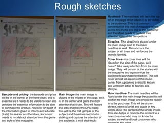
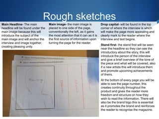
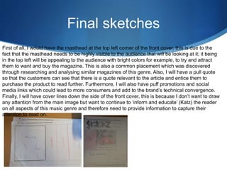

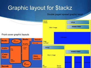


The document provides rough sketches and plans for the layout of a magazine cover. It discusses placing the masthead, strapline, cover lines, main image, main headline, barcode, and pricing in specific areas of the cover to direct attention and convey important information to readers. The main image is centered to gain the most attention, while the cover lines are on the side so as not to take away from the image. Placement of elements needs to inform and educate readers without being distracting.


