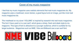
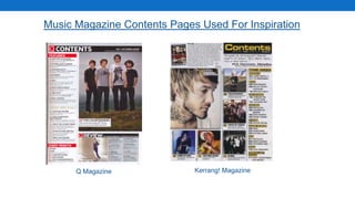
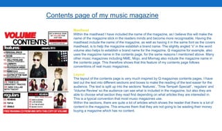
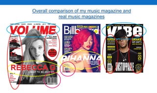
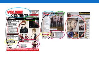
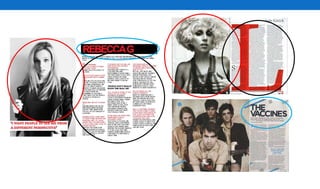
My music magazine uses and develops conventions of real music magazines in several ways:
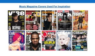
1. It includes elements like mastheads, layouts, images and text found in magazines like Vibe and Q.
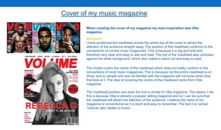
2. The cover uses a masthead, cover lines and main story similar to Vibe.
3. Inside, the contents page and double-page interview follow conventions for formatting and layout seen in Q and NME.
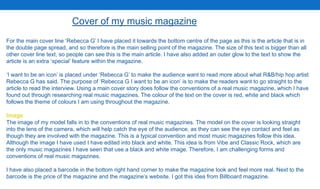
However, it also challenges some conventions by using a black-and-white cover image and multiple smaller images on the contents page rather than one large image. Overall, the magazine draws heavily on researched conventions but puts its own spin in a few key areas of design and visual