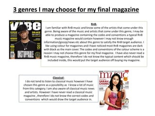
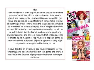
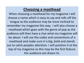
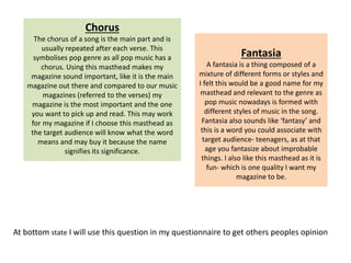
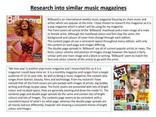
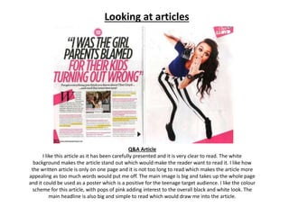
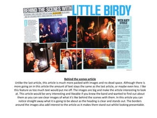
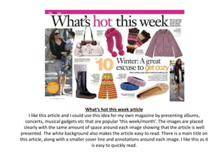
TASK 5
3 genres I may choose for my final magazine
RnB-
I am familiar with RnB music and know some of the artists that come under this
genre. Being aware of the music and artists that come under this genre, I may be
able to produce a magazine containing the codes and conventions a typical RnB
music magazine would contain however I may not know enough
information/gossip/news etc about this genre to satisfy the RnB target audience. I
like using colour for magazines and I have noticed most RnB magazines are dark
with black as the main cover. The codes and conventions of the colour scheme is a
reason I may not choose this genre for my final magazine. I have also never read a
RnB music magazine, therefore I do not know the typical content which should be
included inside, this would put the target audience off buying my magazine.
Classical-
I do not tend to listen to classical music however I have
chosen this genre as a possibility as I know a lot of music
from this category. I am also aware of classical music news
and artists. However I have never read a classical music
magazine , therefore I do not know the correct codes and
conventions which would draw the target audience in.
Pop-
I am very familiar with pop music and it would be the first
genre of music I would choose to listen to. I am aware
about pop music, artists and what is going on within the
news and gossip, so would feel most comfortable writing
about this genre as I know what the target audience would
be interested in. I have read pop music magazines before
so I would know the codes and conventions that should be
included. I also like the layout and presentation of pop
music magazines and this is a strength that encourages me
to create a pop magazine. Pop music is a popular genre as
research shows purchases of pop magazines is very high
compared to other genres like Latin, jazz etc.
I have decided on creating a pop music magazine for my
final magazine as I am interested in this genre and know a
lot about it to provide appropriate content for the target
audience.
Choosing a masthead
When choosing a masthead for my magazine I will
choose a name which is easy to say and rolls off the
tongue as the audience may be more inclined to
remember my magazine this way. I will also choose a
masthead which goes with the genre of pop as the
audience will then have a clue what my magazine will
be about. I will use the codes and conventions of a
masthead and make sure it is big, bold and stands
out to catch peoples attention. I will position it at the
top of my magazine as this may be the first feature
the audience are drawn to.
Harmonise
Harmonise is a word you associate with music and I
thought it would be good for my magazine as people
would straight away know it is a music magazine. The
word ‘harmonise’ can be used to be in agreement in
action, sense of feeling and I like this definition for my
magazine as the target audience will be reading my
magazine in an unity. You can associate ‘harmonise’
with pop music as it means adding notes to make a
harmony- which is what pop music does. My target
audience age will also understand this word and be
able to say it easily.
Fusion
The word fusion is the process of
joining two or more things
together to form a single entity. I
thought this would be a good
name for my magazine as I will be
joining different kinds of content
together e.g. news about new
albums, gossip about artists and
headlines from tours, this creates
a fusion as different topics will be
put together in my magazine. I
also think the word ‘fusion’
symbolises pop music as it makes
people think of a ‘mix-up’, which
is what popular music is-mixing
different beats and tunes
together. I also like the word as it
is fun, short and snappy.
Melody
I liked this possible masthead as ‘melody’ is musically
related and the word itself is simple with a ring to it
and would stick in the audiences head. A melody is a
sequence of single notes that is musically satisfying
and I thought this would work well as my magazine
will be satisfying to the target audience. ‘Melody’ fits
into the pop genre as a sequence of single notes is
found in pop music.
At bottom state I will use this question in my questionnaire to get others peoples opinion
Chorus
The chorus of a song is the main part and is
usually repeated after each verse. This
symbolises pop genre as all pop music has a
chorus. Using this masthead makes my
magazine sound important, like it is the main
magazine out there and compared to our music
magazines (referred to the verses) my
magazine is the most important and the one
you want to pick up and read. This may work
for my magazine if I choose this masthead as
the target audience will know what the word
means and may buy it because the name
signifies its significance.
Fantasia
A fantasia is a thing composed of a
mixture of different forms or styles and
I felt this would be a good name for my
masthead and relevant to the genre as
pop music nowadays is formed with
different styles of music in the song.
Fantasia also sounds like ‘fantasy’ and
this is a word you could associate with
target audience- teenagers, as at that
age you fantasize about improbable
things. I also like this masthead as it is
fun- which is one quality I want my
magazine to be.
Choosing my masthead font and colour
Once I have chosen the name for my
masthead I then need to choose a font and
colour. The font should be big and bold and
this is a convention in most magazines to
make the magazine stand out and be easy to
identify. A convention of the colour scheme is
that the masthead should go with the genre
of the magazine so the target audience have a
clue who the magazine is aimed at.
I have chosen this font because it is big and bold
and this fits the codes and conventions of a
masthead on a magazine. The spacing between
each letter is not too far apart or too close
together, which makes the word easy to
understand and identify. The lettering is simple
block letters and the word runs in one height
which makes it recognisable and easy for my
target audience to read when positioned on my
magazine.
Instead of black and white- bright colours are associated with pop music and this is one of the
reasons I am going to use a colour for my masthead. Pop music is fun and popular so I will use a
colour that stands out and goes with the overall look of my magazine. As my target audience is
aimed at girls from the age of 15-18 I will not use a bright pink as this is associated with younger girls
and therefore may put off my older target audience. I am going to use a teal blue for my masthead
as I feel this colour is feminine and symbolises female teenagers, however it is not too girly to put
the older teenage target audience off buying the magazine. Teal blue is a colour that goes with most
colours so I can be sure my magazine will work well, choosing a standard colour like this, I can also
be sure it will be popular and therefore symbolise the pop genre.
On my masthead I am going to include
heart symbols around the ‘U’ and the ‘O’.
These will be the same colour as the
masthead so they are shown as part of the
masthead and logo. Hearts are an icon
which symbolise femininity and detail on
m masthead will draw my girl target
audience in as they will recognise that the
magazine is for females.
Research into similar music magazines
Billboard is an international weekly music magazine focusing on chart music and
artists which are popular at the time. I have chosen to research this magazine as it is
a pop magazine which is what I will be using for my magazine.
The front covers all consist of the ‘Billboard’ masthead and a main image of a male
or female artist. Although the masthead colour and font stay the same, the
background and colours of cover lines change through each edition.
The content pages all use a consistent layout throughout every edition, with only
the content on each page and images differing.
The double page spreads in ‘Billboard’ are all of current popular artists or news. The
fonts, colour scheme and position of images change however the layout is fairly
similar with one main image and a block or writing. ‘Billboard’ seem to match the
font and colour scheme of the article to go with the artist.
‘We love pop’ is another pop music magazine and I researched this as it is a
magazine I could base mine on. It is a monthly magazine and ranges from a target
audience of 13-15 year olds. As well as being a music magazine, the content also
ranges from fashion, beauty, films and technology. From my research I have
noticed that all the front covers are jam packed with images of artists, big bubbly
writing and things to give away. The front covers are presented with lots of bright
colour and no dead space, they are generally exciting and draw the reader in. The
contents page and double page spreads do the same and contain lots of bright
colours and lots of images. The contents page seems to be consistent with a
consistent layout of what's on what page, whereas the double page spreads are
all mainly laid out differently, however still showing a consistent theme of bright
colour and images.
Looking at articles
Q&A Article
I like this article as it has been carefully presented and it is very clear to read. The white
background makes the article stand out which would make the reader want to read it. I like how
the written article is only on one page and it is not too long to read which makes the article more
appealing as too much words would put me off. The main image is big and takes up the whole page
and it could be used as a poster which is a positive for the teenage target audience. I like the colour
scheme for this article, with pops of pink adding interest to the overall black and white look. The
main headline is also big and simple to read which would draw me into the article.
Behind the scenes article
Unlike the last article, this article is much more packed with images and no dead space. Although there is
more going on in this article the amount of text stays the same as the last article, or maybe even less. I like
this feature as too much text would put me off. The images are big and make the article interesting to look
at. This article would be very interesting and likeable if you knew the band and wanted to find out about
them as you can see clear images of what it’s like behind the scenes with them. In this article you can
notice straight away what it is going to be about as the heading is clear and stands out. The borders
around the images also add interest to the article as it makes them stand out whilst looking presentable.
What’s hot this week article
I like this article and I could use this idea for my own magazine by presenting albums,
concerts, musical gadgets etc that are popular ‘this week/month’. The images are placed
clearly with the same amount of space around each image showing that the article is well
presented. The white background also makes the article easy to read. There is a main title on
this article, along with a smaller cover line and annotations around each image. I like this as it
is easy to quickly read.

Task 5

  • 1.
  • 2.
    3 genres Imay choose for my final magazine RnB- I am familiar with RnB music and know some of the artists that come under this genre. Being aware of the music and artists that come under this genre, I may be able to produce a magazine containing the codes and conventions a typical RnB music magazine would contain however I may not know enough information/gossip/news etc about this genre to satisfy the RnB target audience. I like using colour for magazines and I have noticed most RnB magazines are dark with black as the main cover. The codes and conventions of the colour scheme is a reason I may not choose this genre for my final magazine. I have also never read a RnB music magazine, therefore I do not know the typical content which should be included inside, this would put the target audience off buying my magazine. Classical- I do not tend to listen to classical music however I have chosen this genre as a possibility as I know a lot of music from this category. I am also aware of classical music news and artists. However I have never read a classical music magazine , therefore I do not know the correct codes and conventions which would draw the target audience in.
  • 3.
    Pop- I am veryfamiliar with pop music and it would be the first genre of music I would choose to listen to. I am aware about pop music, artists and what is going on within the news and gossip, so would feel most comfortable writing about this genre as I know what the target audience would be interested in. I have read pop music magazines before so I would know the codes and conventions that should be included. I also like the layout and presentation of pop music magazines and this is a strength that encourages me to create a pop magazine. Pop music is a popular genre as research shows purchases of pop magazines is very high compared to other genres like Latin, jazz etc. I have decided on creating a pop music magazine for my final magazine as I am interested in this genre and know a lot about it to provide appropriate content for the target audience.
  • 4.
    Choosing a masthead Whenchoosing a masthead for my magazine I will choose a name which is easy to say and rolls off the tongue as the audience may be more inclined to remember my magazine this way. I will also choose a masthead which goes with the genre of pop as the audience will then have a clue what my magazine will be about. I will use the codes and conventions of a masthead and make sure it is big, bold and stands out to catch peoples attention. I will position it at the top of my magazine as this may be the first feature the audience are drawn to.
  • 5.
    Harmonise Harmonise is aword you associate with music and I thought it would be good for my magazine as people would straight away know it is a music magazine. The word ‘harmonise’ can be used to be in agreement in action, sense of feeling and I like this definition for my magazine as the target audience will be reading my magazine in an unity. You can associate ‘harmonise’ with pop music as it means adding notes to make a harmony- which is what pop music does. My target audience age will also understand this word and be able to say it easily. Fusion The word fusion is the process of joining two or more things together to form a single entity. I thought this would be a good name for my magazine as I will be joining different kinds of content together e.g. news about new albums, gossip about artists and headlines from tours, this creates a fusion as different topics will be put together in my magazine. I also think the word ‘fusion’ symbolises pop music as it makes people think of a ‘mix-up’, which is what popular music is-mixing different beats and tunes together. I also like the word as it is fun, short and snappy. Melody I liked this possible masthead as ‘melody’ is musically related and the word itself is simple with a ring to it and would stick in the audiences head. A melody is a sequence of single notes that is musically satisfying and I thought this would work well as my magazine will be satisfying to the target audience. ‘Melody’ fits into the pop genre as a sequence of single notes is found in pop music.
  • 6.
    At bottom stateI will use this question in my questionnaire to get others peoples opinion Chorus The chorus of a song is the main part and is usually repeated after each verse. This symbolises pop genre as all pop music has a chorus. Using this masthead makes my magazine sound important, like it is the main magazine out there and compared to our music magazines (referred to the verses) my magazine is the most important and the one you want to pick up and read. This may work for my magazine if I choose this masthead as the target audience will know what the word means and may buy it because the name signifies its significance. Fantasia A fantasia is a thing composed of a mixture of different forms or styles and I felt this would be a good name for my masthead and relevant to the genre as pop music nowadays is formed with different styles of music in the song. Fantasia also sounds like ‘fantasy’ and this is a word you could associate with target audience- teenagers, as at that age you fantasize about improbable things. I also like this masthead as it is fun- which is one quality I want my magazine to be.
  • 7.
    Choosing my mastheadfont and colour Once I have chosen the name for my masthead I then need to choose a font and colour. The font should be big and bold and this is a convention in most magazines to make the magazine stand out and be easy to identify. A convention of the colour scheme is that the masthead should go with the genre of the magazine so the target audience have a clue who the magazine is aimed at.
  • 8.
    I have chosenthis font because it is big and bold and this fits the codes and conventions of a masthead on a magazine. The spacing between each letter is not too far apart or too close together, which makes the word easy to understand and identify. The lettering is simple block letters and the word runs in one height which makes it recognisable and easy for my target audience to read when positioned on my magazine. Instead of black and white- bright colours are associated with pop music and this is one of the reasons I am going to use a colour for my masthead. Pop music is fun and popular so I will use a colour that stands out and goes with the overall look of my magazine. As my target audience is aimed at girls from the age of 15-18 I will not use a bright pink as this is associated with younger girls and therefore may put off my older target audience. I am going to use a teal blue for my masthead as I feel this colour is feminine and symbolises female teenagers, however it is not too girly to put the older teenage target audience off buying the magazine. Teal blue is a colour that goes with most colours so I can be sure my magazine will work well, choosing a standard colour like this, I can also be sure it will be popular and therefore symbolise the pop genre. On my masthead I am going to include heart symbols around the ‘U’ and the ‘O’. These will be the same colour as the masthead so they are shown as part of the masthead and logo. Hearts are an icon which symbolise femininity and detail on m masthead will draw my girl target audience in as they will recognise that the magazine is for females.
  • 9.
    Research into similarmusic magazines Billboard is an international weekly music magazine focusing on chart music and artists which are popular at the time. I have chosen to research this magazine as it is a pop magazine which is what I will be using for my magazine. The front covers all consist of the ‘Billboard’ masthead and a main image of a male or female artist. Although the masthead colour and font stay the same, the background and colours of cover lines change through each edition. The content pages all use a consistent layout throughout every edition, with only the content on each page and images differing. The double page spreads in ‘Billboard’ are all of current popular artists or news. The fonts, colour scheme and position of images change however the layout is fairly similar with one main image and a block or writing. ‘Billboard’ seem to match the font and colour scheme of the article to go with the artist. ‘We love pop’ is another pop music magazine and I researched this as it is a magazine I could base mine on. It is a monthly magazine and ranges from a target audience of 13-15 year olds. As well as being a music magazine, the content also ranges from fashion, beauty, films and technology. From my research I have noticed that all the front covers are jam packed with images of artists, big bubbly writing and things to give away. The front covers are presented with lots of bright colour and no dead space, they are generally exciting and draw the reader in. The contents page and double page spreads do the same and contain lots of bright colours and lots of images. The contents page seems to be consistent with a consistent layout of what's on what page, whereas the double page spreads are all mainly laid out differently, however still showing a consistent theme of bright colour and images.
  • 10.
    Looking at articles Q&AArticle I like this article as it has been carefully presented and it is very clear to read. The white background makes the article stand out which would make the reader want to read it. I like how the written article is only on one page and it is not too long to read which makes the article more appealing as too much words would put me off. The main image is big and takes up the whole page and it could be used as a poster which is a positive for the teenage target audience. I like the colour scheme for this article, with pops of pink adding interest to the overall black and white look. The main headline is also big and simple to read which would draw me into the article.
  • 11.
    Behind the scenesarticle Unlike the last article, this article is much more packed with images and no dead space. Although there is more going on in this article the amount of text stays the same as the last article, or maybe even less. I like this feature as too much text would put me off. The images are big and make the article interesting to look at. This article would be very interesting and likeable if you knew the band and wanted to find out about them as you can see clear images of what it’s like behind the scenes with them. In this article you can notice straight away what it is going to be about as the heading is clear and stands out. The borders around the images also add interest to the article as it makes them stand out whilst looking presentable.
  • 12.
    What’s hot thisweek article I like this article and I could use this idea for my own magazine by presenting albums, concerts, musical gadgets etc that are popular ‘this week/month’. The images are placed clearly with the same amount of space around each image showing that the article is well presented. The white background also makes the article easy to read. There is a main title on this article, along with a smaller cover line and annotations around each image. I like this as it is easy to quickly read.