The document proposes two rap/hip hop magazines called 808 and TMM. 808 would focus solely on rap artists while TMM would also include sections on grime artists. Both magazines would be monthly, cost £4.99, and have an A4 size. TMM's colors would be blue, red, and white while 808's would be black, gold, and white. The proposals provide details on target audiences, content, and production plans for the magazines.
The document provides an analysis of magazine covers and design elements. It discusses techniques used in existing magazine covers that could be applied to the student's own music magazine cover design. These include limited color schemes, positioning of mastheads, use of artist photos, and themes that appeal to target audiences. The student considers fonts, picture editing, representation of social groups, and potential media institutions for distribution.
This magazine cover targets a rock and indie music audience aged 16-29. The large red title stands out against the black background. The main image shows a band that could be featured in the main article. Additional images and text provide information on bands and articles inside the issue, including a free poster. While there is some empty space, key elements like the price and issue date are included.
The document outlines plans for a new music magazine called 808. It will target 16-35 year olds and feature hip hop and rap artists. The monthly magazine will be released for £3.99 per issue, a competitive price point. It will use a black and gold color scheme with the font "Next Ups" for the title and repeat this branding consistently throughout the publication.
The document provides an analysis and evaluation by Samantha Pople of various magazine covers in order to inform the design of her own music magazine cover. She looks at color schemes, layouts, fonts, and main images on existing covers from magazines like Q, Rolling Stone, and NME. Samantha decides on a 2-4 color scheme with contrasting colors and either bold or pastel hues. She also experiments with editing photos and choosing appropriate fonts and images for her own cover.
The document provides rough sketches and plans for the layout of a magazine cover. It discusses where different elements like the masthead, main image, cover lines, and barcode will be placed. The masthead will be in the top left to catch the reader's eye. The main image will be in the center to gain the most attention. Cover lines will be on the side to entice readers without distracting from the main image. The barcode and price will be placed inconspicuously so as not to detract from the content.
The document provides rough sketches and plans for the layout of a magazine cover. It discusses placing the masthead, strapline, cover lines, main image, main headline, barcode, and pricing in specific areas of the cover to direct attention and convey important information to readers. The main image is centered to gain the most attention, while the cover lines are on the side so as not to take away from the image. Placement of elements needs to inform and educate readers without being distracting.
The document provides layout and design details for a magazine mock-up. It discusses placing the masthead, strapline, cover lines, main image, main headline, and barcode in specific areas of the front cover to attract attention and reinforce the brand's identity. The main image is centered to gain the most attention, while cover lines are placed on the side so as not to take away from the image. Inside pages, a drop capital, stand first, page numbers and logo are discussed. Font styles, a color scheme, and masthead ideas are also proposed. Photographs are taken as test images and equipment needs are listed.
The document provides research and analysis for a magazine called "Classic Pop" focusing on 1980s music, including details on the target audience, publisher, and hand drawn drafts of the front cover and contents page to emulate the style of the magazine. Research indicates the target audience is mainly female aged 40+ who lived through the 1980s, and the publisher Anthem Publishing focuses on a variety of genres including music and food. Preliminary sketches were made of the front cover and contents page to understand how to design the magazine in Photoshop.
This document provides information on the cover of XXL magazine. It describes various elements of the cover including the masthead featuring the word "XXL" in a modern font, a mid-shot photo of successful artist Kendrick Lamar looking up, and cover lines signifying the stories covered in the issue. The main headline matches the photo of Kendrick Lamar with the heading "The Chosen One", suggesting he has achieved success through the stories he has told to XXL magazine.
The document summarizes the process of evaluating existing magazines to help design a new music magazine. Key points analyzed include covers, color schemes, fonts, photo editing, conventions, target audiences, and potential distributors. Existing magazines provided inspiration on techniques like limited color palettes, prominent mastheads, and featuring artists to represent the genre. The goal was to create an eye-catching cover that established the magazine while appealing to both male and female readers across various music interests and ages.
The document describes a student's project to create an R&B music magazine. It discusses choosing the genre and name, representing the target teenage audience, comparing conventions to existing magazines, and learning new technologies like Photoshop and InDesign in the process. Market research was conducted on publishers, with the decision to partner with IPC media due to their large reach among men and women. Questionnaires informed choosing teenagers interested in R&B music aged 15-19 from socioeconomic classes C2-E as the target demographic.
The document outlines Owen Shepherd's process for creating two magazines called "Top Dolla" and "Roll Up". It includes mood boards, proposals, graphic layouts, and production plans. The magazines will target 16-25 year olds and focus on hip hop music. They will each have 40 pages and cost £2.99 per monthly issue. Black, red, yellow and orange will feature prominently in the color schemes and designs.
The document discusses research conducted for a student's music magazine coursework project on hip hop genres. It includes an analysis of an existing hip hop magazine called Vibe and a questionnaire distributed to students aged 14-20 about their music preferences and what they want in a magazine. Key findings from the questionnaire indicated that most listeners were 14-16, listened to hip hop and R&B, and preferred gossip features in a magazine that costs £1-2.
The document provides instructions for a media coursework assignment to design the front page layout of a new school/college magazine. Students must produce the front page layout featuring a student photograph and text using desktop publishing and image editing software. They must also produce a mock-up of the contents page layout. Students will be assessed on research and planning, production, and evaluation.
The document provides instructions for a media coursework assignment to design the front page layout of a new school/college magazine. Students must produce the front page layout featuring a student photograph using desktop publishing and image editing software. They must also produce a mock-up of the contents page layout. Students will be assessed on research and planning, production, and evaluation.
The document provides information about Q magazine, a popular UK music magazine published monthly since 1986. It is published by Bauer Media Group, a large European media company. Q magazine targets music buyers aged over 25 and covers a range of pop/rock music styles from current artists. It maintains a consistent red and white color theme across issues. The target audience theories of Katz and Hartley are discussed in relation to Q magazine's readers.
The document provides production details for a coursework assignment to design the front page, contents page, and a double-page spread for a new music magazine. It outlines the tasks, which are to design the front cover featuring an image and text, a contents page layout, and a double-page article spread. It also lists the assessment criteria of research and planning, production, and evaluation. Additional pages provide definitions of magazine design elements and conventions, as well as research results from an audience survey to help inform the design of the magazine.
This document provides information about magazines published in the UK and their production companies through four paragraphs. The first paragraph introduces that many music magazines are published in the UK by a handful of large production companies that also work in other media. The following paragraphs then discuss the specific companies that publish popular music magazines like Kerrang!, Mojo, Classic Rock, Q Magazine, and Prog, providing details on their ownership and other publications.
The document provides an in-depth textual analysis of the layout, design elements, and intended audience of music magazine covers and contents pages. It analyzes elements such as the masthead, images, fonts, pull quotes, and color schemes used and discusses how they relate to the magazine's target demographic and goal of promoting music in the rock/indie genres. Key details like the placement of the magazine name and use of simple yet striking fonts and colors are examined. The intended audience is identified as people aged 18-30 interested in rock/indie music.
The document describes how a media product, a house music magazine, both conforms to and challenges conventions of real music magazines. It conforms in using typical magazine design elements like a catchy headline, straplines about content, artist photos, and informal writing for interviews. However, it challenges conventions by using oversized social media icons without account names and changing the artist's outfit on the contents page to represent the history of house music beyond stereotypes. Overall, the magazine strives to draw in new fans while representing the genre authentically.
Will is pitching two proposed rap/hip hop magazines titled "Rhythm" and "Beat". For each magazine, he discusses the genre, colors, size, price and target audience. He also presents graphic layouts for the front covers and double page spreads, including main images, mastheads, headlines, and branding. Key elements like large central images, catchy titles and consistent branding will be repeated across issues to develop house styles for each magazine.
This document provides details about Ollie Long's plans for two rap/hip-hop magazines called "ANTI" and "Major". It includes information about the target audience, which will be mainly males aged 15-45 from socioeconomic classes C1, C2, and D. Ollie also discusses the magazine layout, colors, mastheads, and includes mood boards and draft designs. The production plan outlines tasks like choosing content, conducting interviews, and incorporating photographs over a two week period.
Thomas McEnaney submitted proposals and designs for a music magazine called SHUTTERS as part of his Level 3 Cambridge Introductory Diploma in Media course at St. Andrew's Catholic School. The document includes draft front covers, a double page spread layout, and explanations of design choices such as the font, layout, cover lines, and interview format. The main focus of the double page spread would be an interview with the band The Killers about their history and future plans.
The document discusses the target audience for a music magazine. It would target mature individuals between 16-45 years old with an interest in rock/alternative music. While appealing to both genders, it is slightly more oriented towards males due to the chosen artists, color scheme, and style of articles. The wide age range is possible because the magazine covers bands that appeal to different subsets within that overall range but share a musical style. Distribution by IPC media would make sense as they already distribute a similar magazine, NME.
The document outlines the preliminary tasks, log book, and evaluation for Von Villanueva's music magazine production portfolio. It includes step-by-step explanations and evidence of creating the front cover and contents page, as well as research on music magazine genres, publishers, and conventions. The chosen genre for the magazine is R&B/hip-hop based on research of exemplar magazines like Q and Vibe.
The document describes the design and conventions used in a mock magazine cover and articles that the author created. Key points:
1. The cover uses conventions of real magazines like a masthead, barcode, date and price. It features a main image and pull quotes to entice readers.
2. The articles use an interview format with questions in red and answers in black. Main images take up space and pull quotes draw readers in.
3. The author learned skills with the text and image tools to create stylistic elements like strokes and effects to achieve a "rocky" tone fitting the genre.
This document provides information on the cover of XXL magazine. It describes various elements of the cover including the masthead featuring the word "XXL" in a modern font, a mid-shot photo of successful artist Kendrick Lamar looking up, and cover lines signifying the stories covered in the issue. The main headline matches the photo of Kendrick Lamar with the heading "The Chosen One", suggesting he has achieved success through the stories he has told to XXL magazine.
The document presents plans and ideas for two music magazines titled "Riff" and "Noise Gate", including mockups of the magazine layout, descriptions of the target audience and branding, and a production schedule. Key details covered are the proposed color schemes, fonts, article types, and timelines for acquiring content, editing, and final production of the magazines.
Here is a draft interview with Matt about his new album:
Me: Hi Matt, I heard you'll be releasing a new album to accompany your newest single. Is this true?
Matt: Yes, the album is coming out in late November. I'm excited for people to hear the full collection of songs.
Me: Your first single was such a hit. What can you tell us about the style of music on this new album?
Matt: I've decided to stick with the same style as my previous music, as that's what my fans seem to enjoy. However, I hope to experiment with different genres in the future as my career progresses.
Me: Any other projects planned for this year or
Thomas McEnaney submitted a media project for his Level 3 Cambridge Introductory Diploma in Media. He proposed creating a monthly music magazine called SHUTTERS focused on new and upcoming British bands. The magazine would be £1.50 per issue and distributed monthly. It would include band interviews, news, and free posters. McEnaney provided details on the magazine's design, including the logo, fonts, colors, and layout. He also outlined plans for photography, equipment needs, and the first issue featuring an interview with The Killers.
This document provides information on the cover of XXL magazine. It describes various elements of the cover including the masthead featuring the word "XXL" in a modern font, a mid-shot photo of successful artist Kendrick Lamar looking up, and cover lines signifying the stories covered in the issue. The main headline matches the photo of Kendrick Lamar with the heading "The Chosen One", suggesting he has achieved success through the stories he has told to XXL magazine.
The document summarizes the process of evaluating existing magazines to help design a new music magazine. Key points analyzed include covers, color schemes, fonts, photo editing, conventions, target audiences, and potential distributors. Existing magazines provided inspiration on techniques like limited color palettes, prominent mastheads, and featuring artists to represent the genre. The goal was to create an eye-catching cover that established the magazine while appealing to both male and female readers across various music interests and ages.
The document describes a student's project to create an R&B music magazine. It discusses choosing the genre and name, representing the target teenage audience, comparing conventions to existing magazines, and learning new technologies like Photoshop and InDesign in the process. Market research was conducted on publishers, with the decision to partner with IPC media due to their large reach among men and women. Questionnaires informed choosing teenagers interested in R&B music aged 15-19 from socioeconomic classes C2-E as the target demographic.
The document outlines Owen Shepherd's process for creating two magazines called "Top Dolla" and "Roll Up". It includes mood boards, proposals, graphic layouts, and production plans. The magazines will target 16-25 year olds and focus on hip hop music. They will each have 40 pages and cost £2.99 per monthly issue. Black, red, yellow and orange will feature prominently in the color schemes and designs.
The document discusses research conducted for a student's music magazine coursework project on hip hop genres. It includes an analysis of an existing hip hop magazine called Vibe and a questionnaire distributed to students aged 14-20 about their music preferences and what they want in a magazine. Key findings from the questionnaire indicated that most listeners were 14-16, listened to hip hop and R&B, and preferred gossip features in a magazine that costs £1-2.
The document provides instructions for a media coursework assignment to design the front page layout of a new school/college magazine. Students must produce the front page layout featuring a student photograph and text using desktop publishing and image editing software. They must also produce a mock-up of the contents page layout. Students will be assessed on research and planning, production, and evaluation.
The document provides instructions for a media coursework assignment to design the front page layout of a new school/college magazine. Students must produce the front page layout featuring a student photograph using desktop publishing and image editing software. They must also produce a mock-up of the contents page layout. Students will be assessed on research and planning, production, and evaluation.
The document provides information about Q magazine, a popular UK music magazine published monthly since 1986. It is published by Bauer Media Group, a large European media company. Q magazine targets music buyers aged over 25 and covers a range of pop/rock music styles from current artists. It maintains a consistent red and white color theme across issues. The target audience theories of Katz and Hartley are discussed in relation to Q magazine's readers.
The document provides production details for a coursework assignment to design the front page, contents page, and a double-page spread for a new music magazine. It outlines the tasks, which are to design the front cover featuring an image and text, a contents page layout, and a double-page article spread. It also lists the assessment criteria of research and planning, production, and evaluation. Additional pages provide definitions of magazine design elements and conventions, as well as research results from an audience survey to help inform the design of the magazine.
This document provides information about magazines published in the UK and their production companies through four paragraphs. The first paragraph introduces that many music magazines are published in the UK by a handful of large production companies that also work in other media. The following paragraphs then discuss the specific companies that publish popular music magazines like Kerrang!, Mojo, Classic Rock, Q Magazine, and Prog, providing details on their ownership and other publications.
The document provides an in-depth textual analysis of the layout, design elements, and intended audience of music magazine covers and contents pages. It analyzes elements such as the masthead, images, fonts, pull quotes, and color schemes used and discusses how they relate to the magazine's target demographic and goal of promoting music in the rock/indie genres. Key details like the placement of the magazine name and use of simple yet striking fonts and colors are examined. The intended audience is identified as people aged 18-30 interested in rock/indie music.
The document describes how a media product, a house music magazine, both conforms to and challenges conventions of real music magazines. It conforms in using typical magazine design elements like a catchy headline, straplines about content, artist photos, and informal writing for interviews. However, it challenges conventions by using oversized social media icons without account names and changing the artist's outfit on the contents page to represent the history of house music beyond stereotypes. Overall, the magazine strives to draw in new fans while representing the genre authentically.
Will is pitching two proposed rap/hip hop magazines titled "Rhythm" and "Beat". For each magazine, he discusses the genre, colors, size, price and target audience. He also presents graphic layouts for the front covers and double page spreads, including main images, mastheads, headlines, and branding. Key elements like large central images, catchy titles and consistent branding will be repeated across issues to develop house styles for each magazine.
This document provides details about Ollie Long's plans for two rap/hip-hop magazines called "ANTI" and "Major". It includes information about the target audience, which will be mainly males aged 15-45 from socioeconomic classes C1, C2, and D. Ollie also discusses the magazine layout, colors, mastheads, and includes mood boards and draft designs. The production plan outlines tasks like choosing content, conducting interviews, and incorporating photographs over a two week period.
Thomas McEnaney submitted proposals and designs for a music magazine called SHUTTERS as part of his Level 3 Cambridge Introductory Diploma in Media course at St. Andrew's Catholic School. The document includes draft front covers, a double page spread layout, and explanations of design choices such as the font, layout, cover lines, and interview format. The main focus of the double page spread would be an interview with the band The Killers about their history and future plans.
The document discusses the target audience for a music magazine. It would target mature individuals between 16-45 years old with an interest in rock/alternative music. While appealing to both genders, it is slightly more oriented towards males due to the chosen artists, color scheme, and style of articles. The wide age range is possible because the magazine covers bands that appeal to different subsets within that overall range but share a musical style. Distribution by IPC media would make sense as they already distribute a similar magazine, NME.
The document outlines the preliminary tasks, log book, and evaluation for Von Villanueva's music magazine production portfolio. It includes step-by-step explanations and evidence of creating the front cover and contents page, as well as research on music magazine genres, publishers, and conventions. The chosen genre for the magazine is R&B/hip-hop based on research of exemplar magazines like Q and Vibe.
The document describes the design and conventions used in a mock magazine cover and articles that the author created. Key points:
1. The cover uses conventions of real magazines like a masthead, barcode, date and price. It features a main image and pull quotes to entice readers.
2. The articles use an interview format with questions in red and answers in black. Main images take up space and pull quotes draw readers in.
3. The author learned skills with the text and image tools to create stylistic elements like strokes and effects to achieve a "rocky" tone fitting the genre.
This document provides information on the cover of XXL magazine. It describes various elements of the cover including the masthead featuring the word "XXL" in a modern font, a mid-shot photo of successful artist Kendrick Lamar looking up, and cover lines signifying the stories covered in the issue. The main headline matches the photo of Kendrick Lamar with the heading "The Chosen One", suggesting he has achieved success through the stories he has told to XXL magazine.
The document presents plans and ideas for two music magazines titled "Riff" and "Noise Gate", including mockups of the magazine layout, descriptions of the target audience and branding, and a production schedule. Key details covered are the proposed color schemes, fonts, article types, and timelines for acquiring content, editing, and final production of the magazines.
Here is a draft interview with Matt about his new album:
Me: Hi Matt, I heard you'll be releasing a new album to accompany your newest single. Is this true?
Matt: Yes, the album is coming out in late November. I'm excited for people to hear the full collection of songs.
Me: Your first single was such a hit. What can you tell us about the style of music on this new album?
Matt: I've decided to stick with the same style as my previous music, as that's what my fans seem to enjoy. However, I hope to experiment with different genres in the future as my career progresses.
Me: Any other projects planned for this year or
Thomas McEnaney submitted a media project for his Level 3 Cambridge Introductory Diploma in Media. He proposed creating a monthly music magazine called SHUTTERS focused on new and upcoming British bands. The magazine would be £1.50 per issue and distributed monthly. It would include band interviews, news, and free posters. McEnaney provided details on the magazine's design, including the logo, fonts, colors, and layout. He also outlined plans for photography, equipment needs, and the first issue featuring an interview with The Killers.
The document outlines plans for a proposed hip hop/rap magazine called 808. It discusses setting the price at £3.99 monthly to be competitive with similar magazines. The target audience is ages 16-35 since the genre may contain explicit lyrics. Articles and photos of popular artists will be featured each month. Advertising on social media will help promote the magazine at a low cost. Overall the proposal provides details on the magazine's concept, design, production schedule, costs, and potential for profit.
Sophie Lyne is proposing a new rock/indie and alternative music magazine called "Record". The 32-page monthly magazine would have a black and white design with some elements in red. It would feature articles on bands and artists, album and concert reviews, and photos. The target audience is 15-35 year olds, mainly male, from socio-economic classes C1, C2, and E, with a diverse ethnicity. The magazine would retail for £3.99 and compete with publications like Q, NME, and XXL magazine.
The document provides details on the design choices for two proposed magazines called Rhythm and Beat focused on hip hop music. Key points include:
- The magazines will target 15-20 year olds as hip hop appeals most to that age range.
- Rhythm will use red, white, and black colors while Beat uses white, yellow, and grey.
- Images will focus on capturing audience attention and being age appropriate.
- The magazines will be released monthly to provide recent content.
- Brand identity logos will feature on every page in bright colors.
- Potential font styles were selected that are bold, eye-catching, and suit the hip hop genre.
-
Unit 13 – LO2 Planning and Pitching a Print Based Media Product stamkostas3068
This document outlines ideas for two rap/hip-hop magazines called "NXT EP" and "313." For "NXT EP," the magazine would focus on the latest news and up-and-coming artists, reflected in its name. It would use red, black, and white colors and target 16-30 year olds. "313" would focus more on throwback stories and original rap music, represented by Detroit's area code. Both magazines would be monthly, cost £3.99, and use A4 size to fit more content. Moodboards provide visual inspiration, depicting iconic rappers for "313" and current popular artists for "NXT EP." The target audience and content are designed to attract
The document provides details about the development of two rap/hip-hop magazines titled "$tackz" and "RapCity". Key details include:
- The target audience for both magazines will be 16-25 year olds who listen to rap music.
- "$tackz" will use red, black, and grey colors and "RapCity" will use red, black, and white.
- The mastheads, or magazine titles, will be "$TACKZ" and "RapCity" in distinctive fonts.
- Both magazines will be released on a weekly basis like the inspiration magazine "XXL".
The document summarizes the proposed layout and design of a student's music magazine focused on the rave/disco genre. It includes an analysis of existing magazines DJ Magazine and MixMag to inform the design. Audience research was also conducted. The proposed layout includes a cover with featured artists and articles, as well as sample content pages.
This document provides details for developing two magazine concepts - "NXT EP" and "313".
For "NXT EP", the magazine would focus on featuring big name artists and up-and-coming artists, with an emphasis on new releases. The masthead "SHD" represents shade or unfair criticism in rap music.
For "313", the magazine would focus on past rap artists from Detroit as well as throwback stories. The masthead number "313" represents Detroit's area code, highlighting the magazine's focus on origins of raw rap talent. Both magazines would be released monthly to keep readers updated on new music and stories in the rap/hip-hop genre.
The document outlines plans for two music magazines called Mixer and Xtra, including proposals, designs, photoshoots, and layouts. It provides details on the target audiences, styles, and content for each magazine. Sample interviews and draft articles are also included to demonstrate the planned content and tone for the publications.
The document discusses potential genres that could be chosen for a magazine: R&B, classical, and pop. Pop is selected as the genre because the author is most familiar with pop music, artists, news, and magazines in that genre. Potential masthead names are also discussed: Harmonise, Fusion, Melody, Chorus, Fantasia. Research is done on existing pop music magazines like Billboard and We Love Pop to analyze layout, design, and content. Different article styles are also examined including a Q&A, behind the scenes, and what's hot this week format. At the end, a question will be included in a questionnaire to get others' opinions on the masthead name.
This is my Initial Ideas where I talk about how I would want my magazine to be by picking out certain things I want and why this would be successful to do so.
This document outlines plans for a new music magazine called "Lyrical" focused on pop and rock music. It discusses the target audience as 16-30 year olds from socio-economic classes B-C2 of both genders. It proposes a monthly circulation to allow time to source stories and images. The color scheme, masthead font, and social media strategy are described. Sample pages from an issue include contents, editor's note, interviews, reviews, advertisements and competitions. Inspiration is drawn from Billboard magazine in terms of layout and design elements.
This document provides details on the planning and design of two music magazines called Mixer and Xtra. It includes sections on mood boards, target audiences, layouts, and summaries of ideas for each magazine. The key differences between the magazines are that Mixer will focus on R&B and hip hop artists who have been in the industry longer, while Xtra will feature newer artists and offer a chance to win Beats headphones to appeal to younger readers. Both magazines will take inspiration from the layout and style of XXL magazine but with some customized elements.
The magazine targets men aged 17-30 from social class ABC1 interested in rock, indie, rap and hip-hop music. It typically features information on music festivals, tours, clubs and concerts. Sales are around 200,000 copies per week, and the website receives 5 million users monthly.
The document provides details on the layout and design choices for two magazine covers - a front cover and a double page spread.
For the front cover, it describes placing the barcode on the columns to allow more room for the cover design and make the barcode less prominent. It also discusses placing the masthead, main image, strapline, cover lines, headlines and other elements.
For the double page spread, it highlights using one of the photo images for the spread with an effective layout that draws attention through a large side image, overlaying pull quote and embedded quote box in the text.
The document then discusses color choices, font selection, potential magazine names, inspiration from other magazines, and finalizing the two
- Twitter was created in 2006 and has approximately 330 million monthly users. It allows users to share their opinions in 280 characters or less.
- Instagram was founded in 2010 and has around 800 million monthly users. It allows users to share photos and videos.
- Snapchat was created in 2011 and has approximately 150 million daily active users globally. It allows users to share photos, videos, and messages that disappear after being viewed.
This document discusses several social media platforms - Twitter, Snapchat, and Instagram. It provides information on the purpose, content, homepage, target users, revenue models, and legal/ethical issues of each platform. For Twitter, it describes tweets, hashtags, profiles, and how users can follow others. It outlines Snapchat's features like stories and how users can add friends. For Instagram, it notes the photo-sharing aspect and using hashtags to find content. The document aims to educate on choosing social media by comparing these major platforms.
The document provides details of hand-drawn drafts, graphic layouts, and plans for an advertisement poster for the 808 Festival. It includes mood boards, descriptions of the campaign message and house style, a production plan and schedule, budget details, and considerations around software risks, legal/ethical issues, and a survey link. The goal is to create a print-based poster using bright colors and space themes to advertise the festival and persuade people to attend.
The document analyzes the Rolling Loud music festival advertising campaign. It discusses the festival's print advertisement poster, target audience as primarily 16-25 year olds of various socioeconomic backgrounds, and representation of the stereotypical attendees as mostly black young adults interested in street fashion and rap/hip hop music. The document also examines the festival's audiovisual advertisements on YouTube and social media promoting the artists, as well as its goals to increase brand awareness and ticket sales for the new music event.
The document proposes two hip hop/rap magazines called 808 and TMM. 808 would focus solely on rap and hip hop artists while TMM would also include sections on grime artists. Both magazines would be monthly, cost £4.99, and be sized A4. They would include artist profiles, interviews, photos and other content related to the genres. The proposals discuss the target demographics, production plans, budgets, marketing strategies and legal/ethical considerations for launching the magazines.
Harry Fennemore created a survey using Survey Monkey to get feedback on a pitch he delivered. The survey questions asked about different aspects of the pitch, including the front cover, delivery, and content. Most respondents said the front cover looked professional but could be improved, and suggested Harry plan his delivery better. Many also felt the magazine's color should be changed. The responses indicated Harry covered the required information and his proposals were information. Harry will consider changing aspects of the front cover but wants to keep the current color. He created a production plan to develop and launch the magazine over several weeks.
In his pitch presentation, the presenter used various equipment like a slide changer and camera on a tripod to engage with the audience and be evaluated. He loaded his Prezi PowerPoint onto the main Mac connected to the projector so the audience could see it clearly.
Prior to the magazine production, he created pre-production materials like drafts and photo plans. He also re-took some photos for the magazine.
For the photoshoot, he used a Nikon D500 camera and iMac computers, which are easy to use with design software and secure from viruses.
After the pitch, he distributed a survey monkey to get feedback on how to improve. He analyzed the results, which
The document provides details on the planning and design for a proposed new hip hop/rap music magazine. Key details include:
- The price will be £3.99 to be competitive with other magazines in the genre.
- The target audience will be 16-35 years old as the genre may contain explicit lyrics. Both male and female artists will be featured.
- It will be released monthly due to production costs and the difficulty of gathering enough new information for weekly issues.
- The color scheme and cover images are designed to match the luxury lifestyle associated with successful music artists.
The document provides details on the costs and planning associated with starting a magazine business. Key points include:
- Total start-up equipment costs are estimated at £38,884 including office space, computers, cameras, and furniture.
- Total annual staff salaries are estimated at £270,000 including positions like publisher, editor, journalists, and designers.
- Producing 15,000 copies of a 40-page inaugural issue is estimated to cost £6,983, or 38p per copy.
- Advertising options and rates are presented from a sample media kit to help generate revenue.
- Steps taken to design the magazine's cover and double page spread interview are summarized. Proper planning
Bauer Media is a large media group that publishes Q Magazine. Some key details:
- Bauer Media owns magazines, radio stations, and TV channels across 16 countries.
- Q Magazine was founded in 1986 and focuses on popular music. It has a readership that is 66% ABC1 consumers and skews more male.
- The production process for Q Magazine includes setting a publication date, acquiring content, editing, layout, proofreading, and distribution to retailers and subscribers.
- Q Magazine is distributed in the UK and worldwide, both through subscriptions, digital copies, and print copies sold at retailers.
The document outlines plans for a proposed hip hop/rap magazine called 808. It includes details such as the target audience being ages 16-35, both male and female. The magazine will be released monthly for £3.99 and feature the latest music artists. Sections of the magazine will include artist interviews, photos, and news. Overall production costs including staff, equipment, printing and advertising are estimated to be around £584,589, with projected annual profit of £59,975. Graphic design drafts and layouts are proposed to showcase artists on the cover and within pages.
The document discusses graphic layouts and proposals for two magazines - 808 and TMM. Microsoft Word was used to create graphic layouts and double page spreads, as it is cheaper than hiring a designer. Proposals for each magazine outline the content, target audience, and other details. Test photography was done to choose the best front cover image. A photoshoot plan and magazine flat plans provide additional details. Color schemes, step-by-step cover creation instructions, and draft interviews are also included. Finally, the front covers, double page spreads, and estimated staff costs are presented.
The document provides details on plans for a new hip hop/rap magazine called LO4. Key points include:
- The magazine will be called 808 or TMM and target 16-35 year olds interested in hip hop/rap music.
- It will be released monthly for £3.99 and feature articles on popular artists along with their photos. Black, white, and gold colors will be used for the magazine design.
- Social media will be heavily utilized to promote the magazine at a low cost. The front cover will feature a full page photo of the month's featured artist to draw readers in.
The document proposes two new hip hop/rap magazines called 808 and TMM. 808 would focus solely on hip hop while TMM would also include sections on grime music. Both magazines would be monthly, cost £4.99, and have an A4 size. They would target 16-35 year olds. The proposals discuss the magazines' content, branding, design, production schedule, costs, marketing, legal and ethical considerations.
Planning and Pitching – Environment of Presentation
In my pitch, I was in front of my class, to help me I used a slide changer to change the slides from far away so I could engage with the audience more. I also used a camera which was placed in front of me on a tripod placed a head height so that I can be evaluated on my pitch, I also used the main mac to load up my prezi PowerPoint, I used this because it was connected to the projector and my PowerPoint could be projected bigger so that my class could see my PowerPoint clearer in order to fill out my survey monkey effectively.
This document contains proposals and planning documents for two music magazines - 808 and TMM. It includes details on the target audience, content, layouts, costs, revenue sources and marketing plans. Photographs, interviews and financial projections are presented to demonstrate preparation for launching the magazines.
This document provides details about planning and pitching a print-based music magazine called Q Magazine. It includes sections on the purpose and meaning of the magazine, its content which focuses on interviews and updates from pop/rock artists. It also deconstructs elements of the magazine's front cover, contents page, and a double-page spread. Additionally, it discusses the magazine's target audience which is primarily males aged 15-30, and covers audience theories and how the magazine satisfies different needs. Finally, it analyzes similarities and differences between the magazine and its website.
The document provides details on a proposed print music magazine called TMM (The Music Magazine). Key points:
- The magazine will focus on hip hop/rap genre and feature small, unsigned bands to distinguish itself from competitors XXL and VIBE.
- Content will include photos, articles, album reviews, concert reports, and lyrics.
- The target audience is males and females aged 16-23, particularly students interested in music.
- The magazine will be 40 pages long, in A4 size, with a weekly frequency to provide timely information, and cost £2.99 per issue.
The document proposes a new hip hop and rap magazine called 808. It will have a simple black and gold logo and title on the front cover. The magazine will be aimed at a young, 16-23 audience and will feature pictures, album reviews, concert reports, and song lyrics focusing on smaller, unsigned artists. The magazine will be constructed in Photoshop and have a black, white, and gold color scheme. It will be 40 pages long, released weekly, and cost £2.99 per issue.
The document outlines a production plan for a music magazine with a deadline of May 10th. It includes tasks such as rough sketches, final sketches, establishing style guides, drafting articles, and planning photography, graphics, and resources. The plan also provides details on the magazine's masthead, cover layout, and design elements like fonts, colors, and images. An equipment cost list is included, with expenses for office space, computers, software, printers, cameras, furniture, and supplies. Finally, a sample week-long schedule is given for initial magazine setup and production tasks like presenting ideas, conducting interviews, gathering content, and finding sponsors.
A Strategic Approach: GenAI in EducationPeter Windle
Artificial Intelligence (AI) technologies such as Generative AI, Image Generators and Large Language Models have had a dramatic impact on teaching, learning and assessment over the past 18 months. The most immediate threat AI posed was to Academic Integrity with Higher Education Institutes (HEIs) focusing their efforts on combating the use of GenAI in assessment. Guidelines were developed for staff and students, policies put in place too. Innovative educators have forged paths in the use of Generative AI for teaching, learning and assessments leading to pockets of transformation springing up across HEIs, often with little or no top-down guidance, support or direction.
This Gasta posits a strategic approach to integrating AI into HEIs to prepare staff, students and the curriculum for an evolving world and workplace. We will highlight the advantages of working with these technologies beyond the realm of teaching, learning and assessment by considering prompt engineering skills, industry impact, curriculum changes, and the need for staff upskilling. In contrast, not engaging strategically with Generative AI poses risks, including falling behind peers, missed opportunities and failing to ensure our graduates remain employable. The rapid evolution of AI technologies necessitates a proactive and strategic approach if we are to remain relevant.
Introduction to AI for Nonprofits with Tapp NetworkTechSoup
Dive into the world of AI! Experts Jon Hill and Tareq Monaur will guide you through AI's role in enhancing nonprofit websites and basic marketing strategies, making it easy to understand and apply.
How to Add Chatter in the odoo 17 ERP ModuleCeline George
In Odoo, the chatter is like a chat tool that helps you work together on records. You can leave notes and track things, making it easier to talk with your team and partners. Inside chatter, all communication history, activity, and changes will be displayed.
it describes the bony anatomy including the femoral head , acetabulum, labrum . also discusses the capsule , ligaments . muscle that act on the hip joint and the range of motion are outlined. factors affecting hip joint stability and weight transmission through the joint are summarized.
June 3, 2024 Anti-Semitism Letter Sent to MIT President Kornbluth and MIT Cor...Levi Shapiro
Letter from the Congress of the United States regarding Anti-Semitism sent June 3rd to MIT President Sally Kornbluth, MIT Corp Chair, Mark Gorenberg
Dear Dr. Kornbluth and Mr. Gorenberg,
The US House of Representatives is deeply concerned by ongoing and pervasive acts of antisemitic
harassment and intimidation at the Massachusetts Institute of Technology (MIT). Failing to act decisively to ensure a safe learning environment for all students would be a grave dereliction of your responsibilities as President of MIT and Chair of the MIT Corporation.
This Congress will not stand idly by and allow an environment hostile to Jewish students to persist. The House believes that your institution is in violation of Title VI of the Civil Rights Act, and the inability or
unwillingness to rectify this violation through action requires accountability.
Postsecondary education is a unique opportunity for students to learn and have their ideas and beliefs challenged. However, universities receiving hundreds of millions of federal funds annually have denied
students that opportunity and have been hijacked to become venues for the promotion of terrorism, antisemitic harassment and intimidation, unlawful encampments, and in some cases, assaults and riots.
The House of Representatives will not countenance the use of federal funds to indoctrinate students into hateful, antisemitic, anti-American supporters of terrorism. Investigations into campus antisemitism by the Committee on Education and the Workforce and the Committee on Ways and Means have been expanded into a Congress-wide probe across all relevant jurisdictions to address this national crisis. The undersigned Committees will conduct oversight into the use of federal funds at MIT and its learning environment under authorities granted to each Committee.
• The Committee on Education and the Workforce has been investigating your institution since December 7, 2023. The Committee has broad jurisdiction over postsecondary education, including its compliance with Title VI of the Civil Rights Act, campus safety concerns over disruptions to the learning environment, and the awarding of federal student aid under the Higher Education Act.
• The Committee on Oversight and Accountability is investigating the sources of funding and other support flowing to groups espousing pro-Hamas propaganda and engaged in antisemitic harassment and intimidation of students. The Committee on Oversight and Accountability is the principal oversight committee of the US House of Representatives and has broad authority to investigate “any matter” at “any time” under House Rule X.
• The Committee on Ways and Means has been investigating several universities since November 15, 2023, when the Committee held a hearing entitled From Ivory Towers to Dark Corners: Investigating the Nexus Between Antisemitism, Tax-Exempt Universities, and Terror Financing. The Committee followed the hearing with letters to those institutions on January 10, 202
How to Build a Module in Odoo 17 Using the Scaffold MethodCeline George
Odoo provides an option for creating a module by using a single line command. By using this command the user can make a whole structure of a module. It is very easy for a beginner to make a module. There is no need to make each file manually. This slide will show how to create a module using the scaffold method.
Biological screening of herbal drugs: Introduction and Need for
Phyto-Pharmacological Screening, New Strategies for evaluating
Natural Products, In vitro evaluation techniques for Antioxidants, Antimicrobial and Anticancer drugs. In vivo evaluation techniques
for Anti-inflammatory, Antiulcer, Anticancer, Wound healing, Antidiabetic, Hepatoprotective, Cardio protective, Diuretics and
Antifertility, Toxicity studies as per OECD guidelines
This slide is special for master students (MIBS & MIFB) in UUM. Also useful for readers who are interested in the topic of contemporary Islamic banking.
বাংলাদেশের অর্থনৈতিক সমীক্ষা ২০২৪ [Bangladesh Economic Review 2024 Bangla.pdf] কম্পিউটার , ট্যাব ও স্মার্ট ফোন ভার্সন সহ সম্পূর্ণ বাংলা ই-বুক বা pdf বই " সুচিপত্র ...বুকমার্ক মেনু 🔖 ও হাইপার লিংক মেনু 📝👆 যুক্ত ..
আমাদের সবার জন্য খুব খুব গুরুত্বপূর্ণ একটি বই ..বিসিএস, ব্যাংক, ইউনিভার্সিটি ভর্তি ও যে কোন প্রতিযোগিতা মূলক পরীক্ষার জন্য এর খুব ইম্পরট্যান্ট একটি বিষয় ...তাছাড়া বাংলাদেশের সাম্প্রতিক যে কোন ডাটা বা তথ্য এই বইতে পাবেন ...
তাই একজন নাগরিক হিসাবে এই তথ্য গুলো আপনার জানা প্রয়োজন ...।
বিসিএস ও ব্যাংক এর লিখিত পরীক্ষা ...+এছাড়া মাধ্যমিক ও উচ্চমাধ্যমিকের স্টুডেন্টদের জন্য অনেক কাজে আসবে ...
A workshop hosted by the South African Journal of Science aimed at postgraduate students and early career researchers with little or no experience in writing and publishing journal articles.
This presentation includes basic of PCOS their pathology and treatment and also Ayurveda correlation of PCOS and Ayurvedic line of treatment mentioned in classics.
2. Summary of Ideas
808
Genre – The genre of my magazine will cover rap and hip hop. The artists that
will suit this style of genre are; Asap Rocky, Bryson Tiller, Lil Uzi vert..
Colours – Black, Gold , white
Price - £4.99 released monthly
Size of the magazine: A4
TMM
Genre – This magazine will cover the same genre as 808 but will also have
sections of grime within. The artists that will appear in these magazines
are (same as 808) but some grime artists like aj tracey, big zuu etc.
Colours – Blue, Red and White
Price - £4.99 released monthly
Size of the magazine – A4
3. Proposals (808)
These are my proposals for 808.
Within this I talk about what my
magazine includes and the
background of the magazine. I talk
about what audience I'm tying to
appeal to and the type of content I'm
going to include all the way to the
length of the magazine and what size
each page is going to be.
4. Proposals (TMM)
These are my proposals for my second
magazine TMM . Within this I talk
about what my magazine includes and
the background of the magazine. I talk
about what audience I'm tying to
appeal to and the type of content I'm
going to include all the way to the
length of the magazine and what size
each page is going to be.
5. My
Magazines
Price;
The price of the magazines will
be around £3.99. I have chose
this price because not many
competitors sell issues for this
cheap. Such as; XXL costs £4.99-
£5.99
Masthead Names;
- 808
- Beats
- TMM (The Music
Magazine)
Straplines
‘The best in music’
‘Love it or 808 it’
‘The best in the business’
Target Audience;
The target audience will be from 16-35 years
old, this is because the genre of the
magazine is hip hop/rap suggesting that the
words in the song are explicit. The gender
for the magazine will be for both males and
females, this will mean my magazine will
have to include an artist on the front page of
a person that is liked by both gender.
Frequency of release;
My magazines will be released
monthly, the price determined this
because it is an expensive
magazine to pay for every week.
Also, it will be hard to find
information to put in the magazine
to release weekly.
Colour Schemes; The colour scheme
for my first magazine will be black
with white writing but will have partly
gold words throughout the magazine
to math the gold title. I have chosen
this colour because it signifies the
reader that the colours match the
music artists life in which it is fulfilled
will expensive jewelry. My other
magazine will be red and blue. Red
will stand out to a pass along
audience.Brand Identity; On the front of
magazine (across the masthead) I
will have all the social media
links that help self advertise my
magazine onto social media as
this is a much more cheaper
alternative to promotion than
releasing a advert on TV for more
audience.
Images;
On the front cover of my magazine I will have a
picture of the music artist that is going to have
the biggest amount of information inside the
magazine. This will be someone who is
extremely big in this music business of this
genre. The technical code of this photo will be
a long-shot, this will give the effect on the
reader that my magazine has exclusive photos
of this artist because not many photos are like
that.
6. Connotations behind the name
The reason the magazine is called 808
is because that is the name of a drum
used in every hip/hop rap or grime
beat. I thought this would suit as those
genres are the ones that are being
covered in my magazine. I also like it
because it is short and easy to say and
with the bold writing it will be easy to
see on the shelves and will hopefully
attract more readers. I also like the
name because it will attract people
that are interested in music and will
understand what an 808 is, this is good
because it will make people think that
because it has good title, it will contain
high quality information.
7. Connotations behind the name
The masthead ‘TMM’ or ‘The Music Magazine’ shows to the reader
that the magazine they are going to pick up is full of everything on the
genre of music I am covering. I have shortened ‘The Music Magazine’
down to just simply ‘TMM’ because I feel that it with its bold writing it
will stand out of shelves instead of the music magazine as it may come
across as something boring when intact it contains very detailed and
exciting music on the chosen genres.
9. Font Style Conclusions
For the magazine ‘808’ I have chosen the next ups text, this is because I feel it
has a very modern and unique look which suits my genre of music that is
being covered in the magazine. I have chosen the font style haydon-brush for
TMM magazine as it is simple but has a twist to make it different to other
magazine fonts such as XXL.
10. Steve Neale: What will I repeat?
TMM
I will repeat the colours used for the
masthead and for the detailing in the
headline. The reason behind this is
because I think it will stand out from
the rest of the shelves as they will be
using other colours but a bold red
with catch someone's eye and will
hopefully make them pick it up and
invest in my magazine so that I can
earn money in order to make my
magazine successful. I will also repeat
the little black details as I think it
makes the magazine look more
professional and well made, this will
make the reader feel that because the
front page looks professional, the
information inside will be interesting
and professional.
11. Target Audience for my
magazines
Gratifications and Uses (Katz)
The audience will be ‘informed and educated’ by my music magazine. They will be educated on the
music information and new artists such as MC Chiznle the new artist. Furthermore, the audience will
be ‘diverted’ from everyday situations by reading this magazine as it will entertain them with articles
and interviews.
Maslow’s Hierarchy of Needs
The audience will be ‘social climbers’ as they will inspire to be like the artist on the front cover who
will denote ‘star appeal’ (Richard Dyer).
Socio-economic needs
According to the socio-economic needs table the audience will fit in categories of E, D and C2 and C1.
The audience will be young and will like the hip-hop genre therefore some of these will be
unemployed.
Hartley’s Seven Subjectivities
According to Hartley’s Seven Subjectivities the audience will be aged 16 – 30 year olds. Because the
genre is informal as it is hip-hop this will be more relevant to the younger audience.
12. Production Plan
Week Beginning
05/12/16 -
Monday
Tuesday –
06/12/16
Wednesday -
07/12/16
Thursday –
08/12/16
Friday -
09/12/16
Saturday -
10/12/16
Sunday –
11/12/16
Move into offices
with all
equipment
brought and
ready
Present ideas for
first issue of
magazine to all
staff
Set up interview
with main cover
artist and other
cover lines
included in
magazine
Gather
information and
pictures to
include in
magazine
Find business
that would like to
promote
magazine
Day Off Day Off
Week Beginning
12/12/16 -
Monday
Tuesday –
13/12/16
Wednesday -
14/12/16
Thursday –
15/12/16
Friday -
16/12/16
Saturday -
17/12/16
Sunday –
18/12/16
Take photo shoot
and interview
headline artist
inside magazine
Insert main
article into
magazine
Insert longer
articles into
magazine
Promote
magazine using
businesses who
would like to
promote
magazine
Insert longer
articles into
magazine
Day Off Day Off
13. Production Plan (Continued)
Week Beginning
26/12/16 -
Monday
Tuesday –
27/12/16
Wednesday -
28/12/16
Thursday –
29/12/16
Friday -
30/12/16
Saturday -
31/12/16
Sunday –
01/01/16
Find places to
distribute the
magazine once
they have arrived
Distribute
magazines to
stores and online
websites where
magazine will be
sold
Set up social
media account
and promote
them to people
Set up social
media account
and promote
them to people
Promote
magazine on all
social media
pages
Day Off Day Off
Week Beginning –
02/01/17
Magazine Launch
Week Beginning
19/12/16 -
Monday
Tuesday –
20/12/1
Wednesday -
21/12/16
Thursday –
22/12/16
Friday -
23/12/16
Saturday -
24/12/16
Sunday –
25/12/16
Find Short stories
for magazine
Find short stories
for magazine
Put together
magazine
Put together
magazine
Send finished
magazine for
production
Day Off Day Off
14. Equipment and Cost
Equipment Cost
Office Space in Rochester £21,000 a year
9 Apple Imacs £9,441
Adobe CS6 Master Collection £1,800
Desks (x9) £1,123.20
Chairs (x9) £486
Printer £50
Cameras (x4) £4,941
Pens £25.80
Paper £17.94
https://www.officefurnitureonline.co.uk/office-chairs/executive-leather-office-chairs/leather-
office-chairs-less-than-100/turin-leather-manager-chair.html
= £38,884
16. Printing costs of the Magazine
In this screenshot I have shown you how much money 15,000 copies of my 40 page
magazine will cost ( £6,983 ). The cost per issue is 38p.
18. Different ways of marketing the
magazine
I am going to make a Facebook page for my chosen magazine as this will be a cheap
alternative to advertising above the line thought TV adverts etc because I will not have
the capital to fund it.
The price to advertise of Facebook for a day is £5, however, this may only get you 5-30
clicks. The way in which advertising works on Facebook is the more money you pay,
the more people see your advert.
Cost Per Click (CPC) – the cost for 1 click to your website
Cost Per Mille (CPM) – the cost for 1,000 impressions, or views of your ad
19. Profit and loss
Advertising Revenue £1,212,000
Sales £74,850
Total £1,286,850
Expenses
Equipment £38,884
Staff £270,000
Printing £6,983
Advertising £3,640
Total 319,507
Net Profit (Income – Expenses) £ 967,343
20. Legal and Ethical Issues
Legal Issues
A way in which I can keep my magazine out of courts due to legal issues is by doing what
Bauer Medias used in which they wanted freelances who has work for them to sign a
contract which would take away their rights, this means that my magazine (808 or TMM)
can use their work whenever they want without referencing anyone so they cant lose
money.
Ethical Issues
Definition; A problem or situation that requires a person or organization to choose
between alternatives that must be evaluated as right (ethical) or wrong (unethical).
By producing magazines, companies have rules in place that they have to follow once it is
published and sold that it will not cause offence or harm to any of the customers. A rule n
particular is that care must be taken to avoid causing offence to grounds of
race,religion,gender,sexual orientation, disability or age. It will then be judged on its
context, audience, medium, product and its prevailing standards.
www.businessdictionary.com/definition/ethical-
issue.html
21. Copyright and IP
Definition; The exclusive and assignable legal right, given to the originator for a
fixed number of years, to print, publish, perform, film, or record literary, artistic,
or musical material.
The copyright law changed in 1998, this means that photographer or anyone
else that has a major involvement a piece of work now have their own rights for
photocopying from a paer version and if a book is reproduced then the person
with major involves can claim because their rights have been taken away
In Q magazine, there are a huge amount of copyright laws and even in adverts
you can see the copyright sign (which is normally a little c in the corner and the
date it was made). For example, if an imagine is used that
http://www.dictionary.com/browse/co
pyright
22. Copyright
This is content that is covered by copyright. This is content is protected by law and stops anyone
who will try to copy it. It also can be referred to ‘Intellectual property’ and means it is divided
into two different types; industrial property and copyright. Intellectual property means that if
any photographs or written work you have taken cannot be copied onto your work. There is also
a digital watermark available which will help protect your work from getting copied because
there will be a watermark in the way with your name on and therefore the person who is looking
at the work can see that it is not their work and can see that it is yours because of the
watermarked name. However there are some negatives to this such as when protecting your IP
you will have to pay a certain amount of fees like a seven thousand pounds bill and it can take
over 5 years to get and be able to get used. I will need to watch out of for copyright on my
magazine because the money time and effort I would've put onto taking a really good photo or
finding out information could just be taken from me for free.
http://www.nahc.org/advocacy-policy/regulatory-issues/
23. Watermark
If people want to use my photo then they have to
give my magazine credits otherwise they get fined.
In order to stop this from happening you have to
watermark your photos, this means that its
extremely obvious who’s photo it is because it will
have the name of who took the photo spread across
the picture. For example, below this text book I have
made my own watermarked photo for the 808
magazine front cover picture, this means people can
either use this photo with the watermark or pay to
use it with the watermark.
24. Data Protection Act 1988
Data Protection Act
This act is very important to have protected but the data protection act protects any
information that is personal held within the business. The rules of data protection
are that it is used fair and completely, this is extremely important for the company
to be kept in a safe place because someone's life can affect Bauer Media and Q
magazine and all the workers that are included in the business should have their
own privacy within the company. Also, a point that should be made clear to
everyone is health and safety as everyone within the business needs to make sure
that they know how to use all of the equipment correctly so there is less chance of
any harmful acts happening to them. I must make sure when compeleting my
magazine that I follow this act.
25. Ipso – Editors code of practice
The editors code of practice are rules set up that newspapers and magazines
regulated by IPSO have agreed to follow. It contains 1-16 categories in which
rules are implied that vary from whether or not the articles accurate to
serious stories such as reporting suicides or children in sex cases. The
newspaper needs to conform these laws in order to get their newspaper
published, this means following the rules when covering a certain genre in
your article, such as, if the newspaper is writing up an article on children in
sex cases, which would normally be covered in The Mirror because they
focus on the serious genre. They have to follow the following rules which
are; The child's name should never be identified however the adult may
have their name used in the article and also care must be taken that nothing
in the report implies the relationship between the accused and the child. If
the newspaper follows these rules then their newspaper can be published
and sent to the public.
For my magazine I must make sure that I follow this practice. For example I
must make sure my magazine is accurate and what I write about the artists
is accurate and I must make sure I do not misspell the artists names.
https://www.ipso.co.uk/editors-code-of-practice/
The 16 categories in which
are covered in the editors
code of practice
26. Calendar Events
There is no events that are due that will get in the
way of my magazine release day, this is because
festivals and other music related shows usually take
place in the summer because of the weather
whereas I'm releasing the magazine in January
where it will be extremely cold weather, however, if I
festival becomes in place at winter then I will just
cover it in my magazine and therefore it will create
more content for the reader, it may also create more
sales because people may want to find out more
about the festival.
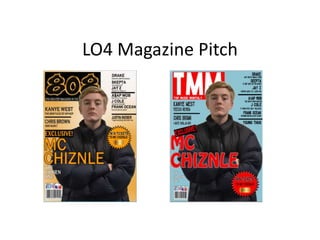