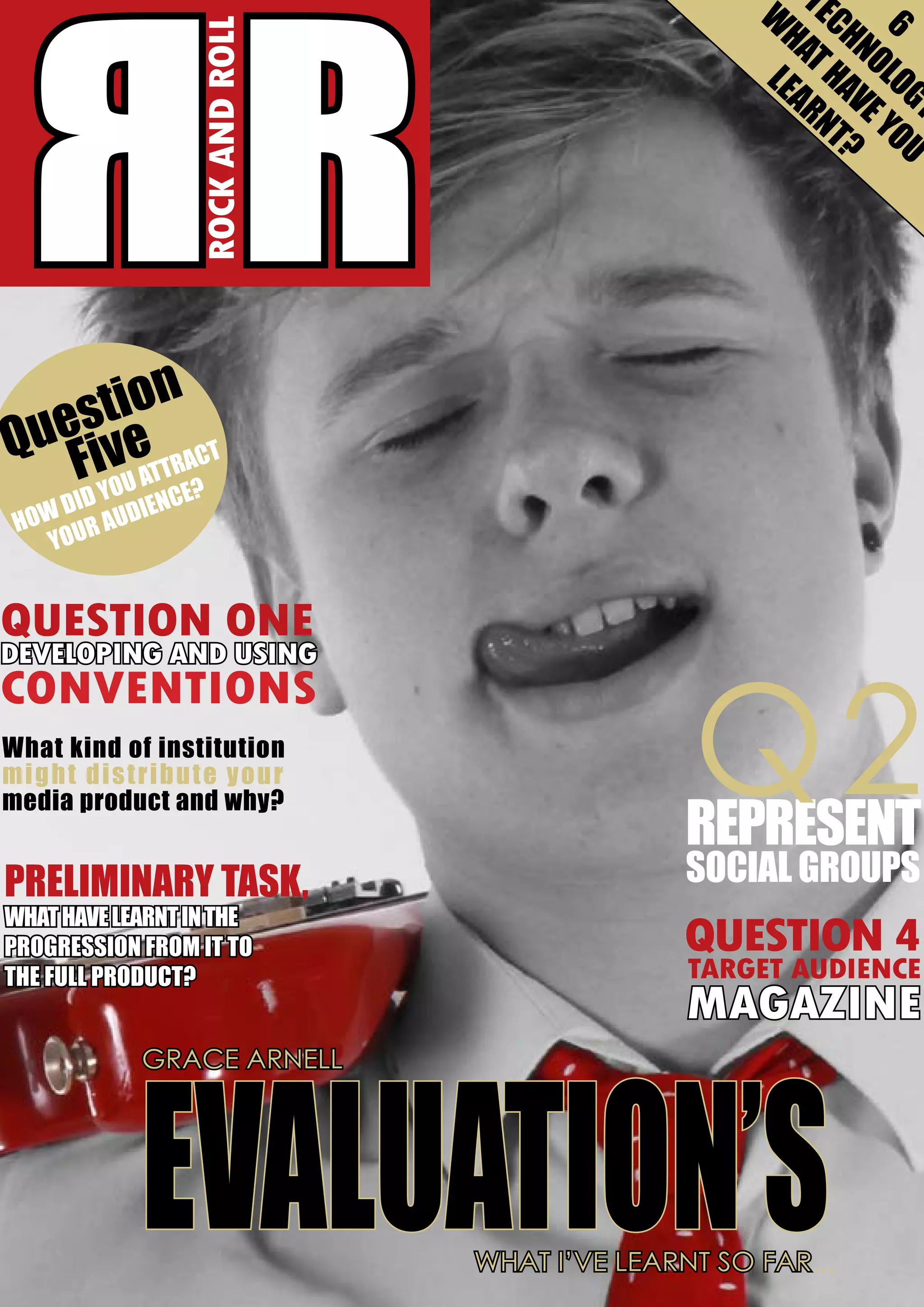
ROCK AND ROLL

RR

tec
What

6

hnolog
have y y
learnt? ou

tion
ues ve ct
Q Fi
ou attra
?
y
did dience
au
How
your

QUESTION ONE
DEVELOPING AND USING
CONVENTIONS
What kind of institution
m igh t di st r i bu t e you r
media product and why?

preliminary task,
what have learnt in the
progression from it to
the full product?

Q2

represent
social groups

QUESTION 4
TARGET AUDIENCE
MAGAZINE

EVALUATION’S
GRACE ARNELL

What I’ve learnt so far...
Q1. In what ways does your media product use,
develop or challenge forms and conventions of
real media products?

rr
ROCK AND ROLL

W

E
tH LErSrS
L E
Ki OSt
P

on my artists face as well as can
relate to the magazine of Rolling
By GRACE ARELL
Stone due to the use of a close up
of a single artist. wWhen choosing
hen beginning to design
the picture I felt that facial expresELLiE G
my magazine I felt that I needed
sion was important as I felt that
iN
GOULDROVE
D
“FAME AD”
to consider other previous music
the audience needed to be able to
M
ME
magazines that have been created
relate to the audience and have
LIVE
fASHiON
and relate to my genre. This would a relationship the second they
GIG LIST
rOCKS
INSIDE
TOPMAN MEETS
aid me in making my magazine
picked the magazine up. I was able SOFT ROCK
as realistic as possible as well as
to create this by the artist looking
MOST POPULAR
COLD
ALBUMS
a basis for my ideas to then be
directly into the camera as well as P L A Y
UtiLMAtE
A
T
E
further developed. With the use
having a stern look to portray the BN TCEKRSV IAEGW
I
rEVEiwS
Of tHE YEAr
THE INVENTION OF
of a standard soft rock magazine
genre of the magazine. This atstyle and the typical conventions
tracts my audiences as it highlights
of magazines in general I would
that the magazine is serious about
“ YOU CANT PLEASE EVERYONE SO WHY TRY ”
be able to make a professional as
music as well as formal meaning
tic pictures used.
well as realistic magazine that can it is perfect for my audience of
be deemed apmainstreamer’s
scheme I
I think that the and individuali- The colourpart of thefelt was an
propriate for my
important
housing
chosen audience.
ties in the social
HOUSING Style is classes of A B C1. style and creation of my magazine
The magazines I
to relate to the target
studied when first
very important The magazine of as it needed well as the secondaudience as
putting my ideas
Rolling Stone I felt ary target audience. This is due
forward were Rolling Stone, NME used these techniques successfully
to the magazine relying on these
and Q. These magazines would
and so was imperative that I used
readers to be successful and easily
be best in aiding me to make my
this convention of serious, close
recognisable due to the consistent
magazine due to the target auup images to enable my magacolours and layout; housing style.
dience age and gender of 16 - 25
zine to be successful. To make my The colours I chose to use were
males were the same. I used these
image stand out as well as make
red and gold with white, black and
as templates as I felt that these
the magazine look slightly classic
grey to give the magazine depth
were the most well known as sucI chose to use a black and white
and intriguing features when becessful magazines within the genre image with high
ing red. I chose these
of rock and were most relevant to
contrast to stand COLOUR SCHEMES colours as I felt that
the soft rock magazine I wanted
out compared to
AND CHOSEN they represented the
to create. The magazines are well
magazines such
genre I have picked
presented as well as consistent
as q which typiIMAGES
extremely well due to
with formal articles and housing
cally use a close p
red having connotastyle about the music rather than
image in colour. I felt this made
tions of passion for the music as
gossip.
the magazine seem more individwell as anger and danger which
ual and therefore relating to my
can easily link to the music genre
The image I chose to use for the
audience. This allows my artist to
of rock. Moreover, the colours
front cover is a close up shot of
be portrayed as serious about her
are also successful at portraying
the artist that will feature in my
music and fans as well as making
my target audience being males
main article. The images I have
the social group that reads the
between the ages of 16 and 25
taken is a close up that focuses
magazine clear due to the authen- as well as secondary audience of

2013

ISSUE:21434

LEAH LOVE

£3.00
1/01/2014
www.rockandroll.com

females of the same age range due
to the colours not being gender
specific as well as bright and bold.
The colour of gold I felt was also
a colour that was practical due
to presenting the audience back
grounds and interesting having
connotations of money and power
therefore representing their classes
of A B C1.
The masthead of my magazine
uses these colours as I felt it was
an important factor in order to
make sure my magazine was easily
recognised. I used the name RR
which is an acronym for the name magazine for the first time. I used
Rock and Roll. I felt that the name the codes and conventions of
any typical magazine and placed
was simplistic yet effective which
the magazines masthead in the
can be seen as mature due to the
top right hand corner due to this
use of an acronym compared to
the initial
top of the pops
Typical Layout for being where readplace
which not capa front cover ers will look for
italised and a
the name. I also
simple phrase. I
music magazine felt that with the
decide to use a
use of this mastred box logo as
head it would allow me to use any
I felt it aided me with the use of
image on the front cover due to
the colour scheme and allowed
me to use a formal font compared the magazine name not having to
be all shown as the magazine will
to my original design which used
be so recognisable it will not need
a childish font and no red box
the masthead in full view.
logo. I felt that the red box aided
my magazine to be easily recogWhen designing my contents
nised to the regular readers as
page I felt that the idea of a gig
well as ones that would buy the

list an important convention of a
rock magazine and so felt it was
imperative that I created a list of
my own for my magazine. When
making my gig list I decided to
use a red heading to make the list
stand out yet also place the text
in a black Arial font to make sure
that it was simplistic and didn’t
take the audiences away from the
images and overcomplicate the
page. I placed the listing on the
right had side of the page underneath the title making sure that it
was easy to find and separate from
the other pieces of information
such as the articles themselves or
the subscription details. This is
complimentary and fits with the
theme of my contents page as the
colours are consistent yet placing
the information in a box out text
with a grey background separates
it from the information breaking
the page down to make it simple
to navigate around the page.
The band index I created I felt was
unique to the magazine due to the
fact that unlike Q it was a range of
artists having a wide spectrum of
soft rock and older pop artists that
the readers will be able to relate to
and enjoy reading about. It further
uses the uses and gratifications
theory and allows the audience
to be informed about the bands
they like as well as entertained
have used
through the images and stories
as well as
that have been linked to them over the main
the past month. I felt to make sure feature
my magazine would stick to the
within this
typical codes and conventions of a article this
music magazine the main feature
month. I
sell line would be placed at the
felt that it
bottom of the page in a large font
was also
that would highlight and gave inimportant
formation about the image I have
to place the
used as well as the main feature
headline
within this article this month. I
in a large,
felt that it was also important to
easy to read
place the headline in a large, easy
front which
a music magazine. This is because
to read front which was bold and
was bold and stood out against
the article uses three columns
stood out against the black backthe black background. I chose to
when giving the information, this
ground. I chose to use the colours use the colours of white and gold
is because it fits the magazine style
of white and gold
making sure I stayed better having it easier to read as
making sure I stayed USING THE CODES within my colour
well as broken down when against
within my colour
the images in the article.
AND CONVENTIONS scheme to make
scheme to make
sure the magazine
sure the magazine was consistent
was consistent yet also that this
I chose to place the artist name
yet also that this part of the magpart of the magazine was unique.
in the centre at the bottom with
azine was unique. I felt to make
the caption introducing her on
sure my magazine would stick to
In general I have followed the
top in a smaller font in gold with
the typical codes and conventions typical conventions of magazine
also another smaller phrase after
of a music magazine the main
due to the layout
further explaining
USES AND
feature sell line would be placed at being the same with
the artists reasoning
the bottom of the page in a large
the masthead at the GRATIFICATIONS for the article and
font that would highlight and gave top of the magazine
what they would
THEORY
information about the image I
as well as the bar
be reading about. I
code at the bottom of the
placed this piece of information
front page. Furthermore
here due to there being the space
I have included magazine
to make sure the sell line was seen
sell lines on the front cover as extremely important as well as
which is also a convention.
aim towards the target audience
This enhances the fact that
due to the simplistic, capitalised
my magazine is a typical
fonts.
magazine which reaches
In conclusion, I believe that the
its pur5tpiose to be entermagazine I have created uses the
taining as well as informaconventions of a music magazine
tive. A factor which allows
well and clearly to enhance the
music magazines to stand
magazines genre of soft rock as
unique against other maga- well as making the information
zines such as fashion is the
given eye catching as well easy
number of columns used
to read, with the pull quotes and
within the articles. A typical images breaking down the intermagazine would use two
viewed styled.
columns having the information spread out, where
as my magazine follows
the typical convention for

Eval1

  • 1.
    ROCK AND ROLL RR tec What 6 hnolog havey y learnt? ou tion ues ve ct Q Fi ou attra ? y did dience au How your QUESTION ONE DEVELOPING AND USING CONVENTIONS What kind of institution m igh t di st r i bu t e you r media product and why? preliminary task, what have learnt in the progression from it to the full product? Q2 represent social groups QUESTION 4 TARGET AUDIENCE MAGAZINE EVALUATION’S GRACE ARNELL What I’ve learnt so far...
  • 2.
    Q1. In whatways does your media product use, develop or challenge forms and conventions of real media products? rr ROCK AND ROLL W E tH LErSrS L E Ki OSt P on my artists face as well as can relate to the magazine of Rolling By GRACE ARELL Stone due to the use of a close up of a single artist. wWhen choosing hen beginning to design the picture I felt that facial expresELLiE G my magazine I felt that I needed sion was important as I felt that iN GOULDROVE D “FAME AD” to consider other previous music the audience needed to be able to M ME magazines that have been created relate to the audience and have LIVE fASHiON and relate to my genre. This would a relationship the second they GIG LIST rOCKS INSIDE TOPMAN MEETS aid me in making my magazine picked the magazine up. I was able SOFT ROCK as realistic as possible as well as to create this by the artist looking MOST POPULAR COLD ALBUMS a basis for my ideas to then be directly into the camera as well as P L A Y UtiLMAtE A T E further developed. With the use having a stern look to portray the BN TCEKRSV IAEGW I rEVEiwS Of tHE YEAr THE INVENTION OF of a standard soft rock magazine genre of the magazine. This atstyle and the typical conventions tracts my audiences as it highlights of magazines in general I would that the magazine is serious about “ YOU CANT PLEASE EVERYONE SO WHY TRY ” be able to make a professional as music as well as formal meaning tic pictures used. well as realistic magazine that can it is perfect for my audience of be deemed apmainstreamer’s scheme I I think that the and individuali- The colourpart of thefelt was an propriate for my important housing chosen audience. ties in the social HOUSING Style is classes of A B C1. style and creation of my magazine The magazines I to relate to the target studied when first very important The magazine of as it needed well as the secondaudience as putting my ideas Rolling Stone I felt ary target audience. This is due forward were Rolling Stone, NME used these techniques successfully to the magazine relying on these and Q. These magazines would and so was imperative that I used readers to be successful and easily be best in aiding me to make my this convention of serious, close recognisable due to the consistent magazine due to the target auup images to enable my magacolours and layout; housing style. dience age and gender of 16 - 25 zine to be successful. To make my The colours I chose to use were males were the same. I used these image stand out as well as make red and gold with white, black and as templates as I felt that these the magazine look slightly classic grey to give the magazine depth were the most well known as sucI chose to use a black and white and intriguing features when becessful magazines within the genre image with high ing red. I chose these of rock and were most relevant to contrast to stand COLOUR SCHEMES colours as I felt that the soft rock magazine I wanted out compared to AND CHOSEN they represented the to create. The magazines are well magazines such genre I have picked presented as well as consistent as q which typiIMAGES extremely well due to with formal articles and housing cally use a close p red having connotastyle about the music rather than image in colour. I felt this made tions of passion for the music as gossip. the magazine seem more individwell as anger and danger which ual and therefore relating to my can easily link to the music genre The image I chose to use for the audience. This allows my artist to of rock. Moreover, the colours front cover is a close up shot of be portrayed as serious about her are also successful at portraying the artist that will feature in my music and fans as well as making my target audience being males main article. The images I have the social group that reads the between the ages of 16 and 25 taken is a close up that focuses magazine clear due to the authen- as well as secondary audience of 2013 ISSUE:21434 LEAH LOVE £3.00 1/01/2014 www.rockandroll.com females of the same age range due to the colours not being gender specific as well as bright and bold. The colour of gold I felt was also a colour that was practical due to presenting the audience back grounds and interesting having connotations of money and power therefore representing their classes of A B C1. The masthead of my magazine uses these colours as I felt it was an important factor in order to make sure my magazine was easily recognised. I used the name RR which is an acronym for the name magazine for the first time. I used Rock and Roll. I felt that the name the codes and conventions of any typical magazine and placed was simplistic yet effective which the magazines masthead in the can be seen as mature due to the top right hand corner due to this use of an acronym compared to the initial top of the pops Typical Layout for being where readplace which not capa front cover ers will look for italised and a the name. I also simple phrase. I music magazine felt that with the decide to use a use of this mastred box logo as head it would allow me to use any I felt it aided me with the use of image on the front cover due to the colour scheme and allowed me to use a formal font compared the magazine name not having to be all shown as the magazine will to my original design which used be so recognisable it will not need a childish font and no red box the masthead in full view. logo. I felt that the red box aided my magazine to be easily recogWhen designing my contents nised to the regular readers as page I felt that the idea of a gig well as ones that would buy the list an important convention of a rock magazine and so felt it was imperative that I created a list of my own for my magazine. When making my gig list I decided to use a red heading to make the list stand out yet also place the text in a black Arial font to make sure that it was simplistic and didn’t take the audiences away from the images and overcomplicate the page. I placed the listing on the right had side of the page underneath the title making sure that it was easy to find and separate from the other pieces of information such as the articles themselves or the subscription details. This is complimentary and fits with the theme of my contents page as the colours are consistent yet placing the information in a box out text with a grey background separates it from the information breaking the page down to make it simple to navigate around the page. The band index I created I felt was unique to the magazine due to the fact that unlike Q it was a range of artists having a wide spectrum of soft rock and older pop artists that the readers will be able to relate to and enjoy reading about. It further uses the uses and gratifications theory and allows the audience to be informed about the bands
  • 3.
    they like aswell as entertained have used through the images and stories as well as that have been linked to them over the main the past month. I felt to make sure feature my magazine would stick to the within this typical codes and conventions of a article this music magazine the main feature month. I sell line would be placed at the felt that it bottom of the page in a large font was also that would highlight and gave inimportant formation about the image I have to place the used as well as the main feature headline within this article this month. I in a large, felt that it was also important to easy to read place the headline in a large, easy front which a music magazine. This is because to read front which was bold and was bold and stood out against the article uses three columns stood out against the black backthe black background. I chose to when giving the information, this ground. I chose to use the colours use the colours of white and gold is because it fits the magazine style of white and gold making sure I stayed better having it easier to read as making sure I stayed USING THE CODES within my colour well as broken down when against within my colour the images in the article. AND CONVENTIONS scheme to make scheme to make sure the magazine sure the magazine was consistent was consistent yet also that this I chose to place the artist name yet also that this part of the magpart of the magazine was unique. in the centre at the bottom with azine was unique. I felt to make the caption introducing her on sure my magazine would stick to In general I have followed the top in a smaller font in gold with the typical codes and conventions typical conventions of magazine also another smaller phrase after of a music magazine the main due to the layout further explaining USES AND feature sell line would be placed at being the same with the artists reasoning the bottom of the page in a large the masthead at the GRATIFICATIONS for the article and font that would highlight and gave top of the magazine what they would THEORY information about the image I as well as the bar be reading about. I code at the bottom of the placed this piece of information front page. Furthermore here due to there being the space I have included magazine to make sure the sell line was seen sell lines on the front cover as extremely important as well as which is also a convention. aim towards the target audience This enhances the fact that due to the simplistic, capitalised my magazine is a typical fonts. magazine which reaches In conclusion, I believe that the its pur5tpiose to be entermagazine I have created uses the taining as well as informaconventions of a music magazine tive. A factor which allows well and clearly to enhance the music magazines to stand magazines genre of soft rock as unique against other maga- well as making the information zines such as fashion is the given eye catching as well easy number of columns used to read, with the pull quotes and within the articles. A typical images breaking down the intermagazine would use two viewed styled. columns having the information spread out, where as my magazine follows the typical convention for