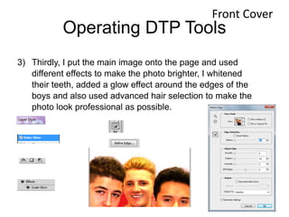
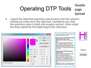
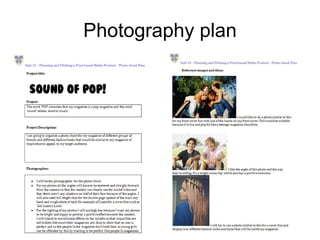
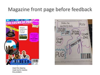
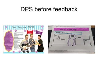
Contents
4. LO3
5. ‘Sound of Pop’ proposal
6. Photography plan
7. Photography plan
8. Prop list
9. Prop list
10. Prop list
11. Risk assessment
12. Risk assessment
13. Production process
14. Production process
15. Production plan
16. Production plan
17. Production plan
18. Graphic layout front cover
19. Graphic layout DPS
20. Final drafts front cover
21. Final draft DPS
22. Magazine flat plan 1
23. Magazine flat plan 2
24. Magazine flat plan 3
25. Magazine masthead/ logo
26. My magazine house style
27. Masthead fonts/ colours
28. Magazine front page before feedback
29. Feedback
30. Magazine front cover after feedback
31. Final pages- front cover
32. DP before feedback
33. Feedback
34. DPS after feedback
35. Final page- DPS
36. Front cover step by step
37. DPS step by step
38. What will be similar for my magazine
compared with Top of the Pops
39. Changes I made- front cover
40. Change I made- DPS
Contents
41. Conclusion of similarities
42. what will be similar for my
magazine compared with Top
of the Pops
43. Conclusion of similarities
44. Manipulating photographs
45. Professional camera comment
46. Operating DTP tools
47. Operating DTP tools
48. Operating DTP tools
49. Operating DTP tools
50. Operating DTP tools
51. Operating DTP tools
52. Operating DTP tools
53. Operating DTP tools
54. Operating DTP tools
55. Operating DTP tools
56. Operating DTP tools
57. Operating DTP tools
58. Operating DTP tools
59. Safe working practices
60. Safe working practices
61. Advertising via Facebook
62. Conclsuion
Contents
63. LO4
64. Prezi presentation
65. Script/supportive material for the pitch
66. What I will use
67. Witness statement
68. Witness statement
69. Survey analysis
70. Survey analysis
71. Survey analysis
72. Survey analysis
73. Survey analysis
74. Survey analysis
75. Survey analysis
76. LO5
77. Prezi presentation
78. Script/ supportive material for the pitch
79. What I will use
80. Witness statement
81. Witness statement
82. Survey analysis
83. Survey analysis
84. Survey analysis
85. Survey analysis
86. Survey analysis
87. Survey analysis
88. Survey analysis
89. Interview with the publisher
90. Production plan
91. Production plan
92. Production plan
93. Budget summary
94. Budget plan
95. Calendar events
96. Evaluation
‘Sound of Pop!’
Proposal
Photography plan
Photography plan
Prop list
• What equipment I will need to take the photographs:
I search for
these items in
the Google
Shopping are
of the website.
https://www.google.co.uk/webhp
?gws_rd=ssl#q=microphone&safe
=strict&tbm=shop
Prop List
• Apple IMac x 4
• £4,196.00
• https://creative.adobe.com/plans?single_app=photoshop?promoid=KRQMA
• http://store.apple.com/uk/cart
• Photoshop x 3
• £514.44 per year (Excluding VAT) (£171.48 per year each)
• https://creative.adobe.com/plans?single_app=photoshop?promoid=KRQMA
• http://store.apple.com/uk/cart
• Illustrator x 1
• 171.48 per year (excluding VAT)
• https://creative.adobe.com/plans?single_app=photoshop?promoid=KRQMA
• http://store.apple.com/uk/cart
Prop List
http://www.instantoffices.com/en/gb/serviced-office-space?lat=51.3362231&lng=-
0.2688232&plid=ChIJCcdQ8g3idUgRMGnsoi2uDgQ
Risk assessment
Risk assessment
Production Process
• Process:
• Decide date of publication,
– Once the date for the release of my magazine has been chosen I will then be
working with a schedule which is in the slide after this.
• Manage a schedule,
– This is where my schedule will be managed and decided which is what
everyone will have to work against.
• Decide the over all budget,
– The editorial team will choose what topics that will be included in the
magazine, then look at how much money we have and decide a final budget for
the production of whole magazine.
• Decide content that will be included,
– At this stage journalists and reporters do a lot of research about the topics and
content that will be included in the magazine, interviews will be arranged and
artwork/ graphics are also worked on at this stage.
• Edit the magazine
– We edit the magazine to make sure all facts are correct, checking spelling and
grammar and the house-style is carried out.
http://hosbeg.com/the-magazine-production-process/
Test photography will
be used here to
decide what images
will be best to include
in the magazine.
Production process
• Decide the layout of all the pages,
– The editorial team then choose the layout of each page in the
magazine and which order they should all go in. To do this, the main
programme that is used is InDesign. Adverts are also placed in the
magazine at this point.
• Proofreading,
– Once a hardcopy of the magazine has been printed, editors will look
through it and find and correct any mistakes.
• Send file of the magazine to the printer,
– Once proofread, the DTP file of the fully finished magazine will be
sent to the printer. If the editors approve he printing, the printer will
then start mass printing.
• Distribution.
– The magazines are neatly packed and sent to a warehouse where the
magazines are distributed and then sold to the public.
http://hosbeg.com/the-
magazine-production-process/
• 5-6 weeks prepProduction
Plan
Week beginning: Monday 27th October 2014
Monday Tuesday Wednesday Thursday Friday Saturday Sunday
Task: decide the
final deadline for
the publication of
the magazine
and manage the
schedule for the
production of the
magazine.
Discuss what
topics will included
in the magazine,
who will be in it,
what pictures to
take, then discuss
the final budget
you wish to pay by
looking at how
much you have to
spend and what
the money will be
spent on in the
magazine.
Discuss what
topics will included
in the magazine,
who will be in it,
what pictures to
take, then discuss
the final budget
you wish to pay by
looking at how
much you have to
spend and what
the money will be
spent on in the
magazine.
Discuss what
topics will included
in the magazine,
who will be in it,
what pictures to
take, then discuss
the final budget
you wish to pay by
looking at how
much you have to
spend and what
the money will be
spent on in the
magazine.
Gather content
for the magazine.
Artwork and
graphics are also
worked on at this
point. Research
is also collected
by journalists
through either the
internet (on
gossip websites)
and interviews.
Gather content
for the magazine.
Artwork and
graphics are also
worked on at this
point. Research
is also collected
by journalists
through either the
internet (on
gossip websites)
and interviews.
Gather content
for the magazine.
Artwork and
graphics are also
worked on at this
point. Research
is also collected
by journalists
through either the
internet (on
gossip websites)
and interviews.
Complete by:
End of day
Complete by:
Two days time
Complete by:
The next day
Complete by:
End of day
Complete by:
One week time
Complete by: End
of day
Complete by: End
of day
Date: 27th
October
Date: 28th October Date: 29th October Date: 30th October Date: 31st
October
Date: 1st
November
Date: 2nd
November
http://hosbeg.com/the-magazine-production-process/
Week beginning: Monday 3rd November 2014
Monday Tuesday Wednesday Thursday Friday Saturday Sunday
Gather content
for the magazine.
Artwork and
graphics are also
worked on at this
point. Research
is also collected
by journalists
through either
the internet (on
gossip websites)
and interviews.
Gather content for
the magazine.
Artwork and
graphics are also
worked on at this
point. Research is
also collected by
journalists through
either the internet
(on gossip
websites) and
interviews.
Gather content for
the magazine.
Artwork and
graphics are also
worked on at this
point. Research is
also collected by
journalists through
either the internet
(on gossip
websites) and
interviews.
Gather content for
the magazine.
Artwork and
graphics are also
worked on at this
point. Research is
also collected by
journalists through
either the internet
(on gossip
websites) and
interviews.
Editing the
magazine to
make sure that all
the facts are
correct, the
spelling is
correct, grammar
and punctuation
is correct, that
the house-style
for the magazine
is used, and that
the page layout is
revised and
corrected if need
be.
Decide the layout
of each page
using programs
like InDesign and
Photoshop to
construct all of
the pages in
order to make the
magazine.
Decide the
layout of each
page using
programs like
InDesign and
Photoshop to
construct all of
the pages in
order to make the
magazine.
Complete by:
End of day
Complete by: End
of day
Complete by: End
of day
Complete by: End
of day
Complete by: End
of day
Complete by:
Two days time
Complete by: The
next day
Date: 3rd
November
Date: 4th
November
Date: 5th
November
Date: 6th
November
Date: 7th
November
Date: 8th
November
Date: 9th
November
http://hosbeg.com/the-magazine-production-process/
Week beginning: Monday 10th November 2014
Monday Tuesday Wednesday Thursday Friday Saturday Sunday
Decide the layout
of each page
using programs
like InDesign and
Photoshop to
construct all of
the pages in
order to make
the magazine.
The editors of the
magazine print out
a hard copy of the
magazine and
read through it to
try and find any
mistake and then
correct them.
The editors of the
magazine print out
a hard copy of the
magazine and
read through it to
try and find any
mistake and then
correct them.
The editors of the
magazine print out
a hard copy of the
magazine and read
through it to try and
find any mistake
and then correct
them.
Once the
magazine's
mistakes are
corrected the
DTP file of the
magazine is sent
to the printer
making sure that
you send all of the
images and fonts
with it as well.
The magazine is
sent to a
warehouse. From
there the
magazines are
distributed and
sent to shops to
sell to the public.
The magazine is
sent to a
warehouse. From
there the
magazines are
distributed and
sent to shops to
sell to the public.
Complete by:
End of day
Complete by:
Two days time
Complete by:
The next day
Complete by:
End of Day
Complete by:
End of Day
Complete by:
The next day
Complete by:
End of day.
Date: 10th
November
Date : 11th
November
Date: 12th
November
Date: 13th
November
Date: 14th
November
Date: 15th
November
Date: 16th
November
http://hosbeg.com/the-magazine-production-process/
Release date= 18th November
Graphic layout front cover
Another
Band
Graphic layout DPS
Final Drafts Front cover
Cover
Lines
Main
image
Main
heading
Pug of free
poster
Masthead
Barcode, date it
was released,
issue number,
Facebook and
Twitter logos and
website address
of my magazine.
Final drafts DPS
Text boxes from interview
– including Drop Capital Main heading
Anchorage textMain image
Box will include Twitter
name of band, page
no., website of band
Magazine flat plan 1
Magazine flat plan 2
Magazine flat plan 3
Magazine masthead/ logo
Utopian colors
Verbal code ‘Sound’ relates to music- clearly
denoting what the magazine is about.
Pink & white-
very girly colors-
using the white
as the main
color and the
pink as an
outline makes
the masthead
stand out.
Special effects
are also used to
help with this.
My magazine house style
The house style of my magazine will consist of the colours: Red (to signify excitement, energy and love), Pink (to connote love,
romance and excitement), Yellow (to represent Joy, happiness, optimism, imagination and hope), Blue (to signify peace, stability, trust
and loyalty), Purple (to signify wisdom and enlightenment), Orange (to signify energy, balance, enthusiasm and warmth), White (to
signify purity, simplicity, peace, youth, good) and Black (to signify Power, elegance, style and innocence). To conclude, most of the
colours on my magazine will be bright (especially the front cover) but I will have some pastel shades in the magazine as well so there is
more variety and utopian colours; as it connotes a very girly and happy outlook on the magazine (motivated by my magazine of
inspiration ‘Top of the Pops’) like a typical pop music magazine. http://www.slideshare.net/marketingboys/colors-meaning
This picture
denotes the
name of the
person company
who took a
specific photo on
a page. I will use
this so that I’m
not stealing
anyone else’s
work.
At the bottom of this double
page spread (DPS) of Ariana
Grande, it gives the reader
information on when her
newest single is out, her new
album that is out now, her
website and the radio
channel, which says “Listen to
The Official Chart, Sundays,
4-7pm, Radio 1”. I will use
this for my magazine so that
reader’s can get the latest
information about their
favourite stars or bands.
On the top of each page, the section of the
magazine has been named, so it’s easier for
the readers to navigate around the
magazine.
This is a picture of the page no. located
at the bottom of every page. I will also
use this for my magazine so that the
readers can say what information is on
what page. Its also easier to pick up
where you left off by having page
numbers. And it looks best when they’re
at the bottom of the page in the middle.
Masthead fonts/colours
• Below are pictures of fonts from Dafont.com that would be typically used in my
magazine as titles and other headings, but also for the body of my magazine. Since I
would like to vary the amount of fonts used in my magazine (apart from the main
heading of my magazine ‘Sound of Pop’), the pictures below aren't the only fonts I plan
to use.
My magazine will consist of the colours: Red (to signify excitement, energy and love), Pink (to signify love,
romance and excitement), Yellow (to represent Joy, happiness, optimism, imagination and hope), Blue (to signify
peace, stability, trust and loyalty), Purple (to signify wisdom and enlightenment), Orange (to signify energy,
balance, enthusiasm and warmth), White (to signify purity, simplicity, peace, youth, good) and Black (to signify
Power, elegance, style and innocence). Most of the colours on my magazine will be bright (especially the front
cover) but I will have some pastel shades in the magazine as well so there is more variety and utopian colours.
Magazine front page before feedback
Used the clipping
mask tool to resolve
this problem.
Feedback
Front cover after feedback
Made
Smaller.
Main Image
made
brighter and
bigger and
teeth were
whitened.
White strip made
smaller.
Masthead
changed.
Removed
unnecessar
y cover
lines.
Added main cover
line/ name of
band.
Final pages- front coverBanner
Puff and
pug
Main image
Main
headline
Mast head
Cover line
Cover
line
Magazine’s
website
address, date,
issue number,
price,
Facebook and
twitter logos
and barcode
DPS before feedback
Feedback
When making adaptations to my Front Cover and DPS, I made sure that every
shape and text box had its own layer which is labeled so I knew what was where
and could make changes individually without effecting anything else on the page
(for example if I only wanted to edit one image and not all of them at the same
time (if it was on the same layer)).
DPS after feedback
Questions put in
bold
Made bigger
More sweets
in the
background
Quotes
fitted
exactly
inside the
wrapper
Drop capital
made a
different
colour
Final pages- dps
Questions in bold
Drop capital
Mast
head
Magazine
name
Quote from
interview
Quote from
interview
Main
image
Page number
Anchorage
text
Text boxes
Words and
photography
by…
Band’s website address Band’s twitter username
Colourful
sweets in
back
ground
Props
Front cover
step by step
DPS step by step
Masthea
d
Main Image
Barcode,
Date, Price
and Issue
Similar
The
same
What will be similar for my magazine compared with
Top of the Pops
Changes I made – Front cover
• This was my magazine front cover
(unfinished) before it got any feedback at
all. I then got my feedback and the
image on the right is my final version of
my front cover. As you can see my mast
head has been changed, I removed
unnecessary cover lines, the band on
the bottom left were made smaller, the
white strip at the bottom of the page was
made smaller, I added main cover
line/name of band and finally made the
main image bigger and their teeth were
also made whiter. I also adjusted the
main image by changing the brightness/
exposure, contrast, hue/ saturation and
finally used advanced hair selection
especially on the main image. As well as
this, on the picture of Lizzie in the
bottom right corner, I created a clipping
mask so that she would fit perfectly
inside the shape.
Changes I made – double page
spread
• The image above is my
double page spread (again
unfinished) before it got any
feedback. Once I had been
given I feedback, I made the
required changes which then
resulted in the image on the
These are the changes I made:
- The main heading of the band was made bigger,
- The questions were put in bold,
- The quotes were moved and made so that the text fit better in the
wrapper,
- I made a drop capital and changed the colour so that it stood out
and fit in with my house style and
- I out more sweets of a different variety in the background.
- Adjusted the photo by changing the exposure, hue/saturation and
again advanced hair selection.
Conclusion of similarities
• I intend to make the mast head of my magazine in the same place
because in that specific place on my magazine page I know that the
masthead will stand out.
• I also intend to make the barcode in the same place as top of the
pops because on their front cover they haven’t made the barcode
seem very important as it is small and in the corner so I feel I should
do the same.
• My main image will be in a similar place on my front cover so that
the most focus on the front cover will be the main image, therefore
the picture should be touching the title and be in the middle of the
page.
• The main headline will be in a different place and style on my front
cover instead of in a bubble so that it could be more eye catching for
my target readers.
Text same
place
Text boxes the same.
What will be similar for my magazine compared with
Top of the Pops
Conclusion of similarities
• I am going to keep the heading the same
because it is at the top of the page, eye-
catching and it will make the title seem
more important as it is at the top.
• The image layout and text boxes will be in
a similar place as it looks more
professional and text boxes are more
appealing to the eye rather than large
chunks of text.
Manipulating photographs
• So that the photos look professional, I had to manipulate them by adjusting the light etc…
however, I still wanted the photos to look natural what I did to the images was:
- Added an outer glow
- I did this by double clicking on the layer and selecting ‘Outer Glow’. I changed the opacity,
spread and size to make the main image stand out but I didn’t want the outer glow to be
really obvious.
- Made the photos brighter and increased the exposure and Contrast
- I did this by clicking on the layer then selecting image adjustments Brightness/ Contrast
and Exposure.
- Changed the shadows/ highlights
- I did this by selecting Adjustments  Shadows/Highlights
- Used advanced hair selection
- I did this by using the quick selection tool and selected the image, then pressed ‘Refine
Edge’ and changed the radius setting to 1.3, changed the feather number to 0.5 as well as
ticking the box called ‘Smart Radius’ and carefully went around the edge of the image, then
pressed ‘OK’. Once it brought me back to the main page, I right clicked and pressed
deselect
Professional camera comment
• To take the photographs for my magazine I used a
Nikon D3100 with a 18-55 mm lens so that the images
would come out in the best quality which could be
used in my magazine. I also used a tripod so that the
angle of the photo was straight and un-blurred.
Operating DTP tools
• Photoshop shortcuts I used:
- Spacebar to move image whilst cropping or colouring
- Control + Alt and scroll up to zoom in scroll down to
zoom out
- Control + Z to undo
- Select multiple items = Shift + Click
- Step backward = Control + Alt + Z
- Step forward = Control + Shift + Z
- Eraser = E
- Hand tool = H
- Copy = Control + C
https://helpx.adobe.com/photoshop/using/default-keyboard-shortcuts.html
- Paste = Control + V
- Increase or decrease the brush size = ]/[
- Control + S = save
- Free Transform = Control + T
- Left direction = control + scroll up
- Right direction = control + scroll down
- Brush = B
Operating dtp tools
Front Cover
1) First I chose the background for my magazine (red).
2) I then made the barcode bar at the bottom of the page and entered the barcode, web
address of my magazine (www.soundofpop.co.uk), the month and year of the first
issue (November 2014), the price (£1.99), the issue number (issue 1) and the Facebook
and Twitter logos as well.
Control + T
Operating DTP Tools
3) Thirdly, I put the main image onto the page and used
different effects to make the photo brighter, I whitened
their teeth, added a glow effect around the edges of the
boys and also used advanced hair selection to make the
photo look professional as possible.
Front Cover
Operating DTP Tools
3) I then arranged the masthead background and the
masthead its self, again adding effects to it to make it
stand out to the readers, such as a drop shadow, bevel
and emboss and stroke. I also put the blue bar, stars and
blue boxes with the text at the top of the page, above the
masthead.
Front Cover
Operating DTP Tools
4) I additionally added the puff and pug of a
free ‘The Vamps’ poster in the top right
corner.
Front Cover
Operating DTP Tools
6. After this was completed, I placed the picture of Lizzie
(using advanced hair selection as well), puff and the
magazine’s website address in the bottom right corner.
Front Cover
Operating DTP Tools
6. Once this was perfected, I added a picture of a new band (who I made up) and
used effects such as a drop shadow, an outer glow and a stroke to make the
image look professional. I added the band’s name, a ‘bubble’ background for the
text, anchoring text for the band, a copy of the title on the edge of the bubble,
and different coloured stars in a diagonal line going away from the bubble so
there are more fun colours and shapes on the page and again used advanced
hair selection before placing the image onto the page.
Front Cover
Operating DTP Tools
7. Lastly, I made sure that there was enough space
to put the name of the band stretching over the
main image and made sure that it stood out. This
meant that I had to make the image of Lizzie and
the new band who’re both in the corners smaller
but still readable.
Front Cover
Operating DTP
Tools
Double page
Spread
1) I made the background/ boarder for the heading and the bar at the bottom of
the page.
2) I typed the title of the double page spread and the anchorage text.
Control + T =
transform
I copied and pasted this from the title
page so it would be exactly the same.
This was the font I used for the ‘are back!’
text, which I downloaded for free from
dafont.com
I used the text tool for this and again downloaded a font, which was called ‘Neon
80’s’
Operating DTP Tools
3) I made the columns that the text would go into and
placed the main image onto the main page (and edited
the photo so it looked brighter and that the advanced
hair selection was correct). I then changed the opacity
of the columns so that you could still see the
background of the image behind and so that it looked
more professional.
Added a
stroke to the
shape and
changed the
opacity of
the white
area so you
could still
see the
background.
So that the boxes were exactly the same, I made copies of the
first box by pressing and holding ‘Alt’ and dragging the box, the
using the ruler tool so they were all in line.
Double
page
Spread
Operating DTP Tools
Double
page
Spread
Operating DTP Tools
4. I typed the interview questions and answers into the columns
making sure they were the right font I wanted to use, that
the questions were in bold and answers normal. I then made
the drop capital for the beginning of the interview.
Double
page
Spread
Operating DTP Tools
5) I placed all of the sweets into the back ground.
6) I added all of the information into the bottom bar and into the
top corner of the page e.g. page no., website address of
band, words and photography by… and ‘Sound of Pop!’
7) Made the quotes and fitted them onto two different sweetie
wrappers
8) Arranged the sweets in the background of the double page
spread.
Double
page
Spread
Safe Working Practices
- I wanted to crop the images so that there wasn’t any un necessary details in the background that
could distract from the main subject for example if the picture was taken in a café you wouldn’t
want all of the other people in the background as you want the main subject of the photo to stand
out.
- I used the pen tool so that the text box would fit perfectly around the main image especially on the
double page spread. I also used the pen tool when writing text in shapes. For example on my double
page spread, I wanted to put quotes in sweetie wrappers, so I used the pen tool to make sure that
the text fitted perfectly inside the sweetie wrapper and would be integrated onto the page neatly.
- I used the ruler tool for when I was drawing shapes on my front cover and double page spread as
well as text boxes so that the shape would be the perfect size that I want and that the text boxes are
straight.
Used ruler tool so text boxes
were in line with each other
Safe Working Practices
- I used the healing tool to correct any dark marks or
spots and also shadows on the models’ faces so that
the images looked more professional and up to a
magazine’s standard.
- In order to maintain the house style of my magazine I
used a very helpful tool called the ‘Eye Dropper tool’.
This tool allowed me to select another color that was
already on my document so that I could use the same
color. What’s even better is that I could save the color
selected to ‘Swatches’ so that in the future I could use
the same color as before.
Adaptations to my pages
• When making adaptations to my Front Cover and DPS, I made sure that every shape and text box had its
own layer which is labeled so I knew what was where and could make changes individually without
effecting anything else on the page (for example if I only wanted to edit one image and not all of them at
the same time if it was on the same layer).
• When creating future editions of my magazine, instead of creating new layers for every edition, I will keep
the same basic template (for example masthead and barcode/ date/ issue no.) and name/ group the
layers, so they can just be edited instead and save it in a different area on the computer to keep the same
template for each edition.
• Linking and grouping layers:
• On my DPS I created multiple layers of different sweets, so I grouped the layers (for example ‘gummy
bears’) together to find them all quicker and easier which also meant that I wouldn’t get them mixed up
with other layers and sweets (especially if I wanted to select all layers of one type of sweet to move them
all together).
Advertising via
Facebook
£1277.50 per year
https://www.facebook.com/ads/create/?act=90195210
It’s important that my magazine will
have a Facebook page because nearly
everyone has at least one type of social
media, so it will gain a lot of exposure
for my magazine, as the page will be
able to include the audience via articles,
the latest news and fun quizzes.
Conclusion
• Overall in LO3, I have looked at a huge variety of important topics
which would have to be considered regarding my magazine. For
example, what props are needed for the images I will have to take
(and what pictures will I take- photography plan), and where and
getting permission to use the props and take the pictures where I
want to take them. The house style of my magazine including fonts,
how my magazine will be laid out, improving from the feedback I
was given to make my magazine look the best and most
professional. I also compared my magazine to my magazine of
inspiration, what was better and what I could ‘repeat’ (Steve Neale).
In order to make my magazine pages I needed to know what tools to
use use and where to use which was part of the Operating DTP
tools.
Prezi presentation
• Here is the link to my pitch on prezi (on
YouTube)
https://www.youtube.com/watch?v=Nxow9lm
QX3g
• Below are the two halves of me performing
my pitch:
Script/ Supportive material for the
Pitch
• When completing my pitch, I decided
not to use a a script or any format of
supportive material, as I thought that
if I was reading what I wanted to say
off a piece of paper I wouldn’t be able
to focus on my presentational skills as
much (for example eye contact with
the audience) or I may loose my place
(then confuse myself as to where is
am), which wouldn’t be very
professional. Therefore I rehearsed my
Pitch multiple times until I knew what
I wanted to say word for word. Mr.
Crafts thought that this was a key
highlight of my pitch.
What I will use:
Computer and desk
Classroom
Projector
Camera
Smart board
Slide
changer
Witness Statement
This feedback that has been given to me in my witness
statement proves that I completed most of the necessary
areas in my pitch, which include: Proposal, production plan,
budget summary, target audience, pre-production materials,
plan for the magazine, Front cover and DPS, verbal
introductions, target audience and spending power and
finally an opportunity for feedback. However, my witness
statement claims that I have not included start-up costs and
a plan for the images in my pitch. Although I have, I could
have reflected on this in more detail when passing these two
slides to make it clearer for my audience to see in detail
what I have included. Other positive ‘WWW’ feedback that I
gained in my witness statement wrote that I didn’t need any
props or prompts( for example a script), that it was very well
pitched and rehearsed, my market leaders breakdown, my
flat plans, the social media marketing, marketing breakdown
costs, my future issue overview and finally how I linked my
content slide to my flat plan: “the question is, what content
have I used from this slide in my magazine flat plan?”.
• The only ‘EBI’ that I was given was that since it was the first
issue of the magazine, could the masthead have been more
visible? Which I have already reflected on in slide no.9, by
changing the stroke of the mast head to a different colour or
changing the words’ colour itself and finally by making the
main image slightly smaller so that you could see what the
masthead said easier. The main image could then be made
bigger a couple of issues later as more people will be used to
what the masthead of the magazine says. Overall I think that I
presented a very successful pitch based on the comments
that I have received.
Witness Statement
• The answers that I received from this question
gave me very positive feedback, as they proved
that I completed my pitch to the full extent that I
could.
• For this
question I was
given an
answer of 9/10,
which meant
that there was a
chance for me
to improve my
work- the
reason is stated
on the next
• This question asked me what I could improve in my pitch overall, in which I got a
response of: “Magazine Front Cover- Although the masthead layout and
positioning is conventional, could it be more visible for the first issue of the
magazine?”. This has been resolved by changing the background of the
masthead and changing the actual font colour of the masthead. I also tried
making the main image slightly smaller so that you could see more of the
masthead.
• These answers again display that when
presenting my pitch I was convincing and had
good, strong ideas that would make the
company want to invest in my magazine.
• The answers that I received from this question helped
me to understand how clear my pitch was for other
people to see and hear (and also the content in my pitch
as well) and from these answers I can see that my pitch
was clear and easy to understand.
• The unanimous answer from this question
proves that there are no issues to be resolved.
• This answer states that my presentational skills
were clear and professional, helping me to be
more approachable for the audience and also
more interesting for the audience to watch my
Prezi presentation
• Here is the link to my pitch on prezi (on
YouTube)
https://www.youtube.com/watch?v=Nxow
9lmQX3g
• Below is me performing my pitch:
Script/ Supportive material for the
Pitch
• When completing my pitch, I decided
not to use a a script or any format of
supportive material, as I thought that
if I was reading what I wanted to say
off a piece of paper I wouldn’t be able
to focus on my presentational skills as
much (for example eye contact with
the audience) or I may loose my place
(then confuse myself as to where is
am), which wouldn’t be very
professional. Therefore I rehearsed my
Pitch multiple times until I knew what
I wanted to say word for word. Mr.
Crafts thought that this was a key
highlight of my pitch.
What I will use:
Computer and desk
Classroom
Projector
Camera
Smart board
Slide
changer
Witness Statement
This feedback that has been given to me in my witness
statement proves that I completed most of the necessary
areas in my pitch, which include: Proposal, production plan,
budget summary, target audience, pre-production materials,
plan for the magazine, Front cover and DPS, verbal
introductions, target audience and spending power and
finally an opportunity for feedback. However, my witness
statement claims that I have not included start-up costs and
a plan for the images in my pitch. Although I have, I could
have reflected on this in more detail when passing these two
slides to make it clearer for my audience to see in detail
what I have included. Other positive ‘WWW’ feedback that I
gained in my witness statement wrote that I didn’t need any
props or prompts( for example a script), that it was very well
pitched and rehearsed, my market leaders breakdown, my
flat plans, the social media marketing, marketing breakdown
costs, my future issue overview and finally how I linked my
content slide to my flat plan: “the question is, what content
have I used from this slide in my magazine flat plan?”.
• The only ‘EBI’ that I was given was that since it was the first issue of
the magazine, could the masthead have been more visible? Which I
have already reflected on in slide no.9, by changing the stroke of the
mast head to a different colour or changing the words’ colour itself
and finally by making the main image slightly smaller so that you
could see what the masthead said easier. The main image could
then be made bigger a couple of issues later as more people will be
used to what the masthead of the magazine says. Overall I think that
I presented a very successful pitch based on the comments that I
have received.
Witness Statement
• The answers that I received from this question
gave me very positive feedback, as they proved
that I completed my pitch to the full extent that I
could.
• For this
question I was
given an
answer of 9/10,
which meant
that there was a
chance for me
to improve my
work- the
reason is stated
on the next
• This question asked me what I could improve in my pitch overall, in which I got a
response of: “Magazine Front Cover- Although the masthead layout and
positioning is conventional, could it be more visible for the first issue of the
magazine?”. This has been resolved by changing the background of the
masthead and changing the actual font colour of the masthead. I also tried
making the main image slightly smaller so that you could see more of the
masthead.
• These answers again display that when
presenting my pitch I was convincing and had
good, strong ideas that would make the
company want to invest in my magazine.
• The answers that I received from this question helped
me to understand how clear my pitch was for other
people to see and hear (and also the content in my pitch
as well) and from these answers I can see that my pitch
was clear and easy to understand.
• The unanimous answer from this question
proves that there are no issues to be resolved.
• This answer states that my presentational skills
were clear and professional, helping me to be
more approachable for the audience and also
more interesting for the audience to watch my
Interview with Publisher
• These are the questions I asked my publisher:
– What could be improved on my front cover or DPS?
– How good were my presentation skills and was there a clear understanding of
what I was trying to communicate?
– What were the best features of the pitch?
– What could be improved?
– Was there any content missing in the pitch? If so, what could be added?
– How well was the production plan constructed?
• This is the interview:
Production plan
Week beginning: Monday 27th October 2014
Monday Tuesday Wednesday Thursday Friday Saturday Sunday
Task: decide the
final deadline for
the publication of
the magazine and
manage the
schedule for the
production of the
magazine.
Discuss what topics
will included in the
magazine, who will
be in it, what
pictures to take,
then discuss the final
budget you wish to
pay by looking at
how much you have
to spend and what
the money will be
spent on in the
magazine.
Discuss what topics
will included in the
magazine, who will
be in it, what
pictures to take,
then discuss the final
budget you wish to
pay by looking at
how much you have
to spend and what
the money will be
spent on in the
magazine.
Discuss what topics
will included in the
magazine, who will
be in it, what pictures
to take, then discuss
the final budget you
wish to pay by
looking at how much
you have to spend
and what the money
will be spent on in
the magazine.
Gather content for
the magazine.
Artwork and
graphics are also
worked on at this
point. Research is
also collected by
journalists through
either the internet
(on gossip
websites) and
interviews.
Gather content for
the magazine.
Artwork and
graphics are also
worked on at this
point. Research is
also collected by
journalists through
either the internet
(on gossip
websites) and
interviews.
Gather content for
the magazine.
Artwork and
graphics are also
worked on at this
point. Research is
also collected by
journalists through
either the internet
(on gossip
websites) and
interviews.
Complete by:
End of day
Complete by:
Two days time
Complete by:
The next day
Complete by:
End of day
Complete by:
One week time
Complete by: End
of day
Complete by: End
of day
Date: 27th October Date: 28th October Date: 29th October Date: 30th October Date: 31st October Date: 1st November Date: 2nd November
Production plan
Week beginning: Monday 3rd November 2014
Monday Tuesday Wednesday Thursday Friday Saturday Sunday
Gather content for
the magazine.
Artwork and
graphics are also
worked on at this
point. Research is
also collected by
journalists through
either the internet
(on gossip
websites) and
interviews.
Gather content for
the magazine.
Artwork and
graphics are also
worked on at this
point. Research is
also collected by
journalists through
either the internet
(on gossip websites)
and interviews.
Gather content for
the magazine.
Artwork and
graphics are also
worked on at this
point. Research is
also collected by
journalists through
either the internet
(on gossip websites)
and interviews.
Gather content for
the magazine.
Artwork and graphics
are also worked on
at this point.
Research is also
collected by
journalists through
either the internet
(on gossip websites)
and interviews.
Editing the
magazine to make
sure that all the
facts are correct,
the spelling is
correct, grammar
and punctuation is
correct, that the
house-style for the
magazine is used,
and that the page
layout is revised
and corrected if
need be.
Decide the layout
of each page using
programs like
InDesign and
Photoshop to
construct all of the
pages in order to
make the
magazine.
Decide the layout
of each page using
programs like
InDesign and
Photoshop to
construct all of the
pages in order to
make the
magazine.
Complete by: End
of day
Complete by: End
of day
Complete by: End of
day
Complete by: End of
day
Complete by: End
of day
Complete by: Two
days time
Complete by: The
next day
Date: 3rd
November
Date: 4th November Date: 5th November Date: 6th November Date: 7th November Date: 8th November Date: 9th November
Production plan
Week beginning: Monday 10th November 2014
Monday Tuesday Wednesday Thursday Friday Saturday Sunday
Decide the layout
of each page using
programs like
InDesign and
Photoshop to
construct all of the
pages in order to
make the
magazine.
The editors of the
magazine print out a
hard copy of the
magazine and read
through it to try and
find any mistake and
then correct them.
The editors of the
magazine print out a
hard copy of the
magazine and read
through it to try and
find any mistake and
then correct them.
The editors of the
magazine print out a
hard copy of the
magazine and read
through it to try and
find any mistake and
then correct them.
Once the
magazine's
mistakes are
corrected the DTP
file of the
magazine is sent
to the printer
making sure that
you send all of the
images and fonts
with it as well.
The magazine is
sent to a
warehouse. From
there the
magazines are
distributed and
sent to shops to
sell to the public.
The magazine is
sent to a
warehouse. From
there the
magazines are
distributed and
sent to shops to
sell to the public.
Complete by:
End of day
Complete by:
Two days time
Complete by:
The next day
Complete by:
End of Day
Complete by:
End of Day
Complete by:
The next day
Complete by:
End of day.
Date: 10th
November
Date : 11th
November
Date: 12th
November
Date: 13th November
Date: 14th
November
Date: 15th
November
Date: 16th
November
Budget Summary
Budget plan
From the feedback that I
was given, I haven't had to
change anything about my
plan and I know that these
figures are realistic because
I have contacted
professionals who know
what they’re talking about
and other websites
specifically for that
purpose and that have
been used by many other
brands for the same thing.
• 16th November= Day of Distribution
• 18th November= Launch Date
• Distribution may take longer than expected therefore making
us extend the launch date. Depending on how long the
extension is, a puff promotion could be included which is
relating to a gig of a popular star or band for example One
Direction. Since the magazine is released near Christmas, my
magazine’s puff promotion will include Christmas looks and
styles as well as pop star’s favourite Christmas recipes and
maybe a gift which relates to Christmas.
Calendar events
Evaluation
My final proposal for my magazine was successful because I have
taken a lot into consideration inspired from Top of the Pops
magazine, including using utopian colors as well as an effective use
of puffs and pugs on my front cover, then on my Double Page
Spread comprising fun content and constructing an aesthetically
pleasing page for the appropriate target audience. I feel that I have
represented the Pop music genre well in my magazine pages,
however my Double page spread would be even better if I added
more images into the text columns (with fun annotations) because the
readers would be able to see ‘exclusive’ images that might not be in
other magazines and gain a bigger rapport with the group.
From feedback I was given after my pitch I was asked to include start-
up costs of the magazine and a plan for my images of the magazine,
which now is completed in my budget plan and photography plan.

Unit 30 LO3-5

  • 1.
    Contents 4. LO3 5. ‘Soundof Pop’ proposal 6. Photography plan 7. Photography plan 8. Prop list 9. Prop list 10. Prop list 11. Risk assessment 12. Risk assessment 13. Production process 14. Production process 15. Production plan 16. Production plan 17. Production plan 18. Graphic layout front cover 19. Graphic layout DPS 20. Final drafts front cover 21. Final draft DPS 22. Magazine flat plan 1 23. Magazine flat plan 2 24. Magazine flat plan 3 25. Magazine masthead/ logo 26. My magazine house style 27. Masthead fonts/ colours 28. Magazine front page before feedback 29. Feedback 30. Magazine front cover after feedback 31. Final pages- front cover 32. DP before feedback 33. Feedback 34. DPS after feedback 35. Final page- DPS 36. Front cover step by step 37. DPS step by step 38. What will be similar for my magazine compared with Top of the Pops 39. Changes I made- front cover 40. Change I made- DPS
  • 2.
    Contents 41. Conclusion ofsimilarities 42. what will be similar for my magazine compared with Top of the Pops 43. Conclusion of similarities 44. Manipulating photographs 45. Professional camera comment 46. Operating DTP tools 47. Operating DTP tools 48. Operating DTP tools 49. Operating DTP tools 50. Operating DTP tools 51. Operating DTP tools 52. Operating DTP tools 53. Operating DTP tools 54. Operating DTP tools 55. Operating DTP tools 56. Operating DTP tools 57. Operating DTP tools 58. Operating DTP tools 59. Safe working practices 60. Safe working practices 61. Advertising via Facebook 62. Conclsuion
  • 3.
    Contents 63. LO4 64. Prezipresentation 65. Script/supportive material for the pitch 66. What I will use 67. Witness statement 68. Witness statement 69. Survey analysis 70. Survey analysis 71. Survey analysis 72. Survey analysis 73. Survey analysis 74. Survey analysis 75. Survey analysis 76. LO5 77. Prezi presentation 78. Script/ supportive material for the pitch 79. What I will use 80. Witness statement 81. Witness statement 82. Survey analysis 83. Survey analysis 84. Survey analysis 85. Survey analysis 86. Survey analysis 87. Survey analysis 88. Survey analysis 89. Interview with the publisher 90. Production plan 91. Production plan 92. Production plan 93. Budget summary 94. Budget plan 95. Calendar events 96. Evaluation
  • 5.
  • 6.
  • 7.
  • 8.
    Prop list • Whatequipment I will need to take the photographs: I search for these items in the Google Shopping are of the website. https://www.google.co.uk/webhp ?gws_rd=ssl#q=microphone&safe =strict&tbm=shop
  • 9.
    Prop List • AppleIMac x 4 • £4,196.00 • https://creative.adobe.com/plans?single_app=photoshop?promoid=KRQMA • http://store.apple.com/uk/cart • Photoshop x 3 • £514.44 per year (Excluding VAT) (£171.48 per year each) • https://creative.adobe.com/plans?single_app=photoshop?promoid=KRQMA • http://store.apple.com/uk/cart • Illustrator x 1 • 171.48 per year (excluding VAT) • https://creative.adobe.com/plans?single_app=photoshop?promoid=KRQMA • http://store.apple.com/uk/cart
  • 10.
  • 11.
  • 12.
  • 13.
    Production Process • Process: •Decide date of publication, – Once the date for the release of my magazine has been chosen I will then be working with a schedule which is in the slide after this. • Manage a schedule, – This is where my schedule will be managed and decided which is what everyone will have to work against. • Decide the over all budget, – The editorial team will choose what topics that will be included in the magazine, then look at how much money we have and decide a final budget for the production of whole magazine. • Decide content that will be included, – At this stage journalists and reporters do a lot of research about the topics and content that will be included in the magazine, interviews will be arranged and artwork/ graphics are also worked on at this stage. • Edit the magazine – We edit the magazine to make sure all facts are correct, checking spelling and grammar and the house-style is carried out. http://hosbeg.com/the-magazine-production-process/ Test photography will be used here to decide what images will be best to include in the magazine.
  • 14.
    Production process • Decidethe layout of all the pages, – The editorial team then choose the layout of each page in the magazine and which order they should all go in. To do this, the main programme that is used is InDesign. Adverts are also placed in the magazine at this point. • Proofreading, – Once a hardcopy of the magazine has been printed, editors will look through it and find and correct any mistakes. • Send file of the magazine to the printer, – Once proofread, the DTP file of the fully finished magazine will be sent to the printer. If the editors approve he printing, the printer will then start mass printing. • Distribution. – The magazines are neatly packed and sent to a warehouse where the magazines are distributed and then sold to the public. http://hosbeg.com/the- magazine-production-process/
  • 15.
    • 5-6 weeksprepProduction Plan Week beginning: Monday 27th October 2014 Monday Tuesday Wednesday Thursday Friday Saturday Sunday Task: decide the final deadline for the publication of the magazine and manage the schedule for the production of the magazine. Discuss what topics will included in the magazine, who will be in it, what pictures to take, then discuss the final budget you wish to pay by looking at how much you have to spend and what the money will be spent on in the magazine. Discuss what topics will included in the magazine, who will be in it, what pictures to take, then discuss the final budget you wish to pay by looking at how much you have to spend and what the money will be spent on in the magazine. Discuss what topics will included in the magazine, who will be in it, what pictures to take, then discuss the final budget you wish to pay by looking at how much you have to spend and what the money will be spent on in the magazine. Gather content for the magazine. Artwork and graphics are also worked on at this point. Research is also collected by journalists through either the internet (on gossip websites) and interviews. Gather content for the magazine. Artwork and graphics are also worked on at this point. Research is also collected by journalists through either the internet (on gossip websites) and interviews. Gather content for the magazine. Artwork and graphics are also worked on at this point. Research is also collected by journalists through either the internet (on gossip websites) and interviews. Complete by: End of day Complete by: Two days time Complete by: The next day Complete by: End of day Complete by: One week time Complete by: End of day Complete by: End of day Date: 27th October Date: 28th October Date: 29th October Date: 30th October Date: 31st October Date: 1st November Date: 2nd November http://hosbeg.com/the-magazine-production-process/
  • 16.
    Week beginning: Monday3rd November 2014 Monday Tuesday Wednesday Thursday Friday Saturday Sunday Gather content for the magazine. Artwork and graphics are also worked on at this point. Research is also collected by journalists through either the internet (on gossip websites) and interviews. Gather content for the magazine. Artwork and graphics are also worked on at this point. Research is also collected by journalists through either the internet (on gossip websites) and interviews. Gather content for the magazine. Artwork and graphics are also worked on at this point. Research is also collected by journalists through either the internet (on gossip websites) and interviews. Gather content for the magazine. Artwork and graphics are also worked on at this point. Research is also collected by journalists through either the internet (on gossip websites) and interviews. Editing the magazine to make sure that all the facts are correct, the spelling is correct, grammar and punctuation is correct, that the house-style for the magazine is used, and that the page layout is revised and corrected if need be. Decide the layout of each page using programs like InDesign and Photoshop to construct all of the pages in order to make the magazine. Decide the layout of each page using programs like InDesign and Photoshop to construct all of the pages in order to make the magazine. Complete by: End of day Complete by: End of day Complete by: End of day Complete by: End of day Complete by: End of day Complete by: Two days time Complete by: The next day Date: 3rd November Date: 4th November Date: 5th November Date: 6th November Date: 7th November Date: 8th November Date: 9th November http://hosbeg.com/the-magazine-production-process/
  • 17.
    Week beginning: Monday10th November 2014 Monday Tuesday Wednesday Thursday Friday Saturday Sunday Decide the layout of each page using programs like InDesign and Photoshop to construct all of the pages in order to make the magazine. The editors of the magazine print out a hard copy of the magazine and read through it to try and find any mistake and then correct them. The editors of the magazine print out a hard copy of the magazine and read through it to try and find any mistake and then correct them. The editors of the magazine print out a hard copy of the magazine and read through it to try and find any mistake and then correct them. Once the magazine's mistakes are corrected the DTP file of the magazine is sent to the printer making sure that you send all of the images and fonts with it as well. The magazine is sent to a warehouse. From there the magazines are distributed and sent to shops to sell to the public. The magazine is sent to a warehouse. From there the magazines are distributed and sent to shops to sell to the public. Complete by: End of day Complete by: Two days time Complete by: The next day Complete by: End of Day Complete by: End of Day Complete by: The next day Complete by: End of day. Date: 10th November Date : 11th November Date: 12th November Date: 13th November Date: 14th November Date: 15th November Date: 16th November http://hosbeg.com/the-magazine-production-process/ Release date= 18th November
  • 18.
    Graphic layout frontcover Another Band
  • 19.
  • 20.
    Final Drafts Frontcover Cover Lines Main image Main heading Pug of free poster Masthead Barcode, date it was released, issue number, Facebook and Twitter logos and website address of my magazine.
  • 21.
    Final drafts DPS Textboxes from interview – including Drop Capital Main heading Anchorage textMain image Box will include Twitter name of band, page no., website of band
  • 22.
  • 23.
  • 24.
  • 25.
    Magazine masthead/ logo Utopiancolors Verbal code ‘Sound’ relates to music- clearly denoting what the magazine is about. Pink & white- very girly colors- using the white as the main color and the pink as an outline makes the masthead stand out. Special effects are also used to help with this.
  • 26.
    My magazine housestyle The house style of my magazine will consist of the colours: Red (to signify excitement, energy and love), Pink (to connote love, romance and excitement), Yellow (to represent Joy, happiness, optimism, imagination and hope), Blue (to signify peace, stability, trust and loyalty), Purple (to signify wisdom and enlightenment), Orange (to signify energy, balance, enthusiasm and warmth), White (to signify purity, simplicity, peace, youth, good) and Black (to signify Power, elegance, style and innocence). To conclude, most of the colours on my magazine will be bright (especially the front cover) but I will have some pastel shades in the magazine as well so there is more variety and utopian colours; as it connotes a very girly and happy outlook on the magazine (motivated by my magazine of inspiration ‘Top of the Pops’) like a typical pop music magazine. http://www.slideshare.net/marketingboys/colors-meaning This picture denotes the name of the person company who took a specific photo on a page. I will use this so that I’m not stealing anyone else’s work. At the bottom of this double page spread (DPS) of Ariana Grande, it gives the reader information on when her newest single is out, her new album that is out now, her website and the radio channel, which says “Listen to The Official Chart, Sundays, 4-7pm, Radio 1”. I will use this for my magazine so that reader’s can get the latest information about their favourite stars or bands. On the top of each page, the section of the magazine has been named, so it’s easier for the readers to navigate around the magazine. This is a picture of the page no. located at the bottom of every page. I will also use this for my magazine so that the readers can say what information is on what page. Its also easier to pick up where you left off by having page numbers. And it looks best when they’re at the bottom of the page in the middle.
  • 27.
    Masthead fonts/colours • Beloware pictures of fonts from Dafont.com that would be typically used in my magazine as titles and other headings, but also for the body of my magazine. Since I would like to vary the amount of fonts used in my magazine (apart from the main heading of my magazine ‘Sound of Pop’), the pictures below aren't the only fonts I plan to use. My magazine will consist of the colours: Red (to signify excitement, energy and love), Pink (to signify love, romance and excitement), Yellow (to represent Joy, happiness, optimism, imagination and hope), Blue (to signify peace, stability, trust and loyalty), Purple (to signify wisdom and enlightenment), Orange (to signify energy, balance, enthusiasm and warmth), White (to signify purity, simplicity, peace, youth, good) and Black (to signify Power, elegance, style and innocence). Most of the colours on my magazine will be bright (especially the front cover) but I will have some pastel shades in the magazine as well so there is more variety and utopian colours.
  • 28.
    Magazine front pagebefore feedback Used the clipping mask tool to resolve this problem.
  • 29.
  • 30.
    Front cover afterfeedback Made Smaller. Main Image made brighter and bigger and teeth were whitened. White strip made smaller. Masthead changed. Removed unnecessar y cover lines. Added main cover line/ name of band.
  • 31.
    Final pages- frontcoverBanner Puff and pug Main image Main headline Mast head Cover line Cover line Magazine’s website address, date, issue number, price, Facebook and twitter logos and barcode
  • 32.
  • 33.
    Feedback When making adaptationsto my Front Cover and DPS, I made sure that every shape and text box had its own layer which is labeled so I knew what was where and could make changes individually without effecting anything else on the page (for example if I only wanted to edit one image and not all of them at the same time (if it was on the same layer)).
  • 34.
    DPS after feedback Questionsput in bold Made bigger More sweets in the background Quotes fitted exactly inside the wrapper Drop capital made a different colour
  • 35.
    Final pages- dps Questionsin bold Drop capital Mast head Magazine name Quote from interview Quote from interview Main image Page number Anchorage text Text boxes Words and photography by… Band’s website address Band’s twitter username Colourful sweets in back ground Props
  • 36.
  • 37.
  • 38.
    Masthea d Main Image Barcode, Date, Price andIssue Similar The same What will be similar for my magazine compared with Top of the Pops
  • 39.
    Changes I made– Front cover • This was my magazine front cover (unfinished) before it got any feedback at all. I then got my feedback and the image on the right is my final version of my front cover. As you can see my mast head has been changed, I removed unnecessary cover lines, the band on the bottom left were made smaller, the white strip at the bottom of the page was made smaller, I added main cover line/name of band and finally made the main image bigger and their teeth were also made whiter. I also adjusted the main image by changing the brightness/ exposure, contrast, hue/ saturation and finally used advanced hair selection especially on the main image. As well as this, on the picture of Lizzie in the bottom right corner, I created a clipping mask so that she would fit perfectly inside the shape.
  • 40.
    Changes I made– double page spread • The image above is my double page spread (again unfinished) before it got any feedback. Once I had been given I feedback, I made the required changes which then resulted in the image on the These are the changes I made: - The main heading of the band was made bigger, - The questions were put in bold, - The quotes were moved and made so that the text fit better in the wrapper, - I made a drop capital and changed the colour so that it stood out and fit in with my house style and - I out more sweets of a different variety in the background. - Adjusted the photo by changing the exposure, hue/saturation and again advanced hair selection.
  • 41.
    Conclusion of similarities •I intend to make the mast head of my magazine in the same place because in that specific place on my magazine page I know that the masthead will stand out. • I also intend to make the barcode in the same place as top of the pops because on their front cover they haven’t made the barcode seem very important as it is small and in the corner so I feel I should do the same. • My main image will be in a similar place on my front cover so that the most focus on the front cover will be the main image, therefore the picture should be touching the title and be in the middle of the page. • The main headline will be in a different place and style on my front cover instead of in a bubble so that it could be more eye catching for my target readers.
  • 42.
    Text same place Text boxesthe same. What will be similar for my magazine compared with Top of the Pops
  • 43.
    Conclusion of similarities •I am going to keep the heading the same because it is at the top of the page, eye- catching and it will make the title seem more important as it is at the top. • The image layout and text boxes will be in a similar place as it looks more professional and text boxes are more appealing to the eye rather than large chunks of text.
  • 44.
    Manipulating photographs • Sothat the photos look professional, I had to manipulate them by adjusting the light etc… however, I still wanted the photos to look natural what I did to the images was: - Added an outer glow - I did this by double clicking on the layer and selecting ‘Outer Glow’. I changed the opacity, spread and size to make the main image stand out but I didn’t want the outer glow to be really obvious. - Made the photos brighter and increased the exposure and Contrast - I did this by clicking on the layer then selecting image adjustments Brightness/ Contrast and Exposure. - Changed the shadows/ highlights - I did this by selecting Adjustments  Shadows/Highlights - Used advanced hair selection - I did this by using the quick selection tool and selected the image, then pressed ‘Refine Edge’ and changed the radius setting to 1.3, changed the feather number to 0.5 as well as ticking the box called ‘Smart Radius’ and carefully went around the edge of the image, then pressed ‘OK’. Once it brought me back to the main page, I right clicked and pressed deselect
  • 45.
    Professional camera comment •To take the photographs for my magazine I used a Nikon D3100 with a 18-55 mm lens so that the images would come out in the best quality which could be used in my magazine. I also used a tripod so that the angle of the photo was straight and un-blurred.
  • 46.
    Operating DTP tools •Photoshop shortcuts I used: - Spacebar to move image whilst cropping or colouring - Control + Alt and scroll up to zoom in scroll down to zoom out - Control + Z to undo - Select multiple items = Shift + Click - Step backward = Control + Alt + Z - Step forward = Control + Shift + Z - Eraser = E - Hand tool = H - Copy = Control + C https://helpx.adobe.com/photoshop/using/default-keyboard-shortcuts.html - Paste = Control + V - Increase or decrease the brush size = ]/[ - Control + S = save - Free Transform = Control + T - Left direction = control + scroll up - Right direction = control + scroll down - Brush = B
  • 47.
    Operating dtp tools FrontCover 1) First I chose the background for my magazine (red). 2) I then made the barcode bar at the bottom of the page and entered the barcode, web address of my magazine (www.soundofpop.co.uk), the month and year of the first issue (November 2014), the price (£1.99), the issue number (issue 1) and the Facebook and Twitter logos as well. Control + T
  • 48.
    Operating DTP Tools 3)Thirdly, I put the main image onto the page and used different effects to make the photo brighter, I whitened their teeth, added a glow effect around the edges of the boys and also used advanced hair selection to make the photo look professional as possible. Front Cover
  • 49.
    Operating DTP Tools 3)I then arranged the masthead background and the masthead its self, again adding effects to it to make it stand out to the readers, such as a drop shadow, bevel and emboss and stroke. I also put the blue bar, stars and blue boxes with the text at the top of the page, above the masthead. Front Cover
  • 50.
    Operating DTP Tools 4)I additionally added the puff and pug of a free ‘The Vamps’ poster in the top right corner. Front Cover
  • 51.
    Operating DTP Tools 6.After this was completed, I placed the picture of Lizzie (using advanced hair selection as well), puff and the magazine’s website address in the bottom right corner. Front Cover
  • 52.
    Operating DTP Tools 6.Once this was perfected, I added a picture of a new band (who I made up) and used effects such as a drop shadow, an outer glow and a stroke to make the image look professional. I added the band’s name, a ‘bubble’ background for the text, anchoring text for the band, a copy of the title on the edge of the bubble, and different coloured stars in a diagonal line going away from the bubble so there are more fun colours and shapes on the page and again used advanced hair selection before placing the image onto the page. Front Cover
  • 53.
    Operating DTP Tools 7.Lastly, I made sure that there was enough space to put the name of the band stretching over the main image and made sure that it stood out. This meant that I had to make the image of Lizzie and the new band who’re both in the corners smaller but still readable. Front Cover
  • 54.
    Operating DTP Tools Double page Spread 1)I made the background/ boarder for the heading and the bar at the bottom of the page. 2) I typed the title of the double page spread and the anchorage text. Control + T = transform I copied and pasted this from the title page so it would be exactly the same. This was the font I used for the ‘are back!’ text, which I downloaded for free from dafont.com I used the text tool for this and again downloaded a font, which was called ‘Neon 80’s’
  • 55.
    Operating DTP Tools 3)I made the columns that the text would go into and placed the main image onto the main page (and edited the photo so it looked brighter and that the advanced hair selection was correct). I then changed the opacity of the columns so that you could still see the background of the image behind and so that it looked more professional. Added a stroke to the shape and changed the opacity of the white area so you could still see the background. So that the boxes were exactly the same, I made copies of the first box by pressing and holding ‘Alt’ and dragging the box, the using the ruler tool so they were all in line. Double page Spread
  • 56.
  • 57.
    Operating DTP Tools 4.I typed the interview questions and answers into the columns making sure they were the right font I wanted to use, that the questions were in bold and answers normal. I then made the drop capital for the beginning of the interview. Double page Spread
  • 58.
    Operating DTP Tools 5)I placed all of the sweets into the back ground. 6) I added all of the information into the bottom bar and into the top corner of the page e.g. page no., website address of band, words and photography by… and ‘Sound of Pop!’ 7) Made the quotes and fitted them onto two different sweetie wrappers 8) Arranged the sweets in the background of the double page spread. Double page Spread
  • 59.
    Safe Working Practices -I wanted to crop the images so that there wasn’t any un necessary details in the background that could distract from the main subject for example if the picture was taken in a café you wouldn’t want all of the other people in the background as you want the main subject of the photo to stand out. - I used the pen tool so that the text box would fit perfectly around the main image especially on the double page spread. I also used the pen tool when writing text in shapes. For example on my double page spread, I wanted to put quotes in sweetie wrappers, so I used the pen tool to make sure that the text fitted perfectly inside the sweetie wrapper and would be integrated onto the page neatly. - I used the ruler tool for when I was drawing shapes on my front cover and double page spread as well as text boxes so that the shape would be the perfect size that I want and that the text boxes are straight. Used ruler tool so text boxes were in line with each other
  • 60.
    Safe Working Practices -I used the healing tool to correct any dark marks or spots and also shadows on the models’ faces so that the images looked more professional and up to a magazine’s standard. - In order to maintain the house style of my magazine I used a very helpful tool called the ‘Eye Dropper tool’. This tool allowed me to select another color that was already on my document so that I could use the same color. What’s even better is that I could save the color selected to ‘Swatches’ so that in the future I could use the same color as before.
  • 61.
    Adaptations to mypages • When making adaptations to my Front Cover and DPS, I made sure that every shape and text box had its own layer which is labeled so I knew what was where and could make changes individually without effecting anything else on the page (for example if I only wanted to edit one image and not all of them at the same time if it was on the same layer). • When creating future editions of my magazine, instead of creating new layers for every edition, I will keep the same basic template (for example masthead and barcode/ date/ issue no.) and name/ group the layers, so they can just be edited instead and save it in a different area on the computer to keep the same template for each edition. • Linking and grouping layers: • On my DPS I created multiple layers of different sweets, so I grouped the layers (for example ‘gummy bears’) together to find them all quicker and easier which also meant that I wouldn’t get them mixed up with other layers and sweets (especially if I wanted to select all layers of one type of sweet to move them all together).
  • 62.
    Advertising via Facebook £1277.50 peryear https://www.facebook.com/ads/create/?act=90195210 It’s important that my magazine will have a Facebook page because nearly everyone has at least one type of social media, so it will gain a lot of exposure for my magazine, as the page will be able to include the audience via articles, the latest news and fun quizzes.
  • 63.
    Conclusion • Overall inLO3, I have looked at a huge variety of important topics which would have to be considered regarding my magazine. For example, what props are needed for the images I will have to take (and what pictures will I take- photography plan), and where and getting permission to use the props and take the pictures where I want to take them. The house style of my magazine including fonts, how my magazine will be laid out, improving from the feedback I was given to make my magazine look the best and most professional. I also compared my magazine to my magazine of inspiration, what was better and what I could ‘repeat’ (Steve Neale). In order to make my magazine pages I needed to know what tools to use use and where to use which was part of the Operating DTP tools.
  • 65.
    Prezi presentation • Hereis the link to my pitch on prezi (on YouTube) https://www.youtube.com/watch?v=Nxow9lm QX3g • Below are the two halves of me performing my pitch:
  • 66.
    Script/ Supportive materialfor the Pitch • When completing my pitch, I decided not to use a a script or any format of supportive material, as I thought that if I was reading what I wanted to say off a piece of paper I wouldn’t be able to focus on my presentational skills as much (for example eye contact with the audience) or I may loose my place (then confuse myself as to where is am), which wouldn’t be very professional. Therefore I rehearsed my Pitch multiple times until I knew what I wanted to say word for word. Mr. Crafts thought that this was a key highlight of my pitch.
  • 67.
    What I willuse: Computer and desk Classroom Projector Camera Smart board Slide changer
  • 68.
    Witness Statement This feedbackthat has been given to me in my witness statement proves that I completed most of the necessary areas in my pitch, which include: Proposal, production plan, budget summary, target audience, pre-production materials, plan for the magazine, Front cover and DPS, verbal introductions, target audience and spending power and finally an opportunity for feedback. However, my witness statement claims that I have not included start-up costs and a plan for the images in my pitch. Although I have, I could have reflected on this in more detail when passing these two slides to make it clearer for my audience to see in detail what I have included. Other positive ‘WWW’ feedback that I gained in my witness statement wrote that I didn’t need any props or prompts( for example a script), that it was very well pitched and rehearsed, my market leaders breakdown, my flat plans, the social media marketing, marketing breakdown costs, my future issue overview and finally how I linked my content slide to my flat plan: “the question is, what content have I used from this slide in my magazine flat plan?”.
  • 69.
    • The only‘EBI’ that I was given was that since it was the first issue of the magazine, could the masthead have been more visible? Which I have already reflected on in slide no.9, by changing the stroke of the mast head to a different colour or changing the words’ colour itself and finally by making the main image slightly smaller so that you could see what the masthead said easier. The main image could then be made bigger a couple of issues later as more people will be used to what the masthead of the magazine says. Overall I think that I presented a very successful pitch based on the comments that I have received. Witness Statement
  • 70.
    • The answersthat I received from this question gave me very positive feedback, as they proved that I completed my pitch to the full extent that I could.
  • 71.
    • For this questionI was given an answer of 9/10, which meant that there was a chance for me to improve my work- the reason is stated on the next
  • 72.
    • This questionasked me what I could improve in my pitch overall, in which I got a response of: “Magazine Front Cover- Although the masthead layout and positioning is conventional, could it be more visible for the first issue of the magazine?”. This has been resolved by changing the background of the masthead and changing the actual font colour of the masthead. I also tried making the main image slightly smaller so that you could see more of the masthead.
  • 73.
    • These answersagain display that when presenting my pitch I was convincing and had good, strong ideas that would make the company want to invest in my magazine.
  • 74.
    • The answersthat I received from this question helped me to understand how clear my pitch was for other people to see and hear (and also the content in my pitch as well) and from these answers I can see that my pitch was clear and easy to understand.
  • 75.
    • The unanimousanswer from this question proves that there are no issues to be resolved.
  • 76.
    • This answerstates that my presentational skills were clear and professional, helping me to be more approachable for the audience and also more interesting for the audience to watch my
  • 78.
    Prezi presentation • Hereis the link to my pitch on prezi (on YouTube) https://www.youtube.com/watch?v=Nxow 9lmQX3g • Below is me performing my pitch:
  • 79.
    Script/ Supportive materialfor the Pitch • When completing my pitch, I decided not to use a a script or any format of supportive material, as I thought that if I was reading what I wanted to say off a piece of paper I wouldn’t be able to focus on my presentational skills as much (for example eye contact with the audience) or I may loose my place (then confuse myself as to where is am), which wouldn’t be very professional. Therefore I rehearsed my Pitch multiple times until I knew what I wanted to say word for word. Mr. Crafts thought that this was a key highlight of my pitch.
  • 80.
    What I willuse: Computer and desk Classroom Projector Camera Smart board Slide changer
  • 81.
    Witness Statement This feedbackthat has been given to me in my witness statement proves that I completed most of the necessary areas in my pitch, which include: Proposal, production plan, budget summary, target audience, pre-production materials, plan for the magazine, Front cover and DPS, verbal introductions, target audience and spending power and finally an opportunity for feedback. However, my witness statement claims that I have not included start-up costs and a plan for the images in my pitch. Although I have, I could have reflected on this in more detail when passing these two slides to make it clearer for my audience to see in detail what I have included. Other positive ‘WWW’ feedback that I gained in my witness statement wrote that I didn’t need any props or prompts( for example a script), that it was very well pitched and rehearsed, my market leaders breakdown, my flat plans, the social media marketing, marketing breakdown costs, my future issue overview and finally how I linked my content slide to my flat plan: “the question is, what content have I used from this slide in my magazine flat plan?”.
  • 82.
    • The only‘EBI’ that I was given was that since it was the first issue of the magazine, could the masthead have been more visible? Which I have already reflected on in slide no.9, by changing the stroke of the mast head to a different colour or changing the words’ colour itself and finally by making the main image slightly smaller so that you could see what the masthead said easier. The main image could then be made bigger a couple of issues later as more people will be used to what the masthead of the magazine says. Overall I think that I presented a very successful pitch based on the comments that I have received. Witness Statement
  • 83.
    • The answersthat I received from this question gave me very positive feedback, as they proved that I completed my pitch to the full extent that I could.
  • 84.
    • For this questionI was given an answer of 9/10, which meant that there was a chance for me to improve my work- the reason is stated on the next
  • 85.
    • This questionasked me what I could improve in my pitch overall, in which I got a response of: “Magazine Front Cover- Although the masthead layout and positioning is conventional, could it be more visible for the first issue of the magazine?”. This has been resolved by changing the background of the masthead and changing the actual font colour of the masthead. I also tried making the main image slightly smaller so that you could see more of the masthead.
  • 86.
    • These answersagain display that when presenting my pitch I was convincing and had good, strong ideas that would make the company want to invest in my magazine.
  • 87.
    • The answersthat I received from this question helped me to understand how clear my pitch was for other people to see and hear (and also the content in my pitch as well) and from these answers I can see that my pitch was clear and easy to understand.
  • 88.
    • The unanimousanswer from this question proves that there are no issues to be resolved.
  • 89.
    • This answerstates that my presentational skills were clear and professional, helping me to be more approachable for the audience and also more interesting for the audience to watch my
  • 90.
    Interview with Publisher •These are the questions I asked my publisher: – What could be improved on my front cover or DPS? – How good were my presentation skills and was there a clear understanding of what I was trying to communicate? – What were the best features of the pitch? – What could be improved? – Was there any content missing in the pitch? If so, what could be added? – How well was the production plan constructed? • This is the interview:
  • 91.
    Production plan Week beginning:Monday 27th October 2014 Monday Tuesday Wednesday Thursday Friday Saturday Sunday Task: decide the final deadline for the publication of the magazine and manage the schedule for the production of the magazine. Discuss what topics will included in the magazine, who will be in it, what pictures to take, then discuss the final budget you wish to pay by looking at how much you have to spend and what the money will be spent on in the magazine. Discuss what topics will included in the magazine, who will be in it, what pictures to take, then discuss the final budget you wish to pay by looking at how much you have to spend and what the money will be spent on in the magazine. Discuss what topics will included in the magazine, who will be in it, what pictures to take, then discuss the final budget you wish to pay by looking at how much you have to spend and what the money will be spent on in the magazine. Gather content for the magazine. Artwork and graphics are also worked on at this point. Research is also collected by journalists through either the internet (on gossip websites) and interviews. Gather content for the magazine. Artwork and graphics are also worked on at this point. Research is also collected by journalists through either the internet (on gossip websites) and interviews. Gather content for the magazine. Artwork and graphics are also worked on at this point. Research is also collected by journalists through either the internet (on gossip websites) and interviews. Complete by: End of day Complete by: Two days time Complete by: The next day Complete by: End of day Complete by: One week time Complete by: End of day Complete by: End of day Date: 27th October Date: 28th October Date: 29th October Date: 30th October Date: 31st October Date: 1st November Date: 2nd November
  • 92.
    Production plan Week beginning:Monday 3rd November 2014 Monday Tuesday Wednesday Thursday Friday Saturday Sunday Gather content for the magazine. Artwork and graphics are also worked on at this point. Research is also collected by journalists through either the internet (on gossip websites) and interviews. Gather content for the magazine. Artwork and graphics are also worked on at this point. Research is also collected by journalists through either the internet (on gossip websites) and interviews. Gather content for the magazine. Artwork and graphics are also worked on at this point. Research is also collected by journalists through either the internet (on gossip websites) and interviews. Gather content for the magazine. Artwork and graphics are also worked on at this point. Research is also collected by journalists through either the internet (on gossip websites) and interviews. Editing the magazine to make sure that all the facts are correct, the spelling is correct, grammar and punctuation is correct, that the house-style for the magazine is used, and that the page layout is revised and corrected if need be. Decide the layout of each page using programs like InDesign and Photoshop to construct all of the pages in order to make the magazine. Decide the layout of each page using programs like InDesign and Photoshop to construct all of the pages in order to make the magazine. Complete by: End of day Complete by: End of day Complete by: End of day Complete by: End of day Complete by: End of day Complete by: Two days time Complete by: The next day Date: 3rd November Date: 4th November Date: 5th November Date: 6th November Date: 7th November Date: 8th November Date: 9th November
  • 93.
    Production plan Week beginning:Monday 10th November 2014 Monday Tuesday Wednesday Thursday Friday Saturday Sunday Decide the layout of each page using programs like InDesign and Photoshop to construct all of the pages in order to make the magazine. The editors of the magazine print out a hard copy of the magazine and read through it to try and find any mistake and then correct them. The editors of the magazine print out a hard copy of the magazine and read through it to try and find any mistake and then correct them. The editors of the magazine print out a hard copy of the magazine and read through it to try and find any mistake and then correct them. Once the magazine's mistakes are corrected the DTP file of the magazine is sent to the printer making sure that you send all of the images and fonts with it as well. The magazine is sent to a warehouse. From there the magazines are distributed and sent to shops to sell to the public. The magazine is sent to a warehouse. From there the magazines are distributed and sent to shops to sell to the public. Complete by: End of day Complete by: Two days time Complete by: The next day Complete by: End of Day Complete by: End of Day Complete by: The next day Complete by: End of day. Date: 10th November Date : 11th November Date: 12th November Date: 13th November Date: 14th November Date: 15th November Date: 16th November
  • 94.
  • 95.
    Budget plan From thefeedback that I was given, I haven't had to change anything about my plan and I know that these figures are realistic because I have contacted professionals who know what they’re talking about and other websites specifically for that purpose and that have been used by many other brands for the same thing.
  • 96.
    • 16th November=Day of Distribution • 18th November= Launch Date • Distribution may take longer than expected therefore making us extend the launch date. Depending on how long the extension is, a puff promotion could be included which is relating to a gig of a popular star or band for example One Direction. Since the magazine is released near Christmas, my magazine’s puff promotion will include Christmas looks and styles as well as pop star’s favourite Christmas recipes and maybe a gift which relates to Christmas. Calendar events
  • 97.
    Evaluation My final proposalfor my magazine was successful because I have taken a lot into consideration inspired from Top of the Pops magazine, including using utopian colors as well as an effective use of puffs and pugs on my front cover, then on my Double Page Spread comprising fun content and constructing an aesthetically pleasing page for the appropriate target audience. I feel that I have represented the Pop music genre well in my magazine pages, however my Double page spread would be even better if I added more images into the text columns (with fun annotations) because the readers would be able to see ‘exclusive’ images that might not be in other magazines and gain a bigger rapport with the group. From feedback I was given after my pitch I was asked to include start- up costs of the magazine and a plan for my images of the magazine, which now is completed in my budget plan and photography plan.

Editor's Notes