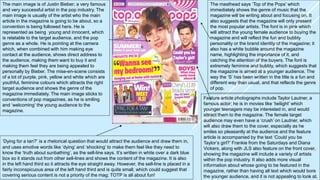
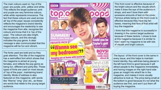
The masthead says ‘Top of the Pops’ which 
immediately shows the genre of music that the 
magazine will be writing about and focusing on. It 
also suggests that the magazine will only present 
the most popular artists. The font is in pink which 
will attract the young female audience to buying the 
magazine and will reflect the fun and bubbly 
personality or the brand identity of the magazine; it 
also has a white bubble around the magazine 
name, highlighting the importance of it, and 
catching the attention of the buyers. The font is 
extremely feminine and bubbly, which suggests that 
the magazine is aimed at a younger audience. The 
way the ‘S’ has been written in the title is a fun and 
different way than usual, and that reflects the genre 
of pop. 
The main image is of Justin Bieber; a very famous 
and very successful artist in the pop industry. The 
main image is usually of the artist who the main 
article in the magazine is going to be about, so a 
convention is being followed here. He is 
represented as being young and innocent, which 
is relatable to the target audience, and the pop 
genre as a whole. He is pointing at the camera 
which, when combined with him making eye 
contact at the audience, shows direct address to 
the audience, making them want to buy it and 
making them feel they are being appealed to 
personally by Bieber. The mise-en-scene consists 
of a lot of purple, pink, yellow and white which are 
youthful, feminine colours which attracts the right 
target audience and shows the genre of the 
magazine immediately. The main image sticks to 
conventions of pop magazines, as he is smiling 
and ‘welcoming’ the young audience to the 
magazine. 
Feature article photographs include Taylor Lautner, a 
famous actor; he is in movies like ‘twilight’ which 
younger teenagers may be interested in, and would 
attract them to the magazine. The female target 
audience may even have a ‘crush’ on Lautner, which 
will also draw them to the cover, especially as he 
smiles so pleasantly at the audience and the feature 
article is accompanied by the text ‘Could you be 
Taylor’s girl?’ Frankie from the Saturdays and Diana 
Vickers, along with JLS also feature on the front cover, 
showing the magazine will include a variety of artists 
within the pop industry. It also adds more visual 
information about whose going to be featured in the 
magazine, rather than having all text which would bore 
the younger audience, and it is not appealing to look at. 
‘Dying for a tan?’ is a rhetorical question that would attract the audience and draw them in, 
and uses emotive words like ‘dying’ and ‘shocking’ to make them feel like they need to 
know the ‘truth about sunbathing’, as the sell-line says. It’s written in white over a dark blue 
box so it stands out from other sell-lines and shows the content of the magazine. It is also 
in the left hand third so it attracts the eye straight away. However, the sell-line is placed in a 
fairly inconspicuous area of the left hand third and is quite small, which could suggest that 
covering serious content is not a priority of the mag; TOTP is all about fun!
The main sell line is about Justin Bieber who is 
the cover model, and gives an insight of what’s 
going to be inside the magazine. The bright 
colours used makes it recognisable, and it’s in 
the left hand third so the audience’s eye goes 
directly to it. A quote from the article in the 
magazine is used saying ‘wanna see my 
bedroom?’ which immediately interests the 
audience, as the audience will love the idea of 
having private access to a secret place like 
Bieber’s bedroom, especially if they ‘fancy’ him.. 
It also says ‘Private pics!’ which gives the idea 
that it’s an exclusive secret that only they will get 
to see it, making the reader feel special, and 
making them buy the magazine so they can 
know all the ‘secrets’. 
The puff is giving readers of the magazine a 
chance to win tickets to meet JLS; a popular 
boy band. This would interest audience, and 
make them want to purchase the magazine in 
order to win this prize. The puff has been 
placed in the left hand third so it catches the 
readership’s eye. ‘Win!’ is written in a larger 
font, and the exclamation mark emphasises 
the importance of the puff and generates a 
sense of excitement. The circle itself is purple, 
fitting in with the colours of the magazine, and 
the yellow font saying ‘MEET JLS!’ is 
capitalised so it stands out and almost makes 
the audience feel that this could be possible, 
that it’s guaranteed to happen. 
Taylor Lautner is a famous actor taking on 
roles in films which would be watched by 
young teenagers. The rhetorical question, 
‘Could you be Taylor’s girl?’ will excite the 
audience, and make them feel like if they 
buy the magazine, they could have a 
chance with a good looking celebrity. As this 
is accompanied by the words ‘Find out 
inside’, it makes the audience feel like the 
magazine can provide the secrets to dating 
a pop star. Direct address is used when 
saying ‘you’ which makes the consumers 
feel special, and like they should buy the 
magazine. Pink and White are used which 
link to the other youthful colours on the ‘top 
of the pops’ magazine. This also shows that 
it is for a younger audience, as older woman 
wouldn’t really be interested in such a ‘fluffy’ 
colour scheme. An image of him looking 
handsome is also used to show it more 
visually and to attract the audience. 
‘BOYS!’ is used in capital letters and with an exclamation mark to make it grab attention and 
attract the audience. Young girls are usually interested in attractive boys, so this sell-line entices 
people and makes them want to buy the magazine. It suggests that the magazine will tell you 
‘what boys really think about’, which would help girls to understand them and ‘get’ their dream 
guy. The pink font shows the magazine’s continuity in its use of a feminine colour scheme.
Another sell-line is ‘LOVE YOUR SUMMER!’. 
Summer is when children get time off school 
to enjoy the weather and spend time with 
their friends and family; this magazine 
mentions this happy time of year and tells 
readers how they can make their summer the 
best. This would interest young girls and 
make them want to buy the magazine. ‘Your’, 
another example of direct address, is used, 
making it personal so the reader feels like it is 
specifically addressed to them. The writing is 
white which is a youthful colour, and pictures 
of celebrities make it more visual and it 
suggests they will be giving tips on how to 
make summer great. The readership will love 
the idea of doing exactly what the celebs do 
in order to make their summer fabulous 
An image of Cheryl Cole is placed 
alongside images of clothes, shoes and 
makeup; girls are interested in this as they 
want to make themselves look good. 
Cheryl Cole is famous, and always looks 
glamorous – the sell-line suggests that 
readers too can be like Cheryl, and see 
how she looks so good, so they can look 
good as well. It also uses the word 
‘bargain’ which would interest anyone, 
especially young girls who don’t have 
money from work, and are dependant on 
their parents. The audience’s eye is also 
drawn to the sell-line through the mode of 
address; ‘OMG’ is an expression they 
themselves would use. 
The barcode, price and date of the magazine 
are placed at the bottom, and are small in 
size. This is so it does not attract the 
readership’s eye, as it’s not important in 
selling the magazine. £2.99 is the price of the 
magazine; this is reasonable because young 
girls rely on parents giving them pocket 
money to spend on these magazines. By the 
time the readership see the price, of course, 
they will already have been persuaded to buy 
the magazine by the content on the cover. 
At the top of the magazine is more 
information about the celebrities that will 
feature in the magazine. Jedward are well 
known for their big and fun hairstyles, and 
the magazine attempts at using humour 
when saying ‘it’s hair raising’, which could 
make the audience smile, warming them 
to the magazine and its cover. 
A pink and white spiral pattern is also 
placed at the top which reflects the fun 
style and brand identity of the magazine, 
and attracts the audience’s eye to the 
magazine.
The main colours used on ‘top of the 
pops’ are purple, pink, yellow and white. 
This reflects the target audience; pink 
and purple are very feminine colours, 
while white represents innocence. The 
fact that these colours are used across 
all ‘top of the pops’ issues consistently 
reflects the magazine’s brand identity 
and encourages the readership to see 
the magazine from afar, recognise the 
colours and know that it is ‘top of the 
pops’. The colours are also bright, 
happy colours, and this strongly 
indicates the pop genre. A clear 
message is also communicated that this 
magazine will be fun and vibrant. 
The fonts used are bold and so they 
grab attention. The title of the magazine 
has a swirl-effect font which shows that 
the magazine is aimed at young 
females, and reflects the pop genre as 
being fun, different and party-like. These 
types of fonts are used on most issues 
of ‘top of the pops’, maintaining brand 
identity. Mode of address is also 
featured on this magazine, with words 
like ‘Wanna’ ‘omg’ ‘pics’ etc., as these 
are words that relate to the young target 
audience. 
This front cover is effective because of 
the bright colours and the visuals which 
make it draw the eye of the audience in 
shops, and won’t bore them with 
excessive amounts of text on the cover. 
Famous artists being on the front cover is 
effective because they have big fan 
bases, meaning that fans of that artist will 
buy the magazine. 
I think that this magazine is successful in 
drawing in the correct target audience 
because of these factors. I chose to look 
at this magazine because it is similar to 
how I want my magazine to be with lots 
of visuals and bright colours. 
The layout of the front cover is the same in 
every issue, and this helps to maintain 
brand identity. Key sell-lines being placed in 
the left hand third is good because it will 
attract people to the magazine immediately, 
and having images on the right hand side 
gives an insight into what’ll be in the 
magazine, and makes it more visually 
attractive to look at. The price being small at 
the bottom is good because it’s not what the 
audience see first, and won’t put them off 
buying the magazine.

Front Cover Analysis 1

  • 1.
    The masthead says‘Top of the Pops’ which immediately shows the genre of music that the magazine will be writing about and focusing on. It also suggests that the magazine will only present the most popular artists. The font is in pink which will attract the young female audience to buying the magazine and will reflect the fun and bubbly personality or the brand identity of the magazine; it also has a white bubble around the magazine name, highlighting the importance of it, and catching the attention of the buyers. The font is extremely feminine and bubbly, which suggests that the magazine is aimed at a younger audience. The way the ‘S’ has been written in the title is a fun and different way than usual, and that reflects the genre of pop. The main image is of Justin Bieber; a very famous and very successful artist in the pop industry. The main image is usually of the artist who the main article in the magazine is going to be about, so a convention is being followed here. He is represented as being young and innocent, which is relatable to the target audience, and the pop genre as a whole. He is pointing at the camera which, when combined with him making eye contact at the audience, shows direct address to the audience, making them want to buy it and making them feel they are being appealed to personally by Bieber. The mise-en-scene consists of a lot of purple, pink, yellow and white which are youthful, feminine colours which attracts the right target audience and shows the genre of the magazine immediately. The main image sticks to conventions of pop magazines, as he is smiling and ‘welcoming’ the young audience to the magazine. Feature article photographs include Taylor Lautner, a famous actor; he is in movies like ‘twilight’ which younger teenagers may be interested in, and would attract them to the magazine. The female target audience may even have a ‘crush’ on Lautner, which will also draw them to the cover, especially as he smiles so pleasantly at the audience and the feature article is accompanied by the text ‘Could you be Taylor’s girl?’ Frankie from the Saturdays and Diana Vickers, along with JLS also feature on the front cover, showing the magazine will include a variety of artists within the pop industry. It also adds more visual information about whose going to be featured in the magazine, rather than having all text which would bore the younger audience, and it is not appealing to look at. ‘Dying for a tan?’ is a rhetorical question that would attract the audience and draw them in, and uses emotive words like ‘dying’ and ‘shocking’ to make them feel like they need to know the ‘truth about sunbathing’, as the sell-line says. It’s written in white over a dark blue box so it stands out from other sell-lines and shows the content of the magazine. It is also in the left hand third so it attracts the eye straight away. However, the sell-line is placed in a fairly inconspicuous area of the left hand third and is quite small, which could suggest that covering serious content is not a priority of the mag; TOTP is all about fun!
  • 2.
    The main sellline is about Justin Bieber who is the cover model, and gives an insight of what’s going to be inside the magazine. The bright colours used makes it recognisable, and it’s in the left hand third so the audience’s eye goes directly to it. A quote from the article in the magazine is used saying ‘wanna see my bedroom?’ which immediately interests the audience, as the audience will love the idea of having private access to a secret place like Bieber’s bedroom, especially if they ‘fancy’ him.. It also says ‘Private pics!’ which gives the idea that it’s an exclusive secret that only they will get to see it, making the reader feel special, and making them buy the magazine so they can know all the ‘secrets’. The puff is giving readers of the magazine a chance to win tickets to meet JLS; a popular boy band. This would interest audience, and make them want to purchase the magazine in order to win this prize. The puff has been placed in the left hand third so it catches the readership’s eye. ‘Win!’ is written in a larger font, and the exclamation mark emphasises the importance of the puff and generates a sense of excitement. The circle itself is purple, fitting in with the colours of the magazine, and the yellow font saying ‘MEET JLS!’ is capitalised so it stands out and almost makes the audience feel that this could be possible, that it’s guaranteed to happen. Taylor Lautner is a famous actor taking on roles in films which would be watched by young teenagers. The rhetorical question, ‘Could you be Taylor’s girl?’ will excite the audience, and make them feel like if they buy the magazine, they could have a chance with a good looking celebrity. As this is accompanied by the words ‘Find out inside’, it makes the audience feel like the magazine can provide the secrets to dating a pop star. Direct address is used when saying ‘you’ which makes the consumers feel special, and like they should buy the magazine. Pink and White are used which link to the other youthful colours on the ‘top of the pops’ magazine. This also shows that it is for a younger audience, as older woman wouldn’t really be interested in such a ‘fluffy’ colour scheme. An image of him looking handsome is also used to show it more visually and to attract the audience. ‘BOYS!’ is used in capital letters and with an exclamation mark to make it grab attention and attract the audience. Young girls are usually interested in attractive boys, so this sell-line entices people and makes them want to buy the magazine. It suggests that the magazine will tell you ‘what boys really think about’, which would help girls to understand them and ‘get’ their dream guy. The pink font shows the magazine’s continuity in its use of a feminine colour scheme.
  • 3.
    Another sell-line is‘LOVE YOUR SUMMER!’. Summer is when children get time off school to enjoy the weather and spend time with their friends and family; this magazine mentions this happy time of year and tells readers how they can make their summer the best. This would interest young girls and make them want to buy the magazine. ‘Your’, another example of direct address, is used, making it personal so the reader feels like it is specifically addressed to them. The writing is white which is a youthful colour, and pictures of celebrities make it more visual and it suggests they will be giving tips on how to make summer great. The readership will love the idea of doing exactly what the celebs do in order to make their summer fabulous An image of Cheryl Cole is placed alongside images of clothes, shoes and makeup; girls are interested in this as they want to make themselves look good. Cheryl Cole is famous, and always looks glamorous – the sell-line suggests that readers too can be like Cheryl, and see how she looks so good, so they can look good as well. It also uses the word ‘bargain’ which would interest anyone, especially young girls who don’t have money from work, and are dependant on their parents. The audience’s eye is also drawn to the sell-line through the mode of address; ‘OMG’ is an expression they themselves would use. The barcode, price and date of the magazine are placed at the bottom, and are small in size. This is so it does not attract the readership’s eye, as it’s not important in selling the magazine. £2.99 is the price of the magazine; this is reasonable because young girls rely on parents giving them pocket money to spend on these magazines. By the time the readership see the price, of course, they will already have been persuaded to buy the magazine by the content on the cover. At the top of the magazine is more information about the celebrities that will feature in the magazine. Jedward are well known for their big and fun hairstyles, and the magazine attempts at using humour when saying ‘it’s hair raising’, which could make the audience smile, warming them to the magazine and its cover. A pink and white spiral pattern is also placed at the top which reflects the fun style and brand identity of the magazine, and attracts the audience’s eye to the magazine.
  • 4.
    The main coloursused on ‘top of the pops’ are purple, pink, yellow and white. This reflects the target audience; pink and purple are very feminine colours, while white represents innocence. The fact that these colours are used across all ‘top of the pops’ issues consistently reflects the magazine’s brand identity and encourages the readership to see the magazine from afar, recognise the colours and know that it is ‘top of the pops’. The colours are also bright, happy colours, and this strongly indicates the pop genre. A clear message is also communicated that this magazine will be fun and vibrant. The fonts used are bold and so they grab attention. The title of the magazine has a swirl-effect font which shows that the magazine is aimed at young females, and reflects the pop genre as being fun, different and party-like. These types of fonts are used on most issues of ‘top of the pops’, maintaining brand identity. Mode of address is also featured on this magazine, with words like ‘Wanna’ ‘omg’ ‘pics’ etc., as these are words that relate to the young target audience. This front cover is effective because of the bright colours and the visuals which make it draw the eye of the audience in shops, and won’t bore them with excessive amounts of text on the cover. Famous artists being on the front cover is effective because they have big fan bases, meaning that fans of that artist will buy the magazine. I think that this magazine is successful in drawing in the correct target audience because of these factors. I chose to look at this magazine because it is similar to how I want my magazine to be with lots of visuals and bright colours. The layout of the front cover is the same in every issue, and this helps to maintain brand identity. Key sell-lines being placed in the left hand third is good because it will attract people to the magazine immediately, and having images on the right hand side gives an insight into what’ll be in the magazine, and makes it more visually attractive to look at. The price being small at the bottom is good because it’s not what the audience see first, and won’t put them off buying the magazine.