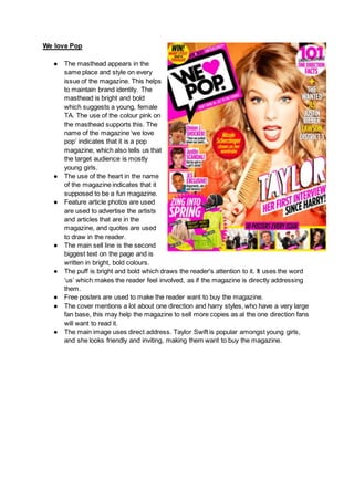
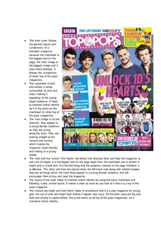
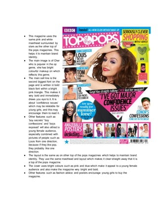
How to Split Bills in the Odoo 17 POS ModuleCeline George
Bills have a main role in point of sale procedure. It will help to track sales, handling payments and giving receipts to customers. Bill splitting also has an important role in POS. For example, If some friends come together for dinner and if they want to divide the bill then it is possible by POS bill splitting. This slide will show how to split bills in odoo 17 POS.
The Roman Empire A Historical Colossus.pdfkaushalkr1407
The Roman Empire, a vast and enduring power, stands as one of history's most remarkable civilizations, leaving an indelible imprint on the world. It emerged from the Roman Republic, transitioning into an imperial powerhouse under the leadership of Augustus Caesar in 27 BCE. This transformation marked the beginning of an era defined by unprecedented territorial expansion, architectural marvels, and profound cultural influence.
The empire's roots lie in the city of Rome, founded, according to legend, by Romulus in 753 BCE. Over centuries, Rome evolved from a small settlement to a formidable republic, characterized by a complex political system with elected officials and checks on power. However, internal strife, class conflicts, and military ambitions paved the way for the end of the Republic. Julius Caesar’s dictatorship and subsequent assassination in 44 BCE created a power vacuum, leading to a civil war. Octavian, later Augustus, emerged victorious, heralding the Roman Empire’s birth.
Under Augustus, the empire experienced the Pax Romana, a 200-year period of relative peace and stability. Augustus reformed the military, established efficient administrative systems, and initiated grand construction projects. The empire's borders expanded, encompassing territories from Britain to Egypt and from Spain to the Euphrates. Roman legions, renowned for their discipline and engineering prowess, secured and maintained these vast territories, building roads, fortifications, and cities that facilitated control and integration.
The Roman Empire’s society was hierarchical, with a rigid class system. At the top were the patricians, wealthy elites who held significant political power. Below them were the plebeians, free citizens with limited political influence, and the vast numbers of slaves who formed the backbone of the economy. The family unit was central, governed by the paterfamilias, the male head who held absolute authority.
Culturally, the Romans were eclectic, absorbing and adapting elements from the civilizations they encountered, particularly the Greeks. Roman art, literature, and philosophy reflected this synthesis, creating a rich cultural tapestry. Latin, the Roman language, became the lingua franca of the Western world, influencing numerous modern languages.
Roman architecture and engineering achievements were monumental. They perfected the arch, vault, and dome, constructing enduring structures like the Colosseum, Pantheon, and aqueducts. These engineering marvels not only showcased Roman ingenuity but also served practical purposes, from public entertainment to water supply.
Welcome to TechSoup New Member Orientation and Q&A (May 2024).pdfTechSoup
In this webinar you will learn how your organization can access TechSoup's wide variety of product discount and donation programs. From hardware to software, we'll give you a tour of the tools available to help your nonprofit with productivity, collaboration, financial management, donor tracking, security, and more.
Unit 8 - Information and Communication Technology (Paper I).pdfThiyagu K
This slides describes the basic concepts of ICT, basics of Email, Emerging Technology and Digital Initiatives in Education. This presentations aligns with the UGC Paper I syllabus.
Instructions for Submissions thorugh G- Classroom.pptxJheel Barad
This presentation provides a briefing on how to upload submissions and documents in Google Classroom. It was prepared as part of an orientation for new Sainik School in-service teacher trainees. As a training officer, my goal is to ensure that you are comfortable and proficient with this essential tool for managing assignments and fostering student engagement.
How to Make a Field invisible in Odoo 17Celine George
It is possible to hide or invisible some fields in odoo. Commonly using “invisible” attribute in the field definition to invisible the fields. This slide will show how to make a field invisible in odoo 17.
Read| The latest issue of The Challenger is here! We are thrilled to announce that our school paper has qualified for the NATIONAL SCHOOLS PRESS CONFERENCE (NSPC) 2024. Thank you for your unwavering support and trust. Dive into the stories that made us stand out!
The French Revolution, which began in 1789, was a period of radical social and political upheaval in France. It marked the decline of absolute monarchies, the rise of secular and democratic republics, and the eventual rise of Napoleon Bonaparte. This revolutionary period is crucial in understanding the transition from feudalism to modernity in Europe.
For more information, visit-www.vavaclasses.com
Basic phrases for greeting and assisting costumers
Front cover analysis
1. We love Pop
● The masthead appears in the
same place and style on every
issue of the magazine. This helps
to maintain brand identity. The
masthead is bright and bold
which suggests a young, female
TA. The use of the colour pink on
the masthead supports this. The
name of the magazine ‘we love
pop’ indicates that it is a pop
magazine, which also tells us that
the target audience is mostly
young girls.
● The use of the heart in the name
of the magazine indicates that it
supposed to be a fun magazine.
● Feature article photos are used
are used to advertise the artists
and articles that are in the
magazine, and quotes are used
to draw in the reader.
● The main sell line is the second
biggest text on the page and is
written in bright, bold colours.
● The puff is bright and bold which draws the reader's attention to it. It uses the word
‘us’ which makes the reader feel involved, as if the magazine is directly addressing
them.
● Free posters are used to make the reader want to buy the magazine.
● The cover mentions a lot about one direction and harry styles, who have a very large
fan base, this may help the magazine to sell more copies as al the one direction fans
will want to read it.
● The main image uses direct address. Taylor Swift is popular amongst young girls,
and she looks friendly and inviting, making them want to buy the magazine.
2. ● This cover follows the
conventions a standard
magazine cover, and
maintains brand identity
through being very similar to
other ‘we love pop’
magazines. This cover is
unique to this magazine
because they have used
colours such as orange,
whereas normally it is pink.
● The name of the magazine
suggests a young female
target audience as they are
the main consumers of pop
music. The font of the
masthead is big and bold
which will draw in young
readers. The bright colours
will also encourage a
younger audience.
● The main image is of one
direction. They are looking
directly at the camera, so
the magazine is using direct
address. They are being
presented as a cool and
attractive band, which will
also encourage a young
female audience.
● Feature article photographs
are used to draw in the
reader, young girls who like
one direction may also like zoella and Luke Hemmings, who are also features on the cover.
This will make the reader feel like there is a lot of content in the magazine that they will enjoy
and so will be more encouraged to buy it.
● The sell lines use direct address, for example, ‘zoella is your life coach’. This makes the
reader feel like the magazine is talking to them personally. Other sell lines’ make the
magazine seem like it will be enjoyable to read, because of the word ‘funnier’ in the sell line
‘one direction, bigger! Fitter! Funnier!’ and the use of the play on words in ‘Luke who’s talking’.
● Other artists featured such as Justin Bieber will grab the attention of his fans and make them
want to buy the magazine.
● The layout is similar to that of other issues of this magazine which maintains brand identity.
The main sell line is the second biggest text on the page, after the masthead. This draws
attention to it. The main image takes up the most space on the page, other sell lines are to
the left hand side, this is where the eye will naturally go to, so the reader’s attention will be
attracted to this area.
● The bright colours such as orange and yellow reflect the pop genre of the magazine.
● Other features such as fashion and life advice and posters will help to draw in the target
audience and encourage them to buy the magazine.
3. ● This cover maintains brand
identity because it follows
the same structure of other
‘we love pop’ magazines.
● The masthead is the same
as on other ‘we love pop’
magazines. It is in the same
place and the same style
which helps maintain brand
identity. The target
audience is young girls, the
masthead reflects that the
magazine is a pop
magazine. It is pink and
uses a heart shape instead
of the word ‘love’. It is within
a speech bubble shape
which indicates there will be
lots of gossip in the
magazine, so it will appeal
to the TA.
● The main image is of the
boyband, the wanted. They
are smiling and look fun
and jokey. They are stood
close together so it looks as
if they are friends having
fun. This will draw in the TA
and fans of the wanted.
Feature article photos are
of one direction members
Liam and niall, this will make one direction fans want to buy the magazine. Young girls who
like the wanted will probably also like one direction.
● The sell line ‘1D shock, niall and Liam form duo’ will encourage one direction's large fan base
to buy the magazine. The main sell line ‘The Wanted, all talk and no trousers’ is the second
biggest text on the page. It appears in a bold font and is highlighted in pink, which draws the
reader's eye towards it.
● The layout of the magazine is the same as other issues of ‘we love pop’ with the masthead on
the left hand side in the top corner. The main sell line and image take up the most space and
are the first thing that the reader's eye is attracted to.
● Bright colours such as pink and light blue are used. This makes the magazine bold and bright
which will appeal to a young female audience, and also reflects the pop genre.
● Free posters and fashion advice also entice young female readers to buy the magazine.
4. Top of the pops
● The name of the
magazine ‘top of
the pops’ highlights
that it is a pop
magazine, this is
also indicated by
the bright colours
and busy layout of
the magazine.
● The masthead is in
uppercase and is in
bold, slightly curly
font. It is
surrounded by pink
and stars which
indicates that the
TA are young girls.
● The main sell line is
in the centre in a
bright puff, which
draws the reader's
eye towards it. It
uses casual
language and slang
such as ‘lolz’ which
shows how the
magazine is written
in a casual style.
● The main image is
of Ariana Grande
who is popular
amongst young
people, she is
smiling directly at
the camera,
highlighting how the
magazine uses
direct address.
● Other artists featured, such as one direction, Austin mahone and the vamps will also appeal
to the young female TA as they are young popular people that many girls find attractive.
Quotes such as ‘outrageous tour secrets’ make the reader want to open the magazine and be
part of the secret.
● Bright colours such as pink blue and yellow are used which makes the magazine bold and
bright, and will attract the attention of young girls, who are the TA.
● The cover also features other people who young people may be interested in such as joey
Essex, and also fashion ideas and tips which will interest a young female audience, making
the magazine cover effective.
5. ● This front cover follows
the general layout and
conventions of a
standard magazine
because the masthead is
the biggest text on the
page, the main image is
the biggest image and it
uses direct address. It
follows the conventions
of other ‘top of the pops’
magazines.
● The masthead is bold
and written in white,
surrounded by pink and
stars, making it
appealing to the young
target audience. It helps
to maintain brand identity
as it is the same as the
masthead on other top of
the pops magazines.
● The main image is of one
direction, they appeal to
a young female audience
as they are young
attractive boys. They are
looking straight at the
camera and smiling
which makes the
magazine seem friendly
and inviting to a young
reader.
● The main sell line ‘unlock 1D’s hearts’ will attract one direction fans and help the magazine to
sell a lot of copies. It is the largest text on the page apart from the masthead and is written in
bright pink in a bold font. It is the first thing that the audience notices on the page therefore it
is effective. The other sell lines are placed down the left hand side along with related images,
they are all things which will most likely appeal to a young female audience and will
encourage them to buy and read the magazine.
● The layout of the cover helps to maintain brand identity by using the same masthead and
following a very similar layout. It makes it clear as soon as you look at it that it is a top of the
pops magazine.
● The colours are bright and bold which helps to emphasize that it is a pop magazine for young
girls, the use of pink and bright blue makes it appear very busy. All the fonts used are big and
bold and mostly in capital letters, this is the same on all top of the pops magazines, so it
maintains brand identity.
6. ● This magazine uses the
same pink and white
masthead surrounded by
stars as the other top of
the pops magazines. This
helps it to maintain brand
identity.
● The main image is of Cher
who is popular in the op
genre, she has bright
colourful makeup on which
reflects this genre.
● The main sell line is the
second biggest font on the
page and is written in bold
black font within a bright
pink triangle. This makes it
very bold and immediately
draws you eye to it. It is
about ‘confidence issues’
which may be relatable for
young girls, and this may
encourage them to read it.
● Other features such as
‘boy secrets’ ‘boy
confessions’ and ‘boys
exposed’ will also attract a
young female audience,
especially combined with
pictures of people such as
Louis from one direction,
because if they like pop,
they probably like one
direction.
● The layout is the same as on other top of the pops magazines which helps to maintain brand
identity. They use the same masthead and layout which makes it clear straight away that it is
a top of the pops magazine.
● The cover uses bright colours such as pink and blue which make it appeal to a young female
audience and also make the magazine very bright and bold.
● Other features such as fashion advice and posters encourage young girls to buy the
magazine.