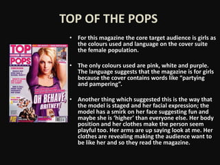
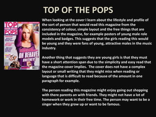
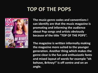
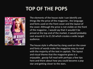
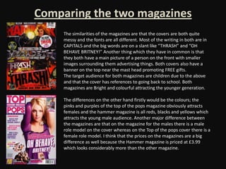
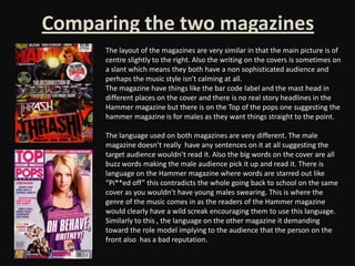
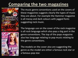
Music Magazine
 Presentation
     Task
           By Sian Hayden
TOP OF THE POPS
 • For this magazine the core target audience is girls as
   the colours used and language on the cover suite
   the female population.

 • The only colours used are pink, white and purple.
   The language suggests that the magazine is for girls
   because the cover contains words like “partying
   and pampering”.

 • Another thing which suggested this is the way that
   the model is staged and her facial expression; the
   model has a smirk on her face suggesting fun and
   maybe she is ‘higher’ than everyone else. Her body
   position and her clothes make the person seem
   playful too. Her arms are up saying look at me. Her
   clothes are revealing making the audience want to
   be like her and so they read the magazine.
TOP OF THE POPS
When looking at the cover I learn about the lifestyle and profile of
the sort of person that would read this magazine from the
consistency of colour, simple layout and the free things that are
included in the magazine, for example posters of young male role
models and badges. This suggests that the girls reading this would
be young and they were fans of young, attractive males in the music
industry.

Another thing that suggests they are young girls is that they must
have a short attention span due to the simplicity and easy read that
the magazine cover implies. The cover does not have a complex
layout or small writing that they might miss when reading or
language that is difficult to read because of the amount in one
paragraph for example.

The person reading this magazine might enjoy going out shopping
with there parents an with friends. They might not have a lot of
homework or work in their free time. The person may want to be a
singer when they grow up or want to be famous.
TOP OF THE POPS
  The music genre codes and conventions I
  can identify are that the music magazine is
  promoting and informing the audience
  about Pop songs and artists obviously
  because of the title “TOP OF THE POPS”.

  The magazine is written informally making
  the magazine more suited to the younger
  generation. Another thing which makes the
  genre clear is the fun and enthusiastic fonts
  and mixed layout of words for example “oh
  behave, Britney!” is off centre and on an
  angle.
TOP OF THE POPS
 The elements of the house style I can identify are
 things like the price of the magazine , the language
 and fonts used on the front cover and the layout of
 the cover. Although the price is not visible on the front
 of the magazine , I would say that it wouldn’t be
 priced at the top end of the market, it would probably
 cost around £1 to £1.50 which creates a wide target
 audience.

 The house style is effected by slang used on the cover
 and fonts of words make the magazine easy to read
 with the majority of the text in capitals. The layout
 and visual theme that the magazine gives is a
 enjoyable , gossip full read with perhaps a few tips
 here and there about how you could become a pop
 star and getting closer to the stars.
Comparing the two magazines
     The similarities of the magazines are that the covers are both quite
     messy and the fonts are all different. Most of the writing in both are in
     CAPITALS and the big words are on a slant like “THRASH” and “OH
     BEHAVE BRITNEY!” Another thing which they have in common is that
     they both have a main picture of a person on the front with smaller
     images surrounding them advertising things. Both covers also have a
     banner on the top near the mast head promoting FREE gifts.
     The target audience for both magazines are children due to the above
     and that the cover has references to going back to school. Both
     magazines are Bright and colourful attracting the younger generation.

     The differences on the other hand firstly would be the colours; the
     pinks and purples of the top of the pops magazine obviously attracts
     females and the hammer magazine is all reds, blacks and yellows which
     attracts the young male audience. Another major difference between
     the magazines are that on the magazine for the males there is a male
     role model on the cover whereas on the Top of the pops cover there is a
     female role model. I think that the prices on the magazines are a big
     difference as well because the Hammer magazine is priced at £3.99
     which looks considerably more than the other magazine.
Comparing the two magazines
      The layout of the magazines are very similar in that the main picture is of
      centre slightly to the right. Also the writing on the covers is sometimes on
      a slant which means they both have a non sophisticated audience and
      perhaps the music style isn't calming at all.
      The magazine have things like the bar code label and the mast head in
      different places on the cover and there is no real story headlines in the
      Hammer magazine but there is on the Top of the pops one suggesting the
      hammer magazine is for males as they want things straight to the point.

      The language used on both magazines are very different. The male
      magazine doesn’t really have any sentences on it at all suggesting the
      target audience wouldn’t read it. Also the big words on the cover are all
      buzz words making the male audience pick it up and read it. There is
      language on the Hammer magazine where words are starred out like
      “Pi**ed off” this contradicts the whole going back to school on the same
      cover as you wouldn’t have young males swearing. This is where the
      genre of the music comes in as the readers of the Hammer magazine
      would clearly have a wild screak encouraging them to use this language.
      Similarly to this , the language on the other magazine it demanding
      toward the role model implying to the audience that the person on the
      front also has a bad reputation.
Comparing the two magazines
     The music genre conventions used on the covers of
     these magazines suggests clearly the types of music
     they are about. For example the Hammer magazine
     is all messy and dark colours with jagged fonts
     suggesting rock music.

     The language use on the cover of the rock magazine
     is all rock language which also pays a big part in the
     genre conventions. The top of the pops magazine
     also has language relating to pop music relating to
     the genre conventions.

     The models on the cover also are suggesting the
     genre as the model are either a famous rock star or
     a famous pop star.
Comparing the two magazines
     The music artists featured and the audience they appeal to
     is very clear for example Brittany is famous for pop and
     being quite rebellious and so the audience might be like
     that as well.

     The special feature sin both magazines is the free gifts and
     the posters of the famous people. Also both magazines
     have a main headline which sound interesting and makes
     the audience buy the magazine and read it.

     The overall techniques that the magazines have are buzz
     words, interesting stories and exiting colours that attracts
     the young target audience. The mode of address in both
     magazines are informal and there is a strong use of slang
     throughout making the magazines have a wide target
     audience and also making easy to read.
THANK YOU
FOR WATCHING

Music magazine presentation task

  • 1.
    Music Magazine Presentation Task By Sian Hayden
  • 2.
    TOP OF THEPOPS • For this magazine the core target audience is girls as the colours used and language on the cover suite the female population. • The only colours used are pink, white and purple. The language suggests that the magazine is for girls because the cover contains words like “partying and pampering”. • Another thing which suggested this is the way that the model is staged and her facial expression; the model has a smirk on her face suggesting fun and maybe she is ‘higher’ than everyone else. Her body position and her clothes make the person seem playful too. Her arms are up saying look at me. Her clothes are revealing making the audience want to be like her and so they read the magazine.
  • 3.
    TOP OF THEPOPS When looking at the cover I learn about the lifestyle and profile of the sort of person that would read this magazine from the consistency of colour, simple layout and the free things that are included in the magazine, for example posters of young male role models and badges. This suggests that the girls reading this would be young and they were fans of young, attractive males in the music industry. Another thing that suggests they are young girls is that they must have a short attention span due to the simplicity and easy read that the magazine cover implies. The cover does not have a complex layout or small writing that they might miss when reading or language that is difficult to read because of the amount in one paragraph for example. The person reading this magazine might enjoy going out shopping with there parents an with friends. They might not have a lot of homework or work in their free time. The person may want to be a singer when they grow up or want to be famous.
  • 4.
    TOP OF THEPOPS The music genre codes and conventions I can identify are that the music magazine is promoting and informing the audience about Pop songs and artists obviously because of the title “TOP OF THE POPS”. The magazine is written informally making the magazine more suited to the younger generation. Another thing which makes the genre clear is the fun and enthusiastic fonts and mixed layout of words for example “oh behave, Britney!” is off centre and on an angle.
  • 5.
    TOP OF THEPOPS The elements of the house style I can identify are things like the price of the magazine , the language and fonts used on the front cover and the layout of the cover. Although the price is not visible on the front of the magazine , I would say that it wouldn’t be priced at the top end of the market, it would probably cost around £1 to £1.50 which creates a wide target audience. The house style is effected by slang used on the cover and fonts of words make the magazine easy to read with the majority of the text in capitals. The layout and visual theme that the magazine gives is a enjoyable , gossip full read with perhaps a few tips here and there about how you could become a pop star and getting closer to the stars.
  • 6.
    Comparing the twomagazines The similarities of the magazines are that the covers are both quite messy and the fonts are all different. Most of the writing in both are in CAPITALS and the big words are on a slant like “THRASH” and “OH BEHAVE BRITNEY!” Another thing which they have in common is that they both have a main picture of a person on the front with smaller images surrounding them advertising things. Both covers also have a banner on the top near the mast head promoting FREE gifts. The target audience for both magazines are children due to the above and that the cover has references to going back to school. Both magazines are Bright and colourful attracting the younger generation. The differences on the other hand firstly would be the colours; the pinks and purples of the top of the pops magazine obviously attracts females and the hammer magazine is all reds, blacks and yellows which attracts the young male audience. Another major difference between the magazines are that on the magazine for the males there is a male role model on the cover whereas on the Top of the pops cover there is a female role model. I think that the prices on the magazines are a big difference as well because the Hammer magazine is priced at £3.99 which looks considerably more than the other magazine.
  • 7.
    Comparing the twomagazines The layout of the magazines are very similar in that the main picture is of centre slightly to the right. Also the writing on the covers is sometimes on a slant which means they both have a non sophisticated audience and perhaps the music style isn't calming at all. The magazine have things like the bar code label and the mast head in different places on the cover and there is no real story headlines in the Hammer magazine but there is on the Top of the pops one suggesting the hammer magazine is for males as they want things straight to the point. The language used on both magazines are very different. The male magazine doesn’t really have any sentences on it at all suggesting the target audience wouldn’t read it. Also the big words on the cover are all buzz words making the male audience pick it up and read it. There is language on the Hammer magazine where words are starred out like “Pi**ed off” this contradicts the whole going back to school on the same cover as you wouldn’t have young males swearing. This is where the genre of the music comes in as the readers of the Hammer magazine would clearly have a wild screak encouraging them to use this language. Similarly to this , the language on the other magazine it demanding toward the role model implying to the audience that the person on the front also has a bad reputation.
  • 8.
    Comparing the twomagazines The music genre conventions used on the covers of these magazines suggests clearly the types of music they are about. For example the Hammer magazine is all messy and dark colours with jagged fonts suggesting rock music. The language use on the cover of the rock magazine is all rock language which also pays a big part in the genre conventions. The top of the pops magazine also has language relating to pop music relating to the genre conventions. The models on the cover also are suggesting the genre as the model are either a famous rock star or a famous pop star.
  • 9.
    Comparing the twomagazines The music artists featured and the audience they appeal to is very clear for example Brittany is famous for pop and being quite rebellious and so the audience might be like that as well. The special feature sin both magazines is the free gifts and the posters of the famous people. Also both magazines have a main headline which sound interesting and makes the audience buy the magazine and read it. The overall techniques that the magazines have are buzz words, interesting stories and exiting colours that attracts the young target audience. The mode of address in both magazines are informal and there is a strong use of slang throughout making the magazines have a wide target audience and also making easy to read.
  • 10.