
Recommended
More Related Content
What's hot
What's hot (20)
Viewers also liked
Viewers also liked (12)
Similar to Masthead designs gtrrbyrtyrs
Similar to Masthead designs gtrrbyrtyrs (20)
Recently uploaded
Recently uploaded (20)
Masthead designs gtrrbyrtyrs
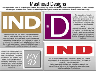
- 1. Masthead DesignsI want my masthead name ind to be designed in a short, eye-catching way, I would also like some aspect of a light bright colour so that it stands out and also gives me a main house colour I can relate to my whole magazine; however with each monthly issue the colours may change. This masthead has bold front which is exactly what I want as I need my title to be seen easily. I like most things about this masthead however personally I would prefer to have a smaller masthead that is not as wide as they is will cover the majority of the top of my front cover and I don’t really like that look. I also do like the gold colour however I would prefer it if it had more of a metallic sheen to it and that is not easy to do and print. This is probably my favourite masthead as it is more of a square, it doesn’t take up much space on my masthead and it leave me room for my main full bleed cover photo to be powerful and the most prominent feature. I also love the colour as it would give my magazine a bit of colour and as it is purple it would heighten my female audience however its not extremely bright so still shouldn’t effect the male audience. I like the fact that the actual text in this design is red and bold, I love the connotations of red as being powerful and could create a good link to my magazine if this design was used. The font is also, again, bold and easy to read which is exactly what I wanted, however I still do not like the idea of the design being spread out all across the top of my front cover. I wanted to try out a design that had a more of a scripted font just to see what it would look like. I discovered it doesn’t look right, it doesn’t stand out and I know that I will defiantly not be using any fonts like the in my magazine for any of that main titles as its not clear and does not look professional.