Final mood board
•Download as PPTX, PDF•
0 likes•222 views
The document discusses the design choices for a female pop magazine cover and layout, including: - Using pink and black/white colors on the cover to appear feminine but not overly contrasted - Using the fonts Calibri for headings and long passages, and Lucida Calligraphy and Papyrus for subtitles and quotes to seem fun and readable - Potentially adding small star shapes in Photoshop for visual interest - Writing the main text in standard English but using slang, punctuation, and numbers for letters in places to relate to the target audience - Selecting a first image for the cover and three others for inside content spreads, feeling they achieve the sophisticated yet professional look desired
Report
Share
Report
Share

Recommended
Contents page layout
The document discusses the design choices made for the contents page of a magazine. It describes using the same font as the front cover but changing the color scheme to be predominantly red instead of purple. Images of models were included to represent the magazine's content. An editor's note was added in a rectangle using Arial Bold font in black to stand out. Feature titles were listed at the bottom with big numbered fonts and effects to draw attention, following conventions seen in researched pop magazines. Consistency was maintained through shared design elements while introducing some variation in colors from the front cover.
Cover layout decisions
The document describes the design process for a magazine cover. The designer experimented with different fonts, colors, effects and graphics to develop an appealing masthead, coverlines, pull quote and other elements. Key decisions included changing the masthead and model shirt colors to purple and red for better coordination, adding effects like bevel and emboss to elements to make them pop more, and adjusting text colors like changing the number 5 from white to black so it stood out more clearly. The goal was to follow magazine design conventions while developing a cohesive visual design.
Photoshop skills
The document describes the student's process of designing a magazine cover in Photoshop for the first time. They experimented with editing a photo by changing eye and hair color, lighting, and blurring parts of the image. For the cover design, they tested different fonts, sizes, and placements of the masthead title and additional text elements. Based on feedback, they made further refinements such as removing a shadow layer and adding design elements like a barcode to complete the magazine cover design project.
Dps amended
The document provides details for a photoshoot plan and layout for a digital photoshoot spread (DPS) for a magazine. It includes details on the model, lighting, editing, and photo selection. Feedback was provided on font and color scheme choices. The creator then made changes based on the feedback, selecting new fonts, changing the color scheme to blue and pink, and altering the model's lip and guitar strap colors in photos. Further revisions were made based on teacher feedback, including repositioning elements like the masthead, photo credit, and page numbers to make the layout less distracting.
Dps new
Photos are selected and edited for a magazine feature on singer-songwriter Poppy Casson. Shots include medium close-ups of Casson playing guitar on a bed. Various photos are considered but some are discarded due to cropping issues, lack of space
Style sheet (finished)
The document discusses font and color scheme choices for a magazine. For the magazine name, the author chose the Varsity font because it is unique and bold to attract attention. For the masthead text, New Athletic was selected as it is plain but bold to contrast nicely with the name font. The main text font is Ani Typewriter since it is easy to read but also unique looking. For the color scheme, a blue and green pastel scheme was finalized as it will provide an "indie" look when contrast is increased to seem hipster-inspired, reflecting the magazine's genre of indie rock.
Evaluation qu 1
The document compares the layout and design conventions used in the student's media product, a magazine, to real magazines.
Some key differences noted include using a background image on the cover rather than just images, listing page contents down the side rather than with quotes, and offering subscription deals to encourage repeat purchases.
The student also discusses using consistent fonts, colors, and layouts throughout the magazine to establish a clear "house style" and make the product feel professionally designed and not like something a child made.
Evaluation qu 1
This document compares the media student's magazine layout and conventions to real magazines. [1] The student used a background image on the cover instead of just images, included different fonts and placed elements like the masthead and cover lines differently. [2] For articles, the student split text using bold and italics, included quotes and notes to break up pages similarly to real magazines. [3] By maintaining a consistent color scheme and fonts throughout, the student aimed to establish a clear "house style" to make the magazine look professionally designed.
Double page spread evaluation
This document discusses the layout of a double page magazine spread. It explains that columns are used to organize text neatly, and that including photos can help illustrate concepts for readers but too many photos may clutter the page. The author placed photos along the outside of the page and used different colored text to distinguish speakers and questions. A plain black background and default font were chosen to keep the layout clear and easy to read.
Flat plan feedback
The document contains feedback on different elements of a magazine design project focused on R&B music:
The front cover received feedback that it had too much text and would benefit from a simpler, neutral color scheme. The contents page feedback indicated the layout fit the R&B theme while not being too cluttered. For the double page spread, reviewers liked the use of two images but had mixed opinions on the background watermark. The debrief summarizes the key points to refine the logo, add more images to the contents page, and explore different photo shots within the magazine.
Presentation1
The document discusses how fonts, colors, images, and layout were used to attract and address the intended audience of the magazine. For fonts, capital letters were used that stand out while maintaining a professional look. The colors scheme included black, white, red, and yellow which suit the target audience. Mid-shot images were used for models that show facial expressions and set the tone. The layout was kept simple without being too crowded to maintain readership.
Cover media creation edit 1st
This document summarizes a photoshoot plan for a magazine cover. It discusses choosing a cover photo that features headphones and has good lighting. It also selects fonts for different cover elements, including using Calibri for dates/issue numbers and AR Bonnie for the masthead. Post-processing of the cover photo includes removing imperfections, darkening features for contrast, and adding color with a gradient tool. Elements are then arranged on the cover, such as placing the masthead above the model and adding cover lines and text using Orator Std and Calibri fonts in varying sizes.
Designing
The document discusses font and color choices for magazine design elements. For the masthead, the designer chooses a combination of Birds of Paradise and 60's Stripe fonts. Red is selected as the main masthead color for boldness. Sample layouts are presented for the cover, contents page, and double page spread that emphasize large central images and transparent text boxes over images. Photography plans aim to capture posed but relaxed full-figure shots for the contents page and close-up portraits for the cover and spreads. A 30-page flat plan with ads is presented as the final magazine layout.
Q1
The document discusses the design choices made for a student-created magazine. It describes placing the title in the top left corner as most magazines do. An attention-grabbing font was used for the title. The front cover image depicts a rapper holding a microphone to emphasize their musical career. Color scheme, coverlines, and other design elements were chosen based on research of popular rap magazines. For the contents page, the student followed some conventions but also made some changes, such as including more images than typical. The double-page spread uses conventions like a drop cap but also makes unique design choices like placing the artist's initial behind the text.
Dps media creation
This document outlines the planning and design process for a photoshoot and magazine page layout. It describes selecting a primary photo because the model looks happy, editing the photo by removing imperfections and adding lighting effects. Fonts and colors were chosen for the masthead, headlines, text blocks based on readability and matching the aesthetic. Elements like pull quotes, captions and banners were added and customized to integrate the photo and text.
Making the front cover evaluation improved
1. The document describes the design process for a magazine cover about DJ and club music. Key elements included choosing a bold, digital-looking font for the masthead to match the theme. Color was added selectively, including a hat in the cover photo, to make it more visually appealing.
2. A classmate was photographed dynamically for the cover to represent club music. Additional graphics like the "Parklife" logo and festival information were included to relate to the target audience and genre of music.
3. Captions and other text were carefully designed and formatted to catch attention and look professional, using consistent colors and layout across elements. The final magazine cover brought together all the researched components to entice readers about
Designing
The document discusses font and color choices for magazine design elements. For the masthead, the author decides to use Birds of Paradise for "Riff" and 60's Stripe for "magazine" as they like how formal yet curly Birds of Paradise looks for the important word and how simple 60's Stripe is for the shorter word. They plan to use consistent fonts like Mouse Deco and Powerhouse Era throughout and a red, black, and blue color scheme. Sample covers, contents pages, and spreads are presented along with photography plans to achieve the desired professional, focused looks.
Screenshots
The student originally used a picture of their model for the front cover but felt the background did not look professional or suit the genre of hip-hop. They tried adding a train track background but received feedback that it also did not fit. They then used a black and white picture of buildings which they felt suited the cover better. The student also resized the model picture, used a color scheme, and added bold cover lines to improve the overall design of the magazine cover. While initially finding Photoshop difficult, the student gained more confidence in the program after using it with help. For the contents page, the student changed one image, made the background darker, added borders, used different fonts and sizes for the cover lines, and added
Screenshots
The student originally used a picture of their model for the front cover but felt the background did not look professional or suit the hip-hop genre. They tried adding a train track background but received feedback that it did not fit. They then used a black and white picture of buildings which they felt suited it better. Creating the contents page was easier once they gained more skills in Photoshop and changed images, fonts, and added effects like shadows to make each item stand out.
Cover media creation
The document summarizes the photoshoot plan for a magazine cover. It describes selecting a cover photo with good lighting that shows the headphones. It also discusses font choices for the masthead, cover lines, and other elements, selecting a "pop" font for the masthead and an eye-catching font for cover lines. It provides steps taken to enhance the selected cover photo, such as removing imperfections, adding color, and positioning graphic elements.
Designing
The document discusses font and color choices for magazine design elements. For the masthead, the author decides to use Birds of Paradise for "Riff" and 60's Stripe for "magazine" as they like how formal yet curly Birds of Paradise looks and how simple yet double-lined 60's Stripe is. Throughout the magazine, the author aims to use consistent fonts like Mouse Deco and Coolvetica for headings and text. The main colors will be red, black, blue and white. Red is chosen for the bold masthead. Sample covers, contents pages and spreads are presented with a focus on large central images and transparent overlaying text.
Development of front cover
The document describes the 12 step process taken to design the front cover of a magazine.
1) The main photo was chosen and edited to remove unwanted flashes and enhance features.
2) Additional elements were added including the magazine title, band name, articles, and album art.
3) Formatting and design elements were adjusted to make the layout symmetrical and visually appealing, including adding blurs and tilting images.
Development diary media
The document is a development diary describing the process of creating magazine covers and layouts. It discusses editing photos using tools like levels, curves, and paintbrush to smooth skin and emphasize lips. Cover lines were added using outer glow and drop shadow to make them stand out. The contents page features boxes around text and pictures on the right for easy reading. A double page spread is split down the middle with a black title box and yellow title with red outline. Fact boxes and additional photos were included for more details.
Evidence of my work!
- The document discusses the process of creating a magazine in InDesign, including screenshots of selecting images, laying out pages on a grid, and editing photos.
- The author created a contact sheet to choose images for articles, selecting one with powerful facial expressions. Photos were edited and placed on pages.
- Steps are described for creating a feature article on rock music and violence, including writing with fake blood and selecting pull quotes.
- The contents page was made with the magazine title, "CONTENTS," and images and text listing article pages. An interview spread included a large photo and introduction.
E7
The document reflects on the learning and improvements made by the author in creating a music magazine compared to an earlier school magazine, including gaining skills in photography, layout, fonts, image manipulation, writing style, and considering factors like costumes and styles to portray bands. Techniques learned included using lighting equipment, higher resolution camera settings, photo editing tools, and an informal yet appropriate writing tone. The music magazine featured a simple but effective layout with one main photo, space for additional elements, and section divisions to aid navigation.
Question 7
The student learned several lessons from creating their first college magazine that they applied to improving their music magazine. Based on feedback, they made the masthead on the cover larger and stand out more. They also spaced out the cover lines so they were not too close to the cover image. For the contents page, they lined up the page numbers and enlarged the main image so the contents page color matched the cover page color better. Overall, they believe they successfully met the targets they set to incorporate the lessons learned from their first magazine.
Task 4 - Moodboard
The document discusses the planning for a magazine cover for a soap opera trailer. It describes choosing a close-up image of the main character looking powerful in black and white. A bold font is considered to stand out for the masthead and cover lines. The color scheme will be black, white and purple. The layout will include the issue number, masthead, main image, cover lines, barcode and logo according to magazine conventions. Possible main cover lines are presented focusing on words related to the trailer's themes.
3. production experiments4.3
The document describes experiments with a mock magazine front cover and double page spread (DPS) for a class project on women's fashion magazines.
For the front cover, the author used a photo of model Cindy Kimberly and included her name in white text on a blue background. For the DPS, a large photo of Cindy is on the left with her name below, and the page includes substantial explanatory text about fashion and the industry.
The author reflects that for the real magazine, they will include more information and possibly images on the cover, as well as a mixture of topics instead of focusing entirely on one person across the DPS pages. The layout will also be improved compared to the experimental versions.
Reasearch contents pages
The layout of the contents page is grid-like with many small images and one large central image. The masthead is in a sans-serif font at the top right. Text is limited and placed on the left side, with page numbers and titles in bold to stand out. The style uses orange, white and black colors and coordinated fonts.
Double page spread research
The document describes the layout and design elements of several magazine double page spreads. It notes the use of large images, colored text, drop caps, and column formatting to draw the eye and guide the reader through the content. Specific techniques mentioned include highlighting names in color, using quotations and catchphrases, and coordinating stylistic elements like colors with the topic or people featured. The target audiences seem to be teenagers and fans of rock music or particular bands based on the images and styles presented.
More Related Content
What's hot
Double page spread evaluation
This document discusses the layout of a double page magazine spread. It explains that columns are used to organize text neatly, and that including photos can help illustrate concepts for readers but too many photos may clutter the page. The author placed photos along the outside of the page and used different colored text to distinguish speakers and questions. A plain black background and default font were chosen to keep the layout clear and easy to read.
Flat plan feedback
The document contains feedback on different elements of a magazine design project focused on R&B music:
The front cover received feedback that it had too much text and would benefit from a simpler, neutral color scheme. The contents page feedback indicated the layout fit the R&B theme while not being too cluttered. For the double page spread, reviewers liked the use of two images but had mixed opinions on the background watermark. The debrief summarizes the key points to refine the logo, add more images to the contents page, and explore different photo shots within the magazine.
Presentation1
The document discusses how fonts, colors, images, and layout were used to attract and address the intended audience of the magazine. For fonts, capital letters were used that stand out while maintaining a professional look. The colors scheme included black, white, red, and yellow which suit the target audience. Mid-shot images were used for models that show facial expressions and set the tone. The layout was kept simple without being too crowded to maintain readership.
Cover media creation edit 1st
This document summarizes a photoshoot plan for a magazine cover. It discusses choosing a cover photo that features headphones and has good lighting. It also selects fonts for different cover elements, including using Calibri for dates/issue numbers and AR Bonnie for the masthead. Post-processing of the cover photo includes removing imperfections, darkening features for contrast, and adding color with a gradient tool. Elements are then arranged on the cover, such as placing the masthead above the model and adding cover lines and text using Orator Std and Calibri fonts in varying sizes.
Designing
The document discusses font and color choices for magazine design elements. For the masthead, the designer chooses a combination of Birds of Paradise and 60's Stripe fonts. Red is selected as the main masthead color for boldness. Sample layouts are presented for the cover, contents page, and double page spread that emphasize large central images and transparent text boxes over images. Photography plans aim to capture posed but relaxed full-figure shots for the contents page and close-up portraits for the cover and spreads. A 30-page flat plan with ads is presented as the final magazine layout.
Q1
The document discusses the design choices made for a student-created magazine. It describes placing the title in the top left corner as most magazines do. An attention-grabbing font was used for the title. The front cover image depicts a rapper holding a microphone to emphasize their musical career. Color scheme, coverlines, and other design elements were chosen based on research of popular rap magazines. For the contents page, the student followed some conventions but also made some changes, such as including more images than typical. The double-page spread uses conventions like a drop cap but also makes unique design choices like placing the artist's initial behind the text.
Dps media creation
This document outlines the planning and design process for a photoshoot and magazine page layout. It describes selecting a primary photo because the model looks happy, editing the photo by removing imperfections and adding lighting effects. Fonts and colors were chosen for the masthead, headlines, text blocks based on readability and matching the aesthetic. Elements like pull quotes, captions and banners were added and customized to integrate the photo and text.
Making the front cover evaluation improved
1. The document describes the design process for a magazine cover about DJ and club music. Key elements included choosing a bold, digital-looking font for the masthead to match the theme. Color was added selectively, including a hat in the cover photo, to make it more visually appealing.
2. A classmate was photographed dynamically for the cover to represent club music. Additional graphics like the "Parklife" logo and festival information were included to relate to the target audience and genre of music.
3. Captions and other text were carefully designed and formatted to catch attention and look professional, using consistent colors and layout across elements. The final magazine cover brought together all the researched components to entice readers about
Designing
The document discusses font and color choices for magazine design elements. For the masthead, the author decides to use Birds of Paradise for "Riff" and 60's Stripe for "magazine" as they like how formal yet curly Birds of Paradise looks for the important word and how simple 60's Stripe is for the shorter word. They plan to use consistent fonts like Mouse Deco and Powerhouse Era throughout and a red, black, and blue color scheme. Sample covers, contents pages, and spreads are presented along with photography plans to achieve the desired professional, focused looks.
Screenshots
The student originally used a picture of their model for the front cover but felt the background did not look professional or suit the genre of hip-hop. They tried adding a train track background but received feedback that it also did not fit. They then used a black and white picture of buildings which they felt suited the cover better. The student also resized the model picture, used a color scheme, and added bold cover lines to improve the overall design of the magazine cover. While initially finding Photoshop difficult, the student gained more confidence in the program after using it with help. For the contents page, the student changed one image, made the background darker, added borders, used different fonts and sizes for the cover lines, and added
Screenshots
The student originally used a picture of their model for the front cover but felt the background did not look professional or suit the hip-hop genre. They tried adding a train track background but received feedback that it did not fit. They then used a black and white picture of buildings which they felt suited it better. Creating the contents page was easier once they gained more skills in Photoshop and changed images, fonts, and added effects like shadows to make each item stand out.
Cover media creation
The document summarizes the photoshoot plan for a magazine cover. It describes selecting a cover photo with good lighting that shows the headphones. It also discusses font choices for the masthead, cover lines, and other elements, selecting a "pop" font for the masthead and an eye-catching font for cover lines. It provides steps taken to enhance the selected cover photo, such as removing imperfections, adding color, and positioning graphic elements.
Designing
The document discusses font and color choices for magazine design elements. For the masthead, the author decides to use Birds of Paradise for "Riff" and 60's Stripe for "magazine" as they like how formal yet curly Birds of Paradise looks and how simple yet double-lined 60's Stripe is. Throughout the magazine, the author aims to use consistent fonts like Mouse Deco and Coolvetica for headings and text. The main colors will be red, black, blue and white. Red is chosen for the bold masthead. Sample covers, contents pages and spreads are presented with a focus on large central images and transparent overlaying text.
Development of front cover
The document describes the 12 step process taken to design the front cover of a magazine.
1) The main photo was chosen and edited to remove unwanted flashes and enhance features.
2) Additional elements were added including the magazine title, band name, articles, and album art.
3) Formatting and design elements were adjusted to make the layout symmetrical and visually appealing, including adding blurs and tilting images.
Development diary media
The document is a development diary describing the process of creating magazine covers and layouts. It discusses editing photos using tools like levels, curves, and paintbrush to smooth skin and emphasize lips. Cover lines were added using outer glow and drop shadow to make them stand out. The contents page features boxes around text and pictures on the right for easy reading. A double page spread is split down the middle with a black title box and yellow title with red outline. Fact boxes and additional photos were included for more details.
Evidence of my work!
- The document discusses the process of creating a magazine in InDesign, including screenshots of selecting images, laying out pages on a grid, and editing photos.
- The author created a contact sheet to choose images for articles, selecting one with powerful facial expressions. Photos were edited and placed on pages.
- Steps are described for creating a feature article on rock music and violence, including writing with fake blood and selecting pull quotes.
- The contents page was made with the magazine title, "CONTENTS," and images and text listing article pages. An interview spread included a large photo and introduction.
E7
The document reflects on the learning and improvements made by the author in creating a music magazine compared to an earlier school magazine, including gaining skills in photography, layout, fonts, image manipulation, writing style, and considering factors like costumes and styles to portray bands. Techniques learned included using lighting equipment, higher resolution camera settings, photo editing tools, and an informal yet appropriate writing tone. The music magazine featured a simple but effective layout with one main photo, space for additional elements, and section divisions to aid navigation.
Question 7
The student learned several lessons from creating their first college magazine that they applied to improving their music magazine. Based on feedback, they made the masthead on the cover larger and stand out more. They also spaced out the cover lines so they were not too close to the cover image. For the contents page, they lined up the page numbers and enlarged the main image so the contents page color matched the cover page color better. Overall, they believe they successfully met the targets they set to incorporate the lessons learned from their first magazine.
Task 4 - Moodboard
The document discusses the planning for a magazine cover for a soap opera trailer. It describes choosing a close-up image of the main character looking powerful in black and white. A bold font is considered to stand out for the masthead and cover lines. The color scheme will be black, white and purple. The layout will include the issue number, masthead, main image, cover lines, barcode and logo according to magazine conventions. Possible main cover lines are presented focusing on words related to the trailer's themes.
3. production experiments4.3
The document describes experiments with a mock magazine front cover and double page spread (DPS) for a class project on women's fashion magazines.
For the front cover, the author used a photo of model Cindy Kimberly and included her name in white text on a blue background. For the DPS, a large photo of Cindy is on the left with her name below, and the page includes substantial explanatory text about fashion and the industry.
The author reflects that for the real magazine, they will include more information and possibly images on the cover, as well as a mixture of topics instead of focusing entirely on one person across the DPS pages. The layout will also be improved compared to the experimental versions.
What's hot (20)
Viewers also liked
Reasearch contents pages
The layout of the contents page is grid-like with many small images and one large central image. The masthead is in a sans-serif font at the top right. Text is limited and placed on the left side, with page numbers and titles in bold to stand out. The style uses orange, white and black colors and coordinated fonts.
Double page spread research
The document describes the layout and design elements of several magazine double page spreads. It notes the use of large images, colored text, drop caps, and column formatting to draw the eye and guide the reader through the content. Specific techniques mentioned include highlighting names in color, using quotations and catchphrases, and coordinating stylistic elements like colors with the topic or people featured. The target audiences seem to be teenagers and fans of rock music or particular bands based on the images and styles presented.
Double page spread research
The document describes the layout and design elements of various magazine pages. It notes the use of large images, colored text, drop caps, and column formatting to draw attention and guide the reader through the content. The target audiences appear to be teenagers and fans of rock music based on the featured celebrities and styles. Visual elements are used to set the scene and complement the articles.
Reasearch contents pages
The layout of the contents page is grid-like with many small images and one large central image. The masthead is in a sans-serif font at the top right. Text is limited and placed on the left side, with page numbers and titles in bold to emphasize sections. The style uses orange, white and black colors and coordinated fonts.
Self branding
I want someone to want me in return. Providing background, the document introduces the author as Mayra Sanchez and indicates they will explain further.
Final evaluation
The student is pleased with how their music magazine turned out overall. They aimed to represent a feminine audience of teenagers and feel they achieved this through their choice of colors, fonts, model poses, and topics covered. They followed conventions from real music magazines but also developed some of their own ideas. Their intended audience is teenage girls interested in music, fashion, and celebrities. They tried to attract this audience through an attractive front cover model and intriguing article headlines.
Research - 10 Front Covers
The document analyzes the front covers of various magazines to determine the targeted audiences. Key details that indicate the audience include the images, colors, layouts, font styles and sizes. Teenage girls are often the target for magazines with bright pink colors, revealing celebrity photos and simple designs. Magazines with band or rapper images on the cover target teenage boys. Older audiences are indicated by magazines featuring older celebrities or bands in darker colors with more text.
10 front covers research
The document analyzes the front covers of various magazines to determine the targeted audiences. Key details that indicate the audience include the images, colors, layouts, font styles and sizes. Teenage girls are often the target for magazines with bright pink colors, revealing celebrity photos and simple designs. Magazines with band or rapper images on the cover target teenage boys. Older audiences are indicated by magazines featuring older celebrities or bands in darker colors with more text.
Preliminary Task- Magazine Front cover
This document is a mock school newspaper advertising various articles to help students with schoolwork, revising, and managing stress. It promotes new revision lessons on page 7, tips for handling stress on page 10, and 40 new ways to revise better on page 12. The newspaper also covers local news, sports, art, and more.
lovegramNYC catalog
Meet lovegram.NYC a sweet approach to Valentine's Day with a mission to make 2015 the sweetest of all.
Enjoy our catalog as you view our brownies presentations, whether square, or heart-shaped, in a kiss form, cupcake or cake pop or Love Arrow among other delicious ideas.
Ask for our Red Velvet Cake & Cheesecake Presentations.
Contact Us:
• lovegram.nyc@gmail.com
• 718-318-6159
• 347-681-4218
Follow Up:
• instagram.com/lovegram.nyc
• twitter.com/LoveGramNYC
• facebook.com/lovegram.nyc
Media magazine preliminary
This document appears to be from a school newspaper called "The Henley News" advertising various articles, including new revision lessons on page 7, tips for handling stress on page 10, and 40 new ways to revise better on page 12 to help students start the new year successfully with their schoolwork.
Personal Learning and Reflection of Research Task
1) The document summarizes the writer's research into various aspects of magazine design including front covers, contents pages, and double page spreads.
2) By analyzing 10 music magazine front covers, the writer found common features like bold headings and large central images to catch readers' eyes.
3) Researching contents pages revealed most use large celebrity photos and limited text.
4) Double page spreads typically feature full page images and text overlaid to fill the page.
5) A questionnaire of the target audience provided guidance on subjects like girl bands and rappers to focus the magazine's style and content.
Mood Board/Location/Photoshoot
The document discusses planning for a photo shoot and magazine cover design. It analyzes color schemes from example magazines to inform color choices. Location, poses, clothing, and props are selected to emulate professional magazines and portray an attractive, glamorous style. The results of the photo shoot achieve the desired look and positions, feeling related to research and producing higher quality, professional images.
Powerpoint show oscar wilde
Oscar Wilde was an Irish poet and playwright born in 1854 in Dublin. He attended Trinity College Dublin and Oxford University, where he studied classics and won awards for his poetry. In the 1880s, Wilde married Constance Lloyd and had two sons but was later convicted of homosexual acts in 1895, serving two years in prison. Some of his most famous works include The Picture of Dorian Gray and The Importance of Being Earnest. He died in 1900 in Paris at the age of 46. Key locations in Dublin related to Wilde include his childhood home and a statue in his honor in Merrion Park.
Viewers also liked (14)
Similar to Final mood board
Media presentation
This document summarizes how the media product uses and develops conventions of real magazines. It discusses using a pink and black color scheme on the masthead to make it eye-catching. Professional photos were taken in a studio to look like real magazines. Techniques like pull quotes and cover lines were used to engage readers. A consistent sans-serif font and house style made the magazine look professional. The double page spread followed conventions like taking up a full page with a photo and columns of text. The images, layout, and techniques develop magazine conventions to create a realistic looking media product.
Cover new
The document provides details on a model's costume and makeup plan for a photoshoot. Key points include:
- The model will wear a light highlight on her cheeks to make her look young and healthy.
- Her eye makeup will include gold eyeshadow with a darker color in the socket and lighter color in the inner corner to make her eyes look bigger. A cat eye flick will also be used.
- A dark plum lipstick will be chosen to coordinate with graphic elements.
- The model will wear blue jeans and a purple/maroon top to look casual yet stylish, appealing to the target demographic of teen girls aged 15-18.
Cover Layout
The document describes the process of designing a magazine cover. It details the selection and formatting of fonts, colors, graphics, and text elements like cover lines and a pull quote. The designer experimented with different color, font, size, and effect combinations to make elements like the masthead, subtitles, graphics, and text prominent and visually appealing on the cover while maintaining a cohesive design.
Cover amended
The document provides details on a model's costume and makeup plan for a photoshoot. It specifies that the model will have very highlighted skin to make her cheekbones shimmer and look young. Her eyeshadow will be gold with darker color in the socket and lighter color in the inner corner to make her eyes look bigger. Lip color will be a dark plum. The model will wear blue jeans and a purple top to look casual yet stylish, appealing to the target demographic of teen girls aged 15-18.
Screen grabs of my front cover
The document describes the process of designing the front cover of a magazine in Photoshop. The designer first chose an image to use and edited it to fit the layout. They then added the title in orange to contrast the purple color scheme. Next, cover lines were added on the left side in purple font. The main headline was placed above in white font to stand out. Finally, finishing touches like the slogan "Turn it up louder" below the title and the phrase "The new sound of 2013" were added in different fonts and sizes to complete the eye-catching cover design.
Fonts
The document discusses font and color choices for a magazine cover. For fonts, the author wants to use three similar sans serif fonts for text, with a bolder font for the masthead to make it stand out. Sans serif fonts are chosen to seem more informal for the target audience of females aged 18-30. The chosen colors are purples and blues, as these were advised to suit the target audience better than other colors like pink. Blues represent qualities like trust and calmness, relating to the beach sunset cover image. Purples represent luxury, relevant to the magazine's luxury boutique shop contents. Darker blues and purples will mainly be used.
Planning 2
The document summarizes the planning for a music magazine, including choosing a color scheme of purple, grey, and black; fonts like "Coolvetica" and "A Love of Thunder"; photographs with models centered or to the side; and using some slang and exclamation points in the text to appeal to the target audience of young women aged 15-21.
Planning: mood board and flat plan
This part of the planning includes the mood board (colour scheme, mast head designs, flashes, camera shots, mode of address and images used). It also includes the flat plan of my magazine.
Front cover anaylsis
Lorna Keaton developed several logo designs for her hip-hop and R&B music magazine before selecting a final design. Her chosen logo features a bold red star with black text reading "OG" below the magazine's title in a font that highlights the genre. She felt the colors worked well together and the red exemplified the magazine's name, while the black star caught the eye. For the magazine cover, Keaton took photos of a model posing in styles seen in similar magazines. She ultimately selected a photo showing the model with a confident, slightly smiling expression to convey a strong, independent woman. After editing the photo on Photoshop to remove the background and enhance features, Keaton incorporated the logo and cover lines into
Planning 2
The document summarizes the planning for a music magazine, including choosing a color scheme of purple, grey, and black; selecting the font "Coolvetica" ; using casual photography of models from the waist up or centered; and addressing readers using some slang to appeal to the target audience of young women aged 15-21.
Drafting
The document provides plans and style guidelines for creating a 90s-themed music magazine, including selecting fonts, color schemes, and layouts for the front cover, contents page, and double page spread, as well as photograph plans featuring a female protagonist in 90s attire for images throughout the magazine.
Masthead designs
Nicola Nightingale is choosing a font and masthead for her magazine targeted at young girls. She considers 9 different font options, commenting on whether each font would appeal to her target audience and be bold enough for a magazine cover. Her favorite option is the "Blenda Script" font because it is bold and joins up the lettering in a way that would appeal to young girls.
Evaluation question 7
The document summarizes what the author learned from their preliminary college magazine task to their final product. In the prelim, the author created a basic front cover and contents page but it lacked organization and professional design. Through research, the author improved layout, use of images, mastheads, headings, color scheme and more. The final product had a more cohesive design that followed magazine conventions and better conveyed information to the audience. The progression showed the author gaining valuable experience in magazine design and production.
Feedback and Evaluation
The student created a magazine cover for a school publication about starting 6th form. They received positive feedback on the use of color, realistic images, and readable fonts. Negative feedback suggested adding a selling line, making the heading and main cover line stand out more. The student made changes like adding a white selling line in the corner, giving the heading a shadow to stand out, and making the word "FRESH" larger in the main cover line. The revisions improved the professionalism and appeal of the cover based on key magazine design conventions.
Mood board and flat plan
The document discusses plans for a music magazine targeted towards young women aged 15-21. It considers color schemes, fonts, images, and modes of address to appeal to the target audience. The preferred color scheme is bright purple, grey, and black. Favorite fonts are bold, trendy styles like "Coolvetica" and "Europe Underground Worn" to look fun and draw attention. Casual camera shots and some slang language in the mode of address would make the magazine feel less formal and appeal more to teenagers.
Presentation1 question 1
The student created a magazine that drew upon conventions from existing music magazine Q. For the front cover, the student used a similar pose and layout as Q, with the main picture and writing around it. For interior pages, the student included interviews and a contents page similar to Q's layout and use of photos, colors, and sections. The student chose the magazine's name "SWAGGA" to match the RnB music genre covered and made the title stand out like other magazines through font size, color, and placement behind the cover model.
Magazine analysis
The document analyzes a magazine front cover and contents page created by the author. Some key points:
- The author used Photoshop to design the bright pink masthead and arrange the cover elements.
- The cover lines highlight important articles in colored boxes, and the lead image shows a surprised model.
- The contents page matches the front cover colors and styles articles sections with photos chosen by the author.
- The author notes what design elements worked well (bright colors, lead image) and not as well (cover lines, contents photos) and what was difficult (article ideas) versus easy (assembling in Photoshop).
Magazine pre pro uploaded
Talia Smith designed a magazine masthead for a music magazine targeting teenage girls aged 13-16 interested in pop music. She drew the masthead by hand using onomatopoeia to represent the "twists" in the music industry. Through tools in Photoshop, she edited the masthead text with drop shadows and beveling to make it stand out from the page. She also overlapped the masthead with the main image to follow conventions of famous magazines. Talia edited images for her double page spread to make them brighter, with more contrast and a "glossy" magazine look. She included relevant social media sites on the front cover and used columns, font size, and pull quotes appropriately throughout the magazine
Magazine cover process
The document summarizes the creative process behind developing a draft magazine cover. Key decisions included choosing an A4 size with white background to appeal to the target audience. The main image was cropped and edited to draw attention, and positioned within the margins with space left for the masthead and headings. Various fonts and styles were tested for the masthead, subheadings, and artist headings before final selections. Overall the creator was happy with the draft but identified areas for improvement, such as repositioning the barcode and recentering the main image, based on feedback.
Initial Ideas For My Magazine
The document discusses plans for a student magazine focused on rock music. It will target readers aged 14-20 and take inspiration from magazines like Kerrang and Rock Sound. Key elements that will be included are: a cover featuring the main story, a contents page with editor details and issue overview, and a double-page article spread in a scrapbook-style layout. Color schemes and fonts are selected to match the rock genre. The proposed magazine name is "Crowd Surf" to capture readers' interest.
Similar to Final mood board (20)
More from chloehiorns1
Flat plan of mix mag
This document appears to be a table of contents or listing of sections for an issue of Mixmag magazine. It includes typical magazine sections like interviews, reviews of albums, DJs and events, as well as advertisements. The sections are numbered but there are some gaps, possibly indicating ads or filler content. It provides a high-level overview of the content contained in the magazine.
Manipulation
The document describes how the author used Photoshop to edit an image for a contents page. They cropped the width of the image and used the magnetic tool to cut out the model from the background. After cutting out the model, they copied her onto the contents page. The author was pleased with the effect and also used Photoshop to cut and paste stars onto the front cover.
Mind Map
This document contains a mind map of topics related to the music industry including female and male singers, their photoshoots, concerts and albums, as well as music charts, competitions, interviews, gossip about celebrities, and profiles of new musicians.
Reflection of Planning Task
The document reflects on the planning for a magazine front cover photoshoot. The author is happy with how the planning went and feels the photoshoot was successful, with different angles captured of the model in various looks. They believe the images produced will look professional and glamorous on the front cover. The outfit, colors, fonts and language details were also well planned and the author now has a clearer vision for designing the magazine cover.
2nd Flat Plan
This document appears to be the contents page for a magazine, listing various interviews, photo shoots, advertisements, charts and guides related to popular music, musicians and the music industry. Some of the articles mentioned include interviews with singers Jessie J, Katy Perry and Cheryl Cole, photo shoots of Jessie J and Cheryl Cole, listings of top singles and rappers, advertisements for makeup and instruments, and guides on playing guitar and getting music noticed.
Flat plan
This document appears to be the contents page for a music magazine, listing 58 articles spread across various pages. The articles include topics like upcoming solo artists and bands, interviews with musicians like Escada and Paul Potts, guides to buying instruments and getting your music heard, reviews of concerts, festivals and award-winning artists, histories of music, and more. The contents page gives an overview of the wide variety of music-related content included in the magazine.
Planning of shoot
The author is happy with their sketches for a photo shoot and is confident in their vision for how the model will pose and be styled with outfit, hair, and makeup. They have additional poses in mind for the model that will be seen at the shoot itself.
Genre and Masthead Designs
The document discusses different font options for the masthead of a female-oriented magazine. It considers four fonts, liking one for its heart-shaped "i" which fits the magazine's focus on females. Another font is deemed too small for a masthead but could work as a subheading. The third font is praised for being unusual, clear, and large enough for readers. The fourth font is liked for being bold, large, and clear, making it suitable for the masthead.
Organisation Table of my Model
The document contains contact details for Mia Tello including her address, mobile number, landline number, and email. It also lists her interests as modelling, textiles, and fashion. The calendar shows dates in February for when Mia will carry out photo shoots.
Time line of what i need to do
The document outlines a 10 week timeline for a course, with the first 3 weeks focused on preliminary research, production and evaluation tasks, and weeks 4 through 10 focused on the main research, planning, and production tasks, culminating in an evaluation in the final week.
Preliminary Task - Evaluation
After researching various media products, the student designed a magazine for teenagers in college to read weekly. The front cover features big fonts, eye-catching pictures, and a presentable but readable font for the masthead. All fonts are a suitable size for students to read. The magazine front cover and contents are color-coordinated in white and blues to look professional and attractive. Important words are highlighted in darker blue. The front cover features a picture of a young student to represent youth. The contents page also includes pictures of music and students to give a college feeling. The intended audience is young students and possibly teachers. The front cover and content aim to attract students by advertising student and college news using informal language.
Preliminary Task- Research
This document analyzes the layout and design of several magazine covers. It notes key details that communicate the intended audience and topics of each magazine. These include large celebrity images and words related to fashion on a Vogue cover, a bold headline and quote about love on another, and photos of bands and musical artists signaling a music-focused magazine. Color schemes and fonts are also described as coordinating with expected female or male readerships. Overall, the document examines visual cues magazines use to attract audiences and convey their brand and content.
More from chloehiorns1 (14)
Final mood board
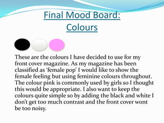
- 1. Final Mood Board:Colours These are the colours I have decided to use for my front cover magazine. As my magazine has been classified as ‘female pop’ I would like to show the female feeling but using feminine colours throughout. The colour pink is commonly used by girls so I thought this would be appropriate. I also want to keep the colours quite simple so by adding the black and white I don’t get too much contrast and the front cover wont be too noisy.
- 2. Font choice The font types I will be using are: Calibri (headings) Lucida Calligraphy Papyrus I have chose to use these three fonts as they are clear and easy to read but still make the writing look attractive. I will use the ‘Lucida Calligraphy’ font for mainly the subheading and quotes and will use the ‘Calibri’ font for the information and long paragraphs. I think these fonts will also suit my genre and my targeted audience as they look fun and don’t give off a serious atmosphere.
- 3. Use of Flashes I do not think I shall be using many different shapes and flashes on my magazine front cover. I think I may add little individual stars in certain places to add to the feminine side of the magazine. I will add these by using tools on Photoshop.
- 4. Mode of Address During my magazine I am going to write the information in standard English so that all the text is understandable and clear. On the front page to add to theme and relate to my targeted audience there may be use of ‘slang’ terms or text speak. I plan to use exclamation marks, questions marks and fun punctuation to emphasize certain points and this will also suit my targeted audience. I also plan to use numbers instead of letters in some occasions to make the whole feeling of the magazine chilled out.
- 5. Final Images
- 6. This are my final four images, I plan to use the first image on my front cover and then the rest on my contents and double page spread. I am really happy with the outcome of my images. I feel they look professional and sophisticated which was exactly the look I was going for. I believe they will look good in my magazine.