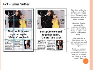
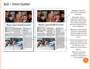
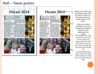
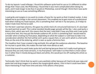
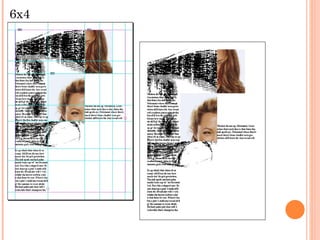
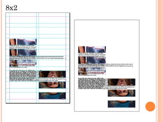
The document discusses layout design for magazine articles using InDesign. It describes using grids and margins to structure the layout and place elements correctly. Headers, drop caps, and baseline spacing are tested in different layouts to attract readers' attention and make the text appear denser. Font choices are considered in terms of masculinity/femininity and their effect on different audiences. Overall the layouts are assessed as dull due to a lack of color and complexity in the mock-ups. Further extension tasks experiment with overlapping elements and different page configurations.
