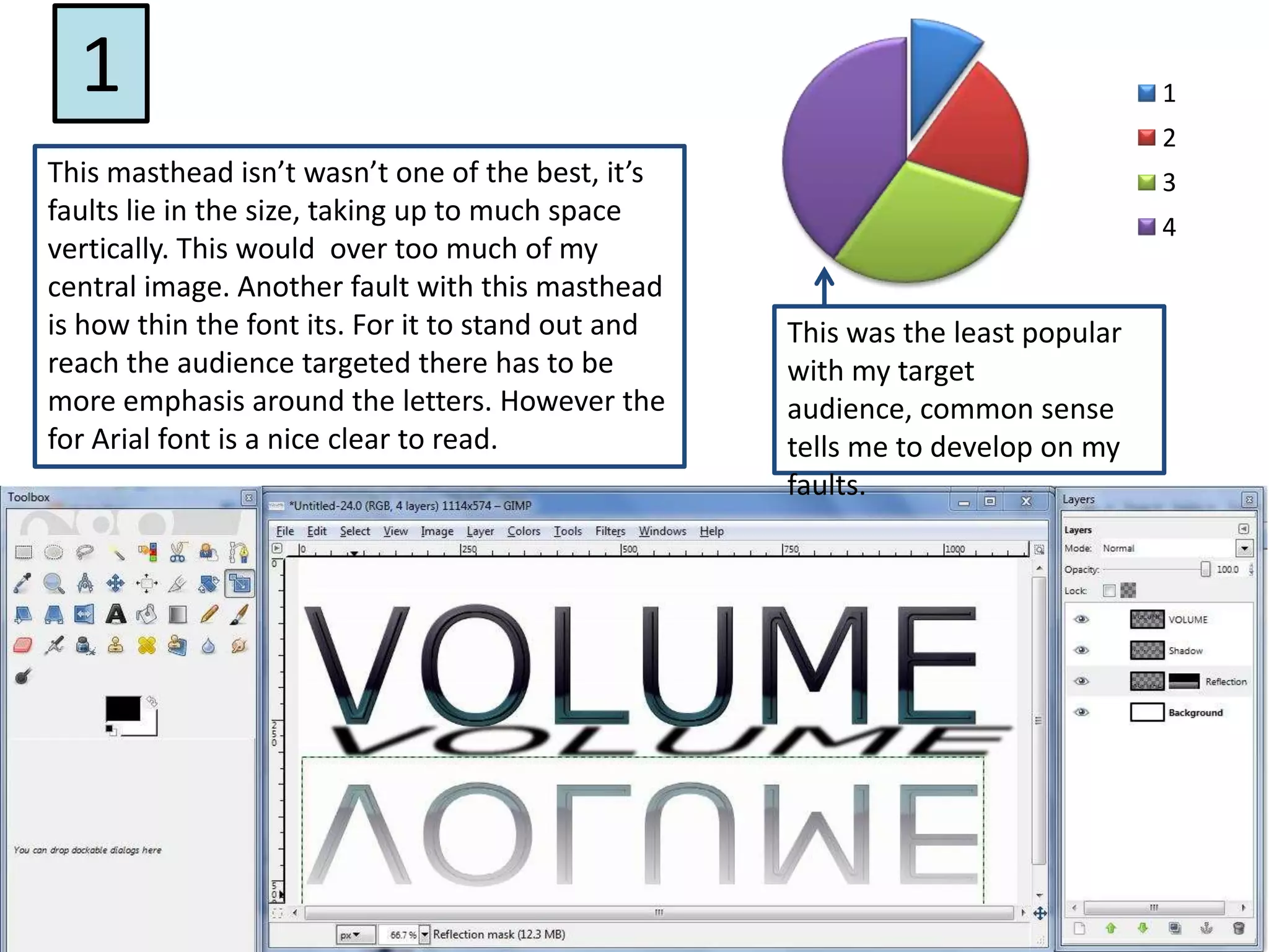
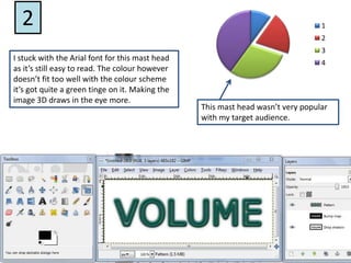
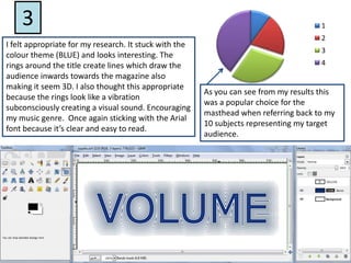
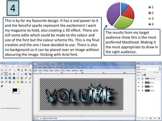
This document discusses different masthead designs for a magazine and evaluates them based on feedback from a target audience. The first masthead took up too much vertical space and had a thin font. The second stuck with an easy to read font but had a color issue. The third incorporated color themes and lines to draw readers in and represented the music genre. It was popular with test subjects. The fourth was the author's favorite with sparks representing excitement and a forceful design while still being readable. It received the most positive feedback, making it the most appropriate choice.