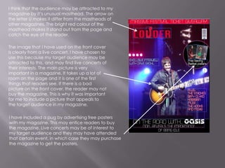
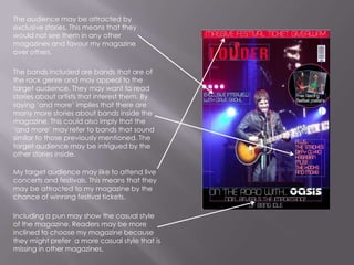
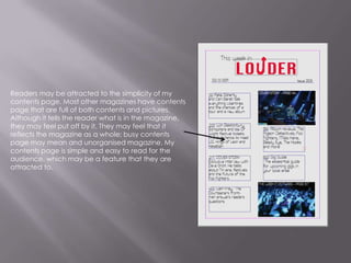
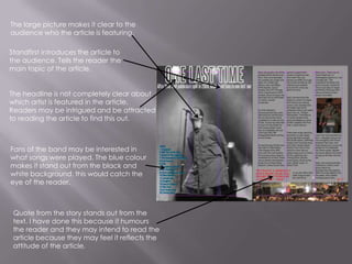
The document discusses how the magazine addressed its target audience through its design elements. The magazine's unusual masthead with an arrow on the U was meant to catch readers' attention. The cover image of a live concert was chosen to appeal to the audience's interest in concerts. Inside, exclusive stories about rock bands and a chance to win festival tickets were included to attract readers. The simple contents page was meant to provide an easy to read format compared to busy competitors. Overall, the magazine's design aimed to attract its target audience through visual elements, relevant content, and a casual style.