Download as PDF, PPTX


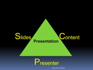


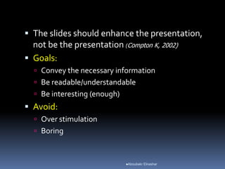
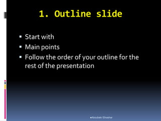


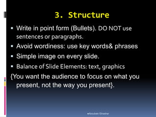

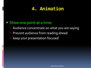


The document provides guidance on how to give effective presentations. It discusses several key areas to focus on, including content, slides, presenter skills, and questions. Some of the main points covered include choosing high-quality content that interests the audience, keeping slides concise with bullet points and large readable fonts, practicing delivery to avoid just reading slides, maintaining eye contact and enthusiasm, and being prepared to answer questions at the end. The overall message is that an effective presentation requires focus on both the visual presentation and oral delivery skills of the presenter.


![Oral Presentation Techniques[1]](https://cdn.slidesharecdn.com/ss_thumbnails/oralpresentationtechniques1-100401132619-phpapp01-thumbnail.jpg?width=640&height=640&fit=bounds)


