Download to read offline


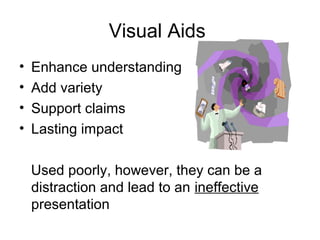


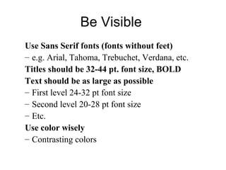


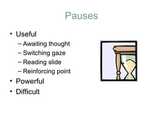


This document provides guidance on developing effective presentation skills. It discusses designing slides with easy to read text sizes and fonts, using color combinations that are visible when projected, and limiting distracting animations and backgrounds. The content should complement the speaker and have an appropriate density. Visual aids should outline main points, support the audience needs, and supplement not dominate the presentation. An effective speaker uses vocal techniques like varying pitch and pausing, makes eye contact, and practices delivering the presentation with notes or a script. The closing summary should restate the key points and allow for questions.


