Task 7
Brandon Parker
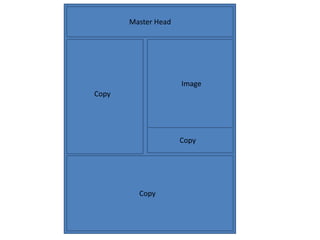
Copy
Copy
Copy
Master Head
Image
Copy
Copy
CopyCopy
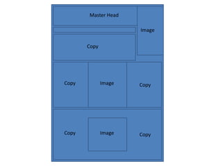
Copy
Master Head
Image
Image
Image
Copy
CopyCopy
Copy
Copy
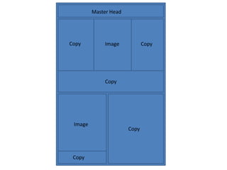
Master Head
Image
Image
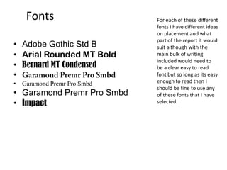
Fonts
• Adobe Gothic Std B
• Arial Rounded MT Bold
• Bernard MT Condensed
•
• Garamond Premr Pro Smbd
• Impact
For each of these different
fonts I have different ideas
on placement and what
part of the report it would
suit although with the
main bulk of writing
included would need to
be a clear easy to read
font but so long as its easy
enough to read then I
should be fine to use any
of these fonts that I have
selected.
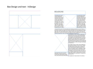
Box Design and text - InDesign
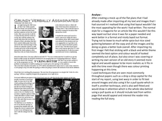
Analyse -
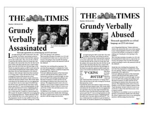
After creating a mock up of the flat plans that I had
already made after importing all my text and images that I
had sourced in I realised that using that layout wouldn’t be
the most appealing for the work I had written. The normal
style for a magazine for an article like this wouldn’t be this
way layed out but since it was for a paper needed and
work better in a formal and nicely layed out format.
Trying not to leave to much white spice but nice sized
guttering between all the copy and all the images and by
doing so gives a better look overall. After importing my
first image I felt that sticking with a black and white theme
seemed the best option and colour would of looked
completely out of place, but also since I was covering or
writing my own version of an old story it seemed more
logical and would appear to be more realistic as it fits in
with the time even though there was colour printing
happening at this time.
I used techniques that are seen most commonly
throughout papers such as a drop a drop capital for the
start of my report, using text warp in order to fit text
around images and also using it for a pull quote which in
itself is another technique, and is also well fitted and
would draw in attention which is the whole idea behind
using a pull quote as it should include text from within
page that would appeal and interest the reader into
reading the full story.
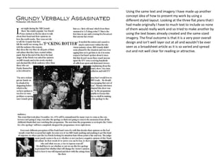
Using the same text and imagery I have made up another
concept idea of how to present my work by using a
different styled layout. Looking at the three flat plans that I
had made originally I have to much text to include so none
of them would really work and so tried to make another by
using the text boxes already created and the same sized
imagery. The final outcome is that it is a very poor overall
design and isn’t well layer out at all and wouldn’t be ever
seen as a broadsheet article as it is so varied and spread
out and not well clear for reading or attractive.
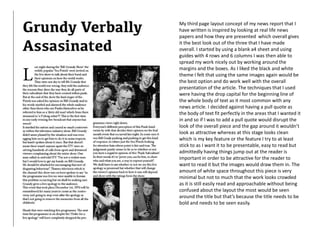
My third page layout concept of my news report that I
have written is inspired by looking at real life news
papers and how they are presented which overall gives
it the best look out of the three that I have made
overall. I started by using a blank a4 sheet and using
guides with 4 rows and 6 columns I was then able to
spread my work nicely out by working around the
margins and the boxes. As I liked the black and white
theme I felt that using the same images again would be
the best option and do work well with the overall
presentation of the article. The techniques that I used
were having the drop capital for the beginning line of
the whole body of text as it most common with any
news article. I decided against having a pull quote as
the body of text fit perfectly in the areas that I wanted it
in and so if I was to add a pull quote would disrupt the
look of the overall piece and the gap around it wouldn’t
look as attractive whereas at this stage looks clean
which is my key feature or the feature I try to at least
stick to as I want it to be presentable, easy to read but
admittedly having things jump out at the reader is
important in order to be attractive for the reader to
want to read it but the images would draw them in. The
amount of white space throughout this piece is very
minimal but not to much that the work looks crowded
as it is still easily read and approachable without being
confused about the layout the most would be seen
around the title but that’s because the title needs to be
bold and needs to be seen easily.
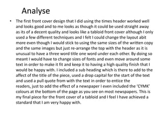
Analyse
• The first front cover design that I did using the times header worked well
and looks good and to me looks as though it could be used straight away
as its of a decent quality and looks like a tabloid front cover although I only
used a few different techniques and I felt I could change the layout abit
more even though I would stick to using the same sizes of the written copy
and the same images but just re-arrange the top with the header as it is
unusual to have a three word title one word under each other. By doing so
meant I would have to change sizes of fonts and even move around some
text in order to make it fit and keep it to having a high quality finish that I
would be happy with. I included a sub heading which is there to add to the
affect of the title of the piece, used a drop capital for the start of the text
and used a pull quote from with the text in order to entice the
readers, just to add the effect of a newspaper I even included the ‘CYMK’
colours at the bottom of the page as you see on most newspapers. This is
my final piece for the front cover of a tabloid and I feel I have achieved a
standard that I am very happy with.

Task 7

  • 1.
  • 2.
  • 3.
  • 4.
  • 5.
    Fonts • Adobe GothicStd B • Arial Rounded MT Bold • Bernard MT Condensed • • Garamond Premr Pro Smbd • Garamond Premr Pro Smbd • Impact For each of these different fonts I have different ideas on placement and what part of the report it would suit although with the main bulk of writing included would need to be a clear easy to read font but so long as its easy enough to read then I should be fine to use any of these fonts that I have selected.
  • 6.
    Box Design andtext - InDesign
  • 7.
    Analyse - After creatinga mock up of the flat plans that I had already made after importing all my text and images that I had sourced in I realised that using that layout wouldn’t be the most appealing for the work I had written. The normal style for a magazine for an article like this wouldn’t be this way layed out but since it was for a paper needed and work better in a formal and nicely layed out format. Trying not to leave to much white spice but nice sized guttering between all the copy and all the images and by doing so gives a better look overall. After importing my first image I felt that sticking with a black and white theme seemed the best option and colour would of looked completely out of place, but also since I was covering or writing my own version of an old story it seemed more logical and would appear to be more realistic as it fits in with the time even though there was colour printing happening at this time. I used techniques that are seen most commonly throughout papers such as a drop a drop capital for the start of my report, using text warp in order to fit text around images and also using it for a pull quote which in itself is another technique, and is also well fitted and would draw in attention which is the whole idea behind using a pull quote as it should include text from within page that would appeal and interest the reader into reading the full story.
  • 8.
    Using the sametext and imagery I have made up another concept idea of how to present my work by using a different styled layout. Looking at the three flat plans that I had made originally I have to much text to include so none of them would really work and so tried to make another by using the text boxes already created and the same sized imagery. The final outcome is that it is a very poor overall design and isn’t well layer out at all and wouldn’t be ever seen as a broadsheet article as it is so varied and spread out and not well clear for reading or attractive.
  • 9.
    My third pagelayout concept of my news report that I have written is inspired by looking at real life news papers and how they are presented which overall gives it the best look out of the three that I have made overall. I started by using a blank a4 sheet and using guides with 4 rows and 6 columns I was then able to spread my work nicely out by working around the margins and the boxes. As I liked the black and white theme I felt that using the same images again would be the best option and do work well with the overall presentation of the article. The techniques that I used were having the drop capital for the beginning line of the whole body of text as it most common with any news article. I decided against having a pull quote as the body of text fit perfectly in the areas that I wanted it in and so if I was to add a pull quote would disrupt the look of the overall piece and the gap around it wouldn’t look as attractive whereas at this stage looks clean which is my key feature or the feature I try to at least stick to as I want it to be presentable, easy to read but admittedly having things jump out at the reader is important in order to be attractive for the reader to want to read it but the images would draw them in. The amount of white space throughout this piece is very minimal but not to much that the work looks crowded as it is still easily read and approachable without being confused about the layout the most would be seen around the title but that’s because the title needs to be bold and needs to be seen easily.
  • 11.
    Analyse • The firstfront cover design that I did using the times header worked well and looks good and to me looks as though it could be used straight away as its of a decent quality and looks like a tabloid front cover although I only used a few different techniques and I felt I could change the layout abit more even though I would stick to using the same sizes of the written copy and the same images but just re-arrange the top with the header as it is unusual to have a three word title one word under each other. By doing so meant I would have to change sizes of fonts and even move around some text in order to make it fit and keep it to having a high quality finish that I would be happy with. I included a sub heading which is there to add to the affect of the title of the piece, used a drop capital for the start of the text and used a pull quote from with the text in order to entice the readers, just to add the effect of a newspaper I even included the ‘CYMK’ colours at the bottom of the page as you see on most newspapers. This is my final piece for the front cover of a tabloid and I feel I have achieved a standard that I am very happy with.