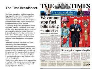
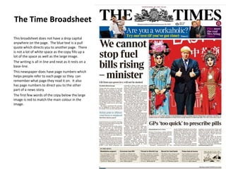
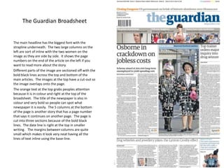
This document summarizes and compares the layouts of two broadsheet newspapers, The Times and The Guardian. For The Times, it notes the large bold header, cross header, and image in the right corner relating to the story. It also discusses the Times New Roman font, images in the title representing establishment connections, and 6 small sections at the bottom continuing stories on other pages. For The Guardian, it describes the main bold headline and strapline, images sectioned off with bold lines, orange and colored text/title grabbing attention, and 5 columns at the bottom continuing a story on another page.


