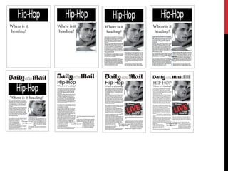
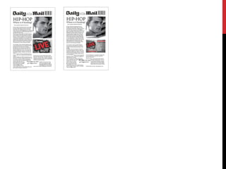
1) The document discusses four different layout designs for a tabloid newspaper mock layout.
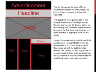
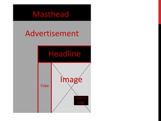
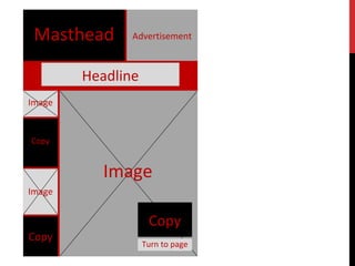
2) The first design has the advertisement at the top and uses columns for the copy. The second places more emphasis on the large image and has a higher text to image ratio.
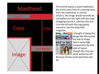
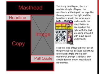
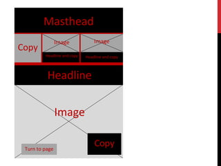
3) The third layout uses a more traditional design with masthead, headline and image on the right with wrapping text.
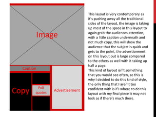
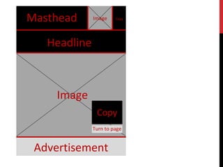
4) The fourth contemporary design pushes boundaries with a minimal caption and large centered image and advertisement.
3. Advertisement
Headline
Image
Caption
Copy
This flat plan would be made of three
columns and seven/four rows, I used this
kind of layout because it’s simple and
organised.
This layout will make people look at the
image first because of how big it will be, I
thought that I would do this one as it is so
that it brings the audiences attention more,
because if the first thing that they see is a
lot of text then it might put them off the
article.
I placed the advertisement at the top of the
page because I thought that it would be
better there as it’s out of the way rather
than mixed up with the subject. I also
thought that I would do the copy so that it’s
in columns rather than just a big paragraph
because I felt that this would help make the
article look neater and more organised.
4. Masthead
Dateline
Image
Copy
Pull quote
Copy
This kind of layout is quite traditional
but at the same time it’s steering away
from the traditional, in normal
article’s, the image would normally be
somewhere on the right with the copy
wrapping around it, whereas this one
is on the left with the copy going
around it. Like the Daily Mail
magazine.
I thought of doing this
design like this so that
the text to image
ratio is quite high
compared to the first
style of layout.
Though this may put
some audiences off
Because of how much text there will
be.
5. Masthead
Headline
Image
Copy
Pull Quote
This is my third layout, this is a
traditional style of layout, the
mastline is at the top of the page like
the magazine on the right and the
headline is also in the same place
underneath, the
image has also
been put on the
right with the text
wrapping around it
with a pull quote
underneath.
I like this kind of layout better out of
the pervious two because everything
is nice and simple and it’s also
traditional, though traditional and
simple doesn’t always mean it will
be the best.
6. Image
Caption
Pull
quotesCopy Advertisement
This layout is very contemporary as
it’s pushing away all the traditional
sides of the layout, the image is taking
up most of the space in this layout to
again grab the audiences attention,
with a little caption underneath and
not much copy, this will show the
audience that the subject is quick and
gets to the point, the advertisement
on this layout out is large compared
to the others as well with it taking up
half a page.
This kind of layout isn’t something
that you would see often, so this is
why I decided to do this kind of style,
the only thing that I aren’t too
confident with is if I where to do this
layout with my final piece it may not
look as if there’s much there.
15. This is my first rough version of my layout done on in Design, which
has been created based on the layout that has been put on the 4th
slide, though it is slightly different because there is parts added on that
weren’t in the flat plan before, for example, there is now a masthead,
head line and subheading, rather than just a masthead and headline,
this is because I used a daily mail logo and I used the article name and
a little line of text underneath, I think that this helps contribute to
making it look more professional like the image of the daily mail news
paper.
The difference between mine and the daily mail’s image is that theirs
has more colour in it, and mine is all black and white apart from one
thing. The image on mine has also been put in a different place to
theirs, when looking at them both together I think that theirs looks
better with the image where it is because it’s got more too it and it
also enables more information to be added, whereas mine just looks
as if it’s an article about one thing and nothing like a front page.
They have also put who the interviewer is as well on each subject or
who wrote the subject as well which is something that I have failed to
do, though there is advertisements, which the daily mail have as well.
When trying to do a pull quote this didn’t work very well because the
text around it was really close to the quote and sometimes overlapped
so this didn’t work out very well for me no matter what I tried, this is
something that may not appear in my final piece.
16. I thought that this font was the best to use because it’s different but still
simple and easy to read, I did this so that the magazine fitted in with the
subject of article and also so that it’s different for people to look at, to me
this looks as if it would be a girls font because of all the flicks that it has
and also because of how curved the writing is, normally in articles the font
will be quite square to fit the masculine side better.
My kind of writing also looks a lot more dense as well and as if there’s a
lot more too it, where as the text for Daily mail doesn’t, so my version
may favour people that like to read a lot, putting off people that don’t
with the amount of text.
My version:
Daily Mail:
Daily Mail:
My version:
My version of the masthead is controversial because it’s going
against the kind of house style that all of the other newspapers
use. I think that this has worked well because it’s gaining the
audiences attention because it’s different to all the others so it
will stand out more, though on the other hand the Daily Mail’s
font is a lot more bolder, so if it where just the two together
the Daily Mails would stand out, but if I where mine against a
load of other newspapers it would stand out in this way
because of it being simple, thin and different.