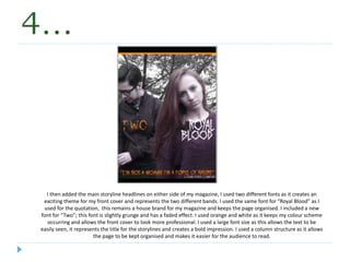
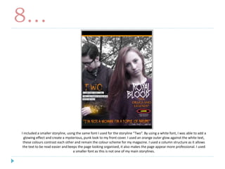
1. The document describes the process of designing a magazine front cover for a rock music magazine. Large images and bold fonts were used to attract attention and represent the genre. Orange and black were used as main colors to create a distinctive style.
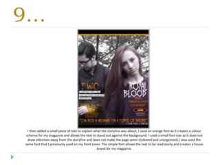
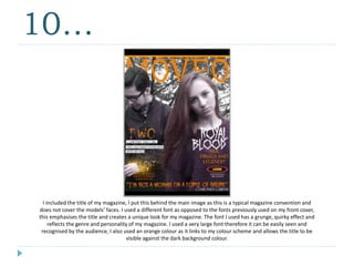
2. Key details like headlines, story descriptions and logos were organized into columns for clarity. Quotes and images were incorporated to highlight stories and bands. Different fonts and sizes were chosen to emphasize important elements while keeping the design cohesive.
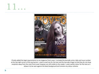
3. Legal and production details like the barcode and issue number were added discretely to meet requirements without distracting from the central content. Overall, an organized and stylistically consistent cover was created through strategic use of images, colors,