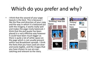
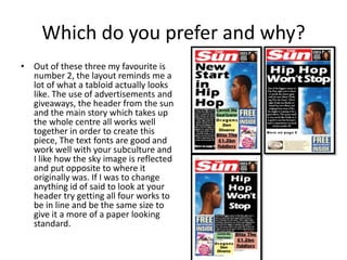
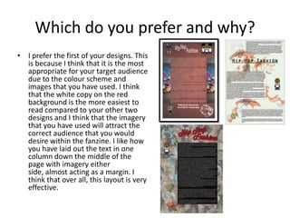
Peer Feed Back
Oli Georgiou
Which do you prefer and why?
• I think that the second of your page
layouts is the best. This is because I
like the flow and direction of your copy
and the way in which it is balanced out
with the imagery, it works really well
and makes the page nicely balanced. I
think that the pull-quote has been
placed in a very effective way however
it could have been much bigger as
there is quite a lot of white space on
the page which is not usually present
within real Broadsheet spreads. I think
the fonts that you have used are clear
and easily legible, and the images that
you have chosen to sue are eye-
catching and relevant to the story.
Which do you prefer and why?
• Out of these three my favourite is
number 2, the layout reminds me a
lot of what a tabloid actually looks
like. The use of advertisements and
giveaways, the header from the sun
and the main story which takes up
the whole centre all works well
together in order to create this
piece, The text fonts are good and
work well with your subculture and
I like how the sky image is reflected
and put opposite to where it
originally was. If I was to change
anything id of said to look at your
header try getting all four works to
be in line and be the same size to
give it a more of a paper looking
standard.
Which do you prefer and why?
• I prefer the first of your designs. This
is because I think that it is the most
appropriate for your target audience
due to the colour scheme and
images that you have used. I think
that the white copy on the red
background is the more easiest to
read compared to your other two
designs and I think that the imagery
that you have used will attract the
correct audience that you would
desire within the fanzine. I like how
you have laid out the text in one
column down the middle of the
page with imagery either
side, almost acting as a margin. I
think that over all, this layout is very
effective.

Peer feed back

  • 1.
  • 2.
    Which do youprefer and why? • I think that the second of your page layouts is the best. This is because I like the flow and direction of your copy and the way in which it is balanced out with the imagery, it works really well and makes the page nicely balanced. I think that the pull-quote has been placed in a very effective way however it could have been much bigger as there is quite a lot of white space on the page which is not usually present within real Broadsheet spreads. I think the fonts that you have used are clear and easily legible, and the images that you have chosen to sue are eye- catching and relevant to the story.
  • 3.
    Which do youprefer and why? • Out of these three my favourite is number 2, the layout reminds me a lot of what a tabloid actually looks like. The use of advertisements and giveaways, the header from the sun and the main story which takes up the whole centre all works well together in order to create this piece, The text fonts are good and work well with your subculture and I like how the sky image is reflected and put opposite to where it originally was. If I was to change anything id of said to look at your header try getting all four works to be in line and be the same size to give it a more of a paper looking standard.
  • 4.
    Which do youprefer and why? • I prefer the first of your designs. This is because I think that it is the most appropriate for your target audience due to the colour scheme and images that you have used. I think that the white copy on the red background is the more easiest to read compared to your other two designs and I think that the imagery that you have used will attract the correct audience that you would desire within the fanzine. I like how you have laid out the text in one column down the middle of the page with imagery either side, almost acting as a margin. I think that over all, this layout is very effective.