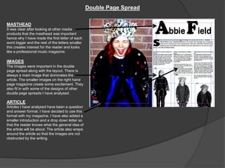
Question 1
   My media product Note has used the typical
    conventions of a real life media product.
   Before creating my magazine I did extensive
    research on what makes a good front cover,
    contents page and double page spread. I have
    taken the structure and style of magazine on
    board and created a music magazine that I feel
    looks professional.
   On the next three slides I have shown where I
    have used these typical conventions of a music
    magazine.
Front Cover
MASTHEAD
The masthead on my magazine fits
the conventions of a music                             PRICE, DATE AND BARCODE
magazine because it is bright, bold                    The date and price and written under
and is at the top of page. It is clear                 the masthead so when the reader is
and easy to read so the reader will                    looking at the masthead they can
know instantly that they are                           clearly see they are buying the correct
reading/looking at Note magazine.                      edition, this is typical with music
                                                       magazines. The barcode is on the
                                                       bottom right hand corner so people can
MAIN IMAGE                                             actually buy it.
The main image fits the typical
conventions of a real music
magazine because the main                              COVER LINES
feature is taking up the entire                        The cover lines also fit in with the
page, creating a sense of                              conventions of a music magazine
closeness to the audience. The                         because they go on either side of the
clothes she is wearing also fit in                     page almost wrapping around the main
with the theme of the magazine                         image.
which seems key when I analysed
a real magazine.                                       MAIN COVER LINE
                                                       The main cover line is written in larger
                                                       bolder text, this is so that is attracts the
FLASHER
                                                       reader and make them want to read
The flasher attracts the readers
                                                       about who ‘Abbie Field’ is and why she
attention because it is a bright
                                                       is a main feature in the magazine.
bold shape explaining that you
                                                       The smaller writing ‘World Exclusive
can win tickets to see Ben
                                                       with’ will excite the reader and make
Howard, this is usually used in a
                                                       them feel they are reading something
real music magazine to attract the
                                                       that nobody else is.
readers attention.
Contents Page

                                                            IMAGES
MASTHEAD                                                    On all of the media products I have
After analysing real media products it                      looked at there is always a main
was clear that the mast head was                            image in the middle of the contents
always at the top of the page. I have                       page. This draws attention to the
also added a smaller image of the                           feature and the small anchored
title of my magazine so that the                            article shows why she is on the
audience know that they are reading                         contents page and why she has
the contents page in Note magazine.                         been featured as a main feature.
                                                            The small image on the bottom left
NUMBERS                                                     hand corner was also in some real
It was clear that the numbers on a                          media product.
real media product are always bigger                        MESSAGE
than the writing so that its clear to the                   When completing my research
reader as to what page they want.                           there was always a small passage
The number on the image take over                           of writing from the editor of the
some of the image so that it is clear                       magazine in order to give a more
that the article about Laura B is found                     personal touch. I have also added
on page 3, clearing up confusion.                           one of these messages so that the
                                                            reader feels they are being given
ADVERTS
                                                            the best quality information.
I added the advertisement for
subscriptions to Note magazine, to                          HEADINGS/COVERLINES
give the magazine a more                                    The heading on the magazine is in
professional feel. The larger bolder                        a brighter bolder box to make the
font at the beginning of the sentences                      section stand out, this is also used
make the article look exciting and                          in real life media products.
reasonable for the viewer to                                The cover line saying Abbie Field
subscribe to. I have also made the                          adds focus to the page and makes
price for the subscription bigger so                        them want to read what is
that the audience think its a                               happening.
reasonable buy.
Double Page Spread

MASTHEAD
It was clear after looking at other media
products that the masthead was important
hence why I have made the first letter of each
word bigger and the rest of the letters smaller
this creates interest for the reader and looks
like a professional music magazine.

IMAGES
The images were important in the double
page spread along with the layout. There is
always a main image that dominates the
article. The smaller images on the right hand
page magazine create some excitement. They
also fit in with some of the designs of other
double page spreads I have analysed.

ARTICLE
Articles I have analysed have been a question
and answer format. I have decided to use this
format with my magazine. I have also added a
smaller introduction and a drop down letter so
that the reader knows what the general idea of
the article will be about. The article also wraps
around the article so that the images are not
obstructed by the writing.

Question 1

  • 1.
  • 2.
    My media product Note has used the typical conventions of a real life media product.  Before creating my magazine I did extensive research on what makes a good front cover, contents page and double page spread. I have taken the structure and style of magazine on board and created a music magazine that I feel looks professional.  On the next three slides I have shown where I have used these typical conventions of a music magazine.
  • 3.
    Front Cover MASTHEAD The mastheadon my magazine fits the conventions of a music PRICE, DATE AND BARCODE magazine because it is bright, bold The date and price and written under and is at the top of page. It is clear the masthead so when the reader is and easy to read so the reader will looking at the masthead they can know instantly that they are clearly see they are buying the correct reading/looking at Note magazine. edition, this is typical with music magazines. The barcode is on the bottom right hand corner so people can MAIN IMAGE actually buy it. The main image fits the typical conventions of a real music magazine because the main COVER LINES feature is taking up the entire The cover lines also fit in with the page, creating a sense of conventions of a music magazine closeness to the audience. The because they go on either side of the clothes she is wearing also fit in page almost wrapping around the main with the theme of the magazine image. which seems key when I analysed a real magazine. MAIN COVER LINE The main cover line is written in larger bolder text, this is so that is attracts the FLASHER reader and make them want to read The flasher attracts the readers about who ‘Abbie Field’ is and why she attention because it is a bright is a main feature in the magazine. bold shape explaining that you The smaller writing ‘World Exclusive can win tickets to see Ben with’ will excite the reader and make Howard, this is usually used in a them feel they are reading something real music magazine to attract the that nobody else is. readers attention.
  • 4.
    Contents Page IMAGES MASTHEAD On all of the media products I have After analysing real media products it looked at there is always a main was clear that the mast head was image in the middle of the contents always at the top of the page. I have page. This draws attention to the also added a smaller image of the feature and the small anchored title of my magazine so that the article shows why she is on the audience know that they are reading contents page and why she has the contents page in Note magazine. been featured as a main feature. The small image on the bottom left NUMBERS hand corner was also in some real It was clear that the numbers on a media product. real media product are always bigger MESSAGE than the writing so that its clear to the When completing my research reader as to what page they want. there was always a small passage The number on the image take over of writing from the editor of the some of the image so that it is clear magazine in order to give a more that the article about Laura B is found personal touch. I have also added on page 3, clearing up confusion. one of these messages so that the reader feels they are being given ADVERTS the best quality information. I added the advertisement for subscriptions to Note magazine, to HEADINGS/COVERLINES give the magazine a more The heading on the magazine is in professional feel. The larger bolder a brighter bolder box to make the font at the beginning of the sentences section stand out, this is also used make the article look exciting and in real life media products. reasonable for the viewer to The cover line saying Abbie Field subscribe to. I have also made the adds focus to the page and makes price for the subscription bigger so them want to read what is that the audience think its a happening. reasonable buy.
  • 5.
    Double Page Spread MASTHEAD Itwas clear after looking at other media products that the masthead was important hence why I have made the first letter of each word bigger and the rest of the letters smaller this creates interest for the reader and looks like a professional music magazine. IMAGES The images were important in the double page spread along with the layout. There is always a main image that dominates the article. The smaller images on the right hand page magazine create some excitement. They also fit in with some of the designs of other double page spreads I have analysed. ARTICLE Articles I have analysed have been a question and answer format. I have decided to use this format with my magazine. I have also added a smaller introduction and a drop down letter so that the reader knows what the general idea of the article will be about. The article also wraps around the article so that the images are not obstructed by the writing.