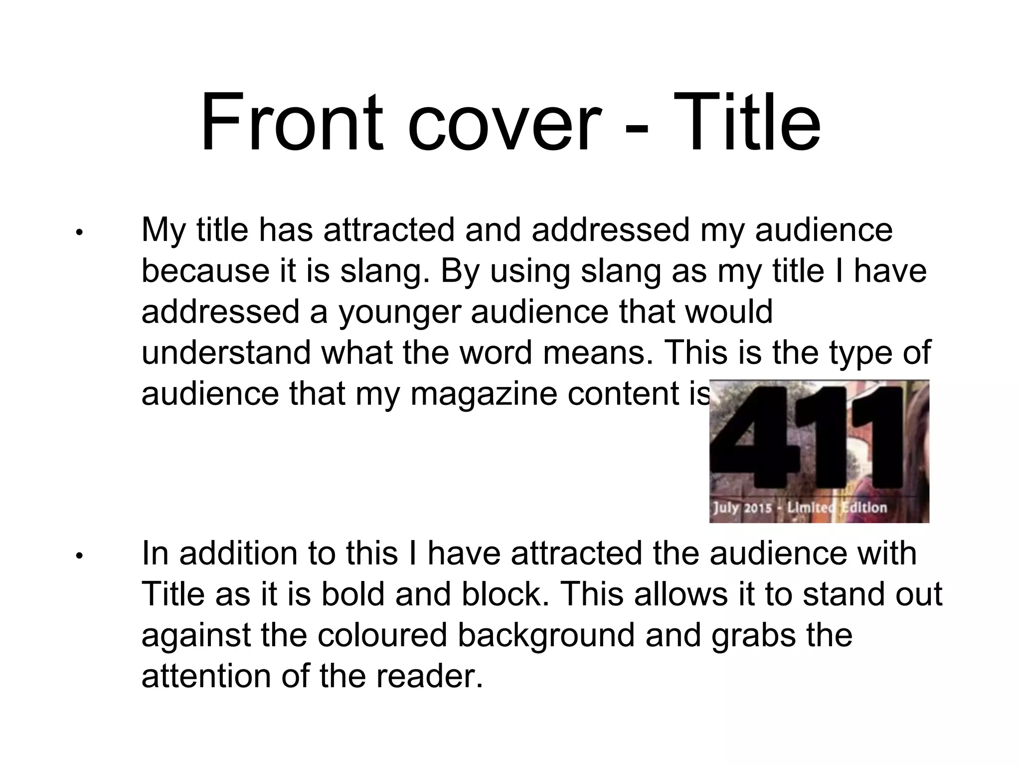
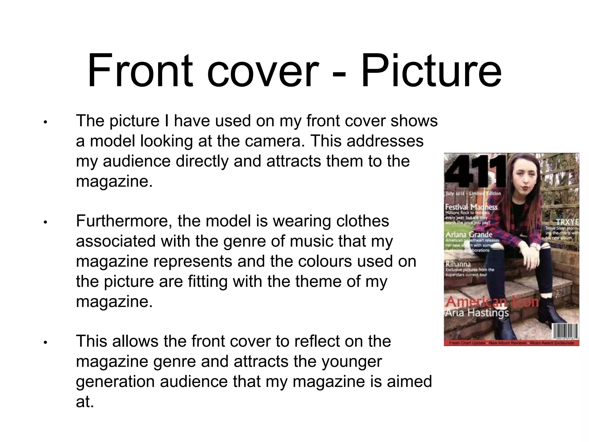
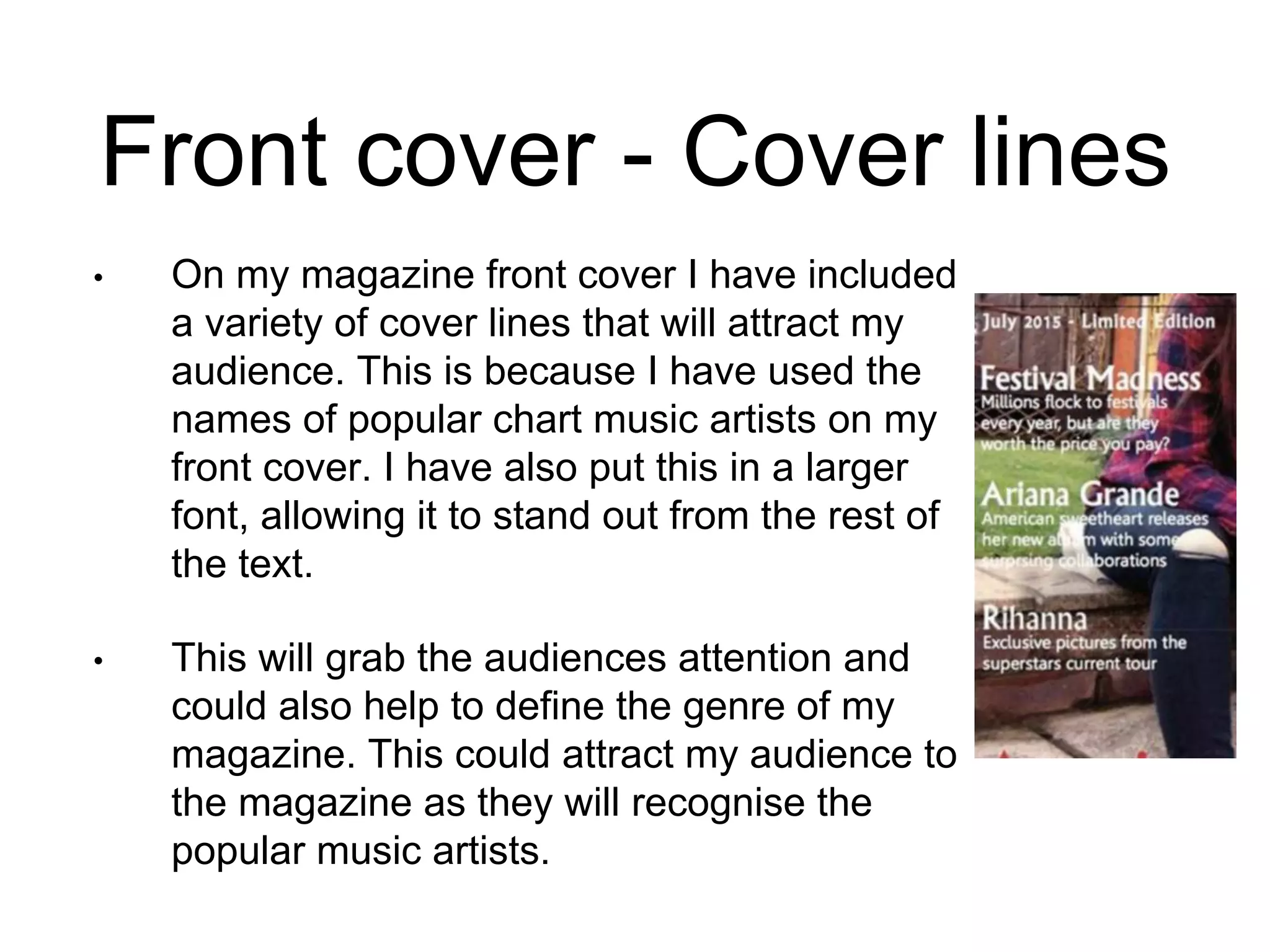
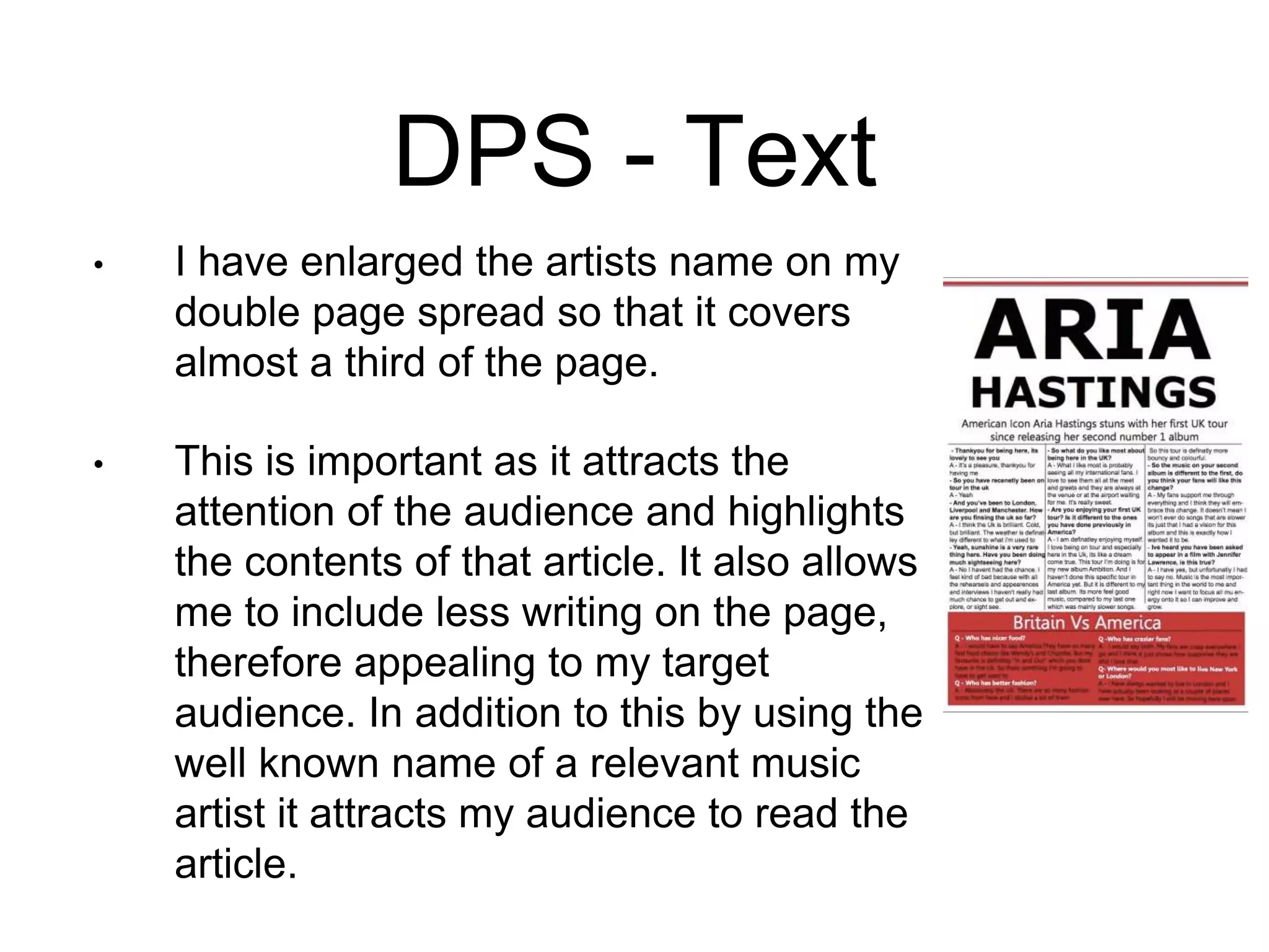
The document discusses how the author attracted and addressed their intended audience through the design of the magazine's front cover, contents page, and a double-page spread. On the front cover, the author used a slang title, bold text, and an image of a model in genre-appropriate clothing to appeal to a younger audience interested in chart music. The contents page highlighted key articles using subheadings and incorporated many images of popular artists alongside minimal text. The double-page spread featured an enlarged artist name covering 1/3 of the page alongside a full-page image and condensed text to appeal to the target audience through less reading.